
Design SystemMarie Dyachenko
I build scalable, pixel-perfect design systems for fast-moving teams
A good design system means your team can ship new features faster without fishing for patterns in countless frames or designing from scratch every time. It keeps your product consistent even when multiple designers or devs are working on it. It should work with your product, not the other way around.
We'll be a fit if:
Your product has grown messy and inconsistent (no shared components, colors everywhere, every screen feels different)
You're about to scale your team and need a foundation before things get worse
You've launched but every new feature takes forever because there's no system to build from
You're starting a new product and want to build it right from day one
What's included
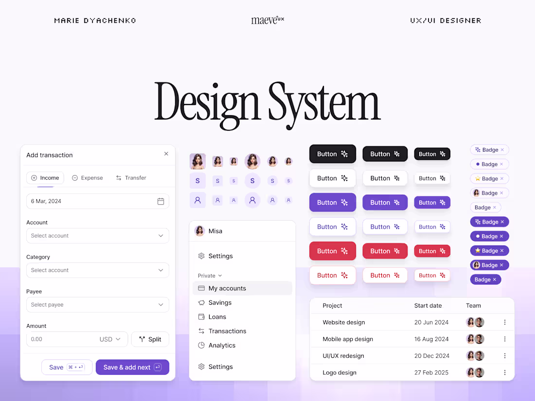
📚 Component Library in Figma
Library of UI components created specifically for the needs of your product: buttons, inputs, cards, modals, navigation, tables, forms, etc.
🎨 Color & Typography System
Semantic color tokens & typography scales that work across your product with clear usage guidelines.
🧬 Design Tokens / Variables
Figma variables for colors, spacing, and typography that maintain consistency and let you easily make changes across the whole product.
📖 Documentation and Usage Guide
Clear guidelines on how to use each component, when to use what, and examples of common patterns (login screens, empty states, forms, etc.).
🧩 Interaction Patterns
Interaction guidelines for each component: hover states, loading states, error states, disabled states, etc...
Process
Audit. I review your existing product (if you have one) and identify what components you actually need.
Foundation. We establish colors, typography, spacing, and core patterns.
Component build. I build the library with all variants and states.
Documentation. Clear usage guidelines so your team actually uses it.
Handoff. I walk your team through the system and answer questions.
Pricing & timeline
Typically a full design system costs $3,000 – $5,000, and takes 3-5 weeks depending on how complex your product is and how many components you need.
FAQs

Marie's other services
Starting at$3,000
Duration3 weeks
Tags
Figma
Design Systems Specialist
Product Designer
UX Designer
Service provided by
Marie Dyachenko proUkraine
- $100k+
- Earned
- 22
- Paid projects
- 5.00
- Rating
- 308
- Followers
Design SystemMarie Dyachenko
Starting at$3,000
Duration3 weeks
Tags
Figma
Design Systems Specialist
Product Designer
UX Designer
I build scalable, pixel-perfect design systems for fast-moving teams
A good design system means your team can ship new features faster without fishing for patterns in countless frames or designing from scratch every time. It keeps your product consistent even when multiple designers or devs are working on it. It should work with your product, not the other way around.
We'll be a fit if:
Your product has grown messy and inconsistent (no shared components, colors everywhere, every screen feels different)
You're about to scale your team and need a foundation before things get worse
You've launched but every new feature takes forever because there's no system to build from
You're starting a new product and want to build it right from day one
What's included
📚 Component Library in Figma
Library of UI components created specifically for the needs of your product: buttons, inputs, cards, modals, navigation, tables, forms, etc.
🎨 Color & Typography System
Semantic color tokens & typography scales that work across your product with clear usage guidelines.
🧬 Design Tokens / Variables
Figma variables for colors, spacing, and typography that maintain consistency and let you easily make changes across the whole product.
📖 Documentation and Usage Guide
Clear guidelines on how to use each component, when to use what, and examples of common patterns (login screens, empty states, forms, etc.).
🧩 Interaction Patterns
Interaction guidelines for each component: hover states, loading states, error states, disabled states, etc...
Process
Audit. I review your existing product (if you have one) and identify what components you actually need.
Foundation. We establish colors, typography, spacing, and core patterns.
Component build. I build the library with all variants and states.
Documentation. Clear usage guidelines so your team actually uses it.
Handoff. I walk your team through the system and answer questions.
Pricing & timeline
Typically a full design system costs $3,000 – $5,000, and takes 3-5 weeks depending on how complex your product is and how many components you need.
FAQs
Marie's other services
$3,000