
Dashboard & SaaS Product UI DesignMonodeep Samanta
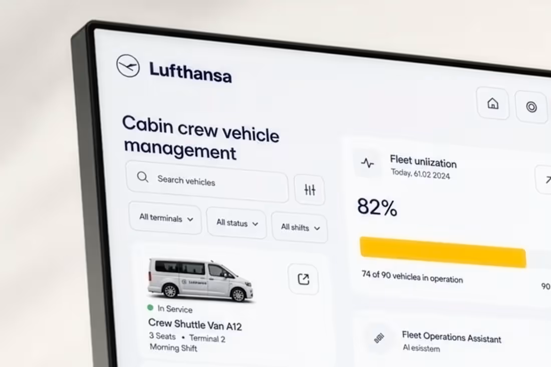
Dashboard design for products where a wrong read costs money
Most dashboards don't fail on looks. They fail because the person using them can't tell what's changed, what's at risk, and what to do next. Decisions slow down, support tickets go up, and the product stops feeling trustworthy — usually just as you're putting it in front of investors or paying customers.
I design the core screens of your web app or SaaS so the data is readable at a glance and holds up when someone senior is scrutinising it. 16+ years, London-based, mostly B2B products where the interface carries commercial weight.
What's included
Four key screens: your main dashboard plus the screens around it that carry the workflow
A structured, layered Figma file your developers can build from
Two rounds of revisions
Handoff notes covering hierarchy, empty and error states, and edge cases
How it works (roughly one week)
Day 1 — Discovery. What decisions this product supports, who makes them, and what currently goes wrong.
Days 2–4 — First direction. Structure, hierarchy and layout for the core screens.
Day 5 — Review. Feedback assessed against the decisions the screens have to support, not personal taste.
Days 6–7 — Delivery. Refined screens, consistent components, notes for build.
Need something wider? More screens, a full product audit, or design plus build — message me with the scope and I'll come back with a fixed quote and timeline.
FAQs
Example work
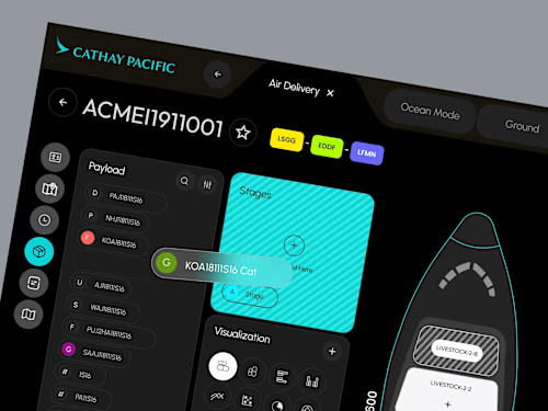
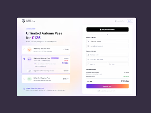
Monodeep's other services
Starting at$900
Duration1 week
Tags
Figma

B2B SaaS
UI Designer
UX Designer
Web Designer
Dashboards
Service provided by
Monodeep Samanta proLondon, UK
- 1
- Followers
Dashboard & SaaS Product UI DesignMonodeep Samanta
Starting at$900
Duration1 week
Tags
Figma
B2B SaaS
UI Designer
UX Designer
Web Designer
Dashboards
Dashboard design for products where a wrong read costs money
Most dashboards don't fail on looks. They fail because the person using them can't tell what's changed, what's at risk, and what to do next. Decisions slow down, support tickets go up, and the product stops feeling trustworthy — usually just as you're putting it in front of investors or paying customers.
I design the core screens of your web app or SaaS so the data is readable at a glance and holds up when someone senior is scrutinising it. 16+ years, London-based, mostly B2B products where the interface carries commercial weight.
What's included
Four key screens: your main dashboard plus the screens around it that carry the workflow
A structured, layered Figma file your developers can build from
Two rounds of revisions
Handoff notes covering hierarchy, empty and error states, and edge cases
How it works (roughly one week)
Day 1 — Discovery. What decisions this product supports, who makes them, and what currently goes wrong.
Days 2–4 — First direction. Structure, hierarchy and layout for the core screens.
Day 5 — Review. Feedback assessed against the decisions the screens have to support, not personal taste.
Days 6–7 — Delivery. Refined screens, consistent components, notes for build.
Need something wider? More screens, a full product audit, or design plus build — message me with the scope and I'll come back with a fixed quote and timeline.
FAQs
Example work
Monodeep's other services
$900