Visual Cargo Planning Workspace Design

Monodeep Samanta

Project Overview
The project began with a clear operational challenge: air cargo teams were working with complex payload, routing, parcel and aircraft capacity information that was difficult to understand quickly through traditional data-heavy systems.
We were brought in to rethink the experience from a UX/UI perspective, with the goal of creating a more visual and intuitive cargo planning workspace.
From the beginning, the focus was not simply on redesigning screens, but on understanding how operators make loading decisions, reducing unnecessary complexity, and turning a technical workflow into a structured, interactive interface that could support faster and more confident decision-making.
Problem
Air cargo planning involves a large amount of operational information at the same time: payload categories, parcel dimensions, weight, routes, loading positions, aircraft capacity and delivery stages. When this information is spread across tables or disconnected tools, operators need to constantly switch context, increasing cognitive load and making it harder to understand where cargo should be placed and how each decision affects the aircraft layout.
The main UX challenge was to transform this complex workflow into a single interface without making the dashboard feel overwhelming.
Solution
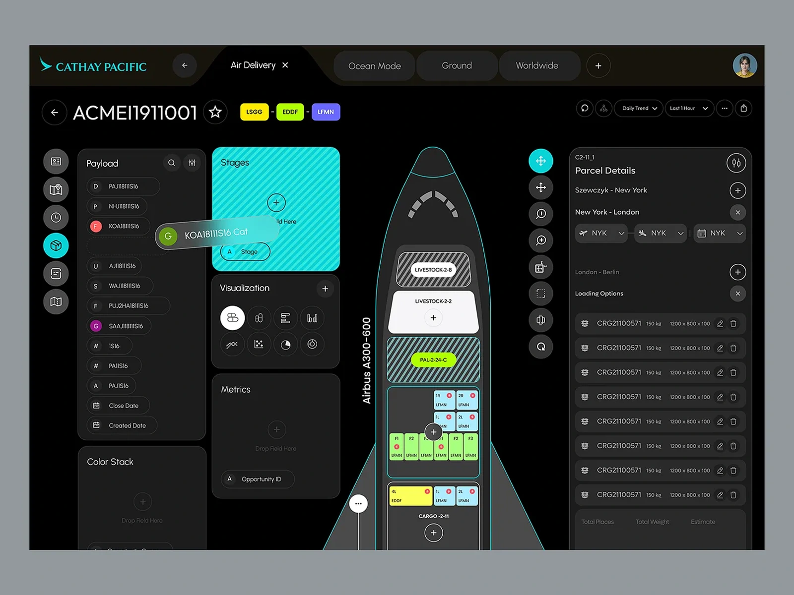
The experience was designed around a visual aircraft loading workspace, allowing the user to understand the cargo configuration immediately rather than interpreting data only through lists.
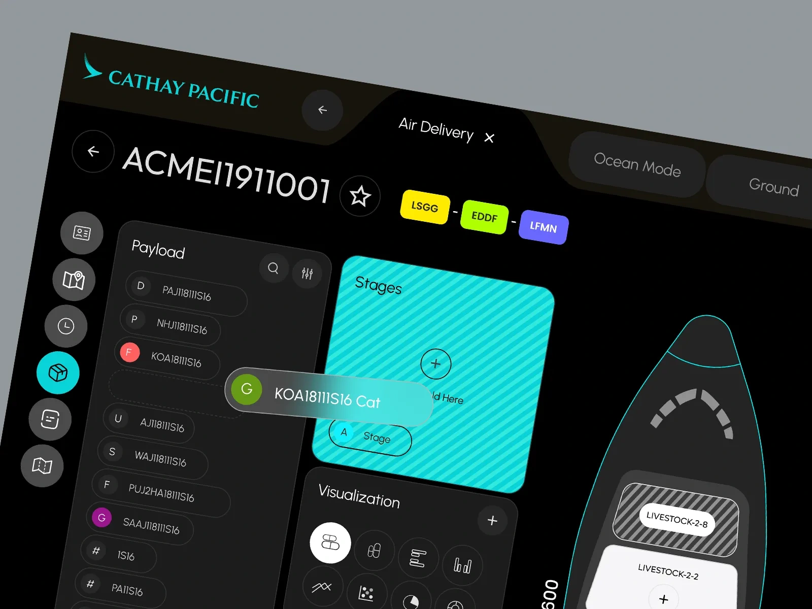
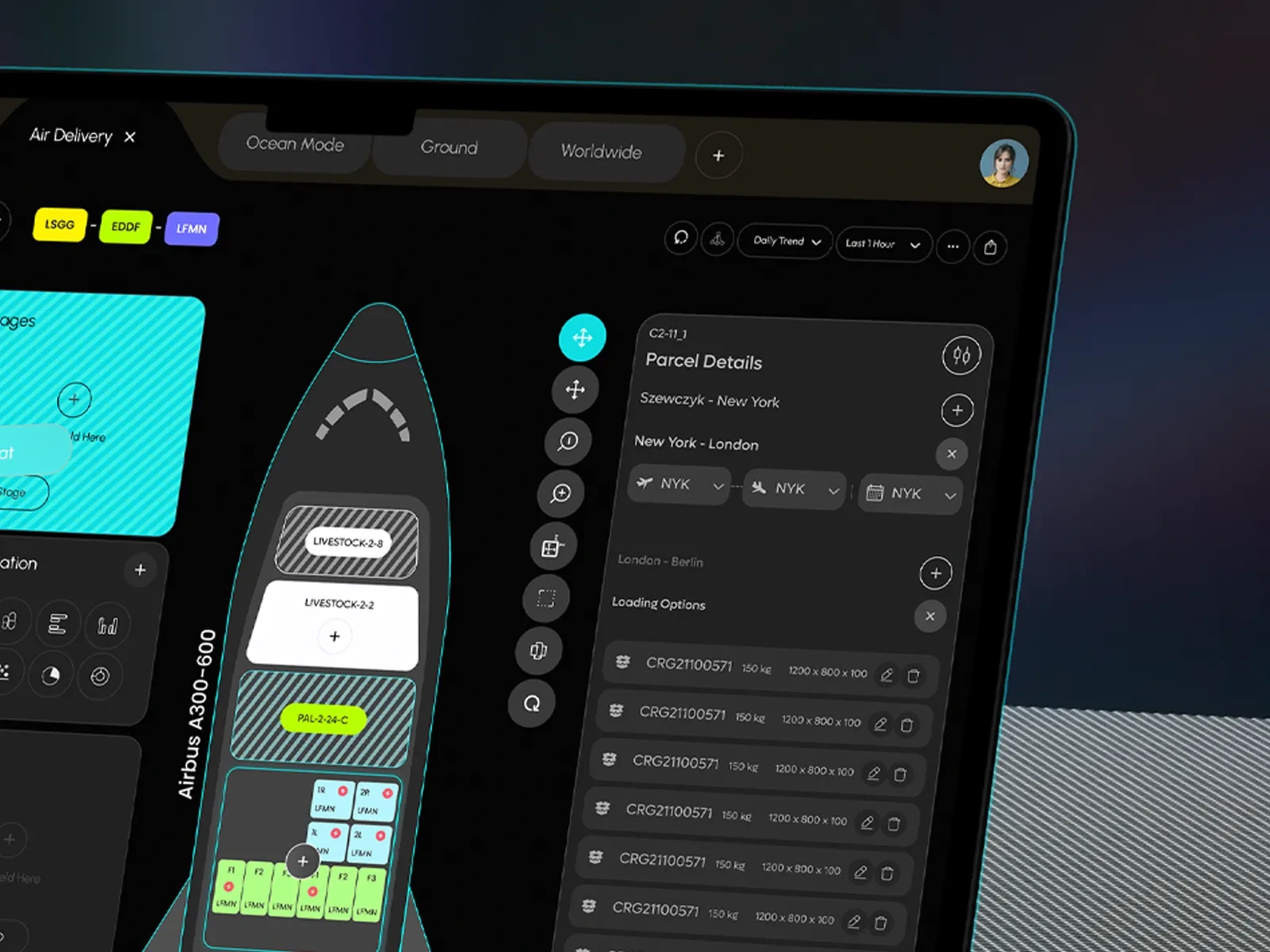
The aircraft remains the central focus, while payload information, parcel details, stages, metrics and visualisation controls are organised into modular side panels. Colour-coded cargo blocks, clear status indicators and drag-and-drop interactions make different loads easier to recognise and reposition.
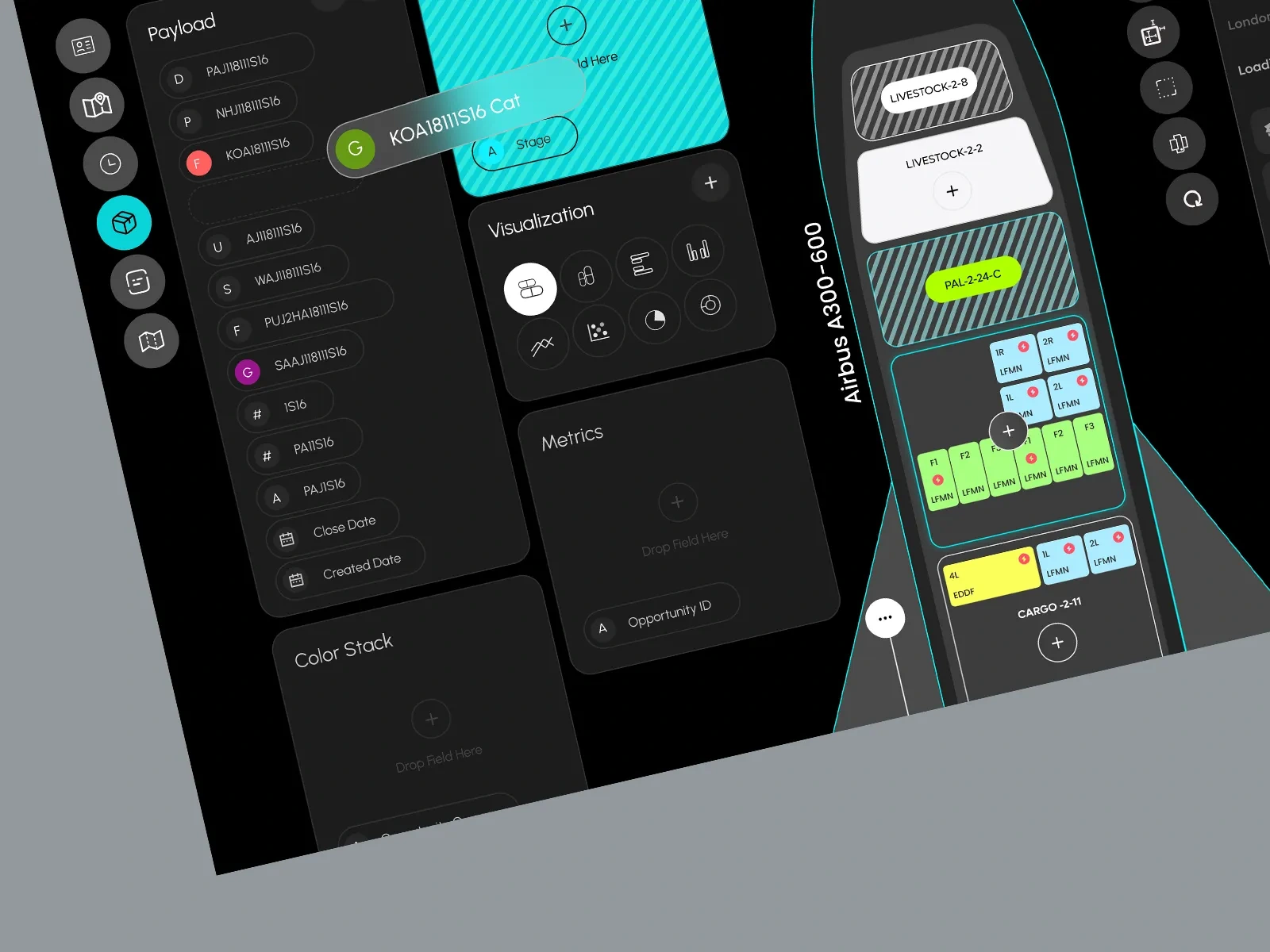
A dark, high-contrast interface reduces unnecessary visual noise, while brighter accent colours are reserved for active states, important cargo information and primary actions. This creates a clear hierarchy that helps operators move from finding a payload → positioning it → reviewing parcel details → validating the loading plan within one continuous workflow.
The result is a more visual, structured and decision-focused experience for managing a highly complex aviation logistics process.
Like this project
Posted Sep 6, 2026
A visual air cargo planning dashboard that simplifies payload placement, parcel tracking, and aircraft loading decisions.
Likes
0
Views
3