
Mini UX Audit: One Screen or One FlowElla Sh.
One screen or one flow, reviewed properly, with fixes ranked by what to do first.
Who this is for. You know something is wrong with checkout, or signup, or one particular screen, and you want an outside read before you spend a sprint on it. Also useful if you want to see how I think before hiring me for something bigger.
How the audit runs. Heuristic evaluation from a power user perspective, going step by step through the flow. Where does someone lose context. Which interactions behave unpredictably. Where does hierarchy fail under real data rather than the sample content in the design file. What is missing that people expect from this pattern.
The output is ranked, not exhaustive. A list of forty issues is a way of avoiding a decision. You get the problems that matter, ordered by impact against effort, so your team can start Monday. Each one is paired with a specific recommendation, not a principle.
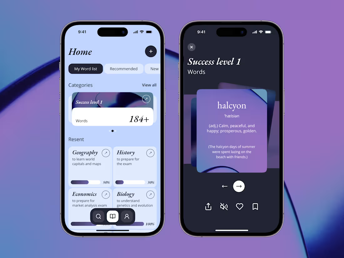
Where this comes from. For Wordela the audit went screen by screen from onboarding through daily practice, and each friction point came with a practical fix. For BioWellth the audit set the priorities for a whole redesign. Same method, smaller scope.
FAQs
Example work



Starting at$250
Duration3 days
Tags
Conversion Optimization
UX Audit
Product Designer
UX Designer
UX Researcher
Service provided by
Ella Sh. Kyiv, 02000
- 5.00
- Rating
- 10
- Followers
Mini UX Audit: One Screen or One FlowElla Sh.
Starting at$250
Duration3 days
Tags
Conversion Optimization
UX Audit
Product Designer
UX Designer
UX Researcher
One screen or one flow, reviewed properly, with fixes ranked by what to do first.
Who this is for. You know something is wrong with checkout, or signup, or one particular screen, and you want an outside read before you spend a sprint on it. Also useful if you want to see how I think before hiring me for something bigger.
How the audit runs. Heuristic evaluation from a power user perspective, going step by step through the flow. Where does someone lose context. Which interactions behave unpredictably. Where does hierarchy fail under real data rather than the sample content in the design file. What is missing that people expect from this pattern.
The output is ranked, not exhaustive. A list of forty issues is a way of avoiding a decision. You get the problems that matter, ordered by impact against effort, so your team can start Monday. Each one is paired with a specific recommendation, not a principle.
Where this comes from. For Wordela the audit went screen by screen from onboarding through daily practice, and each friction point came with a practical fix. For BioWellth the audit set the priorities for a whole redesign. Same method, smaller scope.
FAQs
Example work
$250