
Mini UI Kit: Core Components, One ThemeElla Sh.
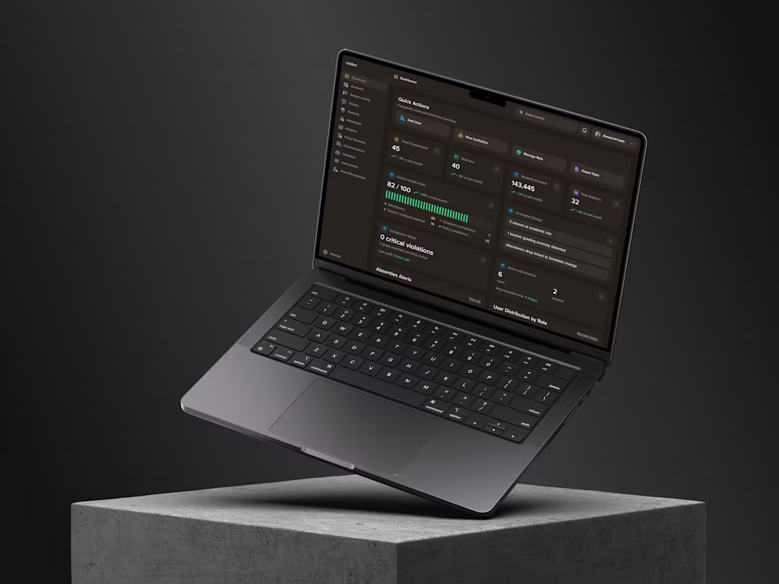
A component set with a defined edge, so your product stops drifting.
Who this is for. Your product has grown past the point where every screen can be drawn from scratch. Buttons look slightly different on three pages, spacing is decided per screen, and every new feature costs a day of small decisions that were already made once.
The scope is fixed on purpose, because "basic components" is the phrase that turns a five-day job into a five-week one. This kit contains exactly: buttons in all states, form inputs and selects, cards, navigation, modal and dialog, tabs, tables, alerts and toasts, plus colour tokens, a type scale, and spacing rules. One theme. That list is the boundary, and it is written here so neither of us discovers it later.
Why this is a design system starter, not a design system. A full system includes dark mode, dense and comfortable variants, motion specifications, accessibility documentation, and governance for how it changes. That is a different scope and a different number. This kit gives you the foundation those get built onto.
Delivered as real components. Figma variants and tokens, not a page of drawn rectangles. Your team can use it the day they get it, and your engineers can map it onto whatever library you use.
FAQs
Example work
Starting at$900
Duration5 days
Tags
Figma

SaaS Design
Design Systems Specialist
Product Designer
UI Designer
Service provided by
Ella Sh. Kyiv, 02000
- 5.00
- Rating
- 10
- Followers
Mini UI Kit: Core Components, One ThemeElla Sh.
Starting at$900
Duration5 days
Tags
Figma
SaaS Design
Design Systems Specialist
Product Designer
UI Designer
A component set with a defined edge, so your product stops drifting.
Who this is for. Your product has grown past the point where every screen can be drawn from scratch. Buttons look slightly different on three pages, spacing is decided per screen, and every new feature costs a day of small decisions that were already made once.
The scope is fixed on purpose, because "basic components" is the phrase that turns a five-day job into a five-week one. This kit contains exactly: buttons in all states, form inputs and selects, cards, navigation, modal and dialog, tabs, tables, alerts and toasts, plus colour tokens, a type scale, and spacing rules. One theme. That list is the boundary, and it is written here so neither of us discovers it later.
Why this is a design system starter, not a design system. A full system includes dark mode, dense and comfortable variants, motion specifications, accessibility documentation, and governance for how it changes. That is a different scope and a different number. This kit gives you the foundation those get built onto.
Delivered as real components. Figma variants and tokens, not a page of drawn rectangles. Your team can use it the day they get it, and your engineers can map it onto whatever library you use.
FAQs
Example work
$900