
UI Concept and MoodboardElla Sh.
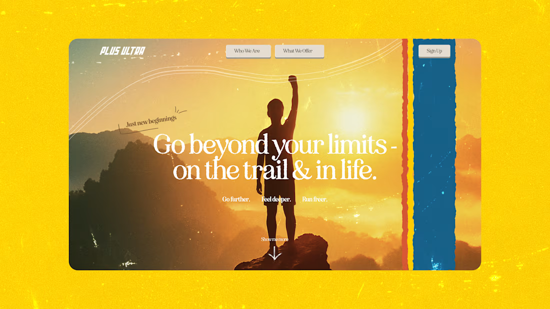
The visual direction settled before anyone builds anything.
Who this is for. You are about to commission a site or a product design and the team cannot agree on how it should feel. Or you have a designer lined up and want the direction locked before their meter starts running. Disagreeing about aesthetics after twenty screens exist is the expensive version of this conversation.
Why a moodboard alone is not enough. References are easy to misread. Two people can look at the same board and picture different products. So the direction gets applied to one real screen or section from your product. Suddenly everyone is looking at the same thing and the argument resolves in an afternoon.
What is settled by the end. Colour, typography, spacing, imagery treatment, and the overall register: whether this reads editorial or utilitarian, warm or precise, dense or spacious. Enough that any competent designer can carry it forward.
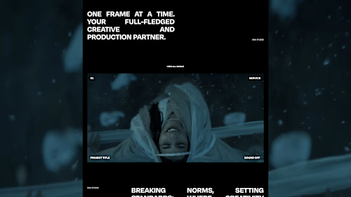
Where this comes from. For Plus Ultra the direction was 80s poster language, chosen because freedom and physicality map onto a trail running community, not because retro looked nice. For DNA Media motion was structural. The value here is the reasoning behind the direction, which is what makes it defensible to your team.
FAQs
Example work
Starting at$300
Duration3 days
Tags
Brand Identity
Art Director
Typographer
UI Designer
Web Designer
Service provided by
Ella Sh. Kyiv, 02000
- 5.00
- Rating
- 10
- Followers
UI Concept and MoodboardElla Sh.
Starting at$300
Duration3 days
Tags
Brand Identity
Art Director
Typographer
UI Designer
Web Designer
The visual direction settled before anyone builds anything.
Who this is for. You are about to commission a site or a product design and the team cannot agree on how it should feel. Or you have a designer lined up and want the direction locked before their meter starts running. Disagreeing about aesthetics after twenty screens exist is the expensive version of this conversation.
Why a moodboard alone is not enough. References are easy to misread. Two people can look at the same board and picture different products. So the direction gets applied to one real screen or section from your product. Suddenly everyone is looking at the same thing and the argument resolves in an afternoon.
What is settled by the end. Colour, typography, spacing, imagery treatment, and the overall register: whether this reads editorial or utilitarian, warm or precise, dense or spacious. Enough that any competent designer can carry it forward.
Where this comes from. For Plus Ultra the direction was 80s poster language, chosen because freedom and physicality map onto a trail running community, not because retro looked nice. For DNA Media motion was structural. The value here is the reasoning behind the direction, which is what makes it defensible to your team.
FAQs
Example work
$300