Rosa roy Wambui
Excel and Data Entry specialist
New to Contra
Rosa roy is ready for their next project!
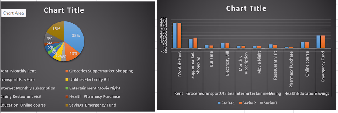
The bar graph was used to compare different spending categories, showing which areas had higher or lower expenses 📊
The pie chart was used to show the proportion of total expenses, making it easy to see how the budget was distributed across different categories 💰✨
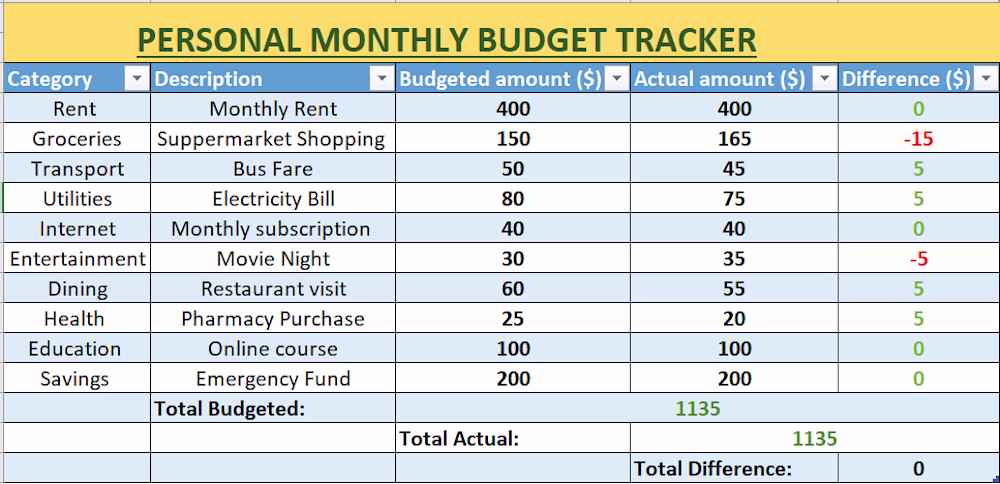
A Personal Monthly Budget Tracker designed to record income and expenses, calculate totals, and help manage money effectively 📊💰
It provides a clear view of spending habits and supports better monthly financial planning 💼✨
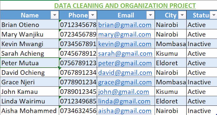
This project involved cleaning and organizing raw data to make it accurate, consistent, and easy to use 📊✨
Duplicates were removed, errors corrected, and formats standardized to ensure the dataset was ready for analysis and reporting 💼📈
Data AnalysisDatabase AdministrationData VisualizationClean SpreadsheetsMicrosoft ExcelMicrosoft Word
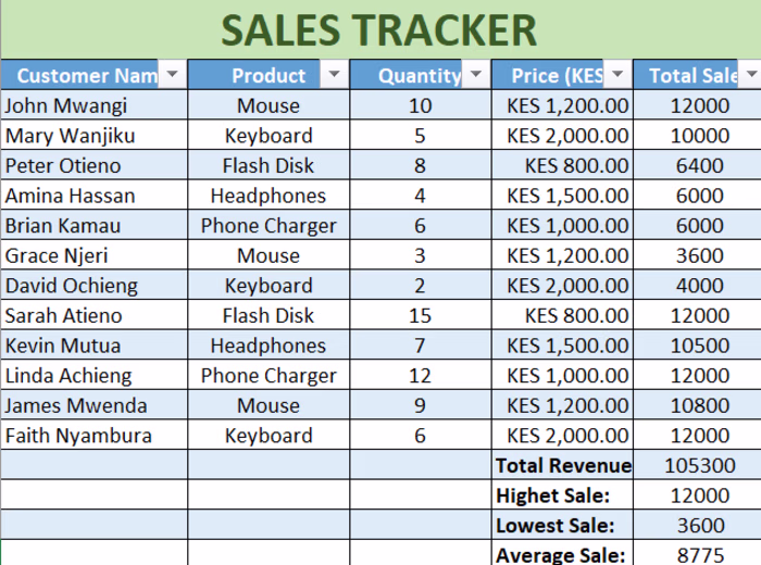
😊 This is my sample of a sales tracker ,want more ??feel free tocontact me