The network for creativity
Join 1.25M professional creatives like you
Connect with clients, get discovered, and run your business 100% commission-free
Creatives on Contra have earned over $150M and we are just getting started
Back to feedPost
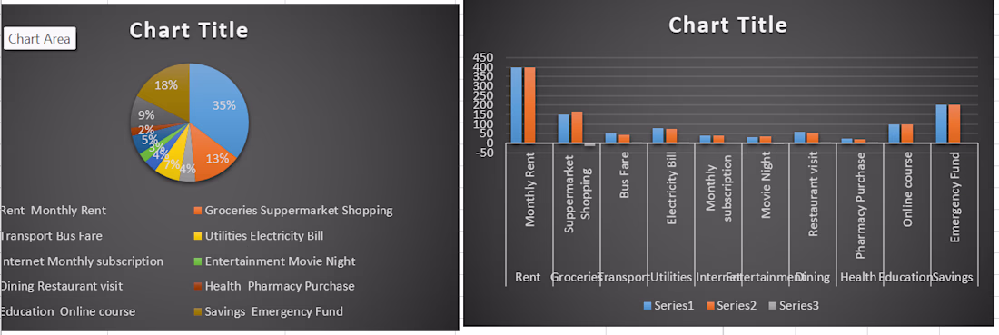
The bar graph was used to compare different spending categories, showing which areas had higher or lower expenses 📊
The pie chart was used to show the proportion of total expenses, making it easy to see how the budget was distributed across different categories 💰✨
The network for creativity
Join 1.25M professional creatives like you
Connect with clients, get discovered, and run your business 100% commission-free
Creatives on Contra have earned over $150M and we are just getting started
Related posts
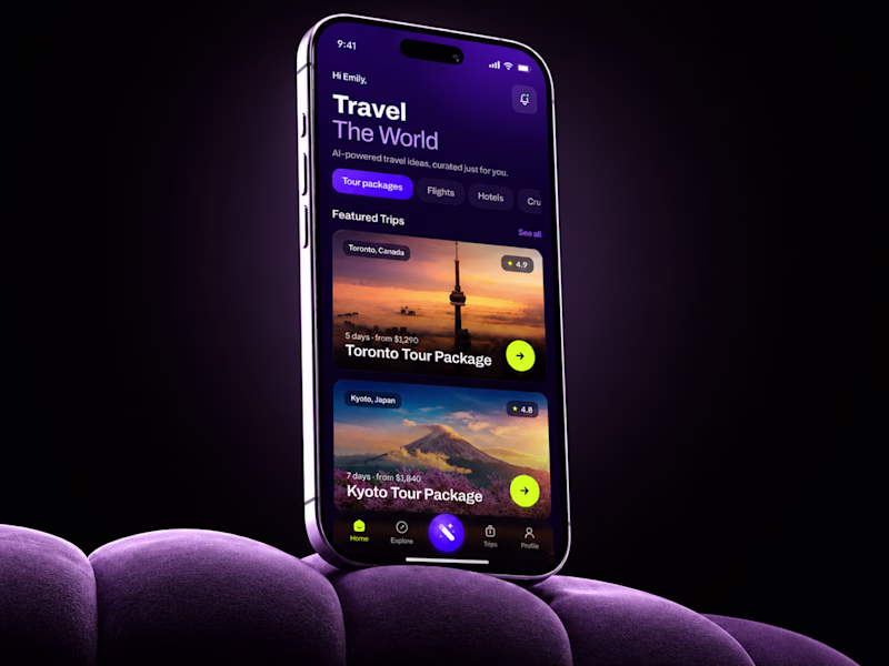
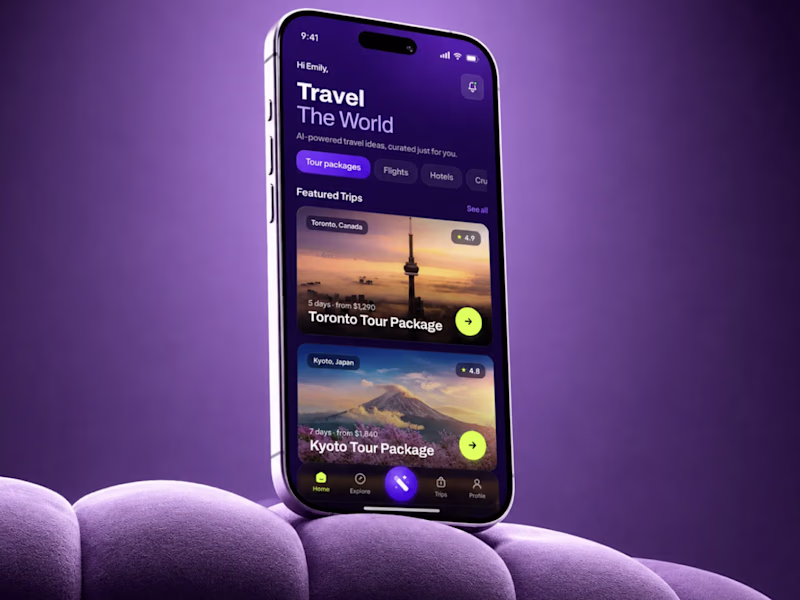
SMALL MOCKUP TEST. BIG DIFFERENCE. 👀
Same AI Travel App UI.
I changed only the background.
Not the UX.
Not the flow.
Not the product logic.
Just the visual context.
And the darker version instantly made the app feel more premium, focused, and easier to read.
That is why presentation matters in mobile app design.A weak frame can make good UI look average.
A strong frame can make the product feel more valuable before the user even taps anything.Expected impact:`
+35-45% first-screen engagement
+25-30% trip card interaction
+20-28% faster package discovery
+30-40% perceived product value
Sometimes design is not about adding more.Sometimes it is about removing what steals attention.
🟢 Book a Mobile App Strategy Session
https://calendly.com/asol_design/book-diagnostic-call-linkedin-clone
26 voted
67%
13 voted
33%
39 votes
Closed
Love this approach. It's fascinating how design can completely change how people feel while using a product.

Hello Saad, is the job role available?
A few illustrations created to support the Circular Wealth website.
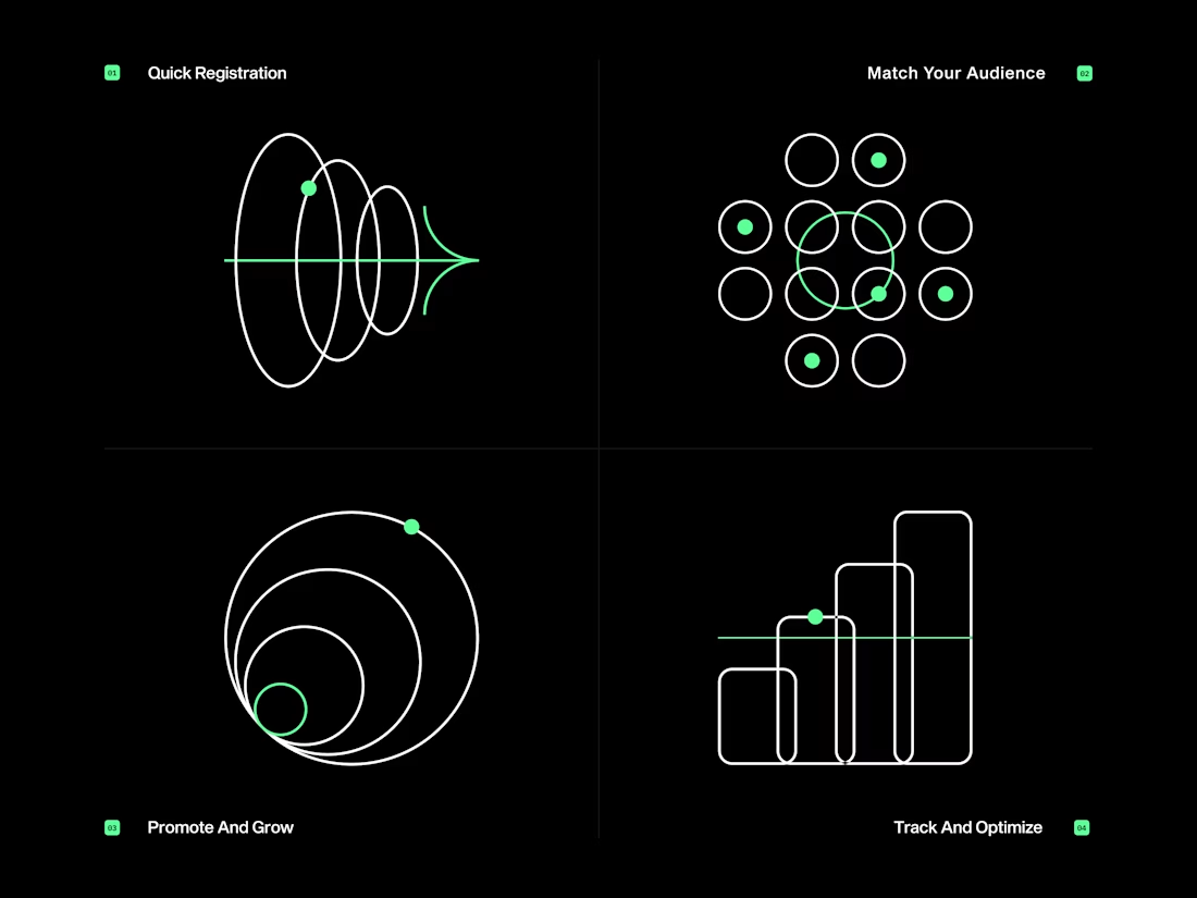
The wireframe-style on dark makes each illustration feel like a technical diagram without losing the visual elegance. The spiral for the registration flow is a clever metaphor.
Trending
Claude
Claude has entered the design space. How are you using Claude Design?
Contra University
Learn from expert creatives how to earn more using next-gen AI tools.
MagicPath
The canvas is infinite, and exploration is becoming the workflow. How are you using MagicPath?
creativeaiflow
Creative AI workflows are evolving. What tools do you use, and what are their strengths and weaknesses?
freelancerlife
Freelancer life is wins, pivots, and everything in between. What’s yours right now?