



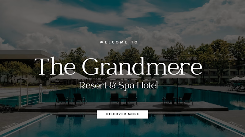
I personally preferred the left direction it felt more refined, editorial, and understated.
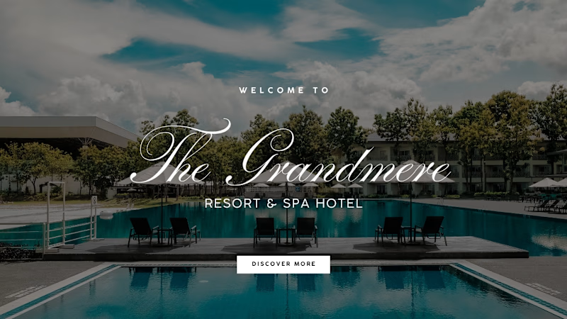
But the client chose the right direction.
And that’s part of the design process: you can have a personal favorite, but the final direction should serve the client’s vision.
Which one would you choose left or right?
5 voted
71%
2 voted
29%
7 votes
Closed
Luxury Event Planner Website Concept
A modern, elegant website concept designed for an event planning and wedding services business.
The design combines warm neutral tones, refined typography, and immersive event photography to create a premium and memorable brand experience.
The...


Modular Interiors Website Concept
A modern website concept designed for a premium modular interiors and kitchen brand.
The design combines a clean editorial layout with warm neutral tones and strong imagery to create a sophisticated, high-end interior design experience.
The website...
CA Firm Website Concept
Sharing a website concept I designed and built for a modern Chartered Accountant firm.
The goal was to create a premium, professional digital presence while making a large amount of financial information easy to explore.
The website includes:
• Professional...
My First Contra Post 🚀
Starting my Contra journey with a website concept I recently designed and built for an Interior Design business.
I wanted to create something modern, premium, and focused on presenting projects beautifully while making it easy for potential clients to get...