The network for creativity
Join 1.25M professional creatives like you
Connect with clients, get discovered, and run your business 100% commission-free
Creatives on Contra have earned over $150M and we are just getting started
Back to feedPost
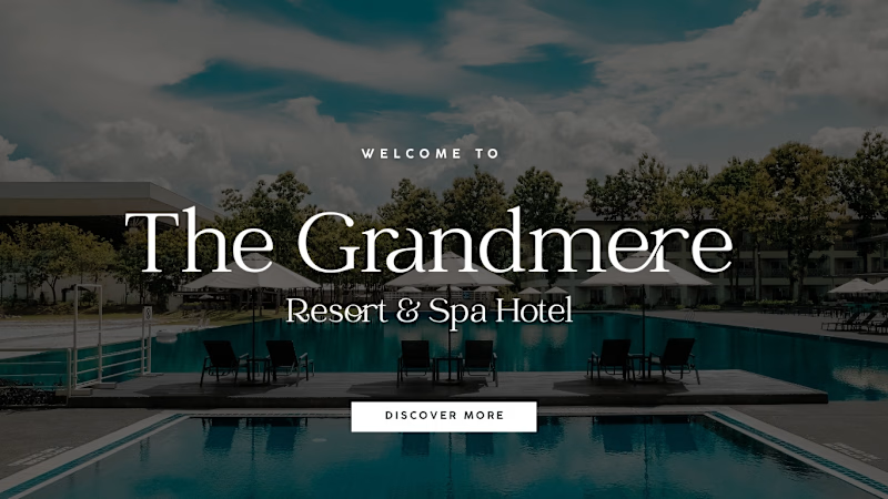
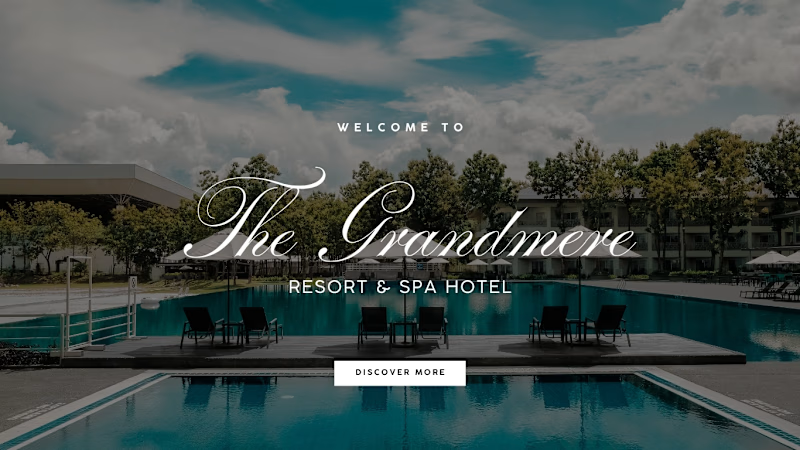
Taste Test
I personally preferred the left direction it felt more refined, editorial, and understated.
But the client chose the right direction.
And that’s part of the design process: you can have a personal favorite, but the final direction should serve the client’s vision.
Which one would you choose left or right?
5 voted
71%
2 voted
29%
7 votes
Closed

love the one with clear lettering

Thank You!

Thank You 🙏🏼
The network for creativity
Join 1.25M professional creatives like you
Connect with clients, get discovered, and run your business 100% commission-free
Creatives on Contra have earned over $150M and we are just getting started





Related posts


I’m exploring different concepts for a project. Which proposal did you like the most?
5 voted
42%

7 voted
58%

12 votes
Closed

Geometric one looks better good job🎉🎉❤️❤️

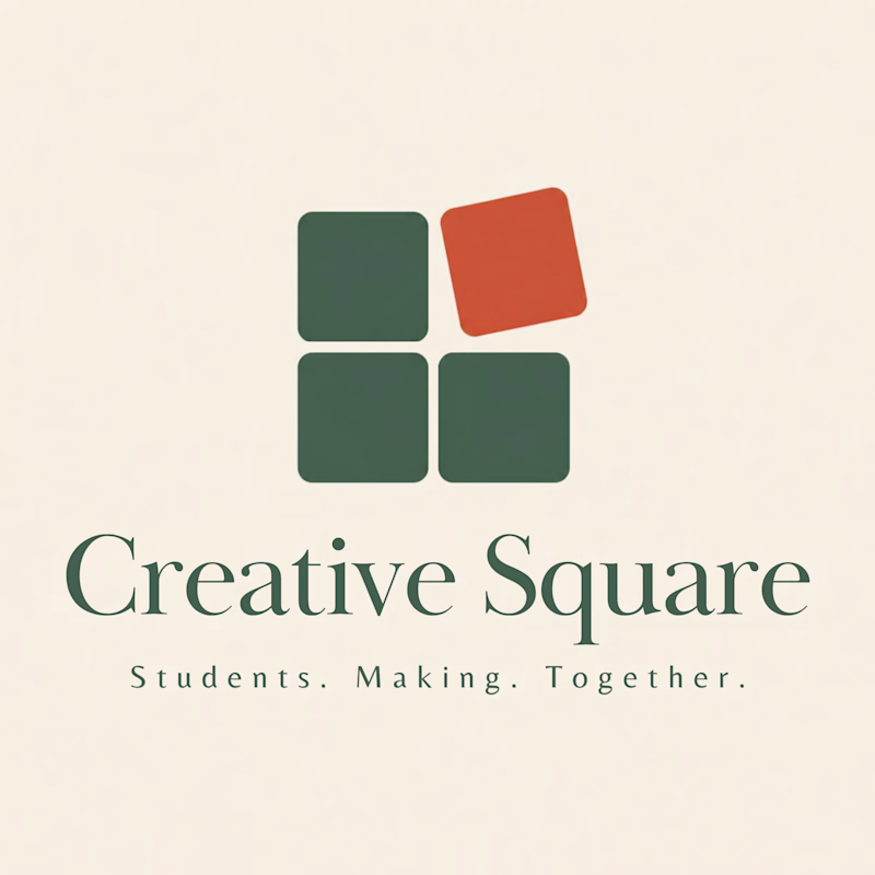
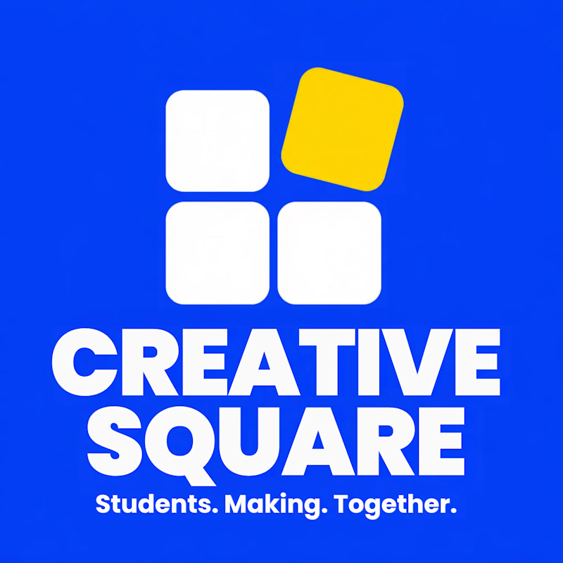
Meet Creative Square, a logo for university students. Same mark, two personalities: loud and energetic, or calm and editorial. Which one would you pick?
13 voted
48%
14 voted
52%
27 votes
Closed
The bold are so attractive that's incredible I choose it ❤️❤️

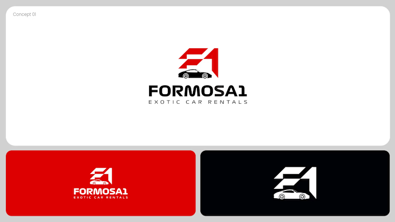
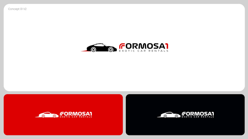
Two logo concepts for Formosa1 Exotic Car Rentals. Which one wins?
A: bold geometric F1 monogram, car tucked inside the mark. Strong and iconic.
B: car silhouette leads, red wordmark with a speed streak. Fast and clean.
Drop your vote 👇
17 voted
53%
15 voted
47%
32 votes
Closed
Both are great but I feel that was something special in the bottom one that's why I choose it❤️❤️