



Hey Contra friends | we’ve got great news!.
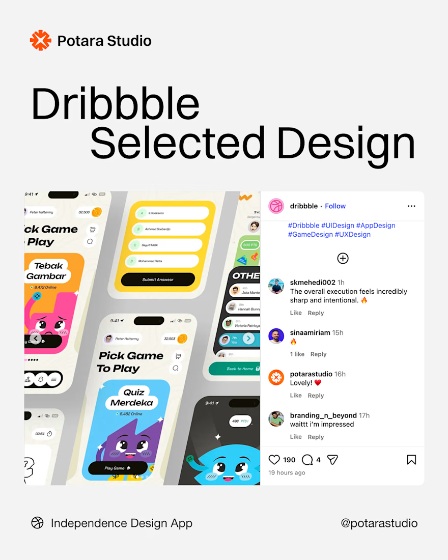
Our Indopendence App has been featured as Dribbble's Pick of the Week 🎉
It's a game built around Indonesian culture: players explore our home country while picking up a bit about it along the way. Making it was a genuinely fun excuse to...
What do you think about this branding?
We wrapped it in more subdued colors—fitting for a skincare moisturizer, while adding a touch of character that gives it a playful vibe.
Top up poin games without login? yes you can
Here is how our team built an app that makes it easy for gamers to top up their points 🎮
Hi, peeps!
The new project from the marketing studio has been completed with a vivid and bold identity like this.
LOGOFOLIO - vol.1
Here are some snippets of branding work, any of them catch your attention?
