People do not buy courses because your website looks nice.
They buy because they understand the value and trust what they see.
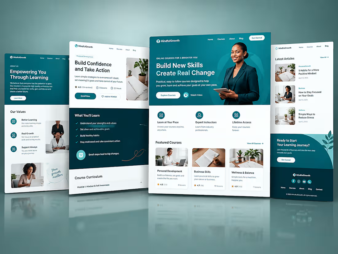
This Kajabi project was designed to make learning feel simple, clear, and easy to join from the first visit.
Every section has a purpose.
Every button leads people one step closer to becoming a student.
That is how a Kajabi website should work.
I help coaches, educators, and course creators build websites that do more than look good.
They help you attract the right people, grow your business, and sell with confidence.
Built with purpose. Designed to convert. Powered by Kajabi.
#KajabiExpert #KajabiDesigner #CourseCreator #OnlineBusiness #OnlineLearning #DigitalProducts #KajabiWebsite #CreatorEconomy #SalesFunnels #WebDesign
1
16
The biggest mistake I see on Kajabi is trying to say everything at once.
When visitors see too much information they stop reading.
When they stop reading they stop trusting.
Keep your message simple.
Tell people what you do.
Who you help.
What they should do next.
Clear always wins.
1
8
Your course can change lives.
But people will never know if they leave your website too soon.
A lot of creators spend months building a great course.
Then they rush their website.
Your website is part of the learning experience.
If it feels clear people stay.
If it feels confusing people leave.
Take time to make your website easy to read and easy to use.
Small changes can make a big difference.
1
10
Many people think Kajabi is the problem.
Most of the time it is not.
Kajabi gives you the tools.
What matters is how you use them.
If people cannot understand what you offer in the first few seconds they will leave.
If they cannot find the next step they will leave.
A good website is not about adding more.
It is about removing what gets in the way.
Simple pages help people make simple decisions.
That is how you turn visitors into students.
1
15
This Kajabi project was built to help a training brand showcase its courses, build trust, and turn visitors into paying students.
A great website is not about having more pages.
It is about creating a clear path from interest to enrollment.
That is exactly what I help creators, coaches, and educators achieve with Kajabi.
Built for growth. Designed for conversions. Powered by Kajabi.
#KajabiExpert #KajabiDesigner #CourseCreator #OnlineLearning #DigitalProducts #KajabiWebsite #BusinessGrowth #CreatorEconomy #SalesFunnels #WebDesign
3
96
Most coaches, consultants, and course creators do not have a traffic problem. They have a conversion problem.
People visit their website, browse around for a few seconds, and leave without taking action.
The reason is simple.
Their website is not guiding visitors toward a clear outcome. The pages feel disconnected, the offer is unclear, and there is no system in place to turn visitors into paying clients.
That is where Kajabi changes the game.
Instead of using multiple tools for your website, courses, email marketing, and sales process, Kajabi brings everything together in one place.
The project shown here was built with one goal in mind: creating a seamless experience that helps visitors understand the offer, build trust, and take action with confidence.
As a Kajabi expert, I help creators and business owners build platforms that do more than look good. I create systems that support growth, automate key processes, and make it easier to sell digital products and services.
A beautiful website is great.
A website that generates leads, nurtures prospects, and drives sales is even better.
If your Kajabi site is not delivering the results you want, it may be time to rethink the strategy behind it.
What is the biggest challenge you are facing with your Kajabi website right now?
#KajabiExpert #KajabiWebsite #OnlineBusiness #CourseCreator #DigitalProducts #SalesFunnels #EmailMarketing #BusinessGrowth #WebsiteDesign #KajabiPartner
3
51
Your website isn’t getting clients and there is a reason for that
Most websites fail because they focus too much on how they look instead of how they actually work
Here is the real problem
When people land on your website they do not know what to do next
No clear message
No direction
No reason to stay
So they leave
The cause is usually simple
Cluttered design
No clear call to action
A confusing user experience
Here is how to avoid it
Keep your design clean and easy to understand
Guide visitors with clear messaging
Make it obvious what step they should take next
A good website is not just about looking nice
It should guide people and turn them into customers
That is what I focus on when designing with Framer
If your website is not working for you it might be time to fix that
1
4
64
I helped a musical instrument business transform their online presence by designing a modern, high converting website using Framer. The goal was to create a site that not only looked visually appealing but also reflected their brand and engaged visitors. The final result was a fast, responsive, and user friendly website that improved their credibility and helped turn visitors into paying customers.
1
3
53
I design high performing websites with Framer that help clients stand out, engage users, and turn visitors into customers.
2
52
A client needed a website that truly reflected their brand and converted visitors into customers. Using Framer, I designed a sleek, responsive site that elevated their brand identity and improved user engagement.
2
64
I worked with a client to transform their online presence by designing a modern, conversion focused website in Framer. The result was a faster, more engaging experience that helped attract and retain more customers.