Paul Olusola
AI Software Engineer | Automation & Custom Systems
- 7
- Followers




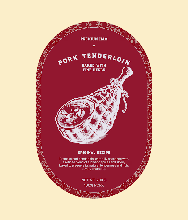
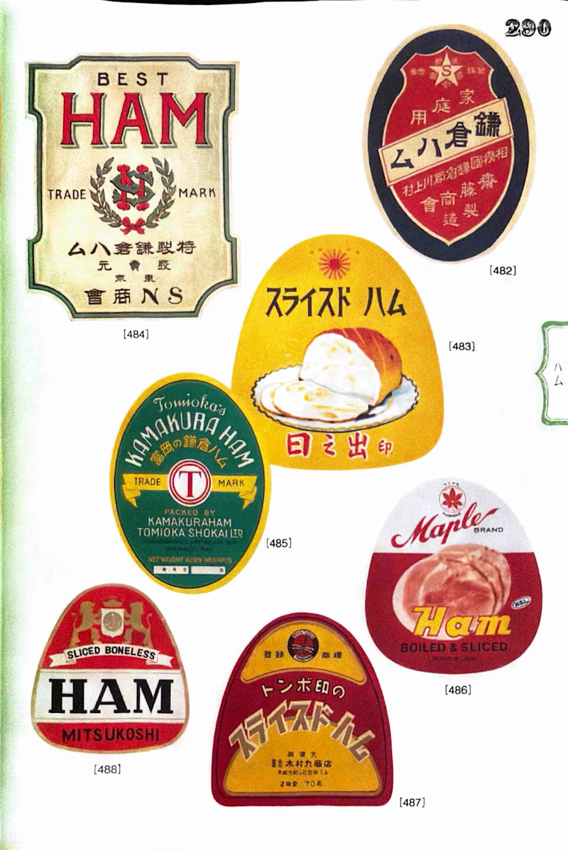
I’d probably reach for the vintage one first. The imperfections and color give it more personality, but the modern version feels more intentional and premium. Depends on whether the goal is nostalgia or standing out on a modern shelf.

Is minimalism doing this label a favor, or losing what made it charming? 🤔
Found this while flipping through a Japanese book of vintage canned food labels and decided to give one a rework. Same ham, completely different shelf presence.
Vintage approach: hand painted illustration,...
43 voted
61%
27 voted
39%
70 votes
Closed
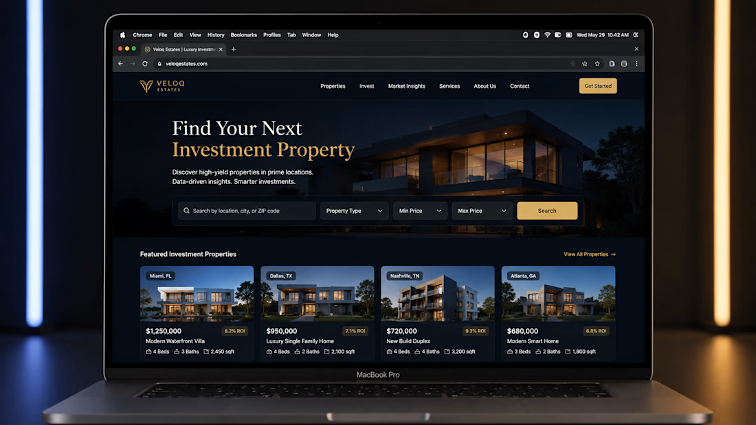
Veloq Estates Real Estate Investment Platform
A modern real estate investment platform designed to help investors discover and evaluate investment properties through a clean, conversion-focused experience.
The interface combines property discovery, location-based search,...


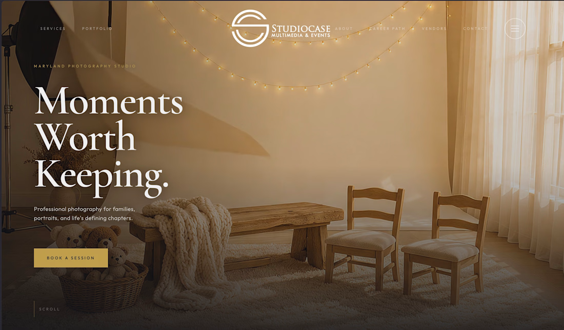
Designed and developed the hero experience for StudioCase, a Maryland photography studio focused on family portraits and life’s defining moments.
The goal was to create a premium visual first impression while making the primary conversion path clear getting visitors from the...


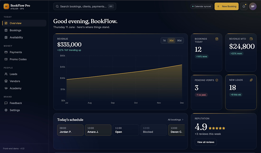
Built the admin operations dashboard for StudioCase, a photography studio booking and client-management system.
The dashboard gives the studio a single place to manage bookings, availability, payments, leads, vendors, promo codes, reviews, and revenue performance instead of...

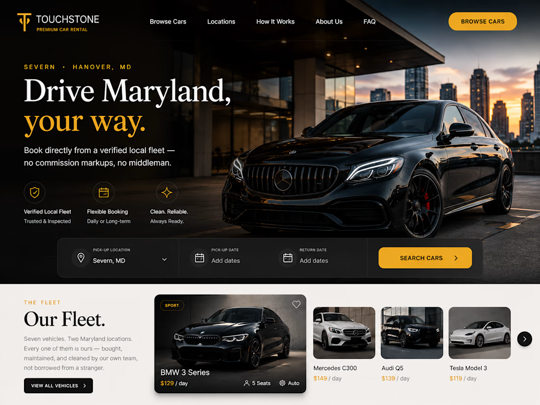
A full-stack car rental booking platform built end-to-end from a fast, mobile-first frontend to a secure backend handling real payments and booking logic.
What's included:
Custom-built booking flow: search by location/dates → real-time availability → multi-step checkout
Live...