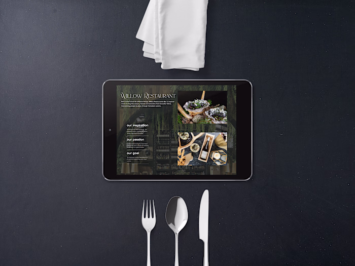
Mountain Fruit Design
Erin Wilson
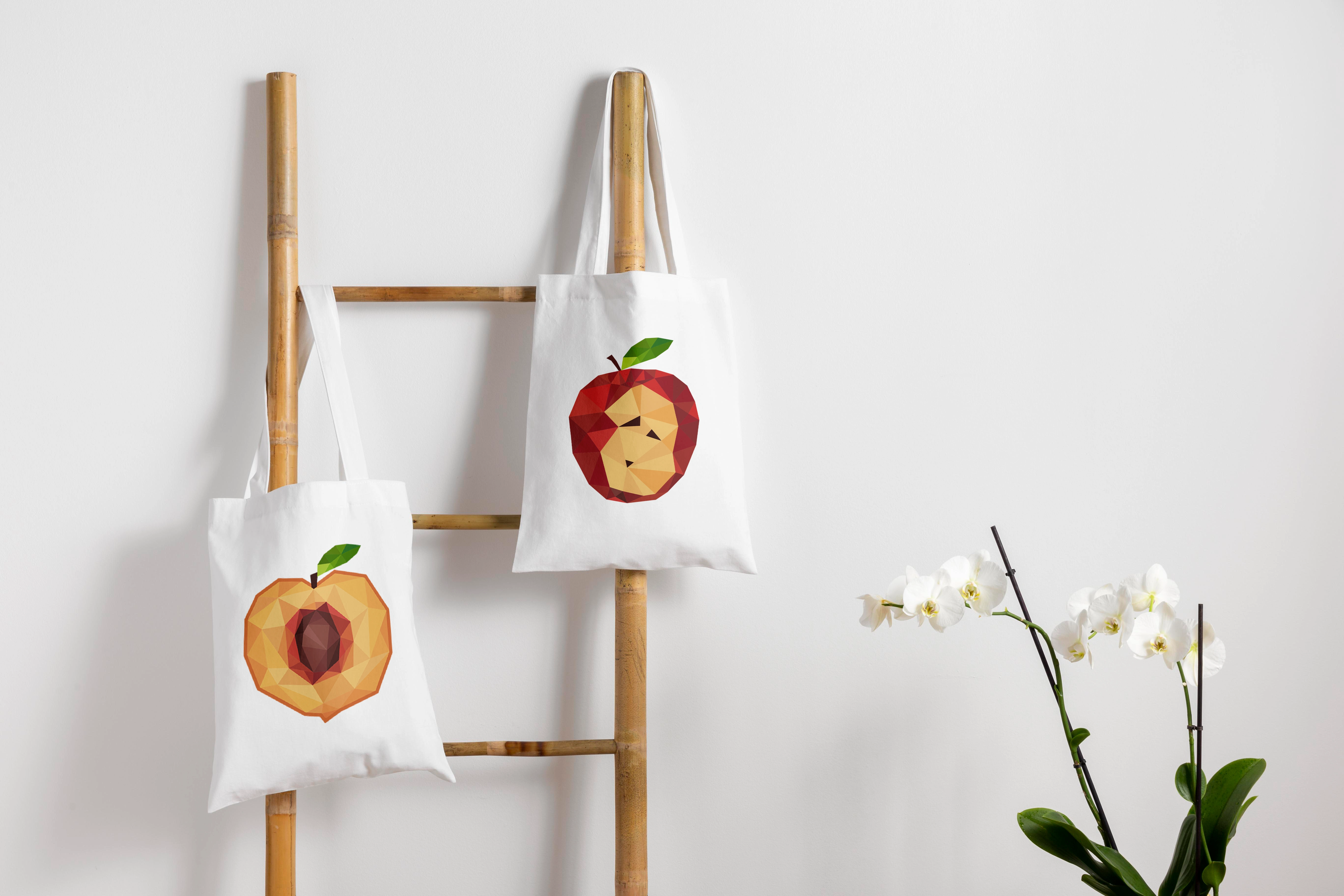
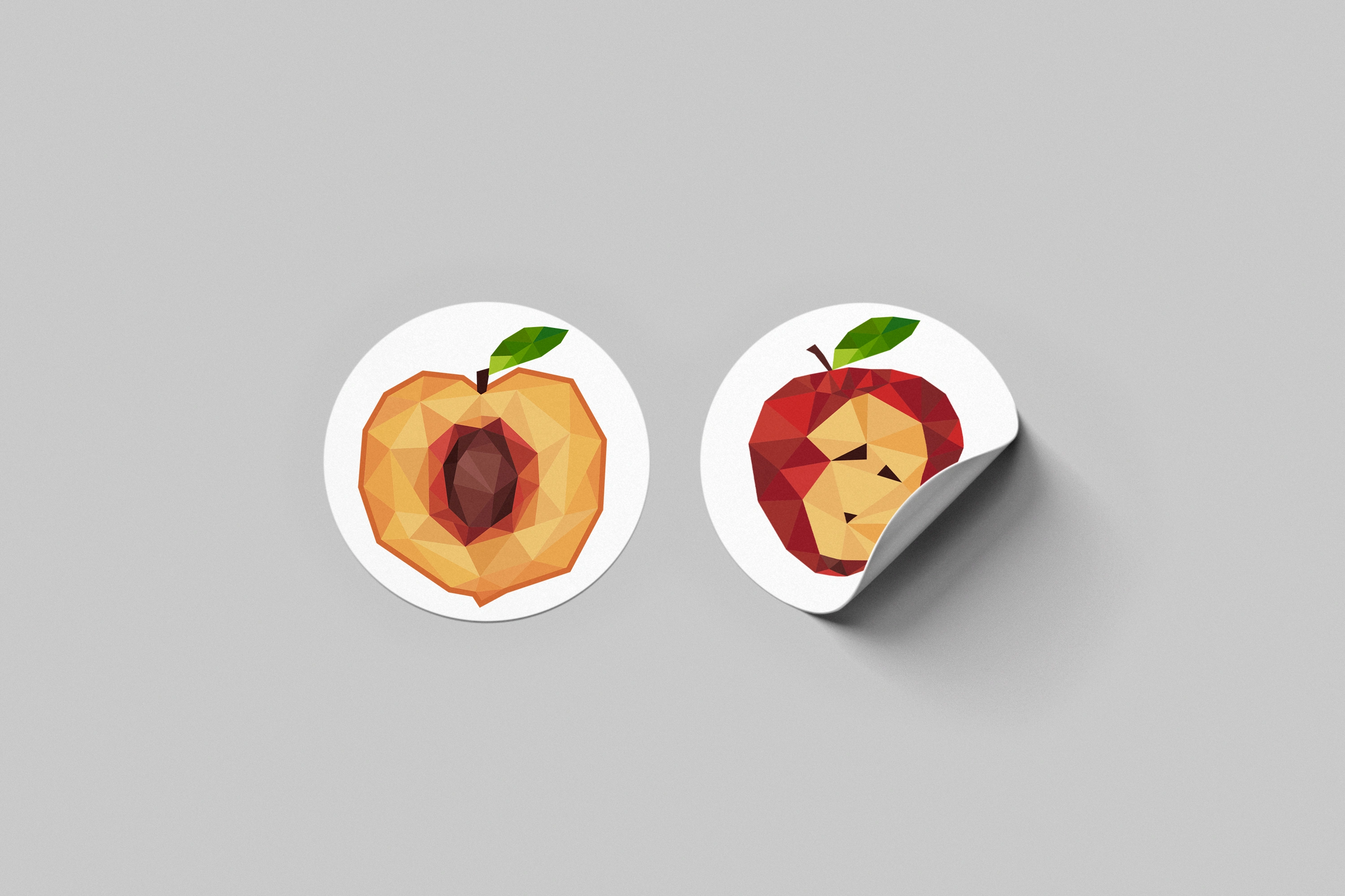
Mountain fruit and co is a jam and preservative company inspired by the natural and creative process of growing fruits near the mountain ridges of northern Ontario. Tucked into the forests and mountain ranges a beautiful farm producing peaches and apples eventually turning into jams and jellies.
The inspiration behind the label comes from the natural and brilliant colours of peaches and apples. Having the colours flourish and thrive from inside out is what mountain fruit & co is all about. Creating a logo, label and trademark that stand out to the viewer is apart of our goal.
Typography is inspired by the font ivy presto in thin and bold for the headings. Having a design that captures the essence of minimalism and creativity is the most important way to please our target audience.
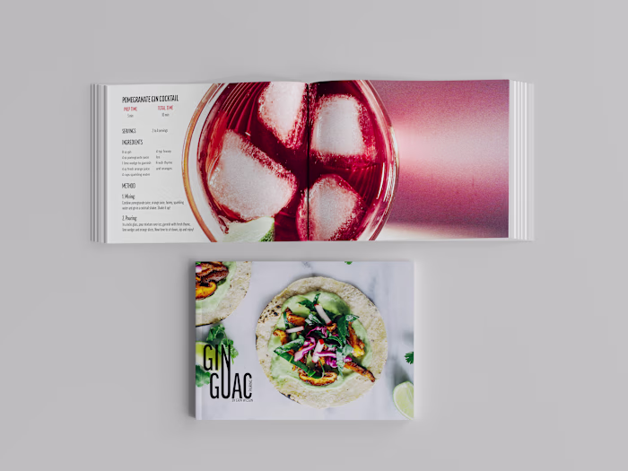
Be sure to click the link above to dive deeper into Mountain Fruits packaging design.
Like this project
Posted Jul 27, 2022
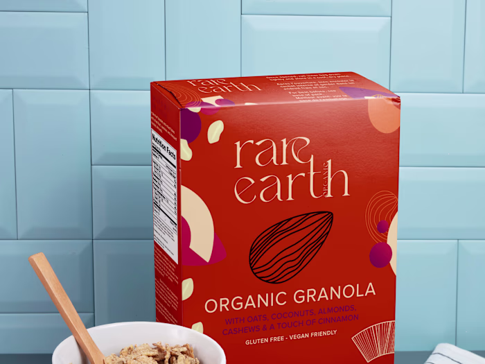
The brand blends a culture-inspired font and symbols with colors and elements associated with the wellness benefits and playful personality of the brand.