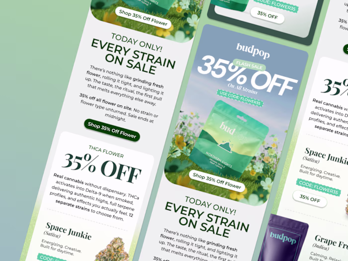
WSH E-commerce Email Campaign Design
Nicko Agnote
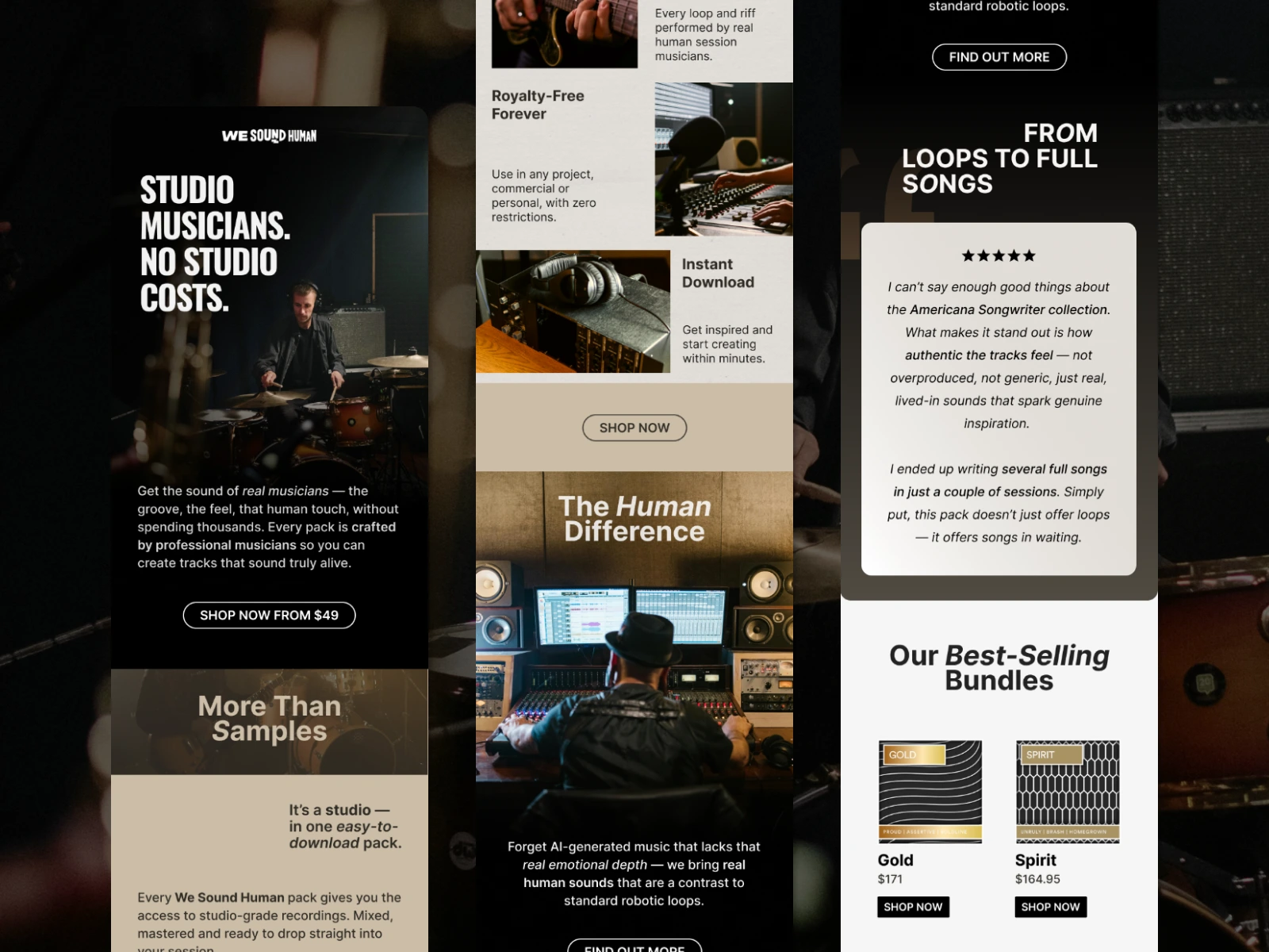
WSH E-commerce Email Campaign
This project is a single promotional email designed for a digital e-commerce brand selling studio-grade music packs performed by real musicians.
The brief emphasized design quality, with a focus on:
Clean, modern aesthetics
Fast scannability
Mobile-first thinking
I approached the task by balancing brand storytelling with commercial clarity.
The Challenge
The brand positioning revolved around a strong contrast:
Human, lived-in music vs. robotic, AI-generated sounds
The challenge was to translate that philosophy into an email that:
Felt authentic and editorial
Avoided "SaaS" or overly UI-driven design
Still functioned as a high-performing e-commerce email
At the same time, the layout needed to remain flexible enough to support dynamic product blocks and real production constraints.
My Design Approach
1. Mobile-First Structure
The entire layout was designed as a single-column flow, prioritizing:
Clear hierarchy
Short, readable sections
Large tap-friendly CTAs
Natural scroll rhythm on mobile
Each section was designed to communicate a single idea quickly, allowing the email to be skimmed without losing its narrative.
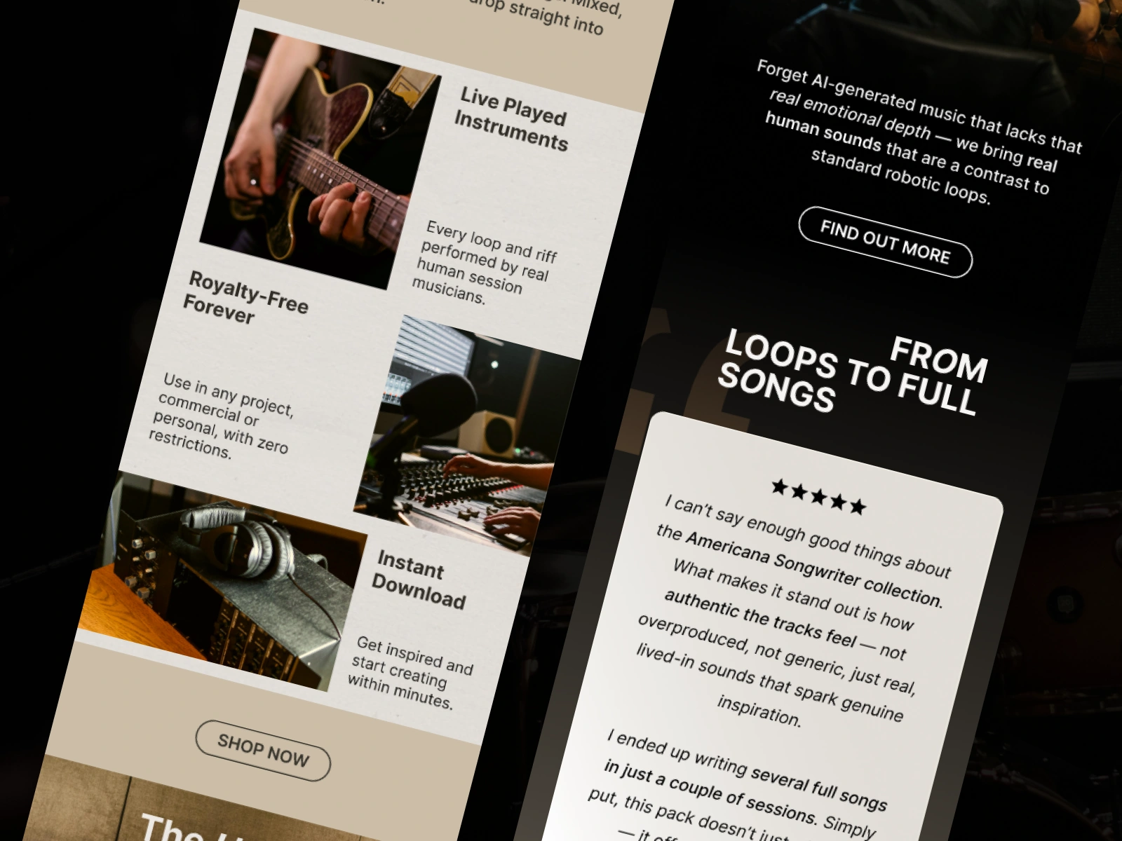
2. Editorial, Not UI-Driven
Rather than relying on boxed "card" components, the design leans toward:
Natural spacing instead of borders
Freely placed imagery
Subtle contrast shifts to separate sections
This helped the email feel human and intentional, aligning with the brand's anti-robotic message.
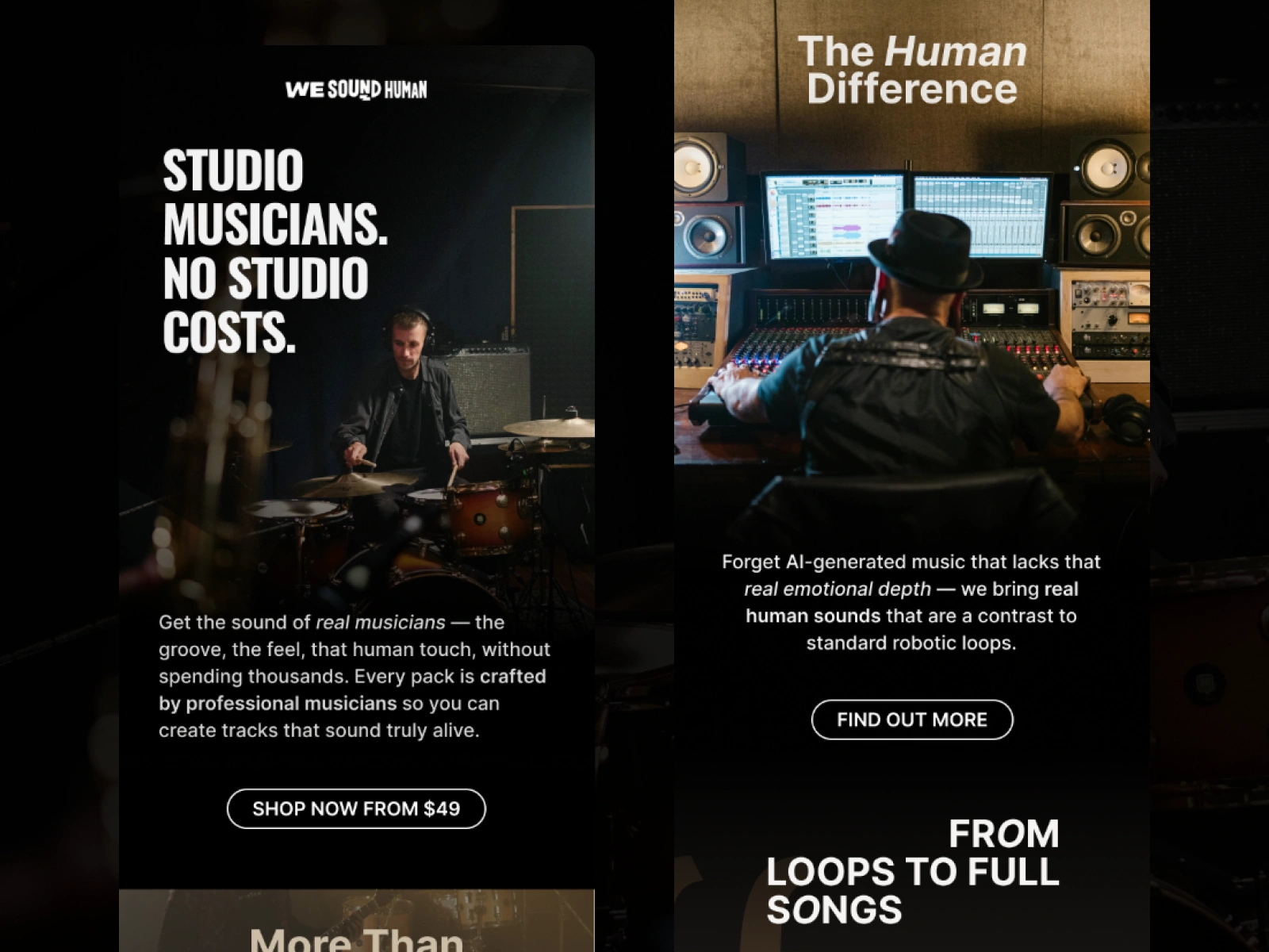
3. Visual Language
The visual direction focused on:
Real studio environments
Live instruments and musicians in context
Warm, low-contrast lighting
These choices reinforced the idea of authenticity and avoided the polished, synthetic look often associated with AI or stock-heavy music platforms.
4. Copy & Hierarchy
Typography was used sparingly and deliberately:
Bold headlines for key value statements
Softer secondary text for pacing
Reduced visual noise to let content breathe
Special attention was given to punctuation, rhythm, and tone to maintain a premium, editorial feel.
5. E-commerce & Klaviyo Considerations
A dedicated dynamic product section was included to reflect real-world Klaviyo usage:
Modular product blocks
Flexible image handling
Clear pricing and CTAs
This ensured the design wasn't just conceptual, but production-ready.
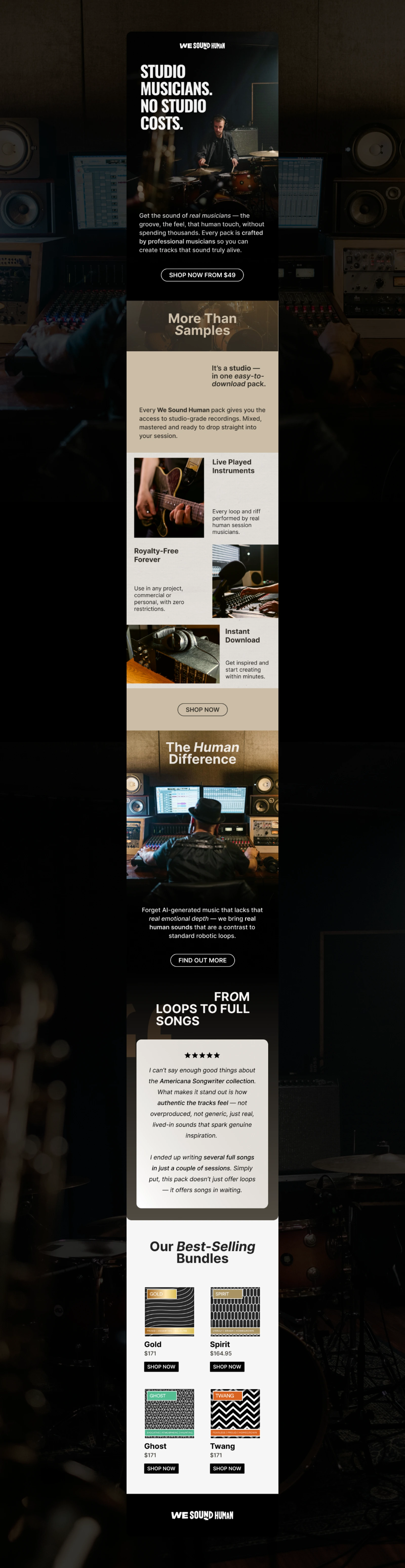
Outcome
The final email balances:
Brand storytelling
Emotional credibility
Commercial intent
While remaining clean, modern, and highly scannable on mobile.
This project demonstrates my approach to email design that feels human, intentional, and grounded in real marketing constraints.
Like this project
Posted Jan 22, 2026
Designed a promotional email for an e-commerce brand with a focus on authentic storytelling and mobile-first design.