Email Campaign Design for Budpop
Nicko Agnote
Project Overview
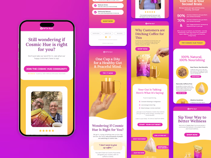
Budpop is a fast-growing e-commerce brand in the wellness and vape space. I was brought in to design marketing emails that aligned with their evolving visual direction, specifically a shift toward a more premium, 3D, product-forward look while remaining clear and effective in email.
This case study highlights two campaign designs created focusing on hero-section execution and visual hierarchy.
The Objective
Create high-impact email heroes that immediately establish product strength
Push toward a 3D "popping" look without compromising email clarity
Stay aligned with existing brand typography, layout systems, and tone
The Challenge
The key challenge was balance.
Early references leaned toward bold, high-energy visuals, but for email, too much cinematic treatment can distract from:
the product
the headline
the call to action
The goal became refining the direction into something that feels powerful but controlled. Premium rather than chaotic.
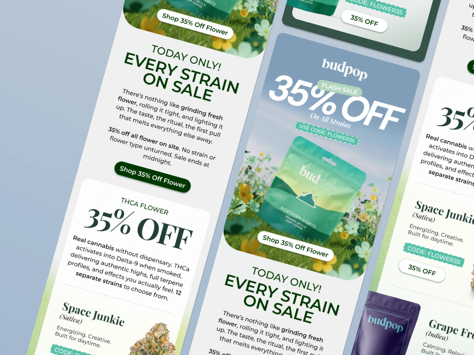
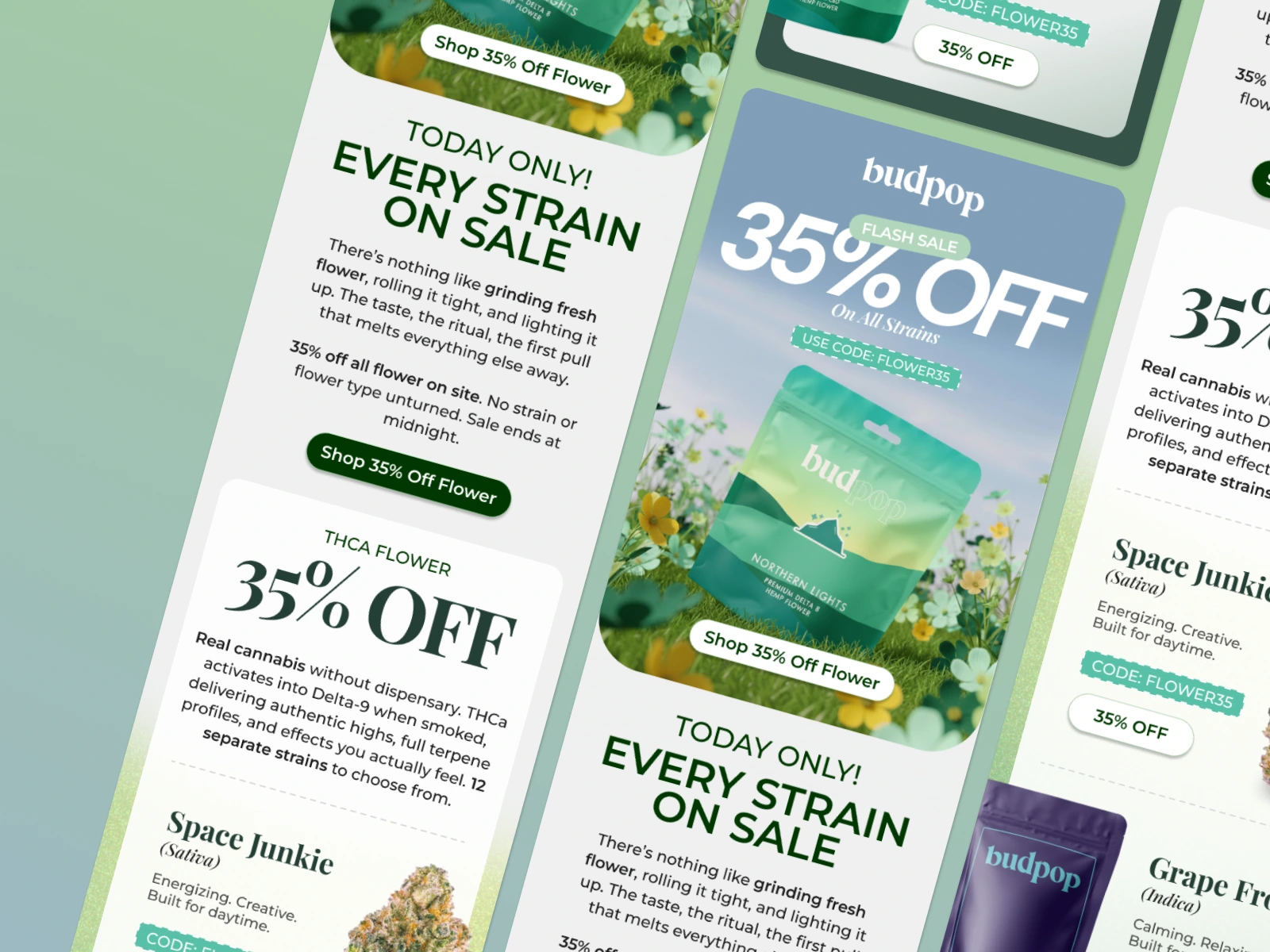
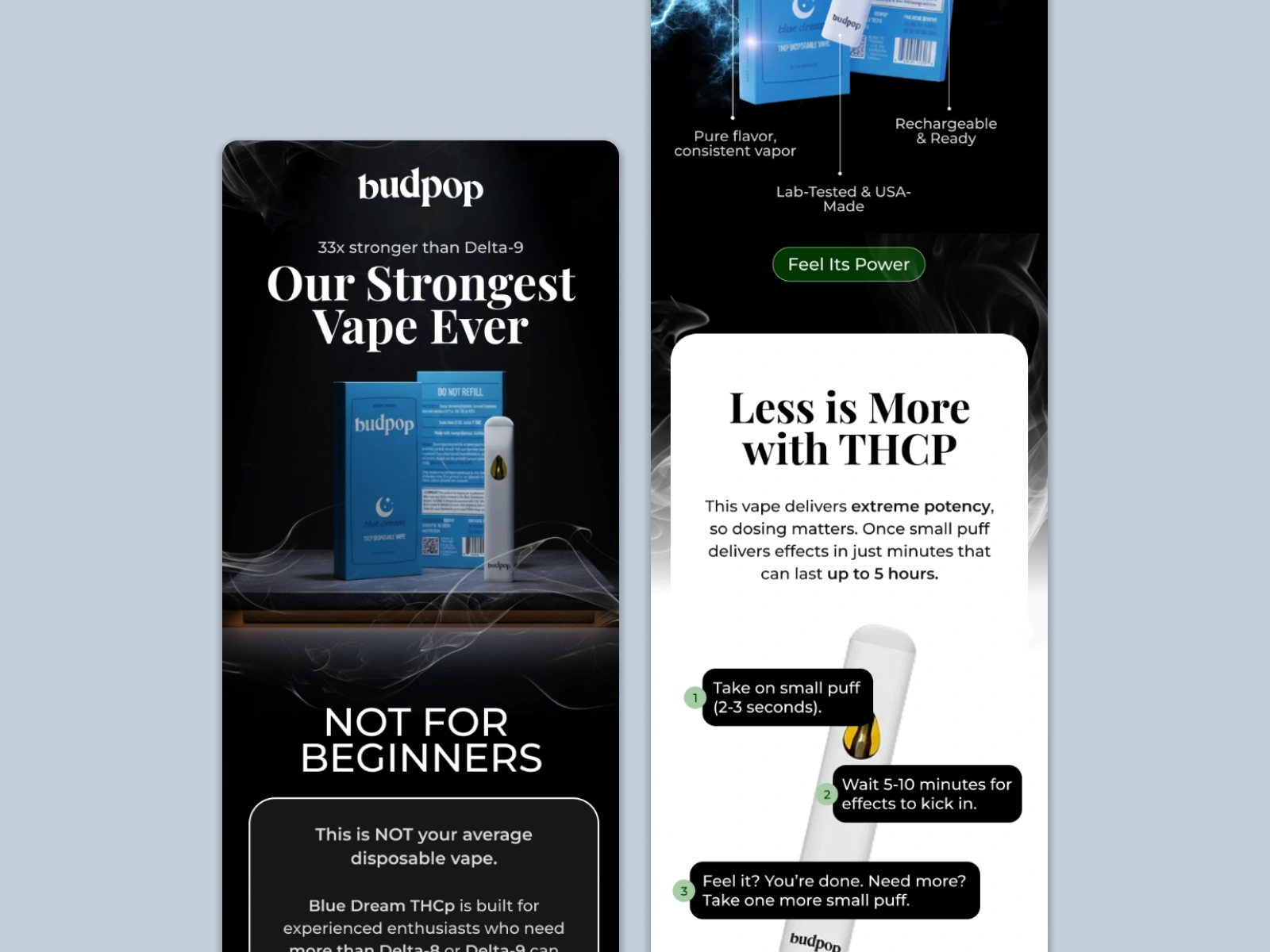
Design Direction & Strategy
Product-on-a-Stage Hero
For both emails, the hero section was designed around a grounded product stage, using:
subtle pedestals or surfaces
soft shadows and reflections
directional lighting
This creates the illusion of depth and realism while keeping the product visually anchored.
Controlled Atmosphere
Given the vape category, atmosphere was important but restrained:
smoke and lighting effects were used sparingly
backgrounds were darkened and simplified
visual noise was reduced to keep focus on the product
The result is a luxury, high-potency feel without overwhelming the layout.
Consistency Across Campaigns
Both designs follow the same visual system:
consistent lighting logic
similar depth treatment
aligned hierarchy
This makes the campaign feel cohesive while still allowing variation between emails.
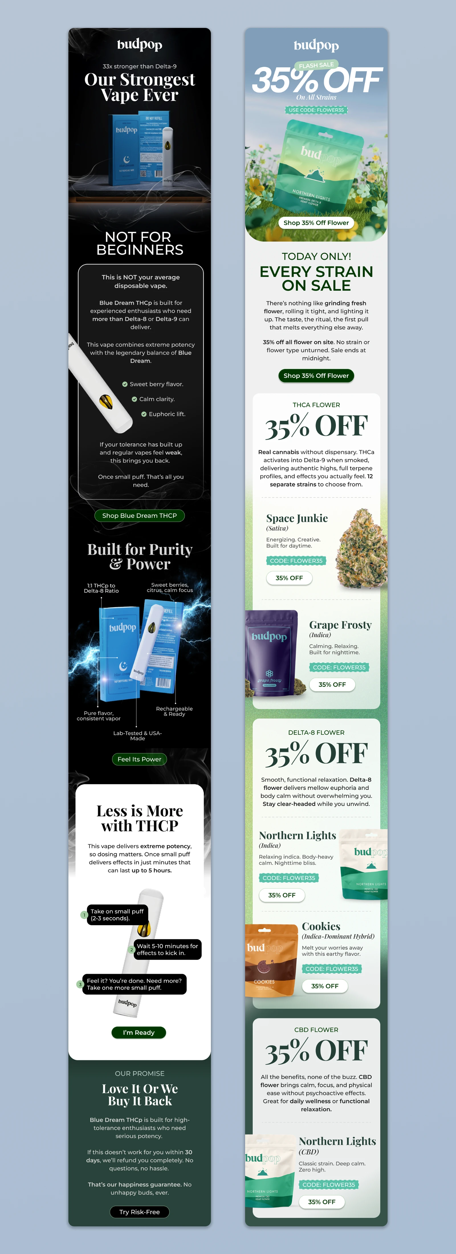
Final Deliverables
Email 1 - Premium hero design emphasizing product strength through depth and lighting
Email 2 - A variation using the same 3D stage system for visual continuity
Both designs were delivered as high-fidelity visuals ready for internal review and deployment.
Outcome
The designs were well received for their clean, premium, execution
The 3D hero system proved scalable for future campaigns
Established a repeatable visual approach that balances brand polish with marketing impact
Key Takeaway
Effective email design isn't about how many effects you use. It's about restraint, hierarchy, and focus.
By grounding the product and controlling atmosphere, these designs communicate strength and clarity at a glance, crucial for high-performing e-commerce emails.
Like this project
Posted Jan 15, 2026
Designed marketing emails with a premium 3D look for Budpop.
Likes
1
Views
3