
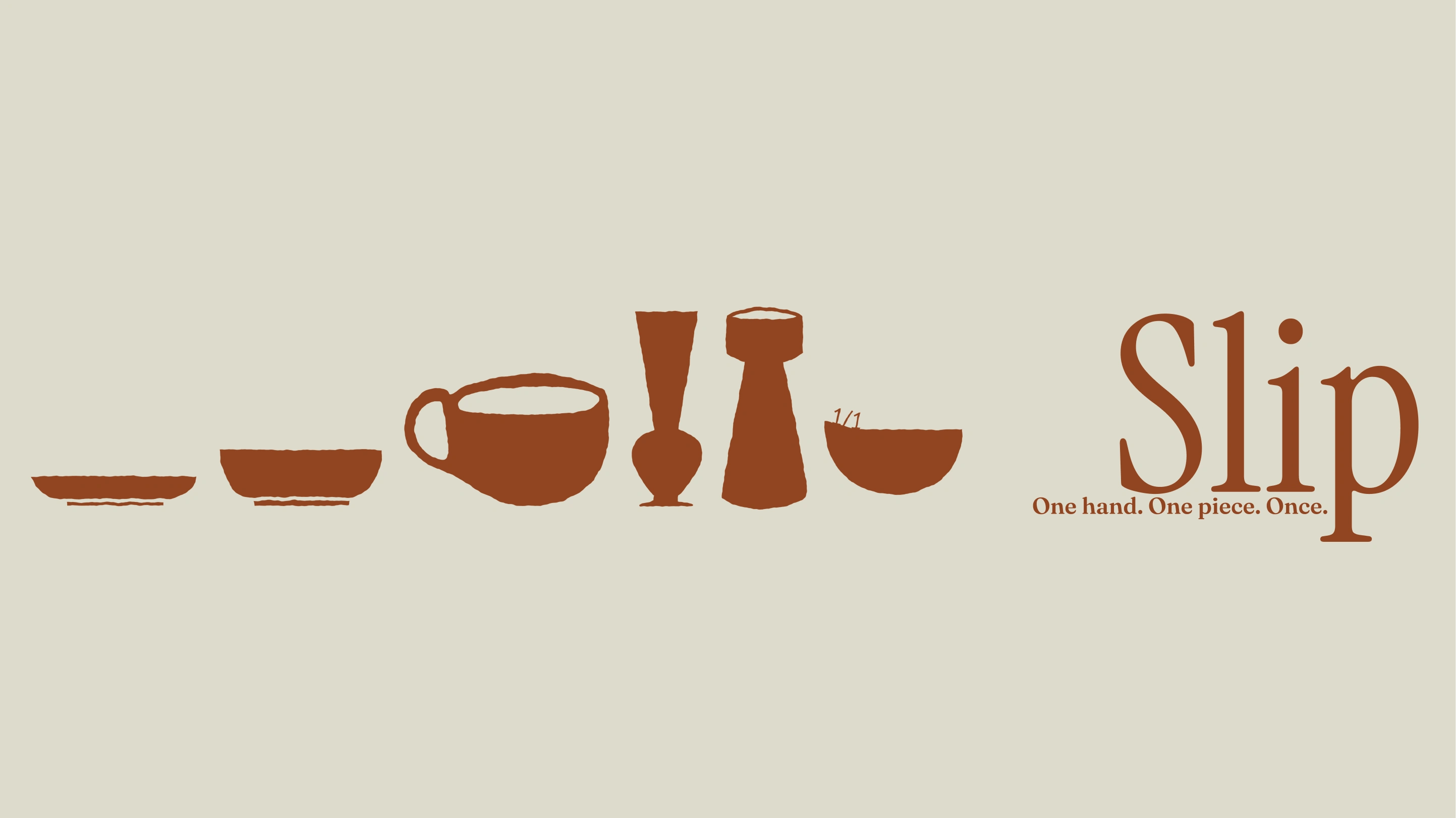
(about the brand)
"Slip" is the liquid clay used to join pieces and coat them before glazing — the studio's own material, hiding in plain sight as a name.
But the word carries a second, unearned meaning: a slip-up, a mistake. That risk mattered more than it looked like it would, because the entire visual system leans on intentional variation — wobbly silhouette edges, an asymmetric bowl, celebrated glaze irregularity. Every one of those choices sits right next to a name that could reframe them as accidents instead of decisions.
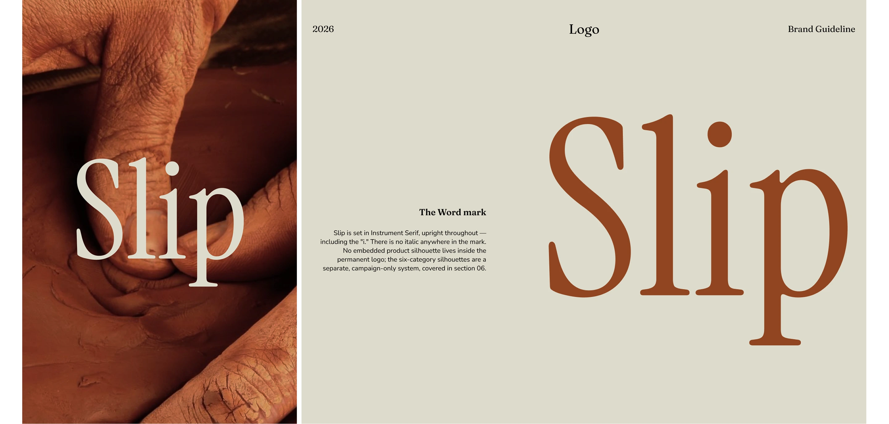
(Logo)
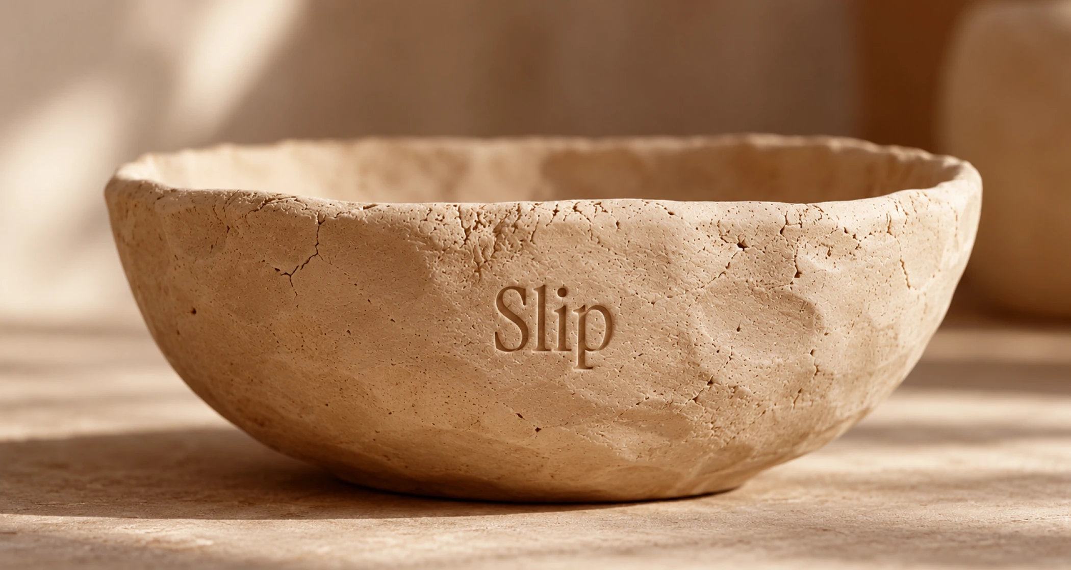
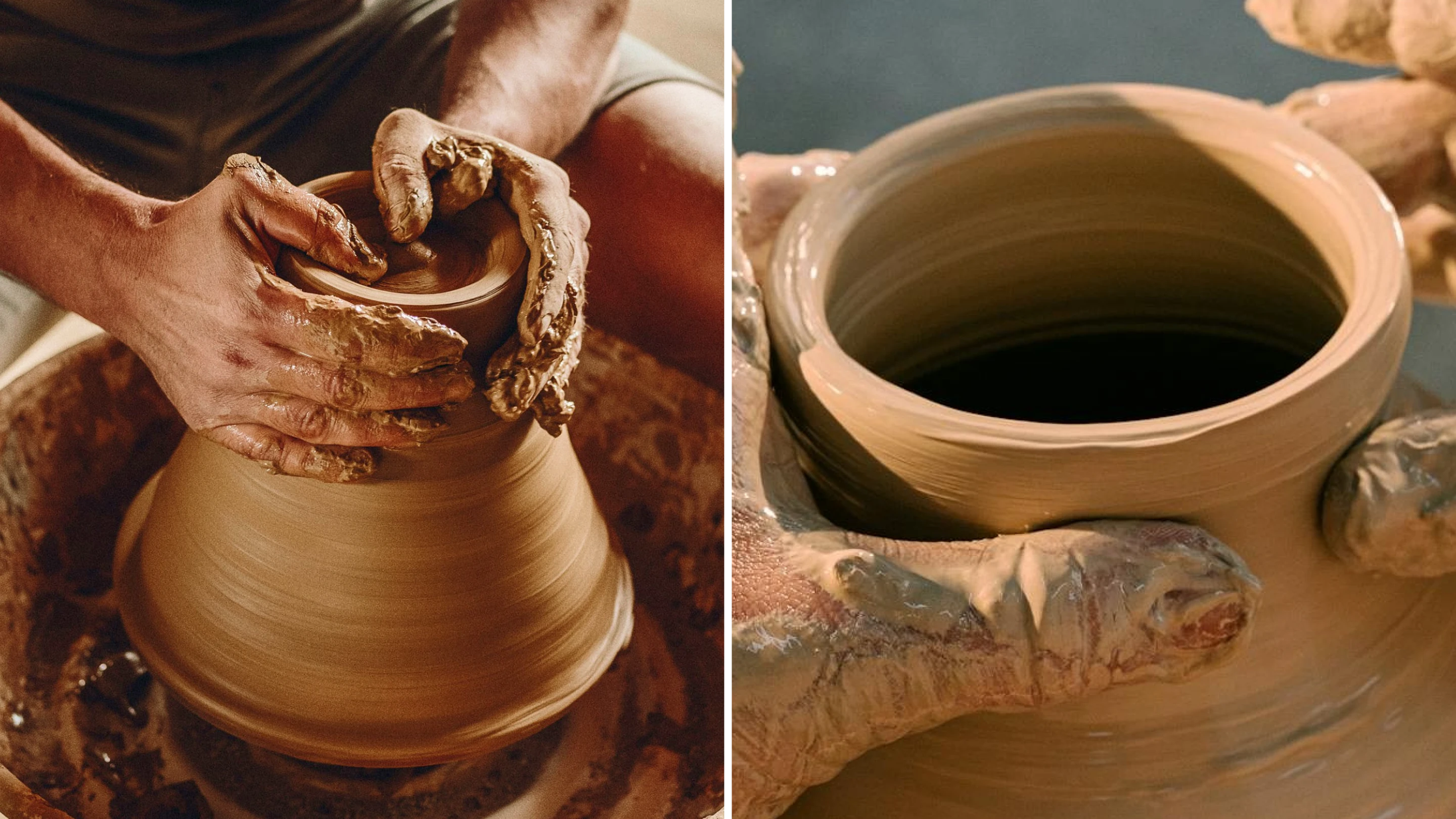
(the visual identity)
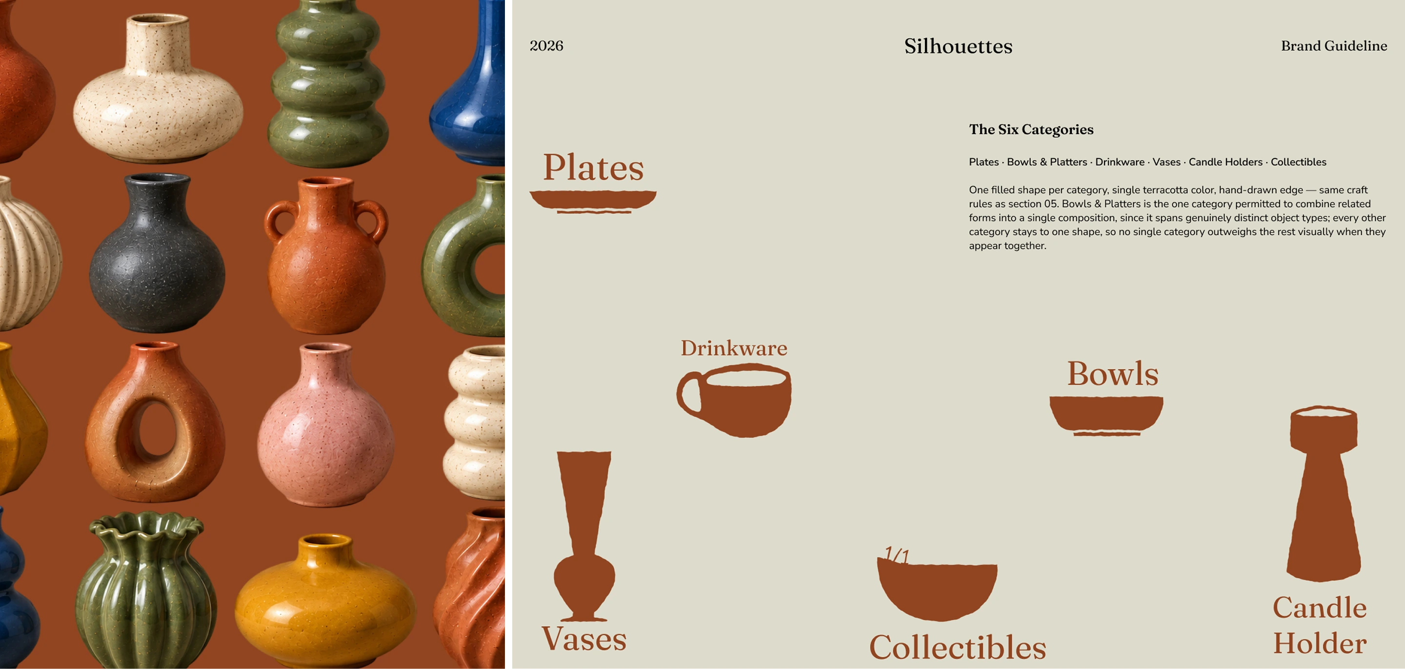
A quiet wordmark that doesn't try to claim handmade — it just names the studio and steps back.Four glaze colors sampled from real fired pieces, not chosen from a mood board.Six hand-drawn silhouettes, one per category, kept out of the logo so no product outranks another.An incised signature and number on every one-of-one piece — proof carved into the clay, not printed on.Restrained where it could be decorative, specific everywhere it needed to prove something real.
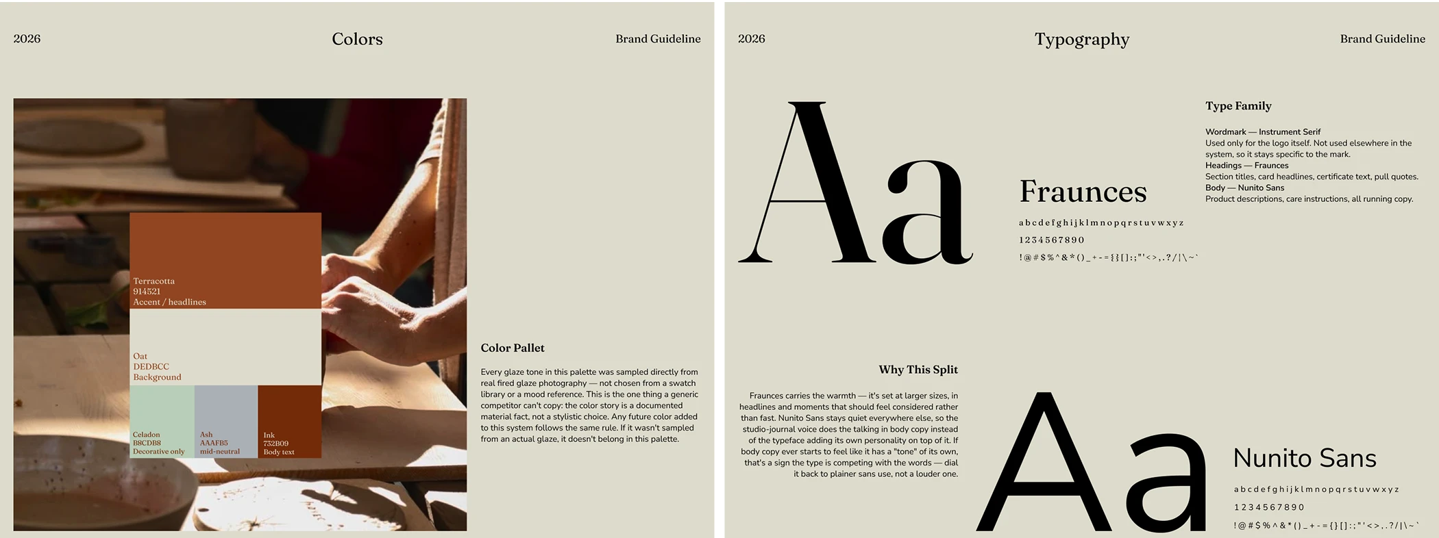
(Color & Typography)
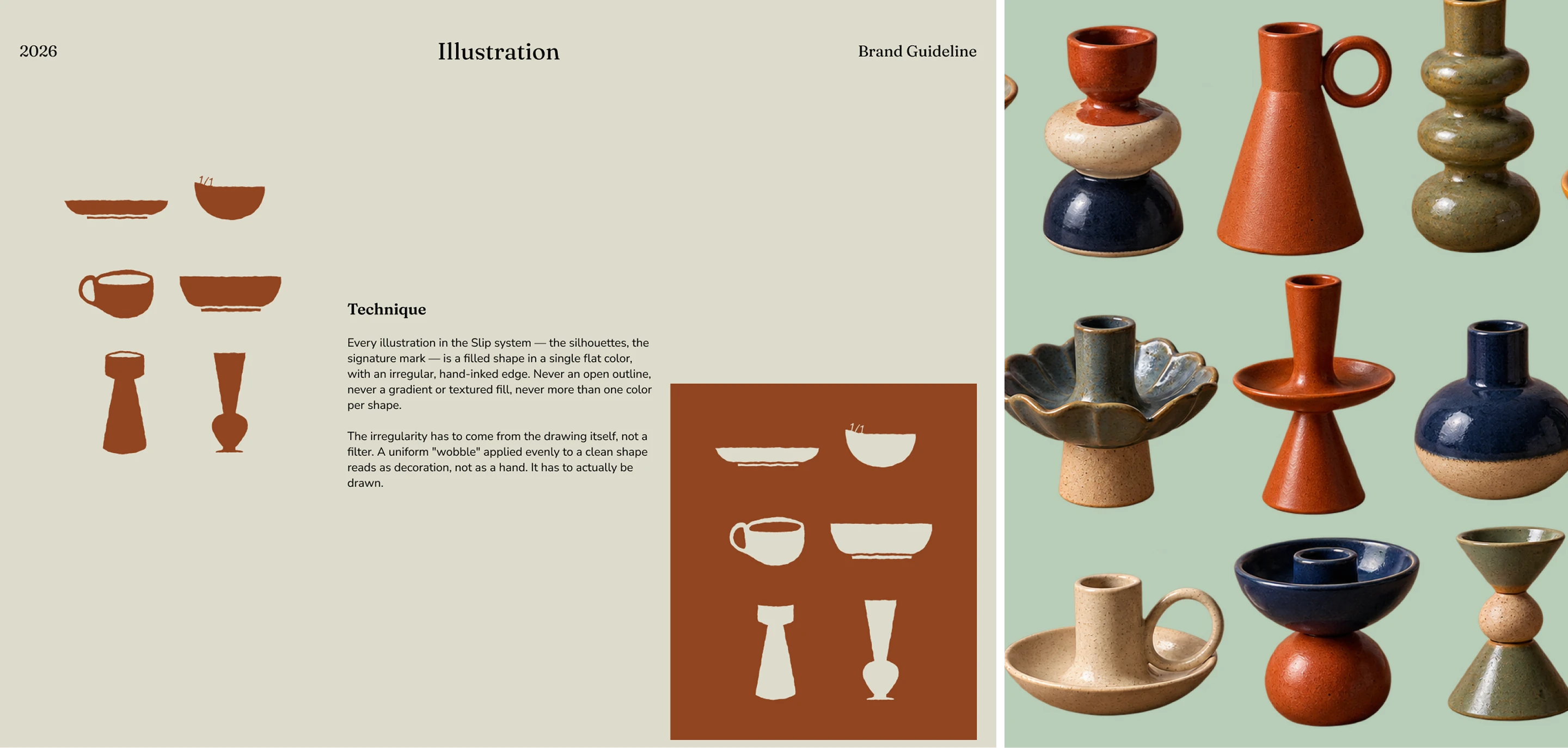
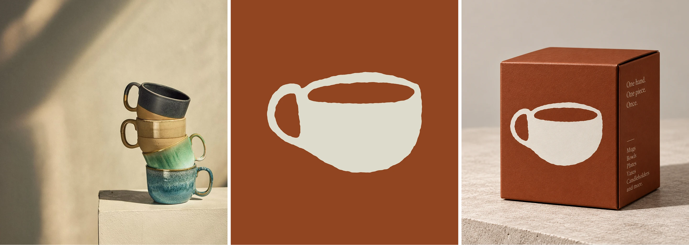
(Drinkware Packaging)
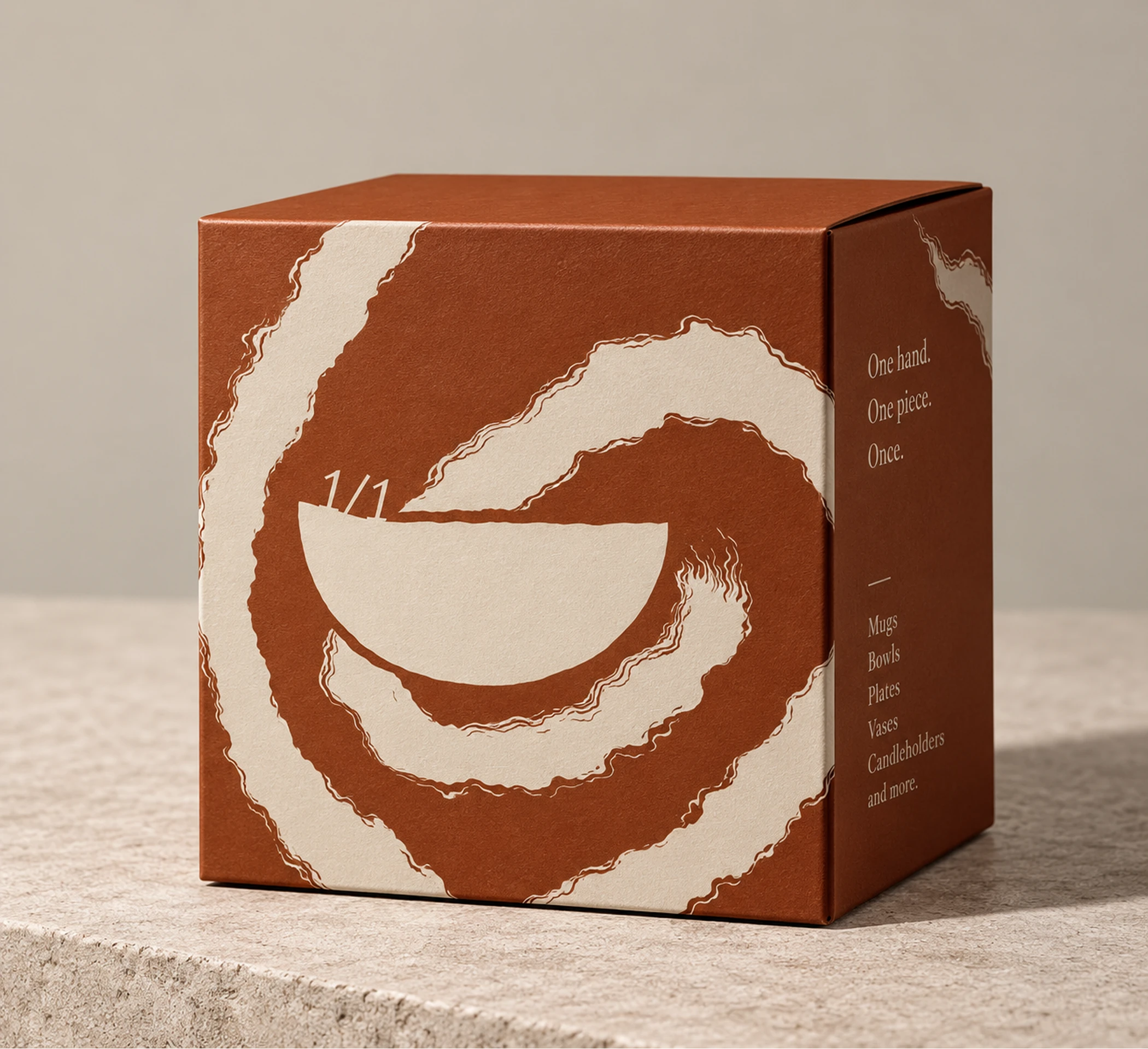
(Collectible Packaging)
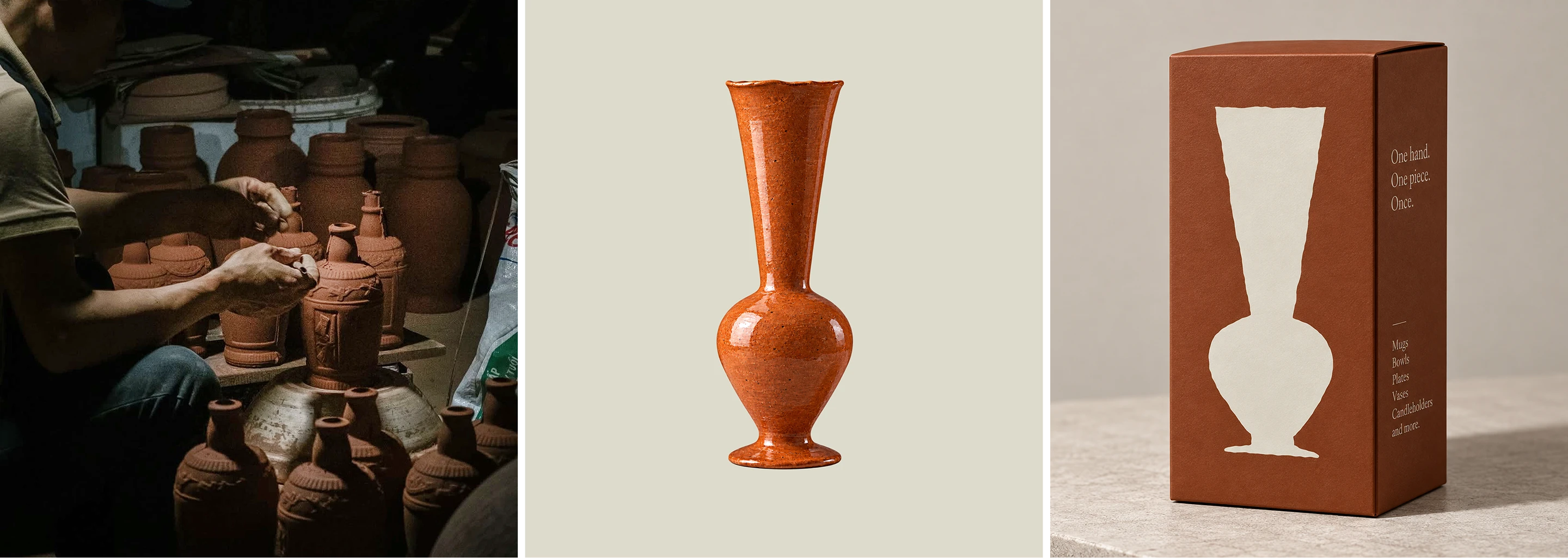
(Vase Packaging)
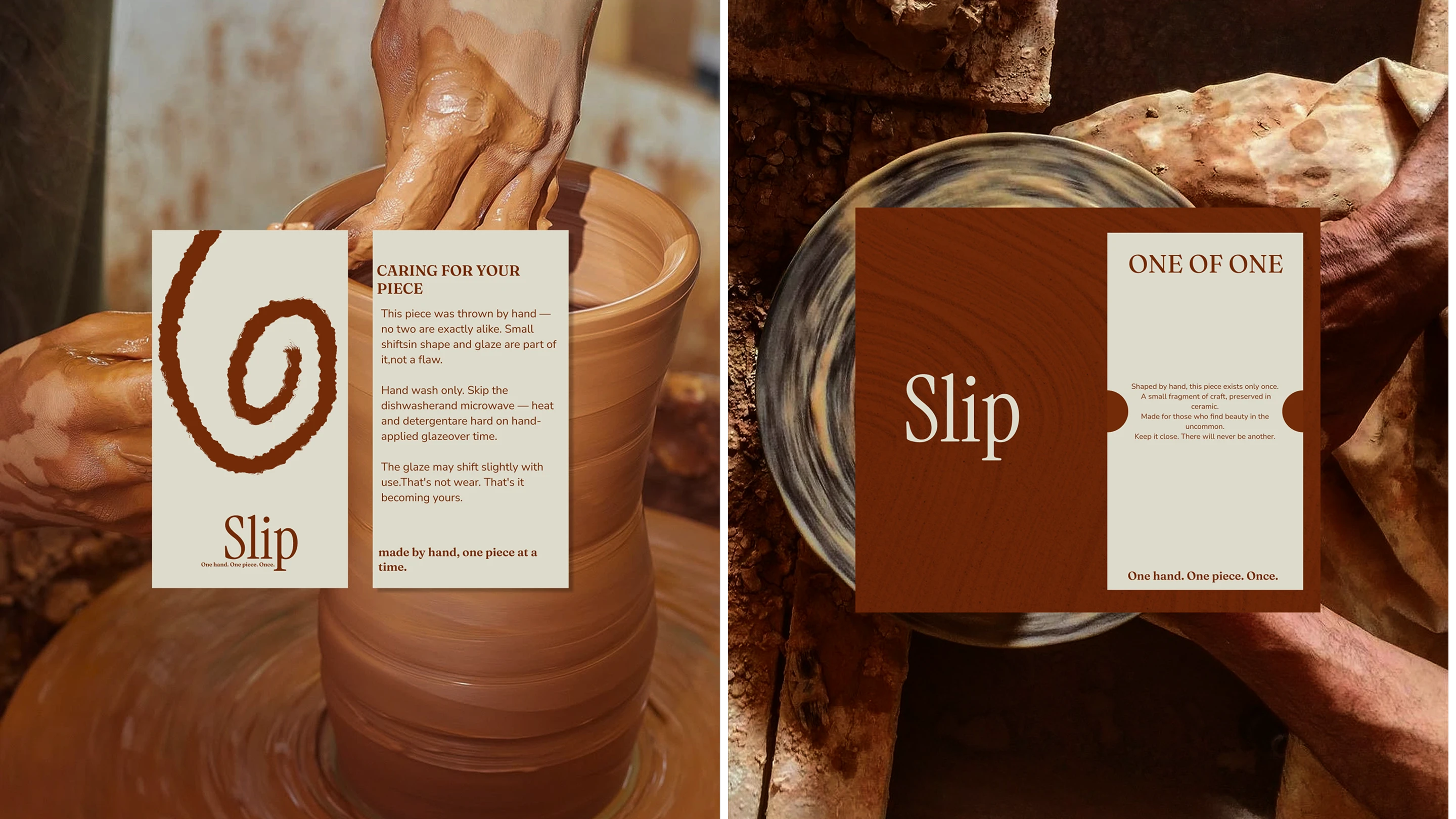
(Care card & collectible Certificate)
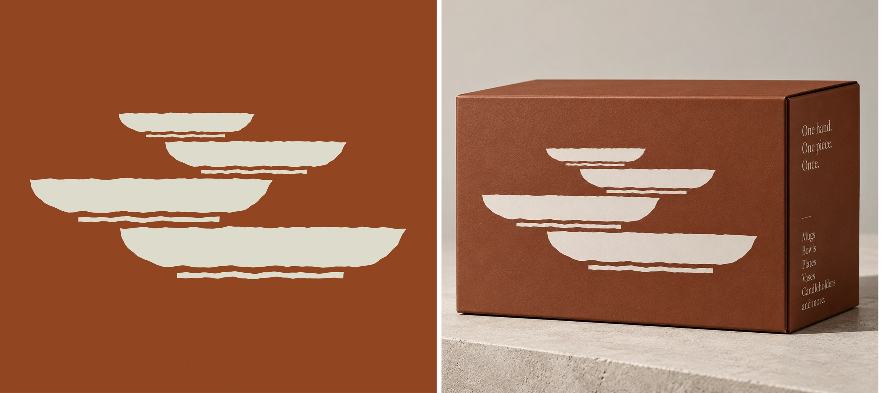
(Plates Packaging)
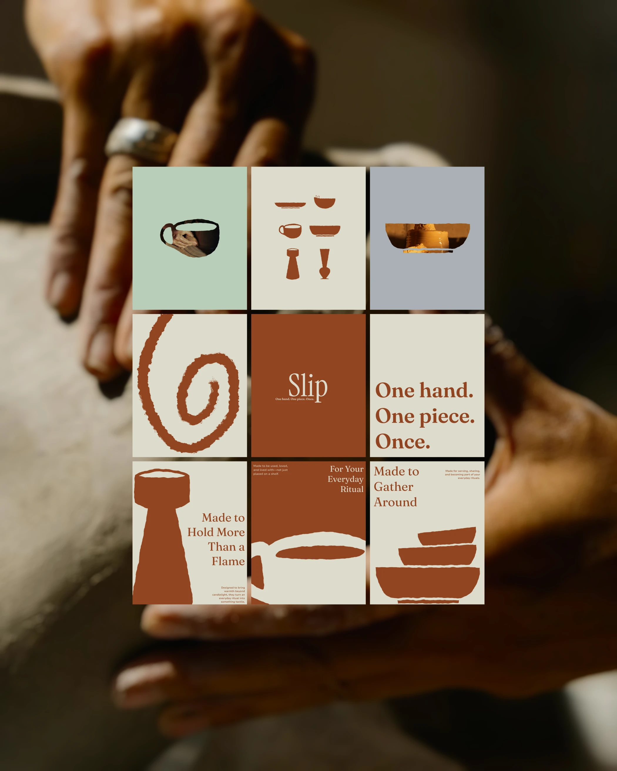
(Social Media)
thank you for watching
brand Identity by amrit brand co
for bookings : calendly.com/amritbrandco/30min
email : amritbrandco@gmail.com
1 like · 4 views · Sep 6, 2026
A complete brand identity for Slip, a handmade ceramics studio.


