Kova Brand Identity Development

Amrit Sharma


KOVA - for home that breathes
Brand Identity for a Home Objects Brand
Keywords: Considered. Warm. Restrained. Architectural. Alive.
Kova is not in the plant business. It is in the home curation business. The product is a considered object that makes a home feel alive — quietly, without demanding attention. The buyer doesn't think of herself as a gardener. She thinks of herself as someone with taste.
The Challenge
The home objects market is split between mass-market generics and precious artisan pieces. Neither speaks to the buyer who thinks of herself as someone with taste — not a gardener, not a collector. Kova needed to occupy a third space: a brand that feels like it belongs in a considered home, not a garden centre.
The Approach
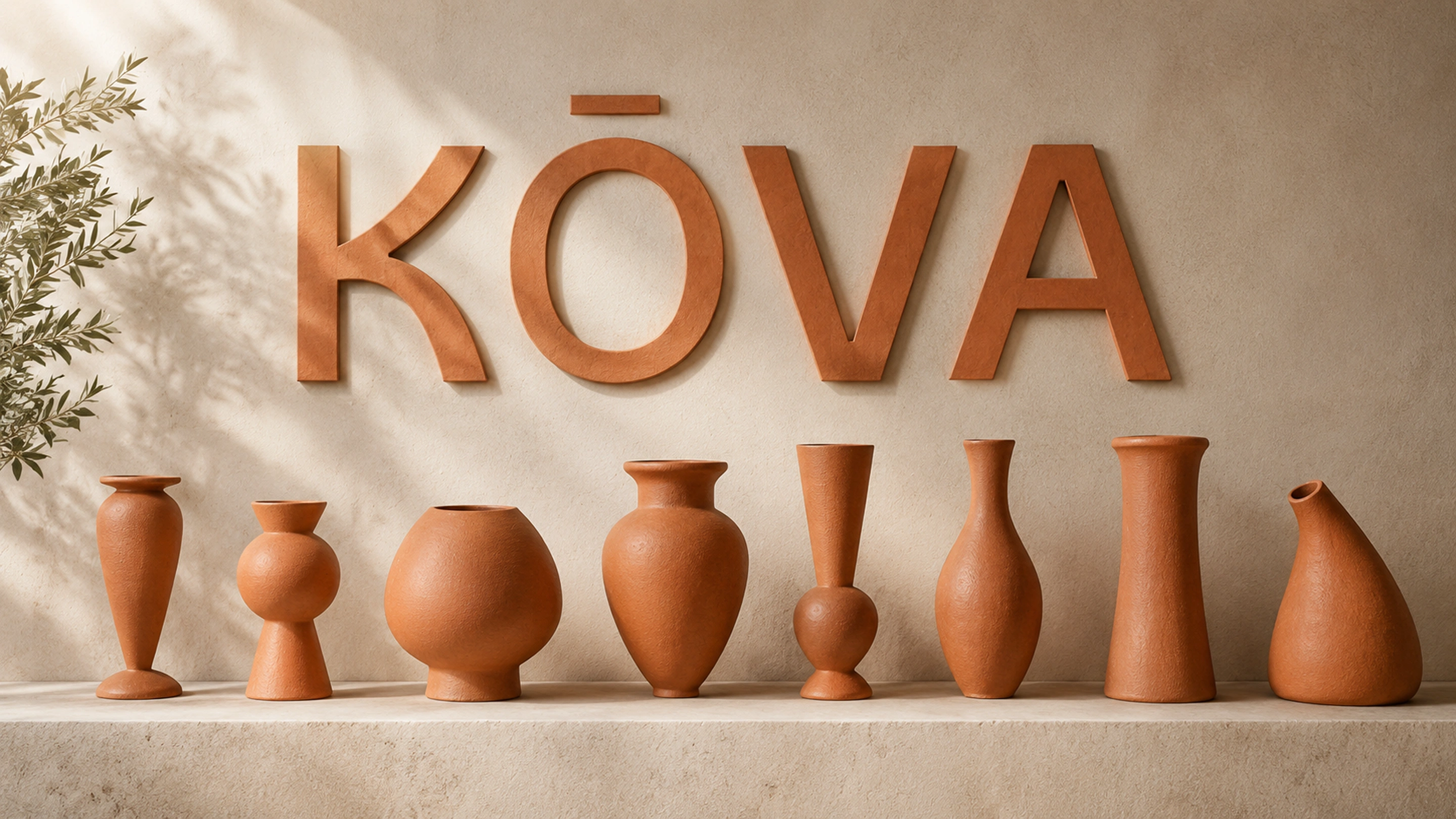
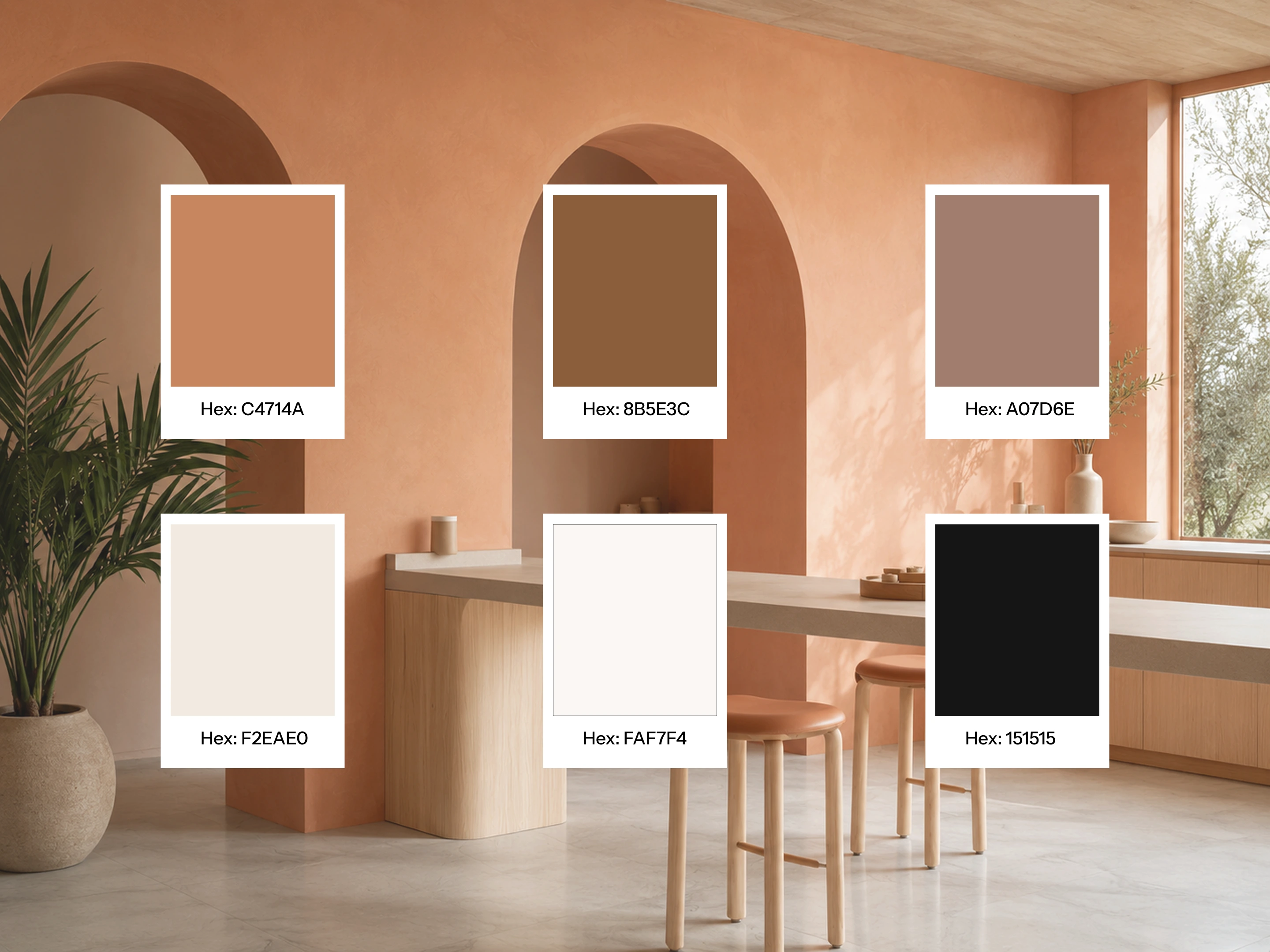
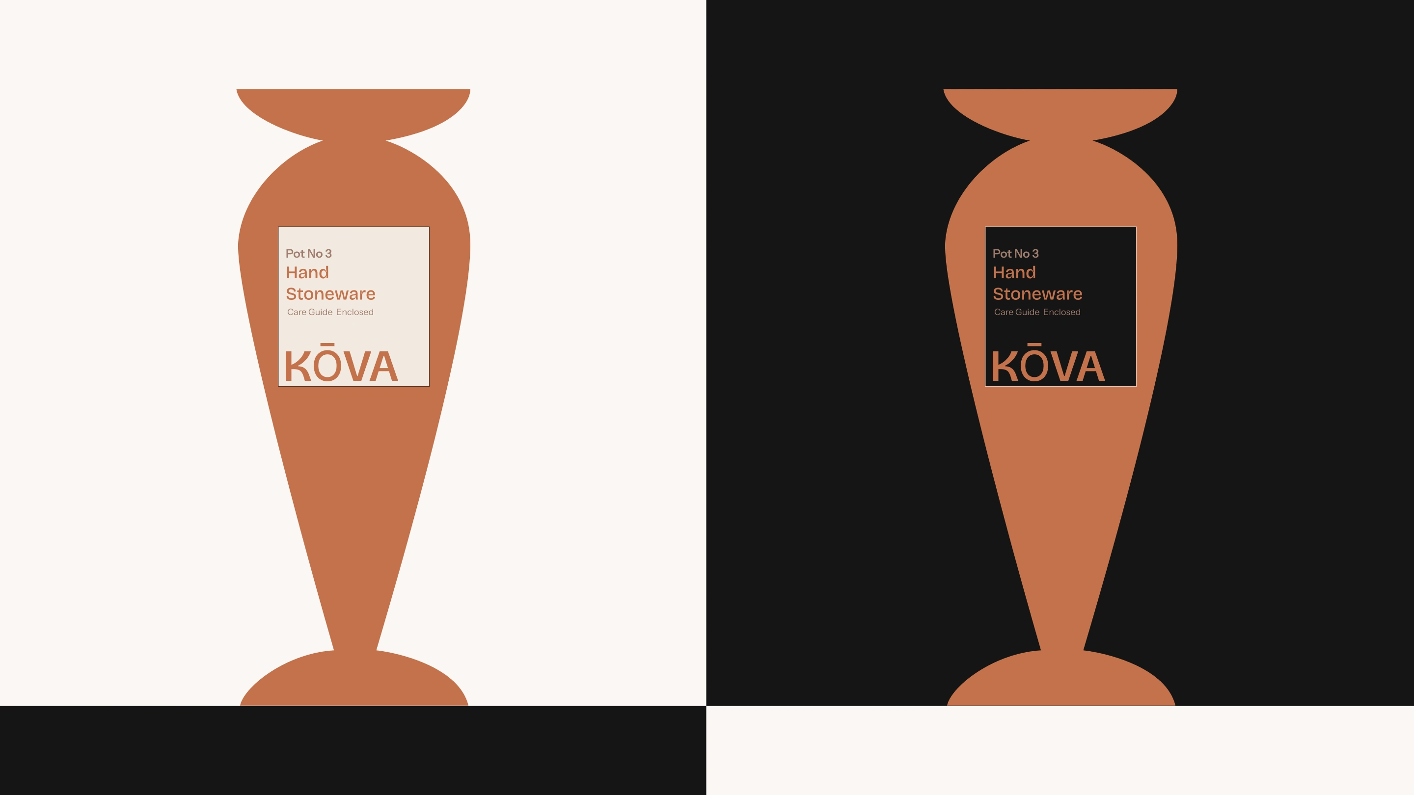
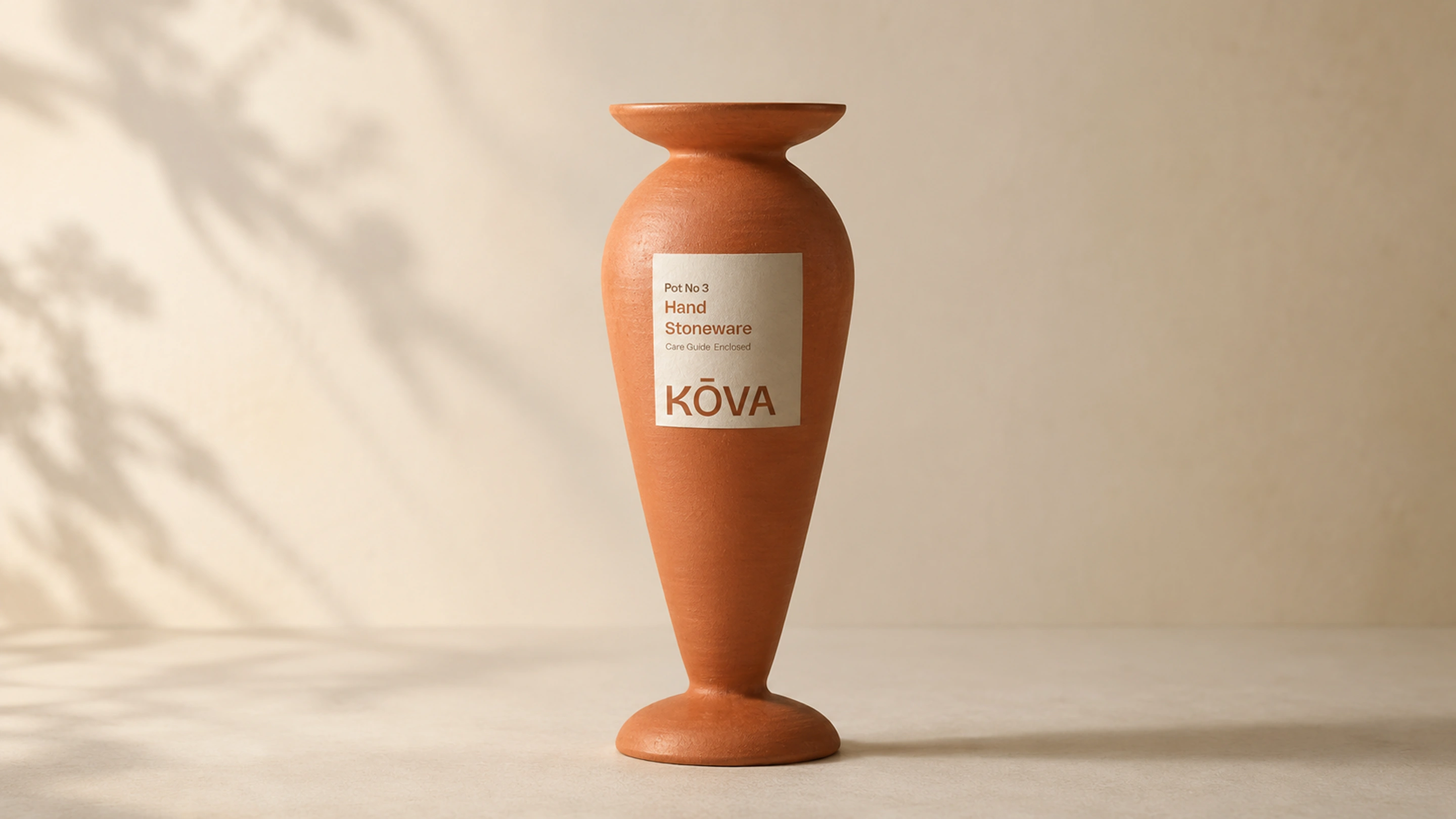
Every decision was made through one filter: does this feel like a design object or a plant product? The silhouette forms reference architecture and craft, not horticulture. The colour palette pulls entirely warm — nothing competes, nothing announces itself. The typography carries personality through considered irregularity rather than decoration. The result is a brand that earns its place on a shelf the same way a ceramic bowl or a linen cushion does.
colors
Typography
The visual identity
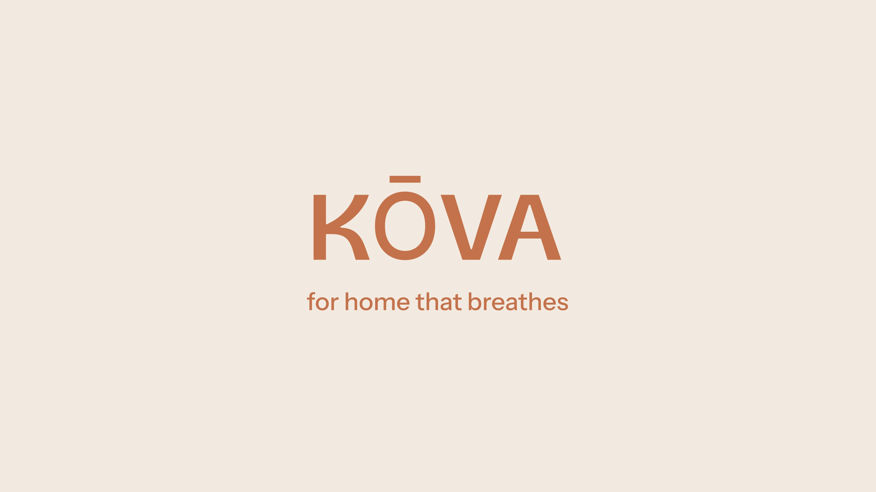
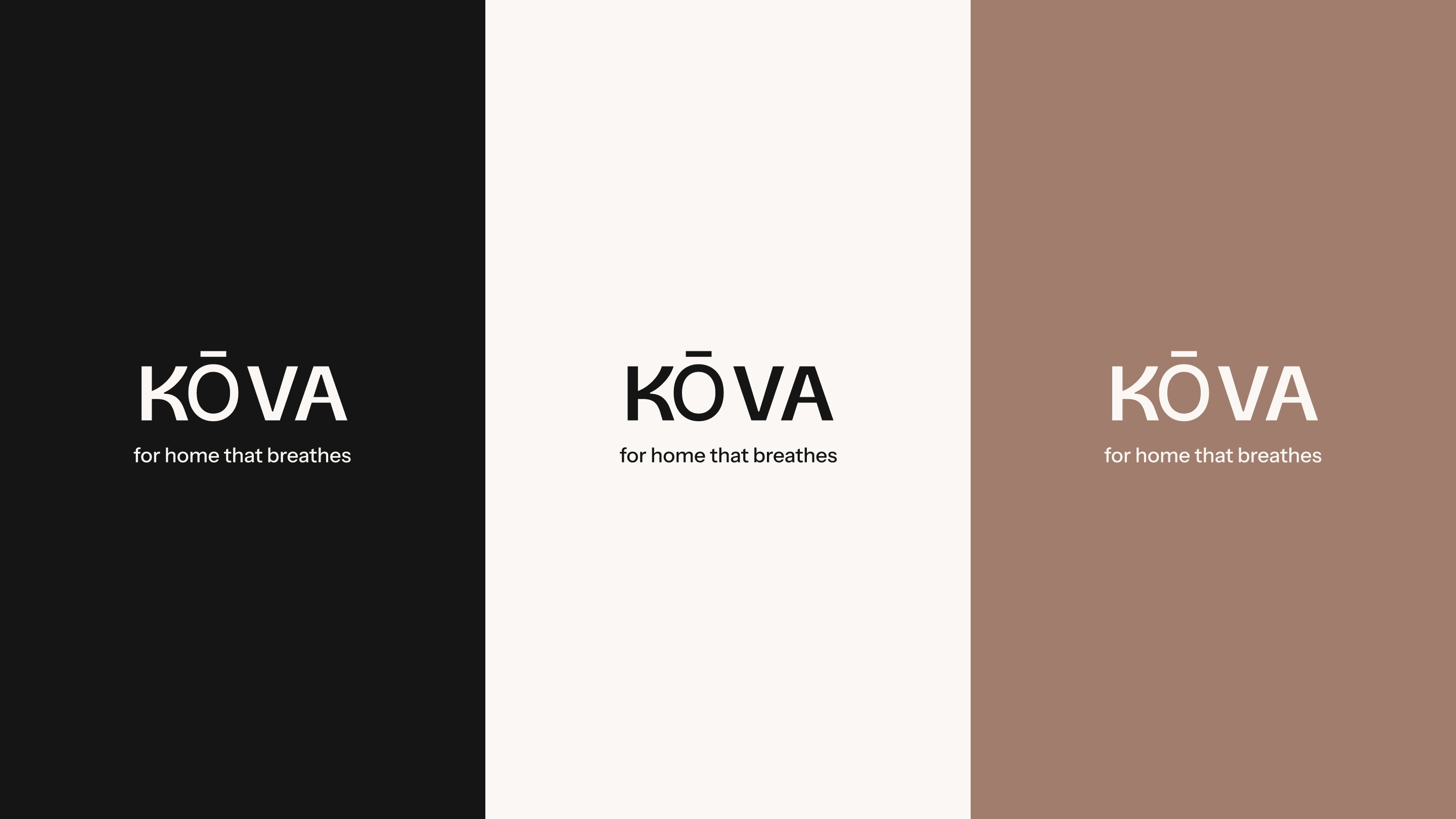
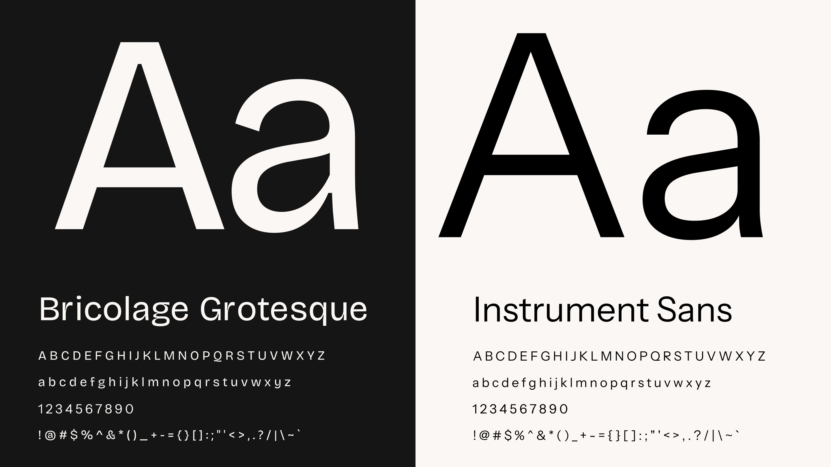
The wordmark uses Bricolage Grotesque — chosen for its slight irregularity in the letterforms, giving it a personality that mirrors the way a Kova buyer gives personality to her home through the objects she places in it. The macron above the O is a single deliberate modification — architectural, precise, and quietly distinctive. Body text uses Instrument Sans for its humanist letter spacing, communicating calmness without losing legibility.
labels
Thank you!
Brand identity by Amrit Brand Co
Enquire here: amritbrandco.framer.website
For bookings : calendly.com/amritbrandco/30min
Email : amritbrandco@gmail.com
Like this project
Posted Aug 13, 2026
Brand identity for Kova, a home objects brand built around the idea that a considered object makes a home feel alive.
Likes
1
Views
2
Clients
Kova