United Way Brochure
The Task
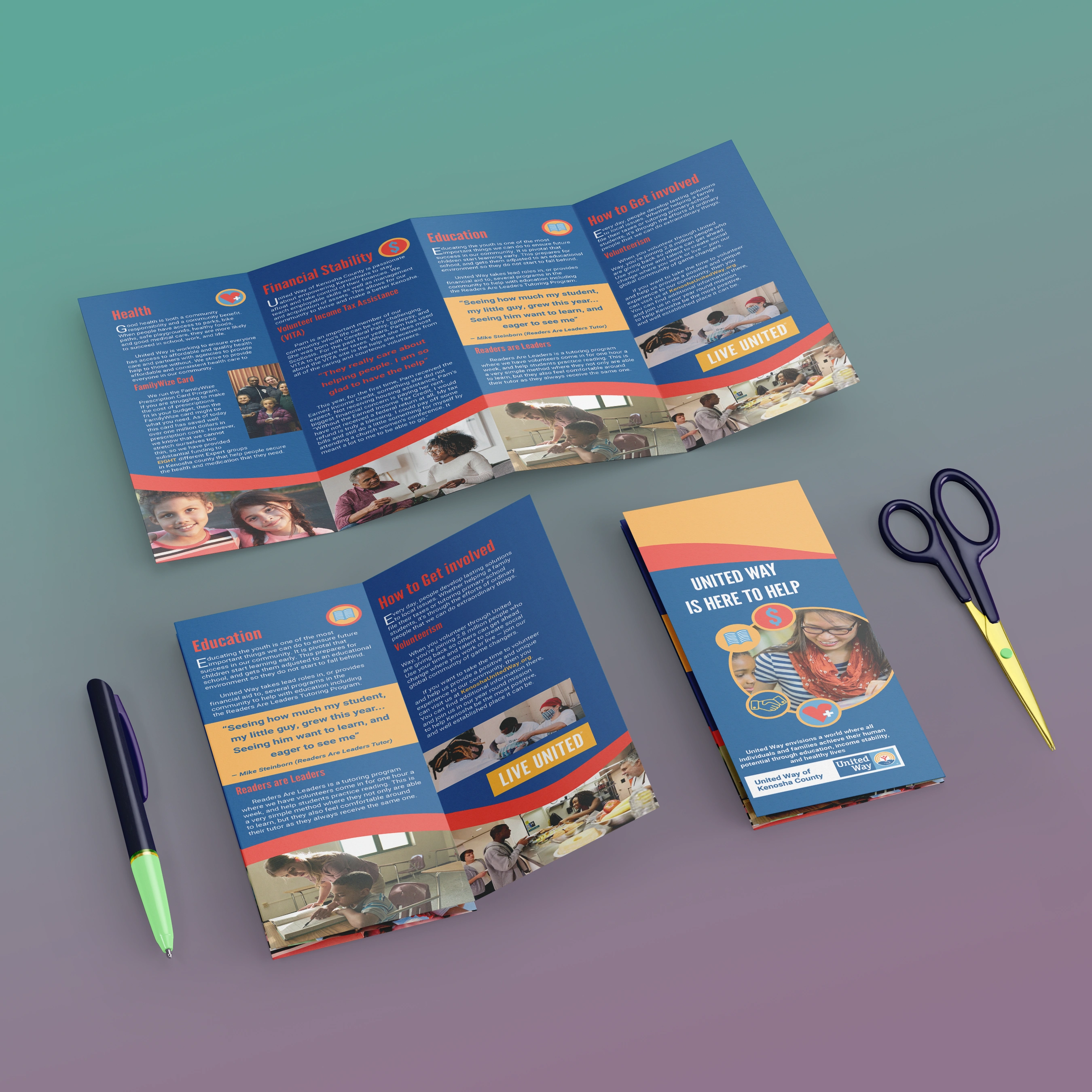
The assignment for this project was to create a brochure for the Kenosha Branch of the United Way charity organization. The project was my first foray into this layout work and working with a live client. In general, they wanted the brochure to inform people of what they do and convince them to join and help them in the process.
My Job
In this project, I worked with another coworker. I had the role of Lead Designer, and she had the role of manager and correspondence manager.
Biggest Challenge
The biggest challenge with this project was that I had not worked with a client before. I was unfamiliar with best practices in communication and coordination. I struggled to get info to and from the client promptly, and in general, I felt a new type of pressure. However, this was resolved with some adaptability and perseverance. I found an online, publicly available document of their brand guidelines and got a strong concept of what they wanted.
Concept and Decisions
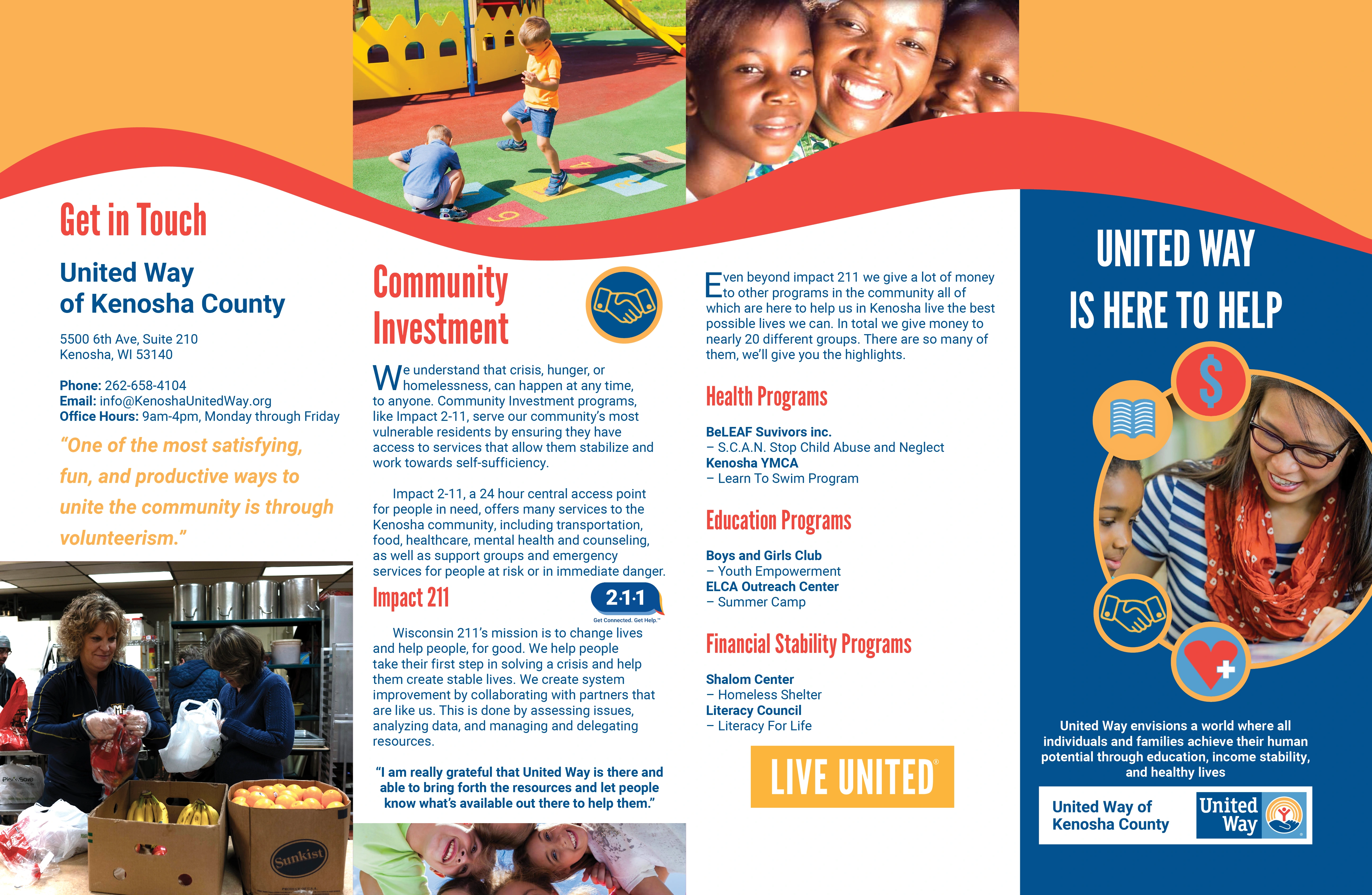
From the beginning, we knew they wanted this document to have a lot of text. However, my coworker and I created the copy ourselves, as none was provided. We used their website and other searches and anecdotes from people discussing it online to coordinate this information. We did, of course, have the client confirm before releasing it.
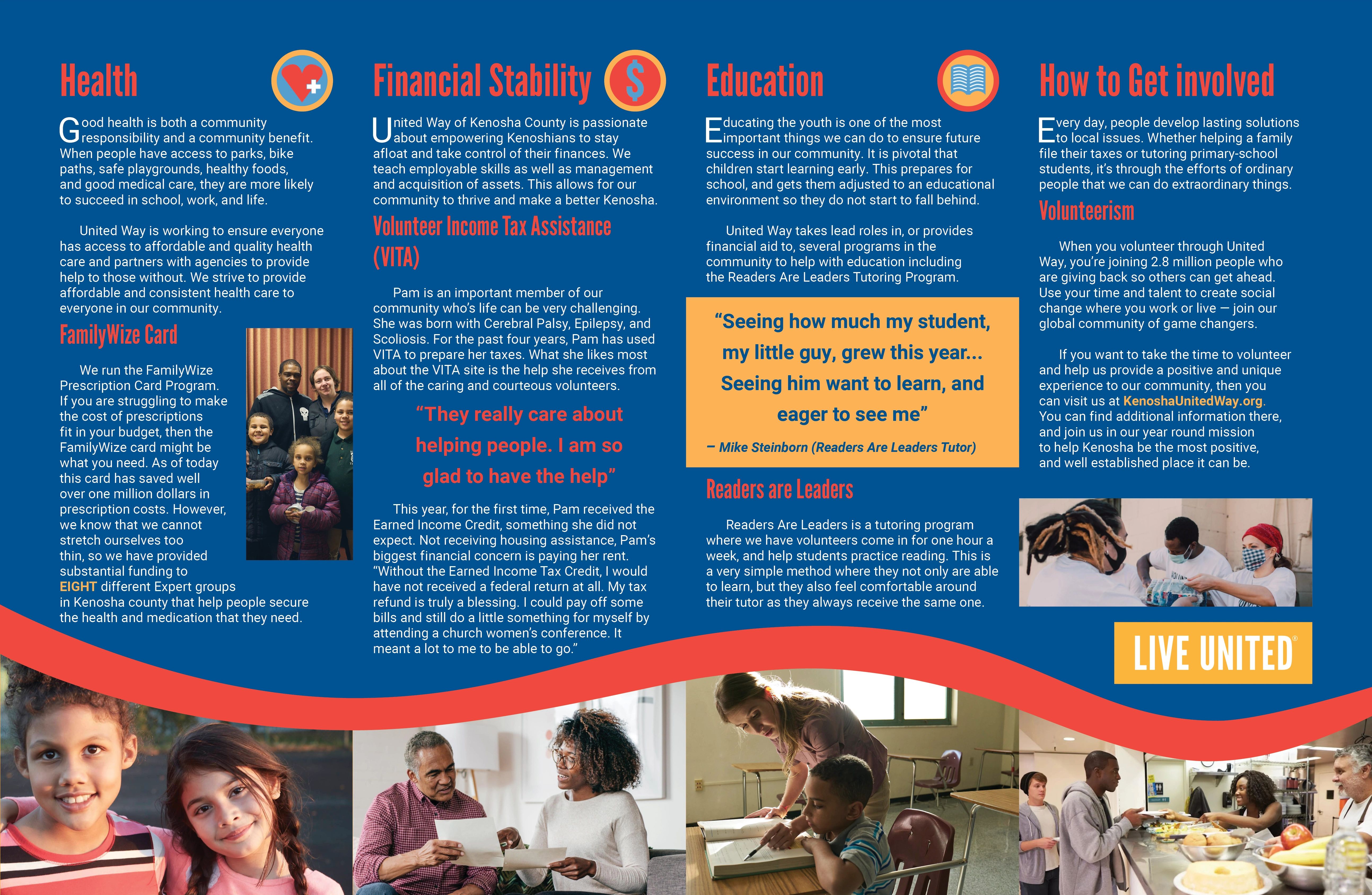
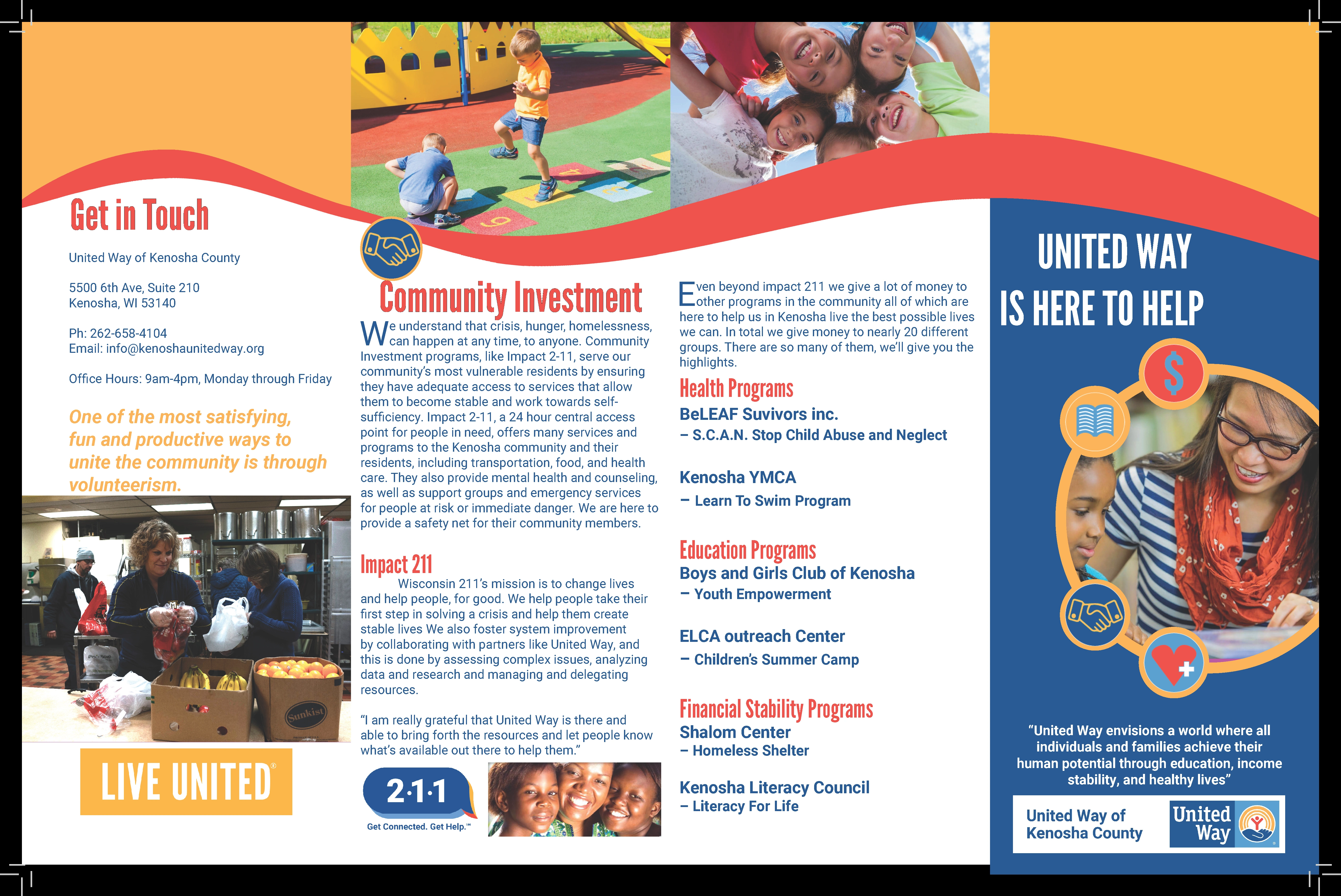
Our first big decision was that the brochure needed to be larger than 8.5 x 11, as we knew it would not contain all the info and still look presentable. As such, we moved immediately to an 11 x 17 design but felt that the traditional three-panel design would not lend itself to good proportions or feeling in the hand of the viewer. As such, we moved forward with a four-panel design to better maintain proportion and comfort for the viewer.
Limitations
The brand guidelines for United Way are stringent. As such, we found that there wasn't a lot of lee-way given to colors, fonts, or hierarchy. However, we found a way to express ourselves while meeting all the conditions. One of the most significant conditions was a small graphic demonstrating the exact ratio in which all colors should be used. As such, the dark blue color became our dominant background and font color.
Additionally, there was no imagery of the Kenosha area, only stock photos, which we worked with to the best of our ability.
Successes and Failures
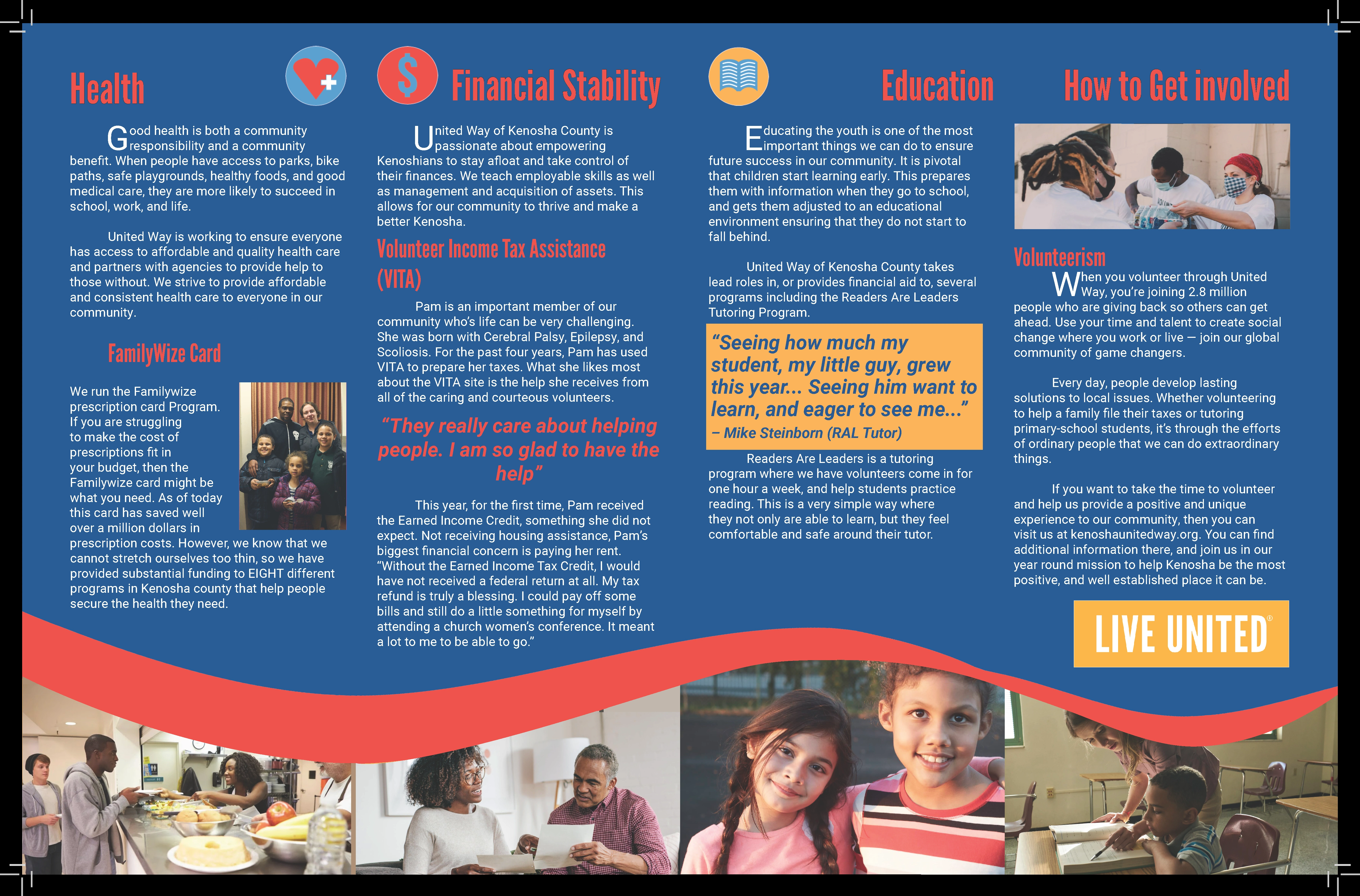
The project was very successful and was used by United Way. They significantly increased the number of people contacting them, both for the beneficial services and to offer to assist them. However, the project was far from perfect. Firstly, you have seen a cleaned-up version I did two years later for my senior thesis work. The original was a bit messier, as I was still learning my way around InDesign then. Although the client loved the work and found significant benefits from using it. The rough version will be visible at the bottom.
This project taught me a lot about InDesign, and I have only learned more since then. It is a program I like using, and I find it relaxing. I found the project to be a massive success at the time, and only in retrospect did I notice how much I improved it.
Old Version
Like this project
Posted Jun 6, 2024
I created an influential Brochure for the Kenosha Branch of United Way. They saw massive success in its implementation and were very eager to have it made.
Likes
0
Views
5
Clients
United Way
