Arcade Style Fighting Game Controller
The Job
The task for this project was unique. It started as a personal project but quickly became my senior thesis project in my last year of college. The goal was to help coordinate the design and create the art for an arcade-style controller built specifically around fighting games.
Biggest Challenge
My most significant challenge with this task was motivating myself to do it in my free time. Once it became a task and an assignment, it moved much faster.
The other impactful challenge was figuring out what I wanted the general theme and design to be. I knew I wanted it to match my identity system, and I also wanted it to include my logo on it. I also knew that I wanted it to include an artistic background without a strong central focal point, as the buttons would likely have covered it anyway.
Origins of the Theme
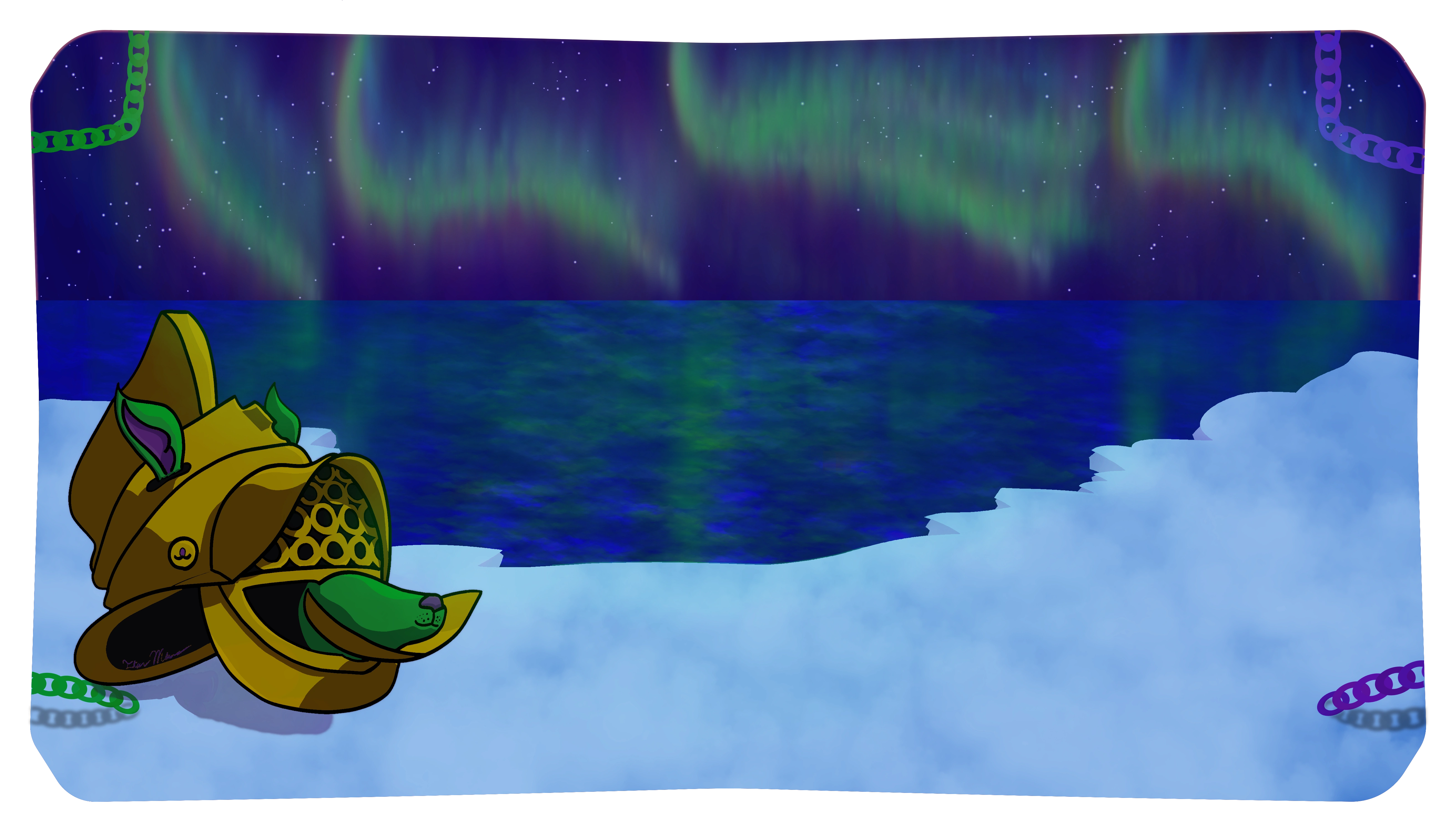
This piece is excellent for me as the theme I ended up on is very relevant to me and my family. My father's side has an annual fishing trip they do up to the northern end of Wisconsin. They do this in the April/May period of the year, and at the time of creating this piece, they had seen the Aurora Borealis in the last two years. I missed both of these trips as I was working on college things then, and I couldn't step away for two weeks for the journey. I felt left out of this experience, which many people never experience. I realized I could channel that and create a miniature version of the Borealis.
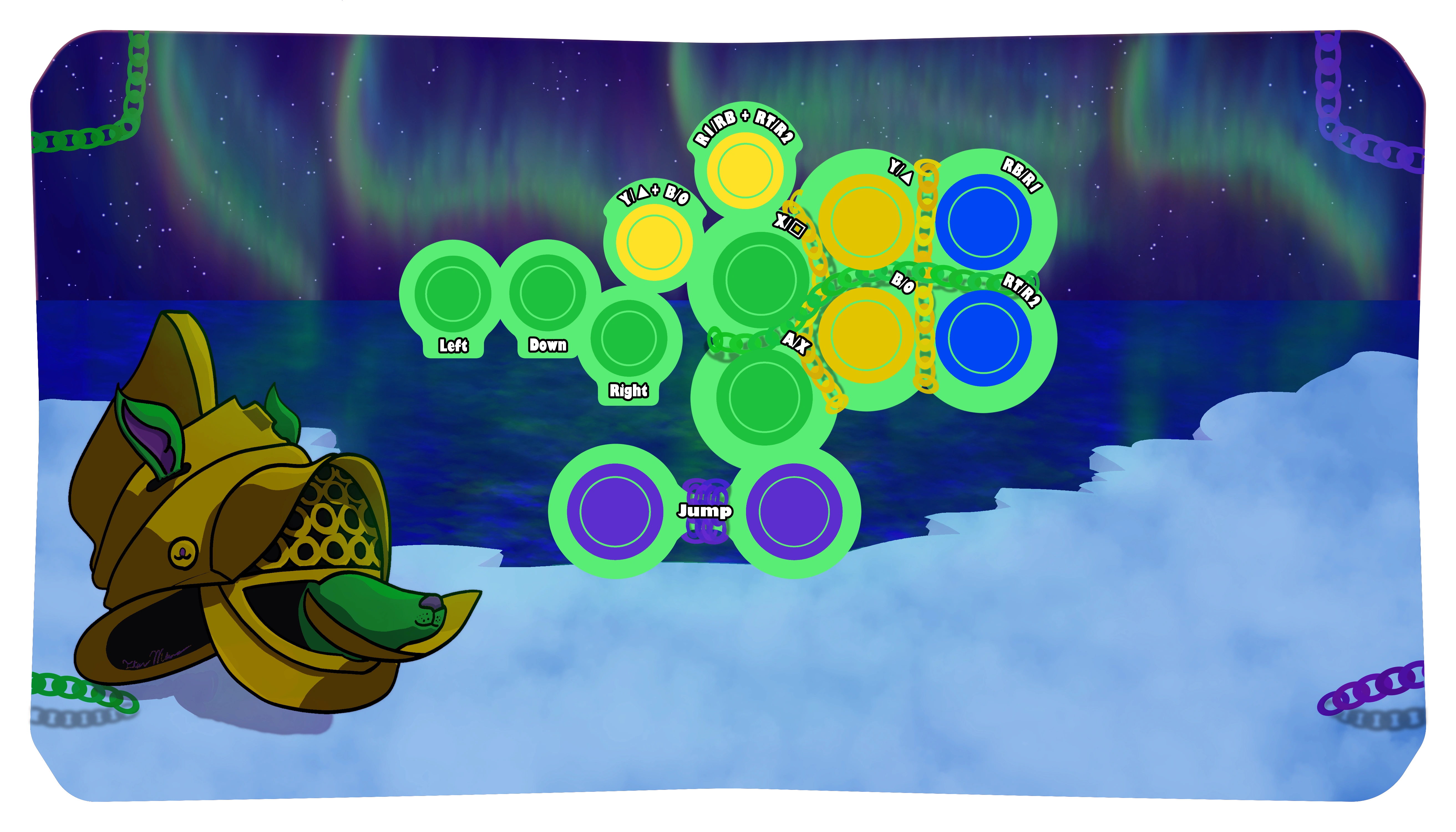
Top Panel with colored buttons to fill in for where the buttons are
The image above is the final version of the design for the top panel of the controller. It also gives you an idea of how the layout works and how you use it. The layout was designed with my hands in mind, and the layout of the physical product was cut and designed by JonyFraze. However, all six sides of the controller have art created for them, and the final product, as you have seen, is completed and put together. I also use it constantly while playing fighting or other 2D games.
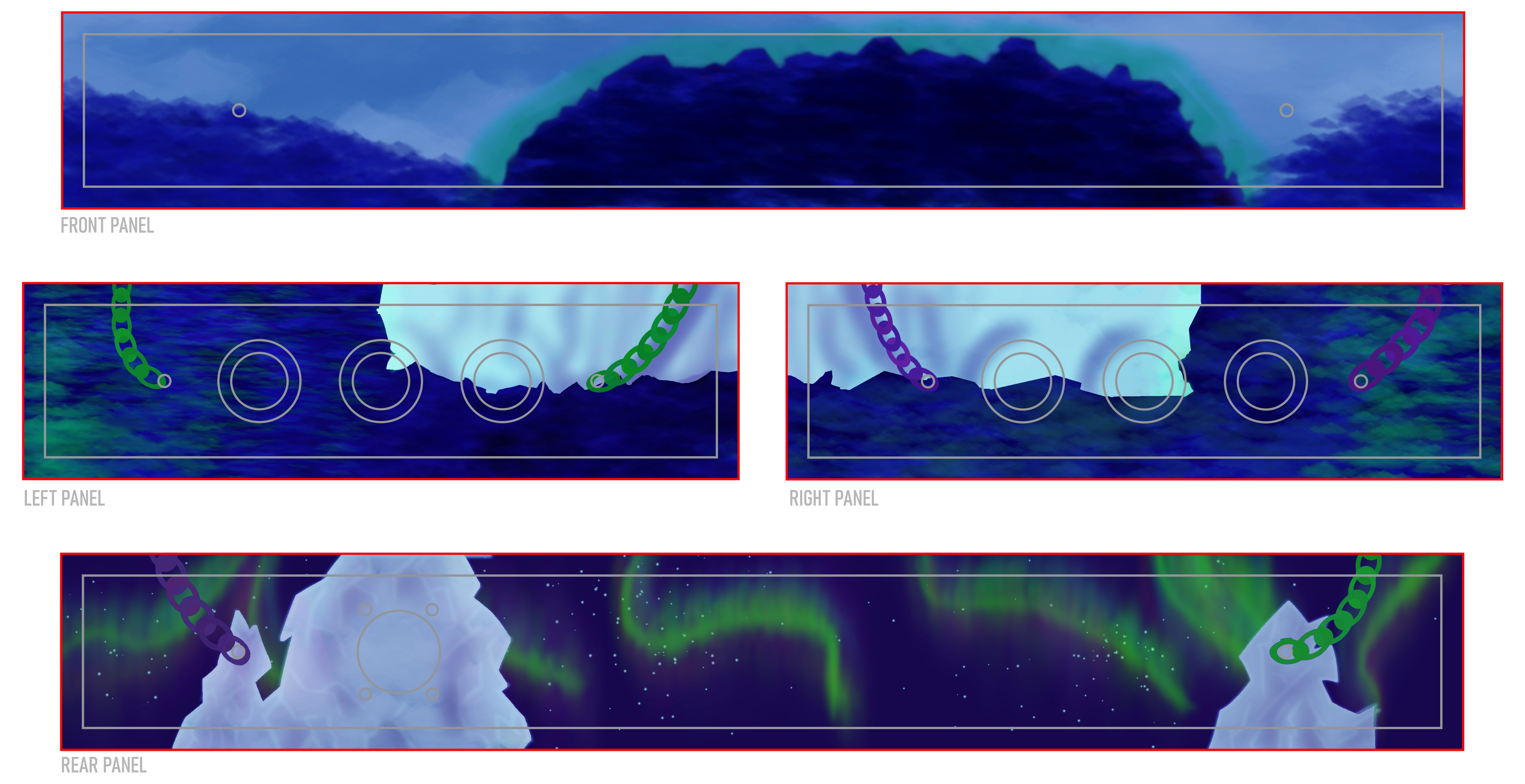
The final layout of all the side panels. NOTE: The front is the side that would be closest to you while holding the controller
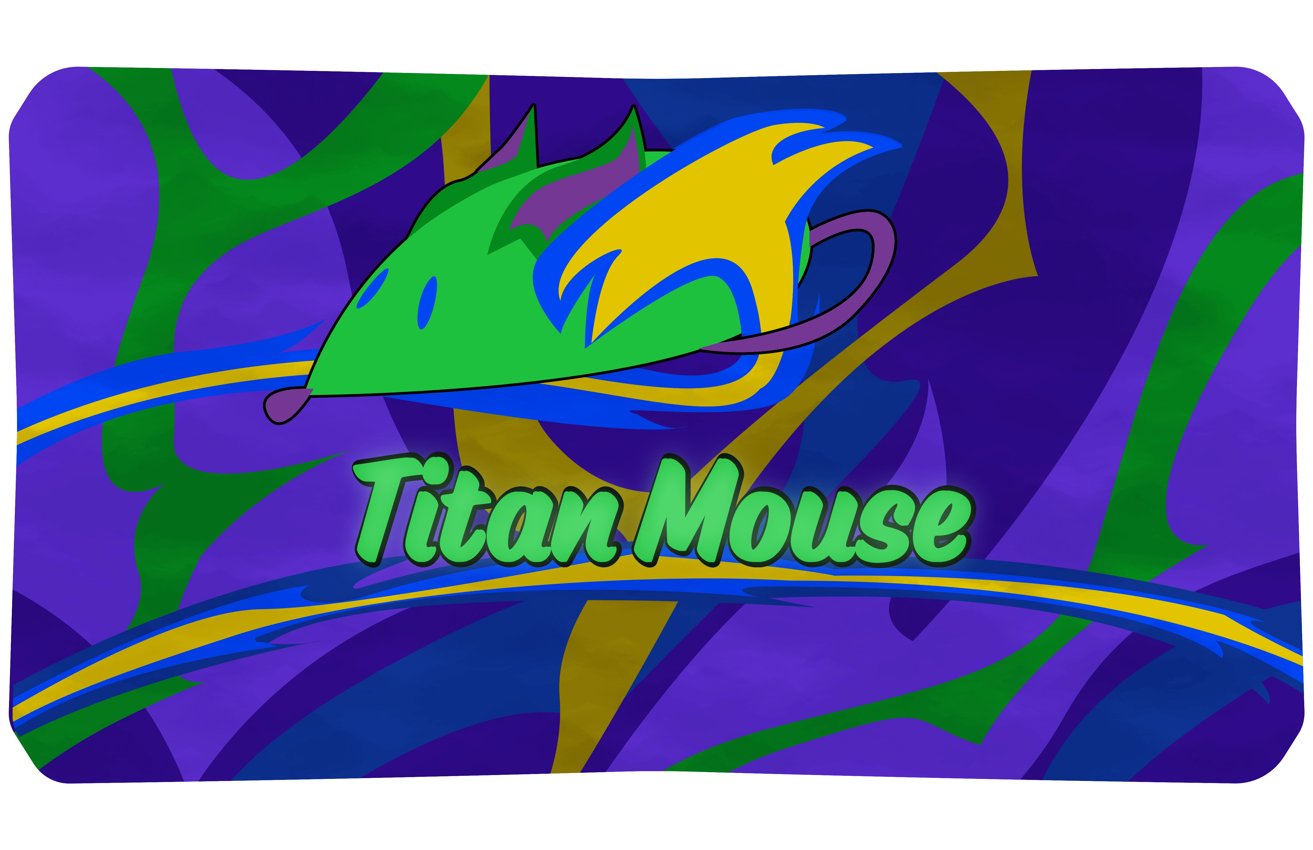
The bottom panel designed for the controller, themed around my identity.
Successes and Failures
The most impactful success of this design is that I love it. I was my client here, and I spent money to acquire all the parts and time designing all the art. I love what I created and am a big fan of the result.
The most significant failure on this project was that when I had considered myself done, I got all of the artwork printed, cut out, and put into the controller, and learned that I needed to brighten up and saturate all the colors. My primary working device has an outstanding display of colors and is very vibrant. However, that means that when I move my work to another device for others to see, the colors feel more muted and dark. The result is that I often try to present projects, and they look much worse on the viewer's screen than on my own. This project helped me learn from this mistake and that I should brighten things up more than I would want to on my main surface. I have added the process of moving work to my laptop to see the difference and try to work with it.
Like this project
Posted Jun 7, 2024
I designed and built an arcade controller. I then designed all the artwork to cover all six sides of the controller to fit my identity.
