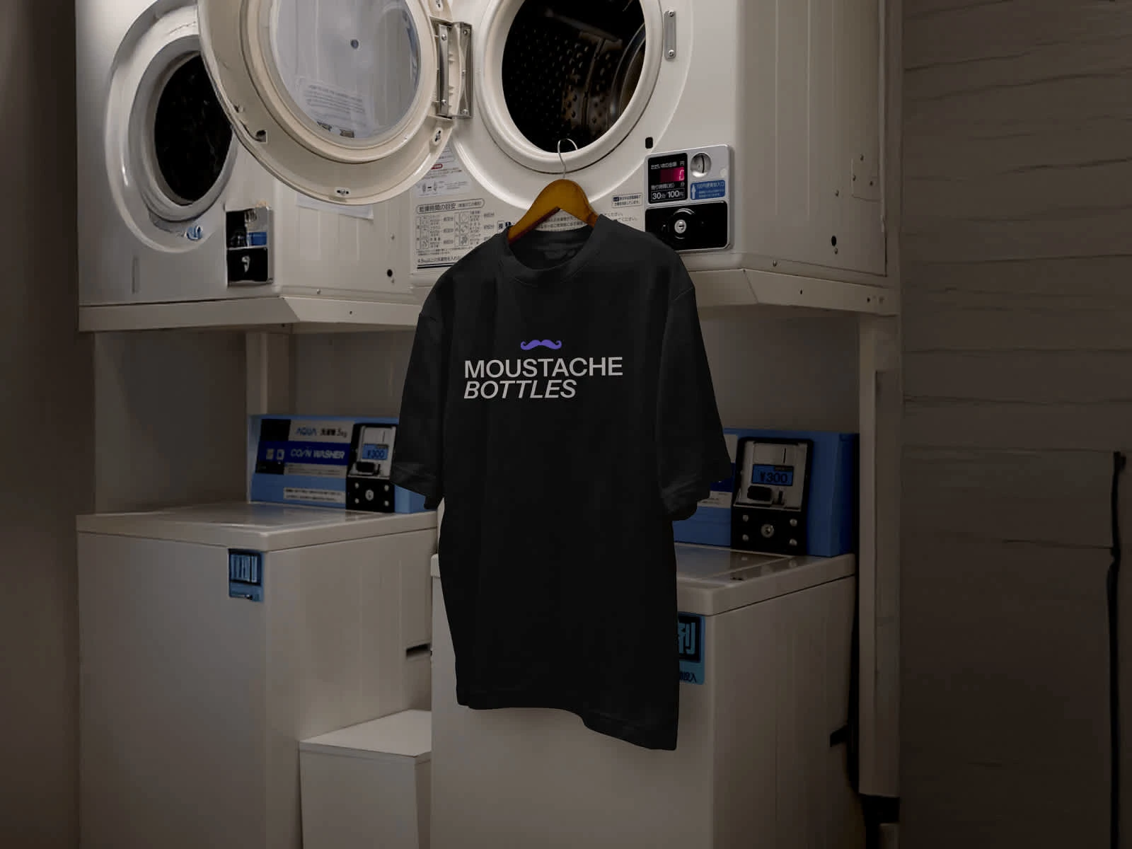
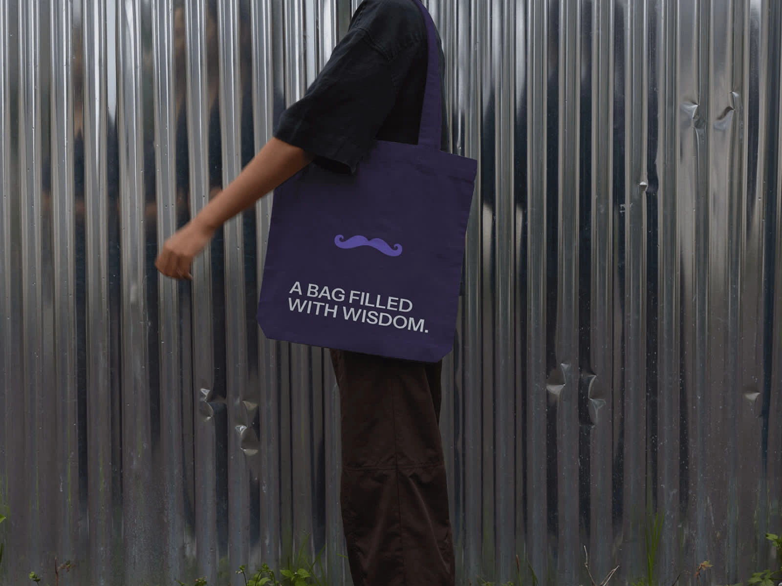
Moustache (Bottles) - Liquor branding
Dries Roef
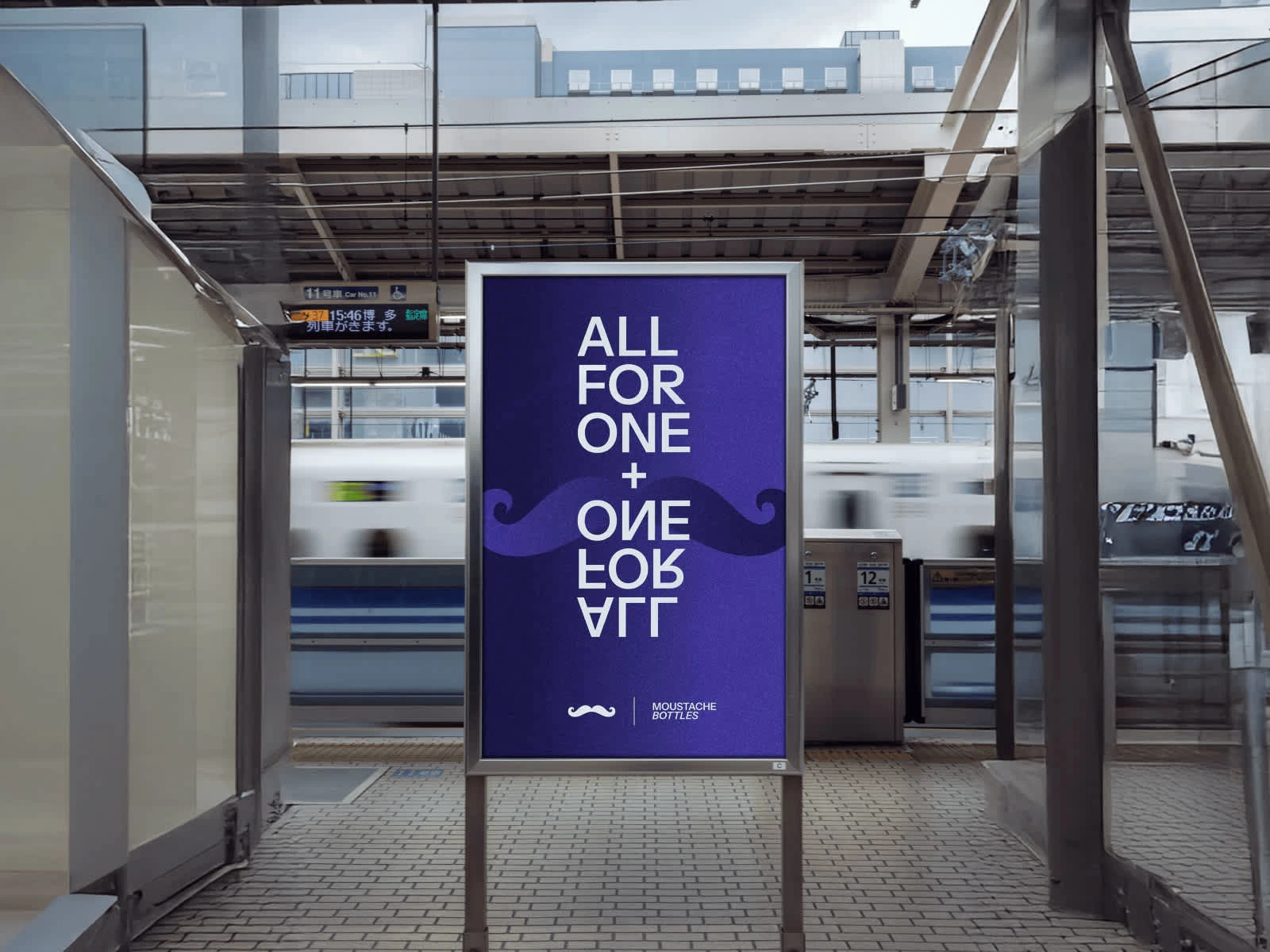
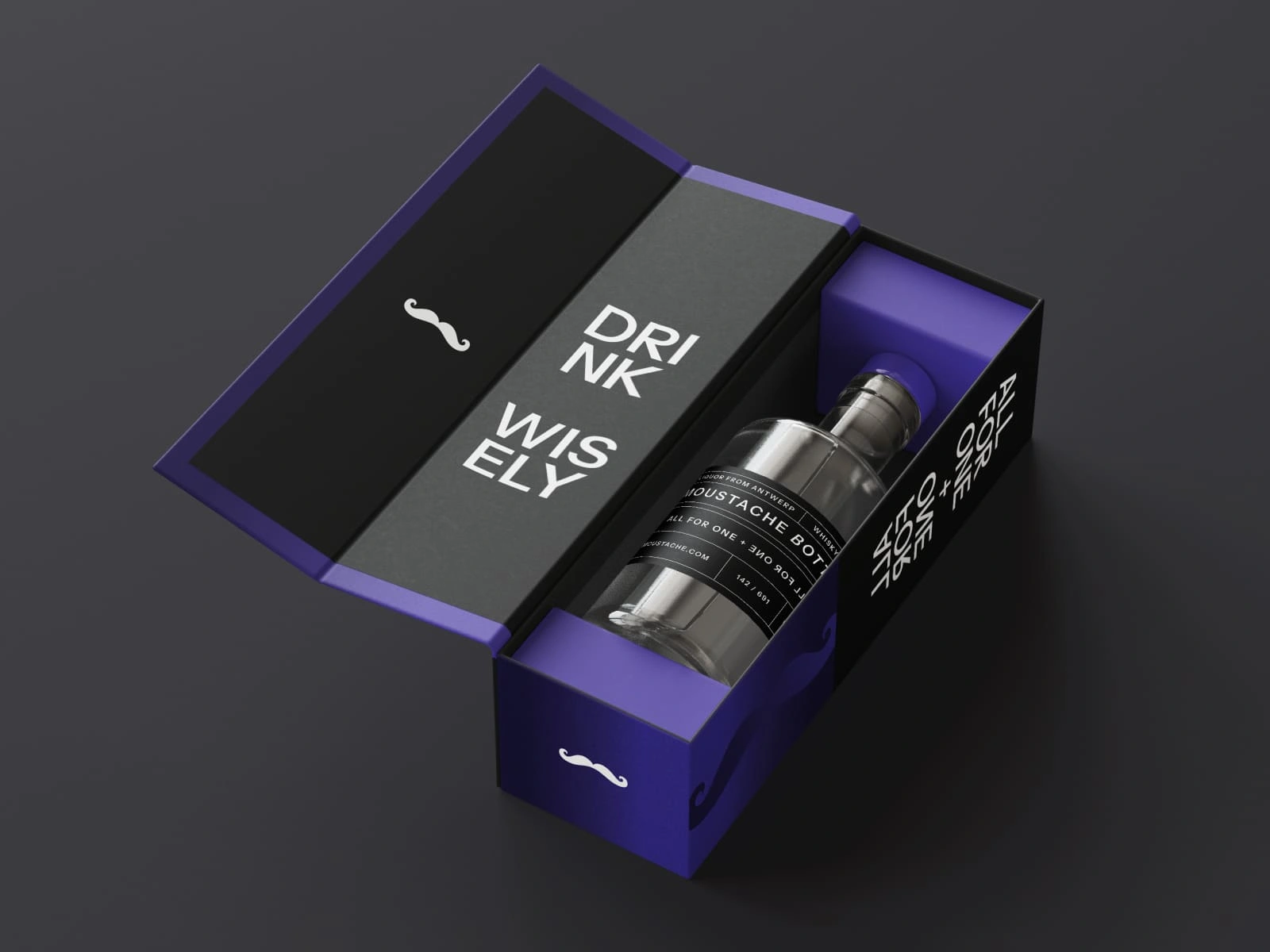
A liquor that embodies the comfort of feeling safe, yet delivers the bold, refined taste of a drink deeply rooted in human connection — the kind forged between people and the places that bring them together. A spirit that doesn’t just sit on the shelf, but becomes part of the story unfolding across the bar.
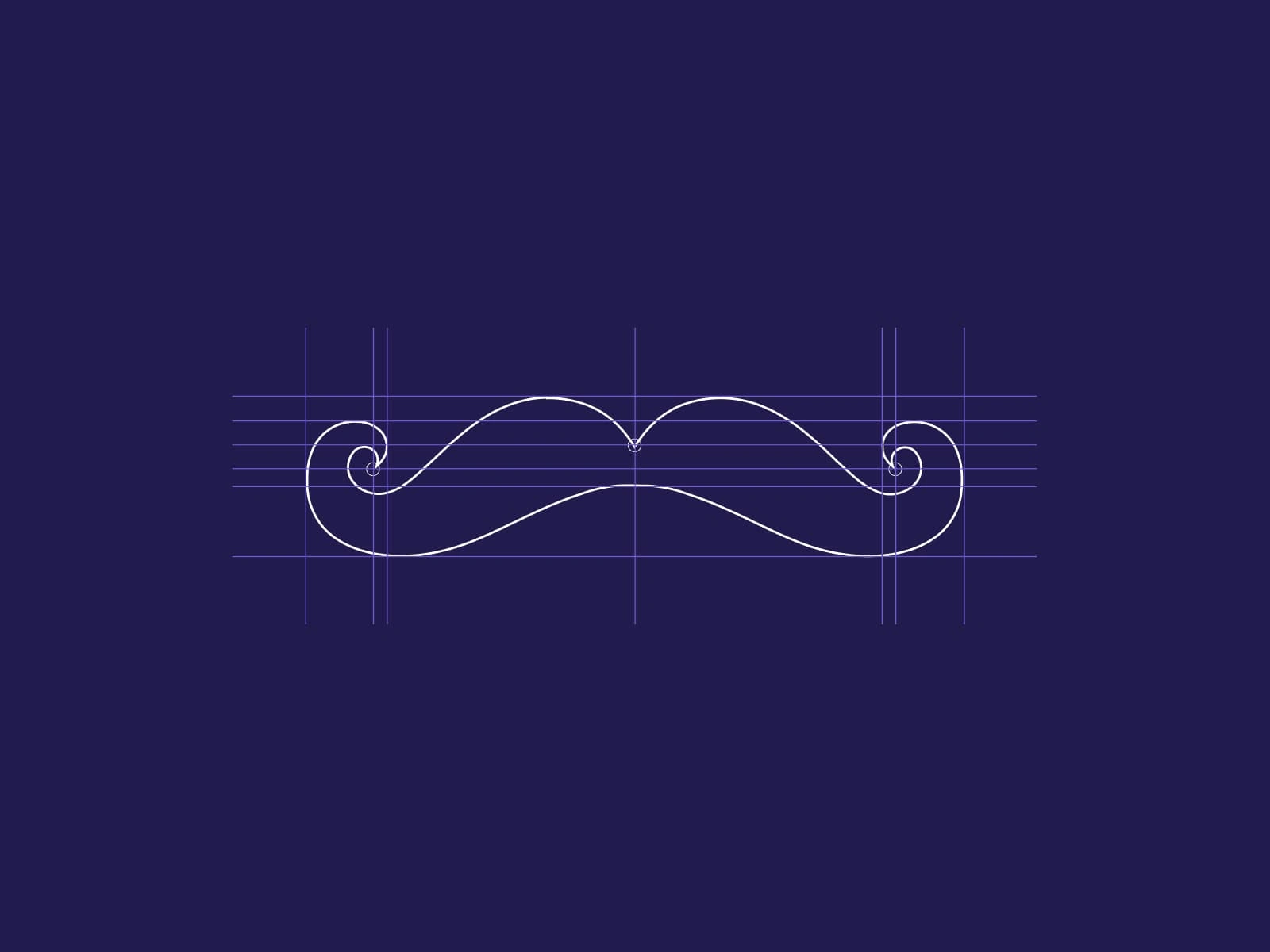
Precision in every curve. The moustache icon was crafted on a custom grid, balancing playfulness with geometric control. At Moustache Bottles, we design every detail with intent.
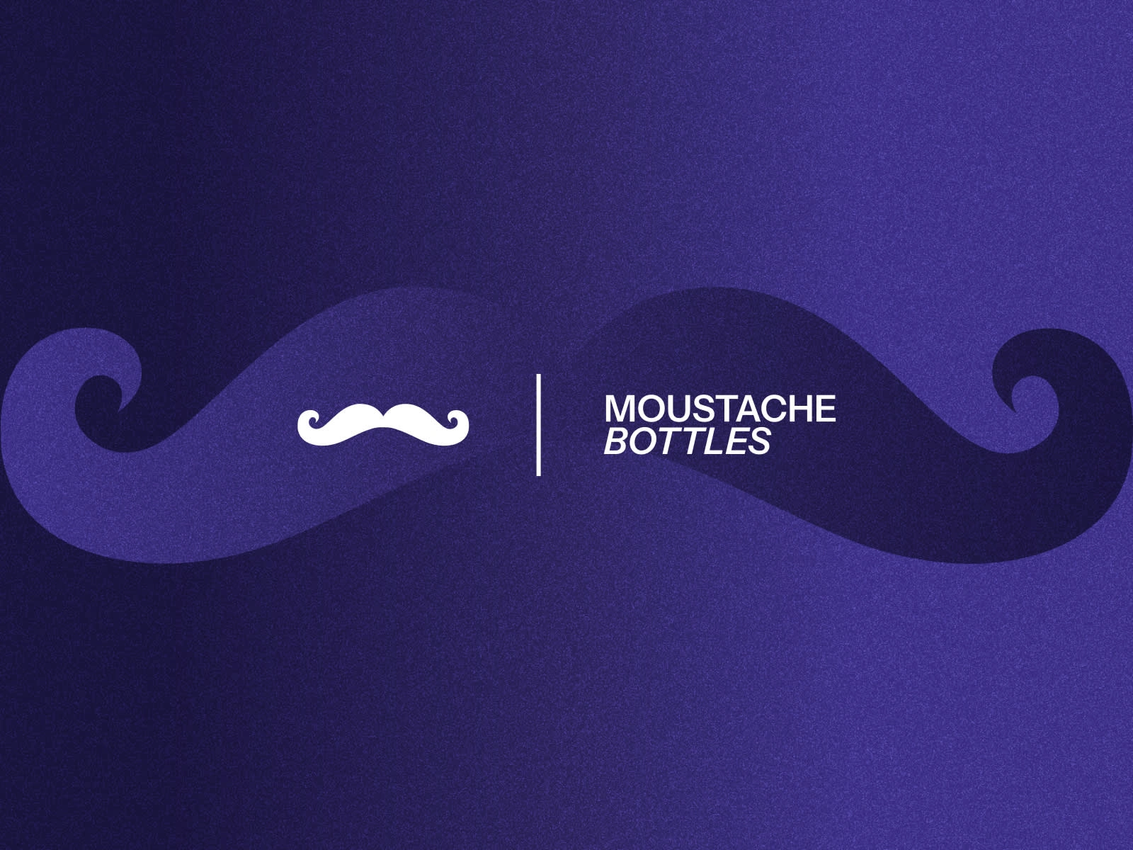
The final logo lockup for Moustache Bottles. A bold logotype paired with our custom moustache icon. Balancing personality and structure, this identity bridges tradition with innovation.
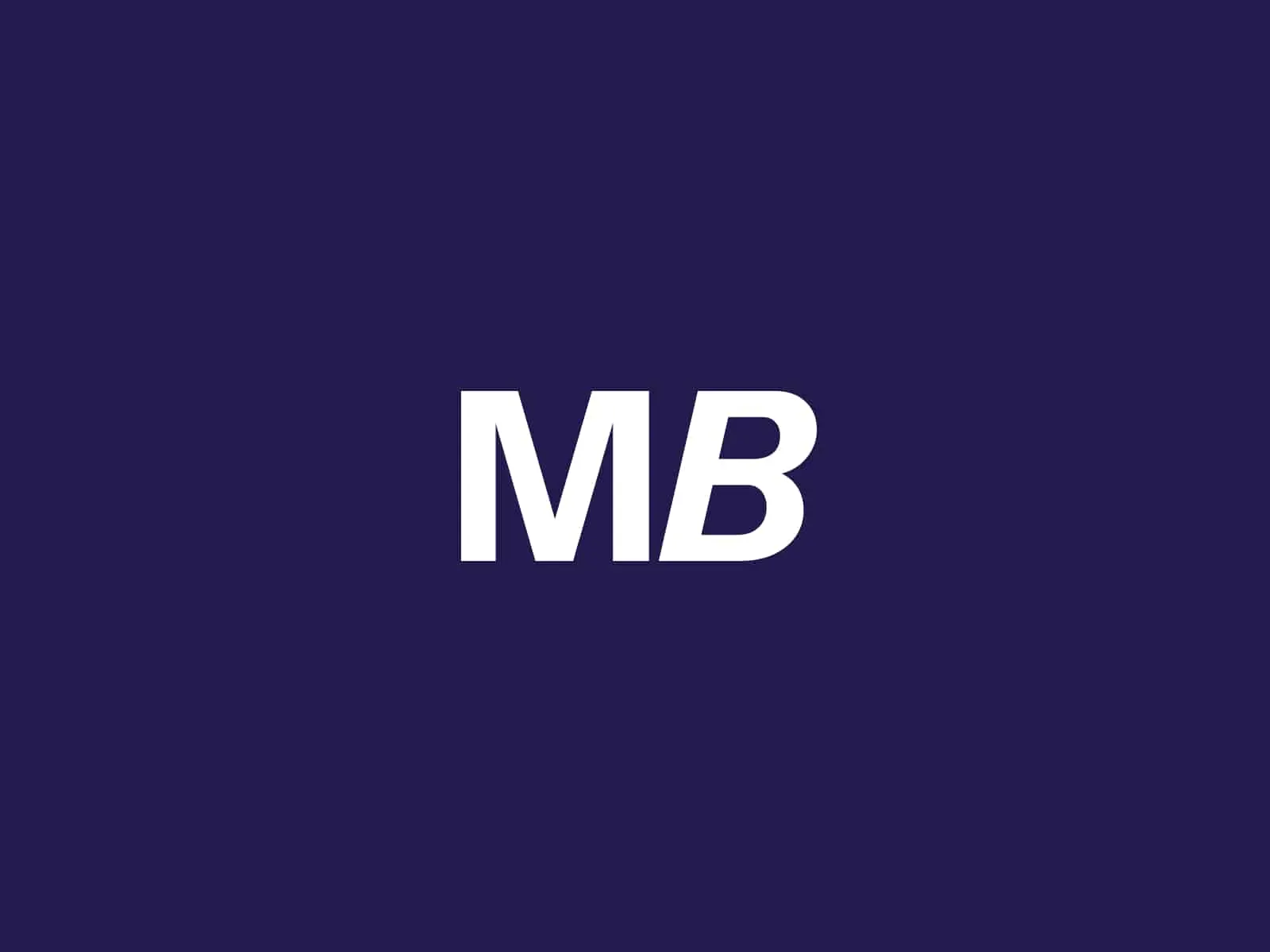
A strong, minimalist monogram that blends elegance and energy. The italic B adds a twist, capturing the brand’s unexpected take on tradition. Designed for recognition and resonance.
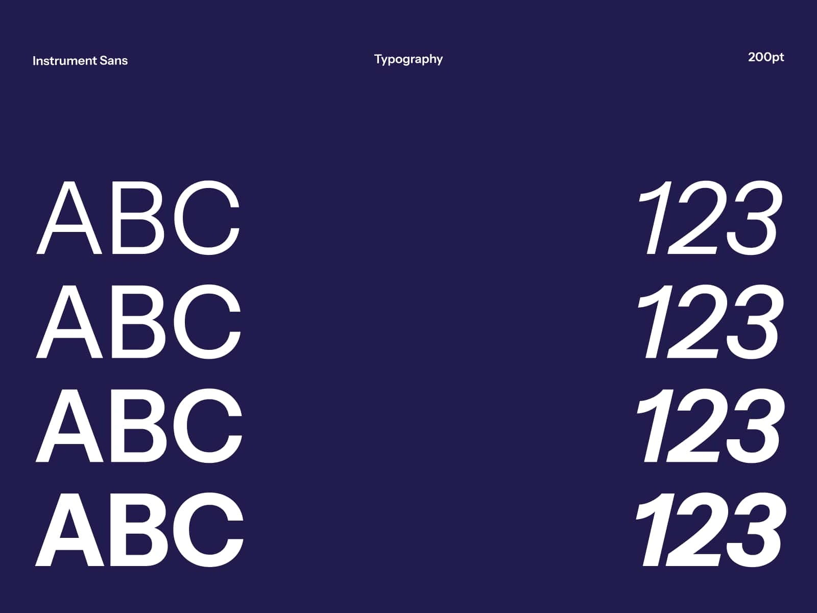
The foundation of Moustache Bottles’ visual language: Instrument Sans. A contemporary sans-serif typeface with strength and clarity, used to communicate flavor without compromise. Typography at 200pt scale—bold yet refined.
Like this project
Posted May 3, 2025
A liquor that embodies the comfort of feeling safe, yet delivers the bold, refined taste of a drink deeply rooted in human connection.