UX research: Pilchuck.com
Carlos Esparza
While I was the marketing manager for the renowned glass art school, Pilchuck, I rewrote and restructured the website, adding features based on my user research.
Role: Web Designer
User Research, Information Architecture, Copywriting, Content Design, JavaScript Development
2014–2015
The first thing I learned about Pilchuck upon joining the company was that it was more than a school, it was a way of life. While it is possible to get a degree in glass art, mostly people learn the craft piecemeal. People might choose to take a workshops with a particular artist at one of various venues worldwide to learn their particular technique, or they might choose based on the experience of the place they study. Or, as is the case with Pilchuck: both.
The immersive 'summer camp for adults' in the woods of northern Washington is an intense experience of living in woodsy dorms and eating, breathing and making glass art. Very few people come to Pilchuck only once, and the most famous glass artists worldwide have all taught there. Dale Chihuly, one of the most famous, started the school in the 1970s. Collectors of his and others' work have been benefactors of the small non-profit since its inception, and they are a community unto themselves. There is a small year-round staff, and then a yearly explosion in summer staff who come to work in the kitchen or as support teams for artists and students in exchange for workshop hours . . . It's kind of like burning man, without (as many) drugs and where everybody leaves with glass art at the end. As a historical site and a tourist draw for glass art enthusiast there is also a yearly flow of people who want to just see what's going on up there. Occasionally some of the facilities were even rented out for events . . .
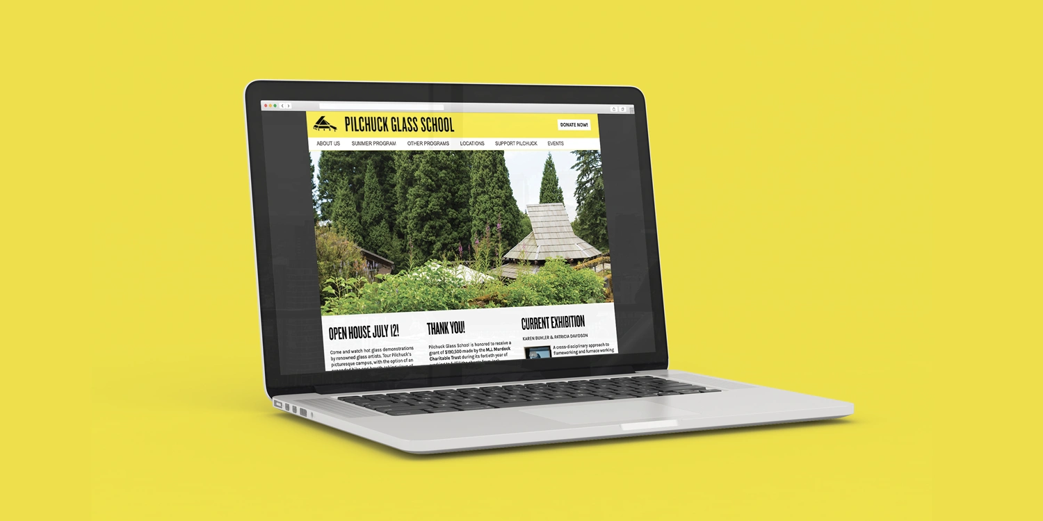
One thing every student, employee, donor, facility renter, and visitor/tourist agreed on was that the website was confusing. There were a lot of different types of users, and a lot of information to convey, but what a visitor to the site found first was as many as 4 levels of dropdown navigation to an overwhelming number of pages with a lot of duplication. Partly due to the nesting, and partly due to the duplication, it wasn't clear where one need to go to find "their" page.
So first I got to work interviewing users from each of the primary groups I had discovered as I got to know the communities interfacing with Pilchuck:
• Donors
• Students
• Artists (applying for residencies)
• Seasonal staff
• Tourists
• Year-round staff
I heard consistent reports in the affirmative that there was a lot of information and much to discover . . . but also consistently heard words like:
Cluttered,
Confusing,
Difficult to use,
Too hard to find basic information,
Easy to get lost,
Unintuitive,
Annoying,
Poorly written
Out of date
I created light personas based on these interviews and forthcoming pain points to build a user flow for each group to achieve their goals in a single click from the navigation no deeper than a 2nd level dropdown menu.
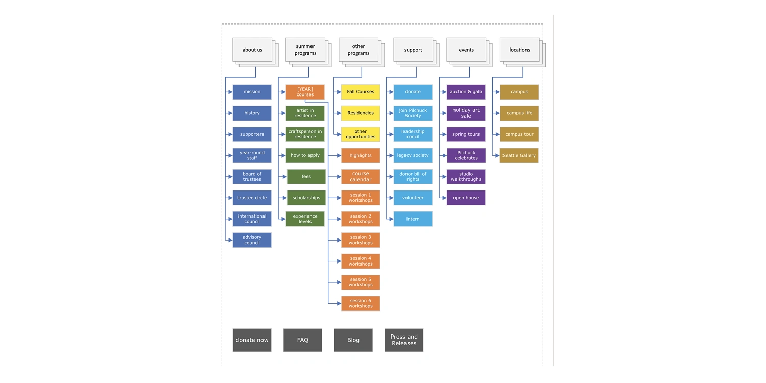
Affinity mapping in Visio led me to a card sort with members of the year-round staff who interface with each of the other public groups that use the website (and who hear from those users on a regular basis). When the dust settled, back in Visio, we had the above information architecture set up. Donate Now gave the donors (a generally older subset of the audience) a quick link that helped the bottom line, where the location of class descriptions for students (a generally younger subset of the audience) was the only element on 2nd tier dropdown menu.
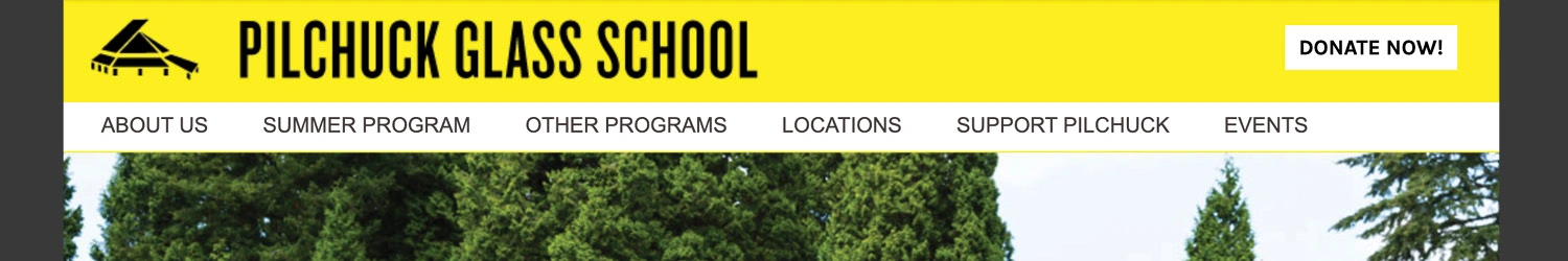
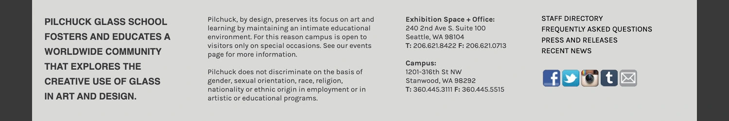
The site had not had a footer navigation before I joined, or a standing primary call to action anywhere on the homepage. Due to popular demand I added a staff directory. Yes for phone numbers. For the purposes of SEO I added an FAQ, blog and online repository for press and our own press releases. These all lived in the new footer, along with addresses (a common phone call for each campus), and some mission+diversity statements.
I conducted user testing with members of the above groups to validate the work and finally heard some positive words about finding one's way around the site and getting things done!
In the decade since completing this project, while the codebase has been updated (goodbye Perl!), much of what I instituted has remained.
Like this project
Posted May 5, 2025
Refined the information architecture and reduced clicks to donate and enroll down to 1 (from 3-6). Part of a marketing plan that increased enrollment by 15%.
Likes
0
Views
7
Timeline
Apr 28, 2014 - Nov 2, 2015
Clients
Pilchuck Glass School