Branding Design: Aziz
Carlos Esparza

In Persian, aziz means “darling”, “dear one”, i.e., the one you love.
Role: Branding Design
Word Mark, Packaging, Content Design, Art Direction, Social Media Design
2023–ongoing
Aziz founder, Saman Maydani, had been making granola for herself and her friends for 9 years before she took it seriously as something she could sell. Her flavors are a mixture of traditional Iranian influences and classic American granola. She came to me with the name she'd recently decided on and a plan to get a website up and into local farmer's markets ASAP.
Goals
Saman knew she needed her branding to be vibrant, friendly, a little mysterious, and she wanted it to include the Persian language mixed in with English. Knowing that a general American audience would be the target market, with and emphasis on farmer's market shoppers was important. I.e., this was not a product for Iranians only. She wanted something with very contemporary styling and a hip, fun feeling.
Font Research
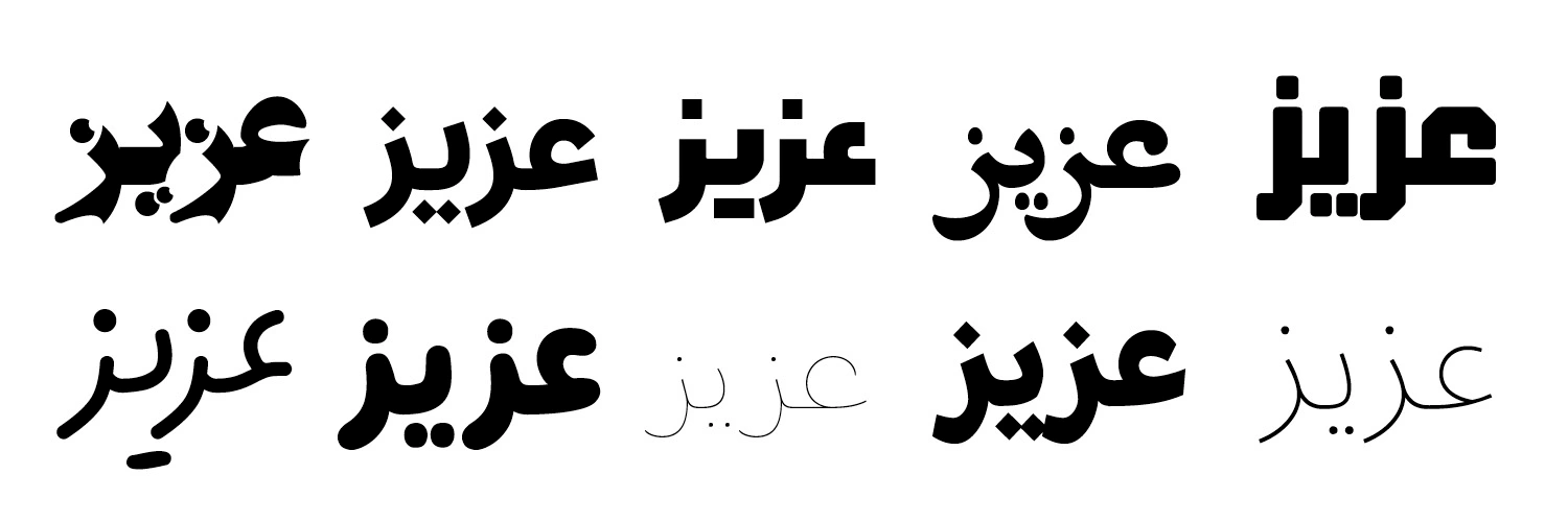
If Persian text in the Arabic script was going to be any kind of a feature of what we made I knew that font would be every bit as important as any used for the English. I've worked a bit with Arabic script over the years, so I knew some research was in order to find something that had some character and had the right kind of friendliness that would translate visually to an english speaking audience. Many that feel modern and fun in Arabic still feel too pointy or ornamental or too much like scribbles to American eyes. We looked through what Adobe had on offer and various examples from Creative Market, etc., and eventually were most drawn to the bubbly roundness of Rabie by Ethar Elaagib.
At this point we weren't sure where the Persian would show up, or how we would create a logo or wordmark. There was talk of having the name only in Persian, or having it as a LARGE design element but not exactly associated with the logo. I argued for having the English name paired with the Persian in most, if not all, instances so the audience would make the connection and understand that this is a product of two world, two languages, and ultimately two people: the baker and nosher.

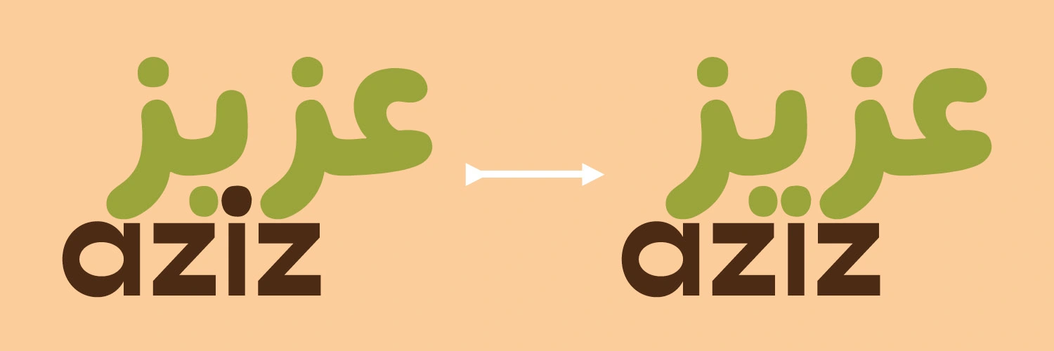
Reading from right to left, the above demonstrates the spelling/which letterform is what sound in Persian.Thinking of those abstract connections between languages and people, I hit upon an idea for how to connect the two iterations of the word . . .

I realized that the lowercase "i" would have a dot above, and represents the same sound as the letter with the dots below in Persian, a perfect place to share a dot! Was it too clever to have the lowercase "i" represent a spoon?
After testing this version a bit I found the spoon idea was not communicating, and I wished to both maintain the connection, but also better separate the words, most likely with color.
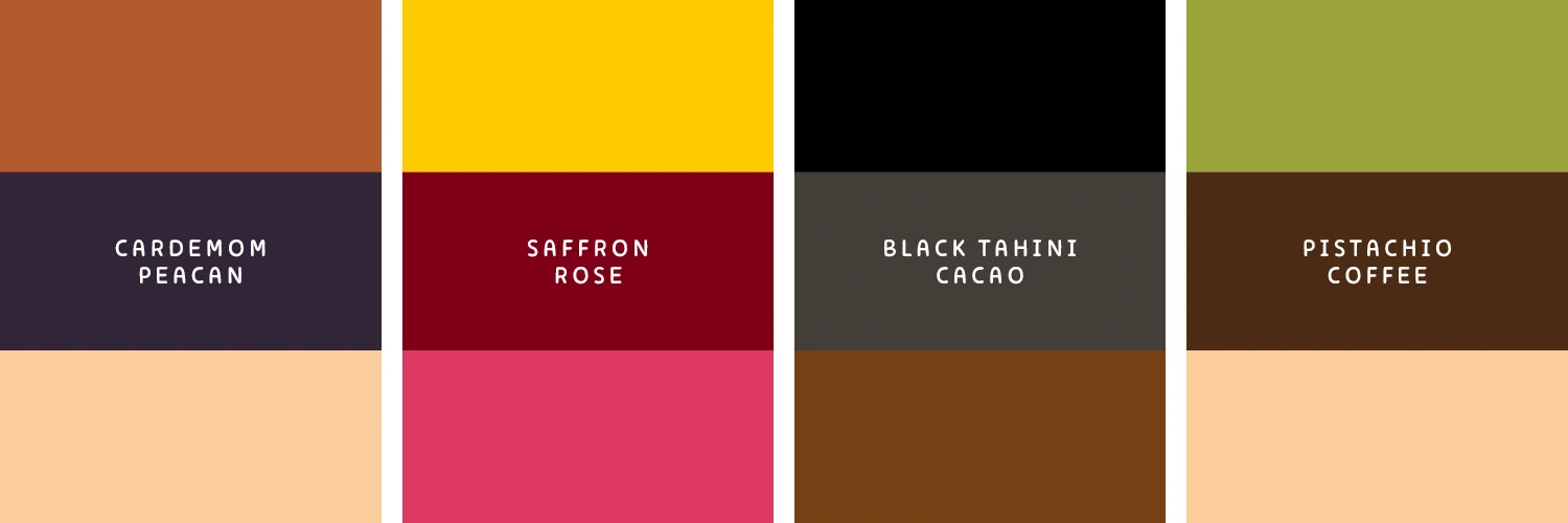
Saman had 4 flavors of granola in the works. She planned to start with just Cardamom pecan and Saffron Rose as 1) a standard pairing of very Persian flavors that are not too out of the ordinary for Western palettes, and 2) a somewhat intense flavor that leans hard on the Persian flavors. The Saffron Rose flavor, she said, was a granola interpretation of Sholeh Zard, a traditional rice pudding that is served for holy days. Tahini and specifically halva are sesame seed products of Iran and the middle east generally. When made from black sesame seeds and paired with cacao it takes on an incredibly rich color and flavor (this was very yummy research). And finally Pistachio Coffee takes two things Persians take as seriously as Westerners take Wine production. Coffee culture in the region dates 800 years or so, and is a big part of the famed Iranian hospitality. There were lots of beautiful colors to be inspired by in the plants and ingredients present in these recipes. Red and pink roses, the yellow dye of saffron. No Pistachio has a singular green, and I tested these endlessly to connote the impression of the nut.
Cardamom and Pecan had the least unique coloring—most of the available colors (nut browns, yellow cardamom flowers, greens of pumpkin seeds) overlapped with marquee colors of other flavors. Eventually we found the deep purple of a cinnamon fruit as inspiration, and a connection to a color of luxury.
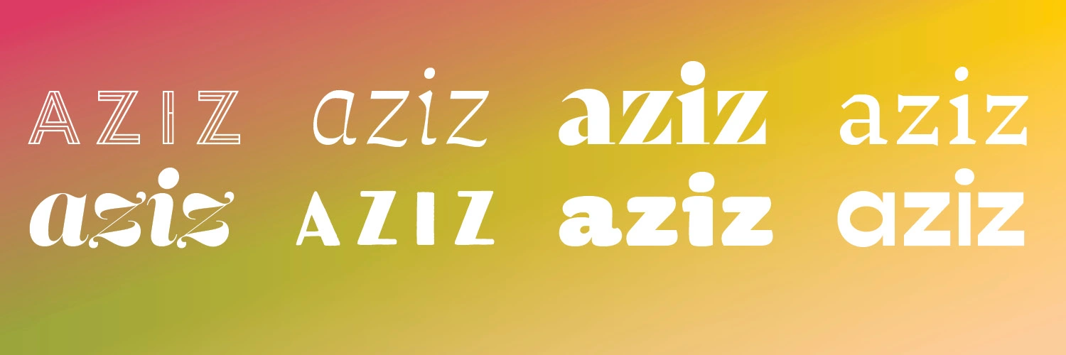
The English Font
We explored quite a few options that leaned into bubbly roundness of Rabie (including the Rabie English characters), some that felt like they held down a more traditional or obviously middle-eastern vibe. Of the fonts explored one stood out for its friendliness and simplicity, and (somehow) character! It was Gopher by Adam Ladd.
The Final Touch
As a part of my freelance practice I make use of a workshop group of trusted designers to offer feedback on works in process. Everybody needs another pair of eyes sometimes. As I was explaining my combination of letters and the sharing of the dot in the "ee" sound of Aziz, I was asked why the Persian didn't get its two dots and let the connection be visual. We know the "i" is connected just by looking at it they reasoned. I realized in that moment that if the design had stayed as it is on the left above, the Persian actually doesn't say "aziz". Looking only at the green letters it says "azbaz".
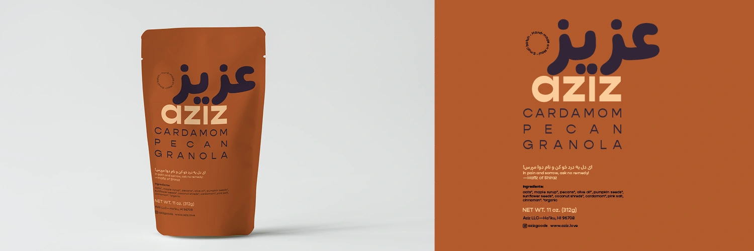
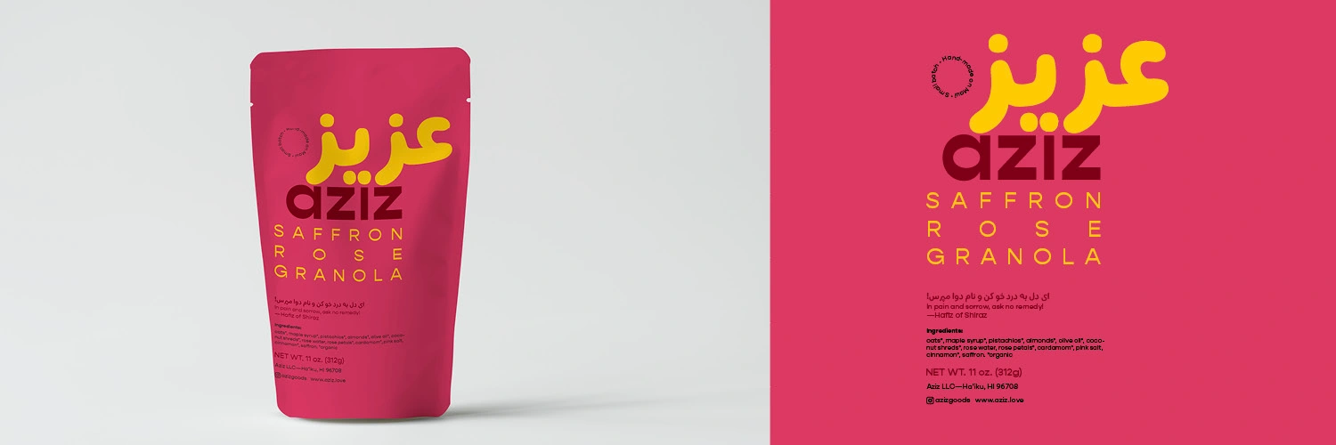
I suggested keeping the package without a window, and without imagery of granola—focusing on the bold colors and Persian to add to the package's luxury feeling.
In addition to the necessary information required for small-batch products (ingredients, net weight, et cetera), Saman wanted the following quote from Persian poet Hafiz of Shiraz, and I was happy to include it. Something poetic and another reference to her country of origin.
ای دل به درد خو کن و نام دوا مپرس
In pain and sorrow, ask no remedy
Like this project
Posted Jun 11, 2025
The client has an easier time getting their product into wholesale accounts due to the stylish brand and packaging. It's also helped them get funding to scale.
Likes
1
Views
13