
Fleen is a marketing studio that turns bold concepts into campaigns built to lift off, scale fast, and deliver real results. They needed an identity that matched that ambition: confident enough to stand next to the brands they build, and memorable enough to work as their own best advertisement.

The Challenge
Building products is getting faster and easier, and marketing studios are everywhere. Brand identity is now what builds trust, creates emotional connection, and makes people remember you. Fleen needed a brand that felt human and optimistic without being generic, and that clearly showed what they do: help ideas get off the ground.
The Idea: Take Flight
The whole identity grows from one simple, universal image: the paper airplane. Everyone has folded one. It’s playful, handmade, and full of possibility, a small idea launched with a bit of intent. That became the core story: Where Brands Take Flight.
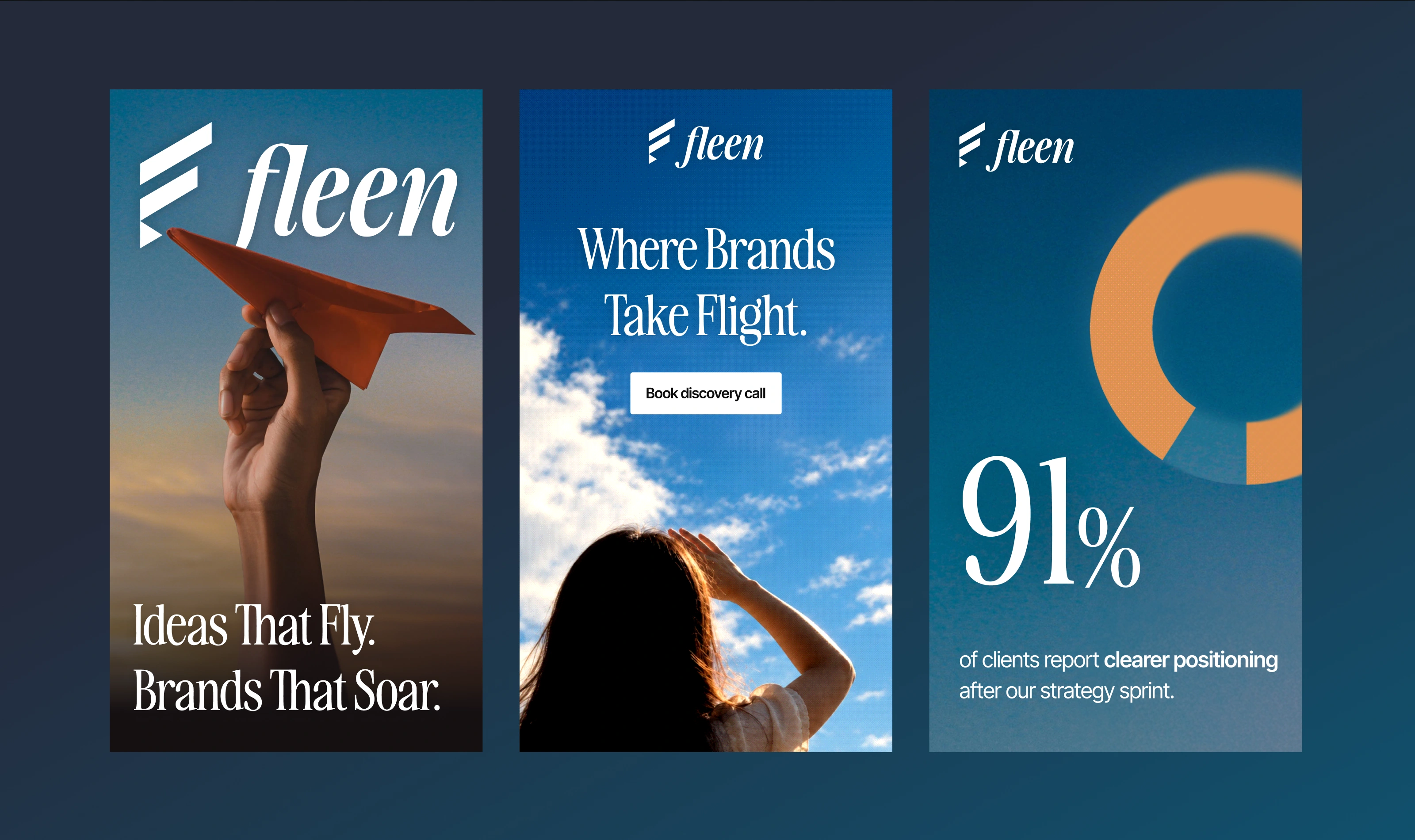
Logo
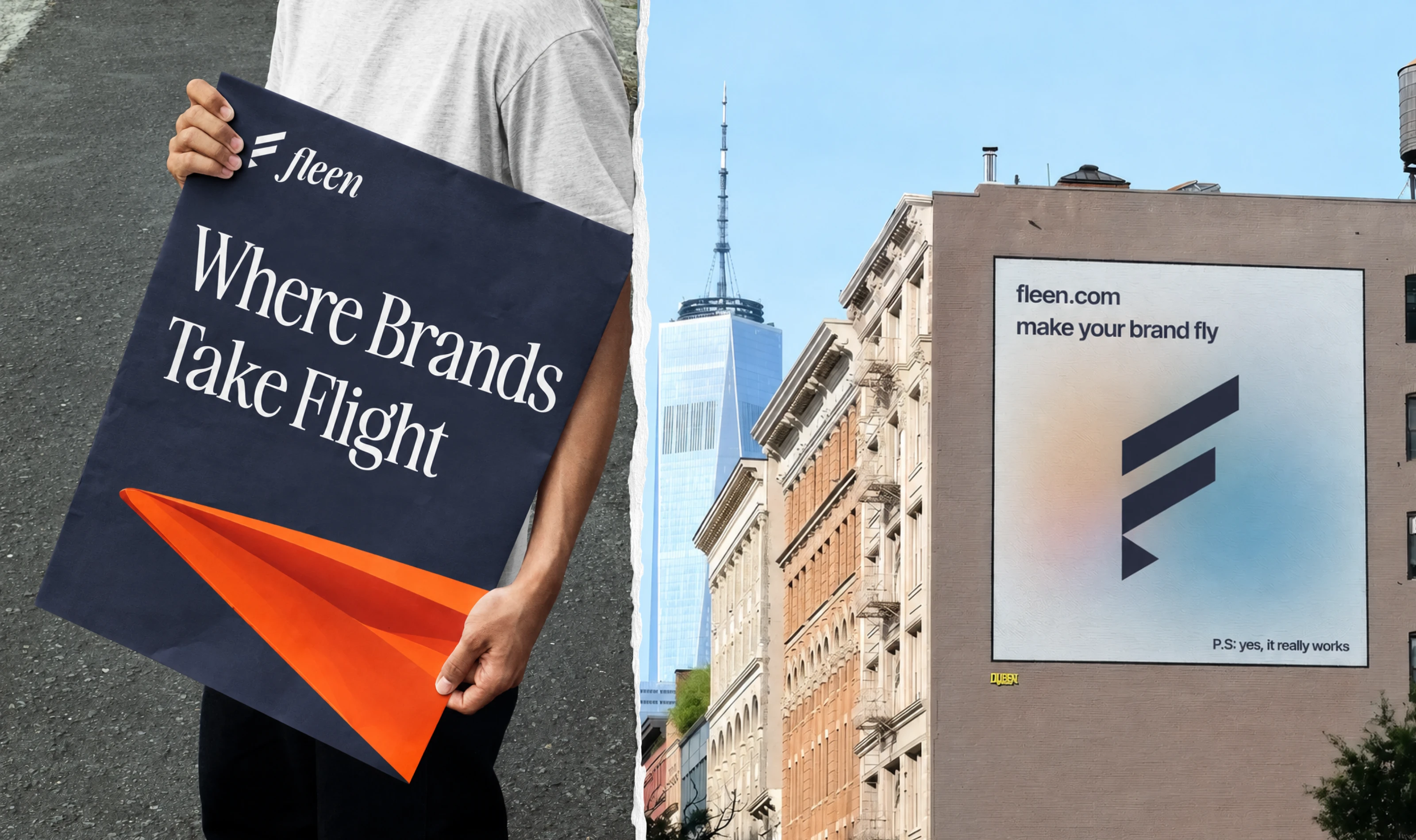
The mark is a stylized “F” built from three angled strokes that rise like wings, ending in a sharp, folded point that echoes the nose of a paper plane. It reads as a letter, a motion line, and a launch all at once, and it works at every size, from a social avatar to a building-scale billboard. It’s paired with an italic serif wordmark whose forward lean adds movement and a sense of craft.
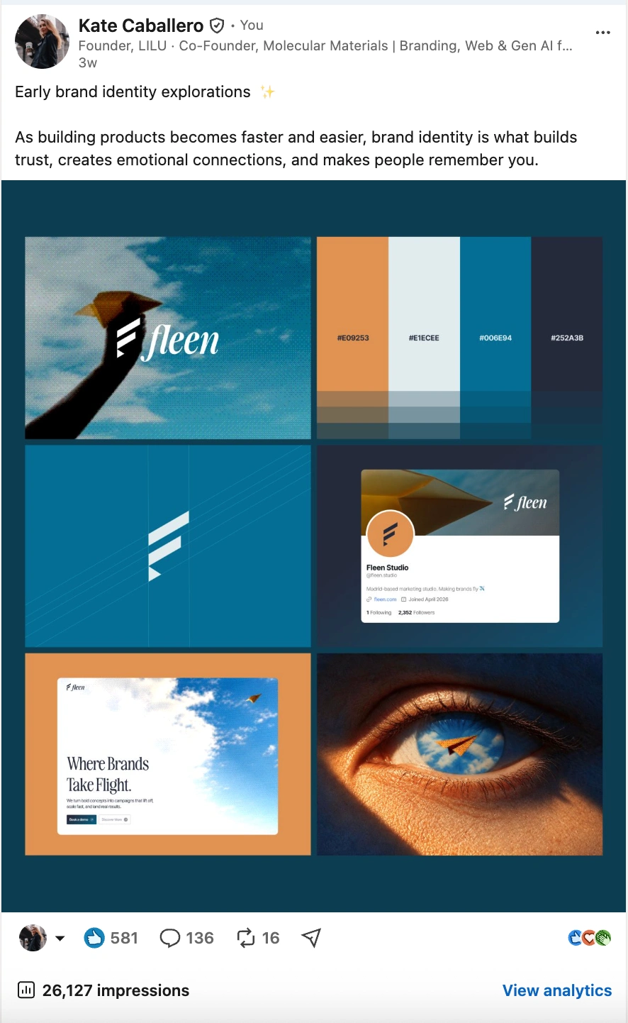
When the early identity explorations were shared on LinkedIn, the work drew over 26,000 impressions, 580+ reactions, and 130+ comments, a strong signal that the concept connected with both designers and founders.
Typography
A refined, condensed serif carries the headlines, giving Fleen an editorial, premium voice (“Ideas That Fly. Brands That Soar.”). A clean, modern sans handles supporting copy, UI, and calls to action, keeping the system practical and readable.
Color
The palette comes straight from the sky at golden hour:
Paper Orange
#E09253: the warm folded-paper accent, gives energy Cloud
#E1ECEE: a soft, airy neutral.Sky Blue
#006E94: the brand’s primary atmosphere.Night Navy
#252A3B: depth, contrast, and seriousness.The warm orange against cool blues creates instant contrast and makes the paper plane the hero of every frame.
Imagery
The photography and art direction follow one rule: always look up. Hands launching planes into open sky, a figure shielding her eyes to watch something take off, and a signature image of an eye reflecting clouds with a paper plane gliding across the iris. Together they frame Fleen as a studio that sees possibility and helps clients reach it. Soft grain and gradient textures keep the system warm and tactile rather than glossy.
0 likes · 0 views · Nov 11, 2026
Fleen is a brand identity for a marketing studio, built around the paper airplane as a symbol of ideas taking flight.


