
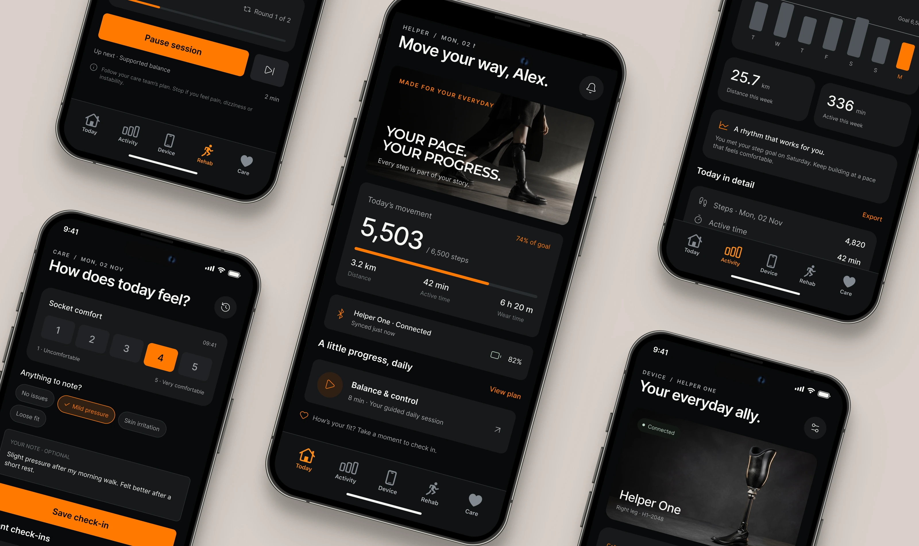
Helper designs advanced prosthetics, from bionic hands to smart lower-limb devices, along with the digital tools that support people in everyday life. The company needed a brand that matched the quality of its engineering while speaking to people as people. The goal was to treat users as individuals living full, active lives, not as patients or cases.
The Challenge
The prosthetics category often feels clinical. Medical blues, stock photos of rehab rooms, and spec sheets can leave users feeling defined by their limb loss. Helper wanted the opposite: a brand with the confidence of a premium tech product and the warmth of a trusted companion. It also had to work across the whole user journey, from a first fitting to years of daily use, in both physical and digital touchpoints.
The Idea: Motion, Returned
The identity is built around one promise: We bring your motion back. Every element is designed to feel warm, alive, and moving forward. The brand’s voice stays personal and encouraging, with lines such as “Your pace. Your progress.” and “Move your way.” Progress is framed as something the user owns, not something measured against a standard.
Logo
The symbol is made from soft, organic shapes that come together into an abstract figure in motion. Read another way, it also forms a stylized lowercase “h.” The rounded forms suggest limbs and joints working together, and a single orange dot acts as the spark, a point of energy and life at the center of the mark. It’s paired with a clean, modern sans-serif wordmark that keeps the system calm and accessible. The orange dot carries through the brand, including the orange full stop in the tagline.
Typography
A neutral, highly legible grotesque sans handles everything from headlines to app UI. It’s friendly at large sizes and clear at small ones, which matters for a product used every day by people of all ages. For editorial moments, letter-spaced uppercase labels add a precise, technical layer that reflects the engineering behind the product.
0 likes · 0 views · Nov 12, 2026
A warm, human identity for a prosthetics company that helps people get their motion back.


