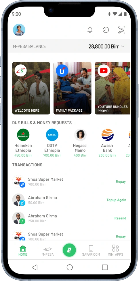
The M-PESA Ethiopia Homepage
Abel Tegafaw
Here is where
Everything started...
It was a typical day in the M-PESA office on February 26th, one of those days you can almost see the stress in the air. I was two months into my role as a product designer, tasked with leading UI and UX design for M-PESA. As I sat at my desk, probably daydreaming about user flows and clean interfaces, the Consumer Product Lead and the Digital Financial Service (M-PESA) Chief appeared on my desk with a mission.
"Just got out of a meeting,” the Product Lead began, looking like he hadn’t slept in days, “and the Chief here isn’t thrilled with the homepage of the M-PESA super app. Can you whip up some proposals for the agency?” The Chief nodded, looking at me like I was a wizard who could conjure up perfect designs out of thin air. “Yeah, it needs to be beautiful and fit the Ethiopian market better. Do your magic.
I nodded confidently, even though inside I was already imagining a night without sleep. “Sure, let me see what I can do,” I replied, then casually asked, “What’s the timeline?” The Product Lead smiled—a smile that screamed trouble. “You have until tomorrow.”
“Tomorrow?” I echoed, feeling my heart skip a beat. “Really?”
“Yeah, yeah,” he said, with the nonchalance of someone ordering a coffee, not requesting a design overhaul in 24 hours. For context, our super app was designed and developed by a European agency. And here I was, expected to pitch a revamped proposal to these design gurus in less than a day. No big deal, right?
The Product Lead and I had a history. We often clashed over the correct spelling of M-PESA. In my second week, while working on a product called UBP, I was crafting visuals for a landing page that read, “Welcome to M-PESA, world of payment convenience.” Suddenly, I heard a voice booming behind me, “Spell M-PESA correctly! It’s all caps and hyphen!” That was our first interaction. Since then, we’ve had regular spelling battles. Once, he even threatened, “I’ll get a tattoo of M-PESA’s spelling and make you look at it every day.”
Back to the present crisis. Design isn’t always a straight path; it’s more like a chaotic journey. With the clock ticking, I dived into some quick research. The Product Lead suggested looking at benchmarks like MTN Momo, Airtel Money, and other African mobile money services, as well as Monzo, Revolut, and Wise from Europe. I asked the obvious question: “What are we trying to achieve with this new homepage?”
The answer was clear: “Drive transactions and highlight key features of the product.” Simple enough, right? Wrong. We were in launch mode, which meant no new features could be introduced. I had to work with what we already had, like trying to make a gourmet meal with just instant noodles. Armed with caffeine and a playlist of motivational music, I started my design marathon. element, had to scream both “modern” and “Ethiopian.”
With the clock ticking and a coffee-fueled frenzy, I dove into redesigning the M-PESA homepage. Here’s a glimpse at the playful journey of Process and creative sparks that followed.
Buckle up, I hope it’s going to be fun!
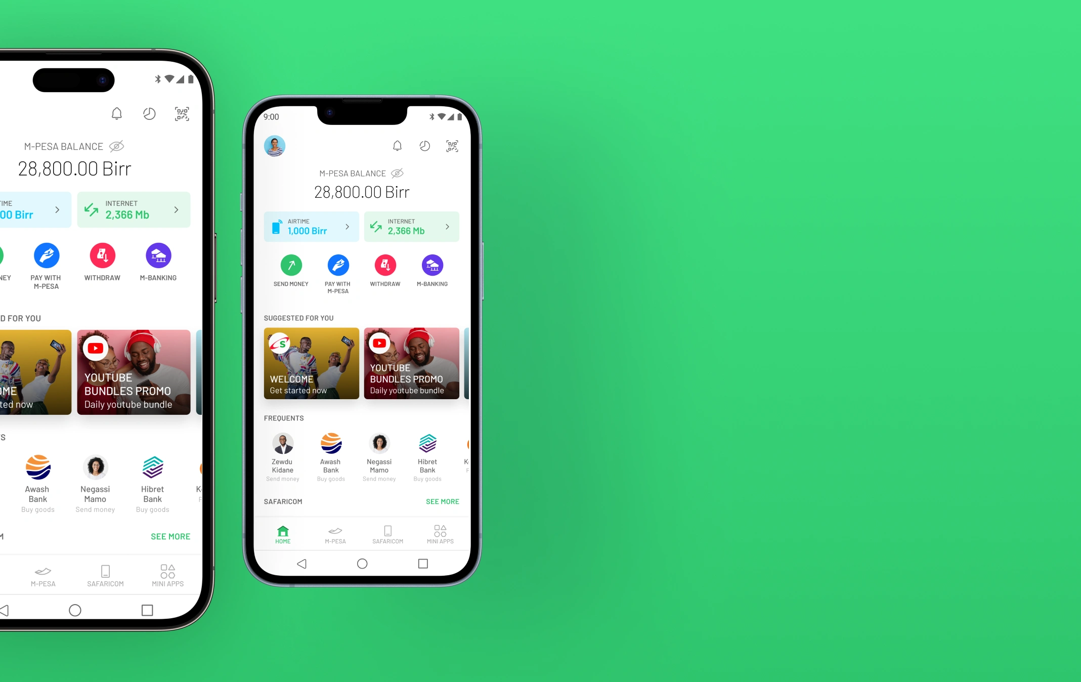
The Initially Existing Design
Problem
Identification
Problems Identified
As I sat down to dissect the existing M-PESA homepage design, I was armed with caffeine and a desire to channel my inner detective. It was time to play Sherlock Holmes, except instead of solving crimes, I was about to tackle some design dilemmas. What could possibly go wrong?
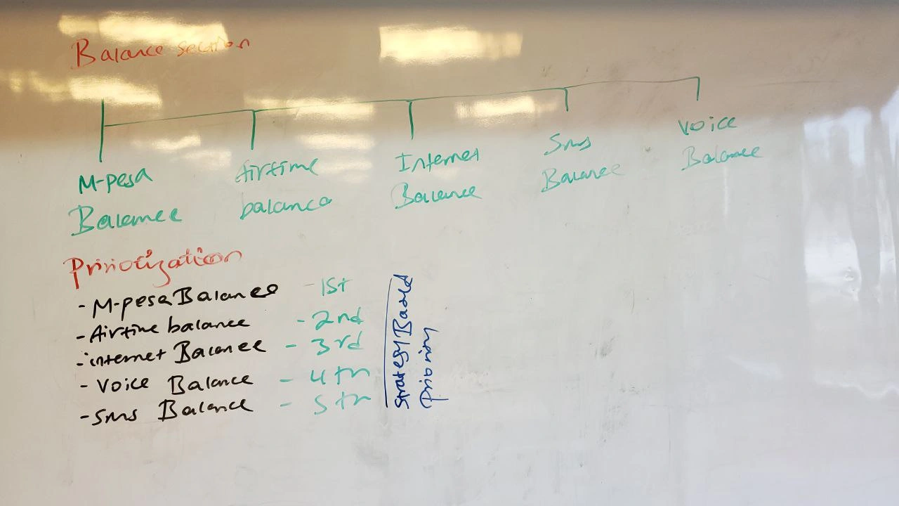
The Dull Balance Display
First up, the balance section. Honestly, it looked as exciting as watching paint dry. It needed a splash of vibrance—something that would make users feel like they were carrying more than just a boring number in their pockets. After all, your balance should spark joy, right?
Features but No Action
Next, I noticed that while the homepage boasted a buffet of features, it felt like a fancy restaurant where you couldn’t order anything. Users were left staring at a delicious menu with limited actions. We needed to turn this feast into a hands-on experience where users could dig in!
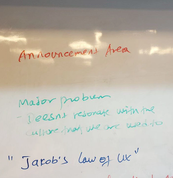
Announcement Section’s Identity Crisis
Then there was the announcement section, which had aspirations of being trendy with a "Stories"-like feature. But let’s be real it was like wearing last season's fashion. The entry UI didn’t resonate with our users; it was like trying to sell winter coats in the Sahara. We needed relevance, not redundancy!
Frequent Actions in the Wrong Direction
Frequent actions? Yes, please! But not in the way it was presented. It felt more like an annoying pop-up than an exciting opportunity. Users should be driven to take action, not just reminded of things they could do. I aimed to transform it into a fun and engaging feature rather than a nagging reminder.
GSM Features—Shining but Not Blinding:
The GSM features were like that friend who tries to steal the spotlight but ends up overshadowing everyone. They were well-highlighted, but we needed to integrate them smoothly into the overall experience, making them essential companions rather than mere distractions.
Cultural Relevance and Accessibility The Missing Pieces
Lastly, we had cultural relevance and accessibility, which were akin to a jigsaw puzzle with missing pieces. The design didn’t quite capture the vibrant essence of Ethiopia, and accessibility felt more like a checkbox than a priority. We needed to paint a picture that resonated with the local culture and was usable by all.
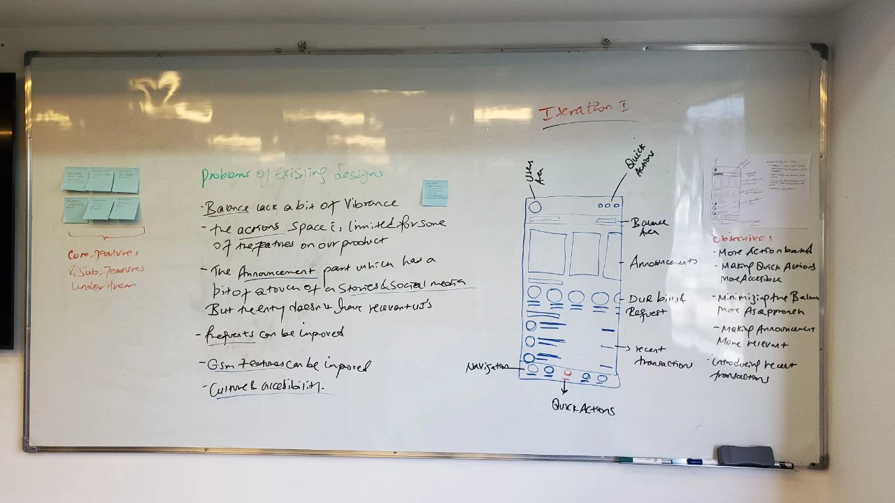
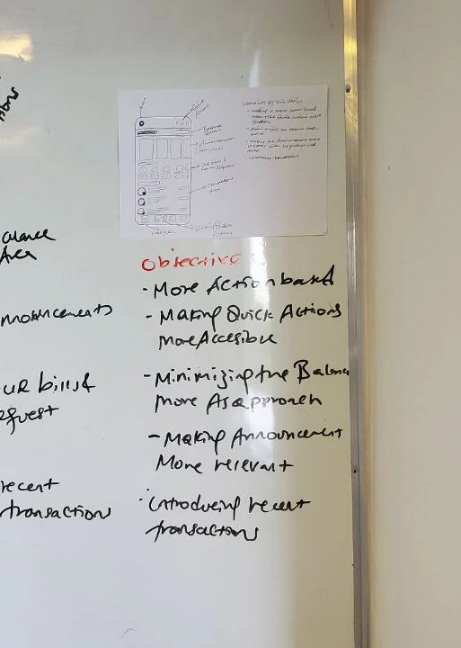
Iteration 1: Less Fluff, More Action
Iteration Objective
Driving more Transactions and actions through our Homepage
Making Quick actions more accessible
Minimizing the balance area more as an approach
Making Announcement more relevant
Introducing recent transaction
Next Stop: The Feature Breakdown
(A.K.A. 'Let’s Put Things Where They Belong')
As I pored over my initial sketches, sipping on my fifth cup of coffee, something became clear: this app needed some serious organization. You know how when you're cleaning your room and find random things that don't belong together—like a sock in your kitchen drawer? That’s exactly how the features felt—useful but scattered.
FEATURE CATEGORIZATION AND LIST
P2P ACTIONS: Send Money, Request Money, Send To Many, Scan to Send (QR)
BUY AIRTIME & PACKAGES - GSM: For Myself, For Others, Buy Different Packages
MONEY WITHDRAWAL: Agent Withdrawal, ATM Withdrawal, QR-Based Withdrawal
PAY WITH M-PESA & SEND TO BANK - P2B: Business Number, Scan to Pay (QR), Send to 17 Banks, Utility (Future)
As we lay it all out—our heroic categorization of features—we’re beginning to see the heartbeat of the app: P2P actions, buying airtime, and withdrawing money all come together like old friends at a table. And now, we add more fuel to the fire with Pay with M-PESA and Send to Bank, where your finances flow as smoothly as your morning coffee. These features aren't just lifeless tools; they’re extensions of your daily life, simplifying, streamlining, and sometimes even saving the day.
At the end of it all, we're not just building an app, we're crafting an experience that listens, learns, and grows with every tap. This is not about transactions—this is about connections. This is your M-PESA, only better.
Now, its the time to
craft each and every section
We're excited to dive deep into each section, crafting every detail to ensure our design is both functional and engaging.
Starting From
the balance Area
as we have mentioned in the objective on this iteration our approach would be Minimizing the balance area more as an approach and making it more interactive
Started with making analysis and breakdown of the balance section
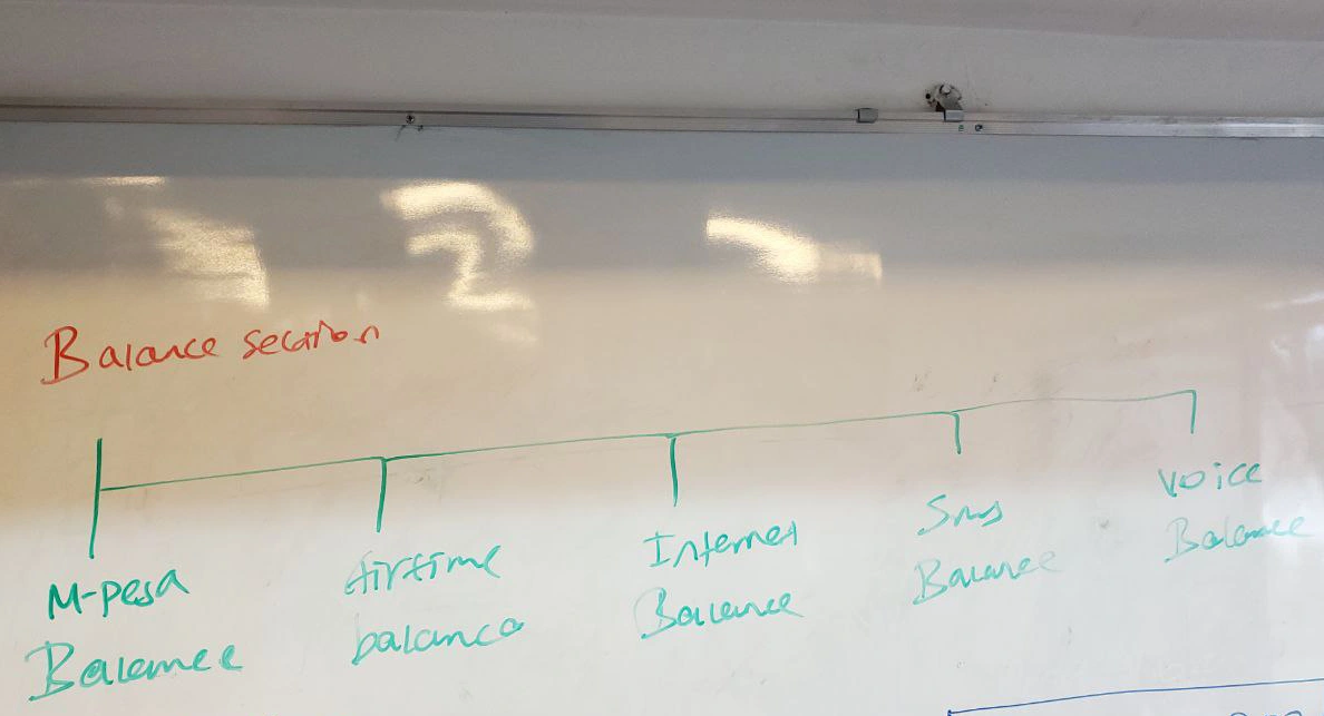
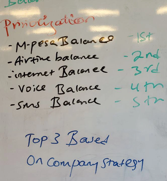
priority list & catagory
As we dive into the exciting world of crafting our app, we’ve uncovered five crucial balances that keep our users in the loop: M-PESA Balance, Airtime Balance, Internet Balance, SMS Balance, and Voice Balance. However, in our quest to simplify and enhance the user experience, we've decided to put the spotlight on three rock stars: M-PESA Balance, Airtime Balance, and Internet Balance!
Why these three? Well, Airtime is like the fuel for our users’ social engines, while M-PESA Balance is the lifeblood of their transactions. And let’s not overlook the Internet—our customers are raving fans because of the quality service we provide, and we want to keep that momentum going! By showcasing these top three balances, we’re not just throwing numbers at our users; we’re connecting with them and celebrating what really matters. Get ready for a balance experience that’s not just functional but delightful!
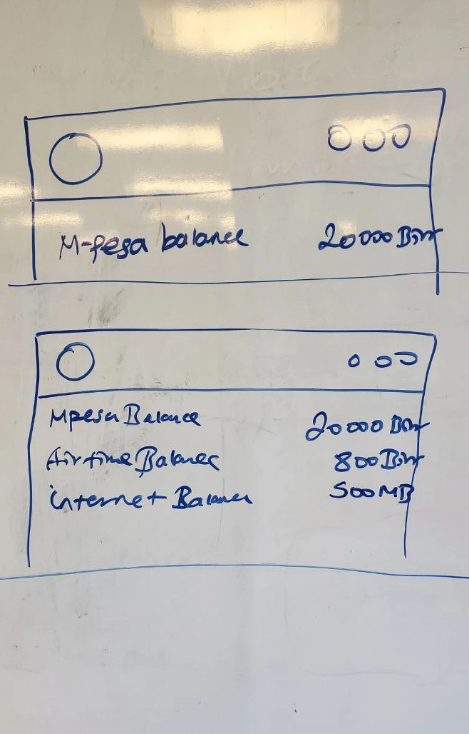
Moved to sketching things up
Alright, team, we’ve rolled up our sleeves and dove into sketching the balance section! After a whirlwind of brainstorming and a few caffeine-fueled moments, I’ve landed on a design that look strikes a chord.
This sketching phase is where our ideas start taking shape, transforming abstract concepts into something both functional and visually appealing. So, let’s get ready to bring these sketches to life, turning our vision into a seamless experience that makes managing balances a breeze!
Next Up : The announcement AND DUE BILLS section
It’s time to sprinkle some magic on those sketches! Let’s make this vision a reality. We’ve officially passed the baton from sketching to designing the user interface and crafting seamless interactions.
Next Up : The announcement AND DUE BILLS section
Thoughts for the section
we have the announcement section—a space where we keep our users informed about the latest updates, promotions, or relevant news. But this isn't just a bulletin board. It's more than delivering information; it's about making sure users feel engaged, connected, and in control. We want them to spot important announcements effortlessly, without breaking their stride or getting lost in a maze of text. The challenge here was to craft a space that feels not only inviting but also naturally integrated into their overall experience on the app.
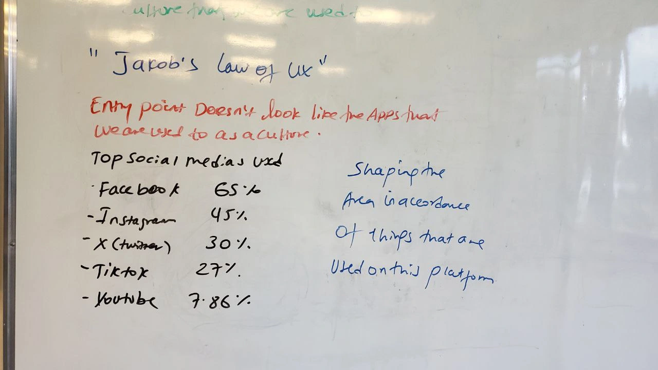
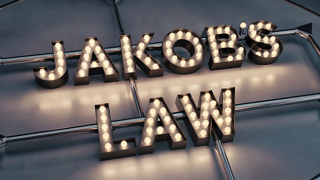
Well, Jakob's Law of UX has our back here: users spend most of their time on other sites, so they expect our platform to work in a way that feels consistent with what they already know.
Going to due bills Section
Going to due bills Section
By aligning with patterns they’ve already mastered, we ensure the announcement section not only captures attention but also fits right into their flow—smooth, seamless, and relevant. Oh, and by the way, I had the pleasure of being interviewed by none other than Mr. Jakob Nielsen himself! During our conversation about UX in Africa, he was genuinely intrigued by how we’re adapting his principles to this unique market. It was a great moment, reinforcing just how essential it is to balance innovation with familiarity.
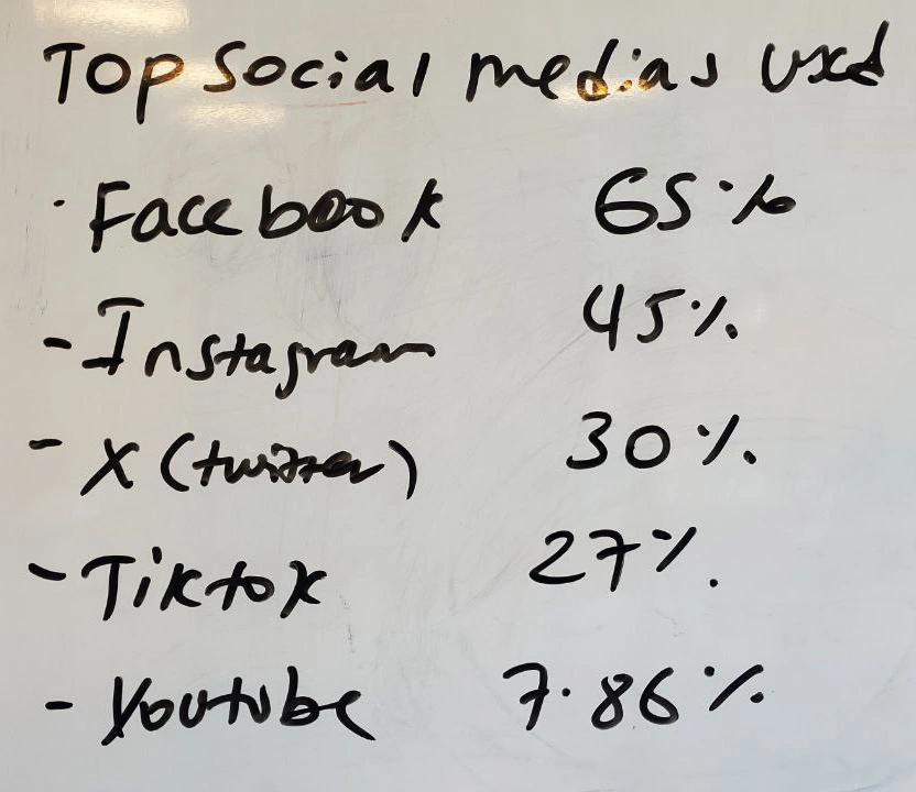
as we see the data of Platform usage in ethiopia we have tried too mimic the story and shorts area of these platforms that have a common kind of UI and information in it
Lets move to the sketch and that sprinkle
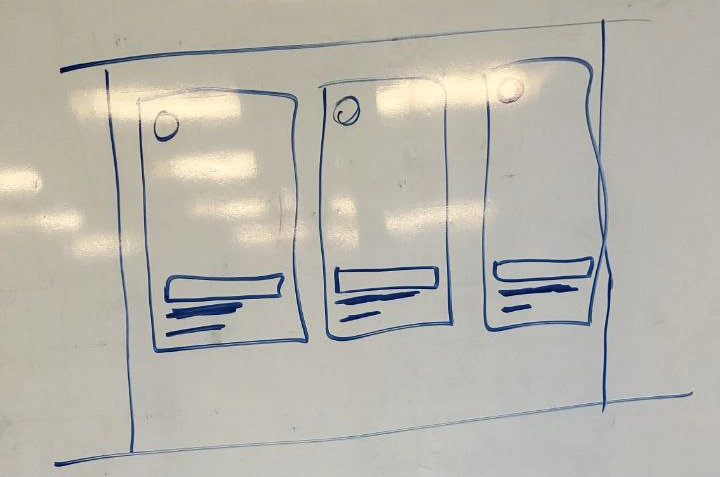
Going to due bills Section
Going to due bills Section
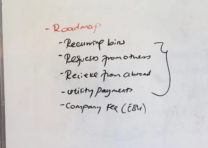
Rough roadmap walkthrough
Recurring Bill Payment
Money Requests from others
Recieve from abroad
Utitlity Payment
Company Business Payment
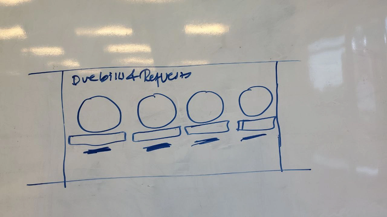
Moving up: to the recent transactions
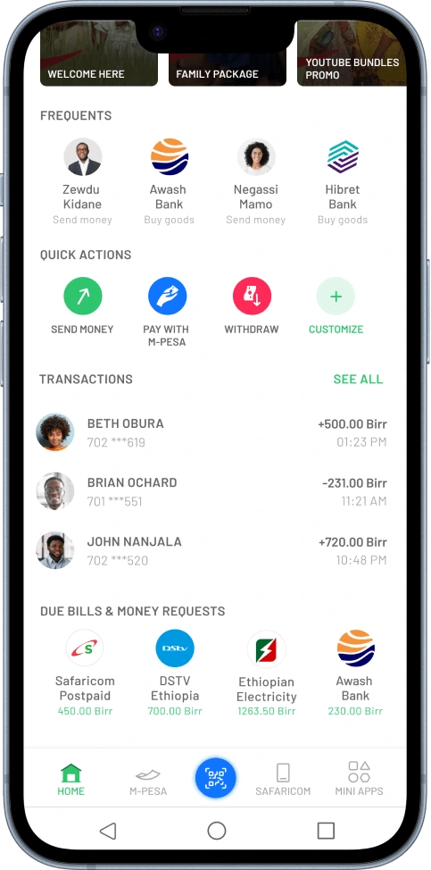
Now that we’ve wrapped up the announcements, it’s time to dive into the Due Bills section—never the most exciting, but we’re making it as seamless as possible. By surfacing all your pending payments, like utility bills, internet subscriptions, and requested money, we’ve made sure they’re all neatly organized in one spot. And the best part? With just a few taps, they’re handled—no stress, no hassle.
As you can see from the design beside, the Due Bills section is clean, intuitive, and built to make paying bills feel effortless.
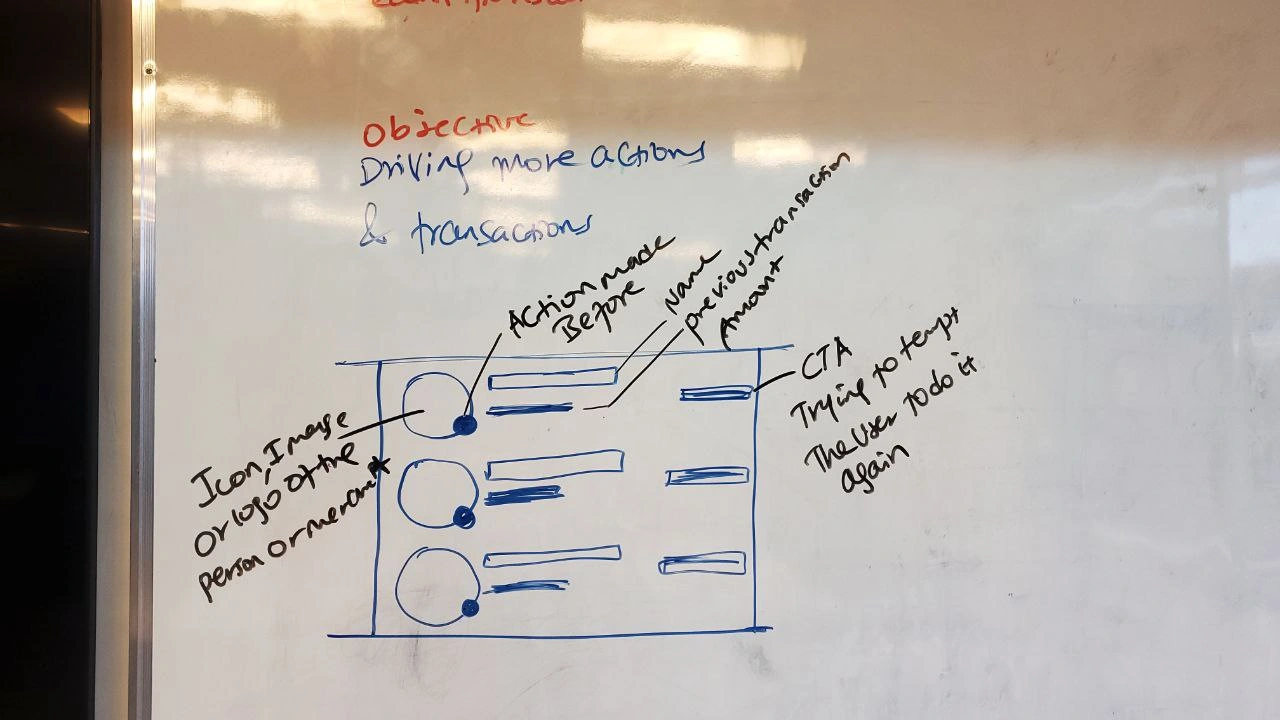
Moving up: to the recent transactions
Let’s talk about the Recent Transactions area, where we blend ease and action. First, it's like a personal log for our users—showing them a clear, no-nonsense history of their latest transactions. It’s a bit like scrolling through your favorite playlist, but instead of songs, it’s a neat list of everything you’ve done with your money. Familiar, reassuring, and right where you need it.
Now here’s where it gets even better: a "redo" button that’s basically the VIP pass to repeating past transactions in a heartbeat. Sent money to a friend last week? Need to pay that bill again? Boom, one tap, and it’s done! We designed it to keep things as smooth as possible, driving more transactions without any hassle. It’s like we’re giving users a little nudge to make their lives easier and we’re all about that!
Here is the design for the recent transaction area beside
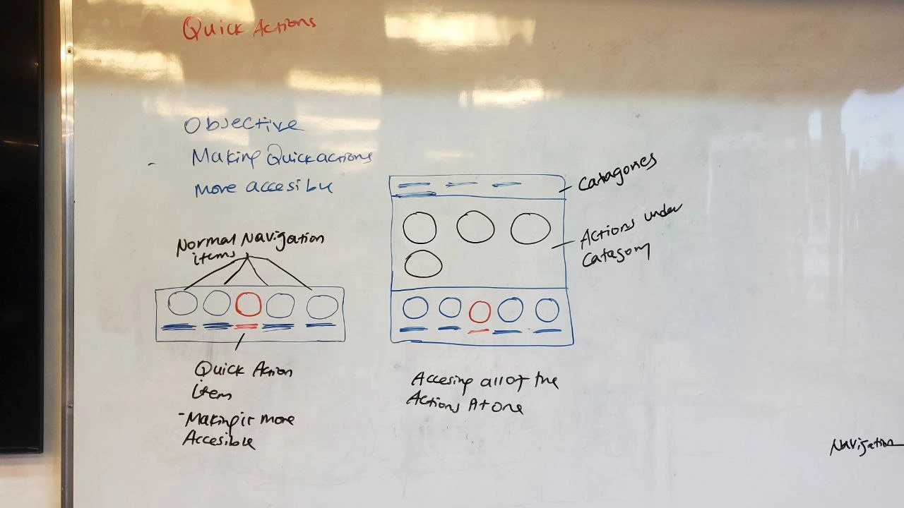
At Last its the navigation
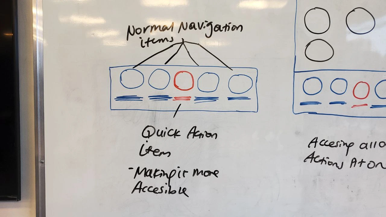
The Navigation Area was designed with one major goal in mind: making quick actions super accessible. We wanted users to do what they need instantly, without the hassle of digging around. While the standard icons like Home, M-PESA, Safaricom, and Mini Apps are in their usual spots, we focused on adding shortcuts that truly empower users to get things done with just a tap. It’s all about keeping things fast, simple, and making sure users can access what they need effortlessly.
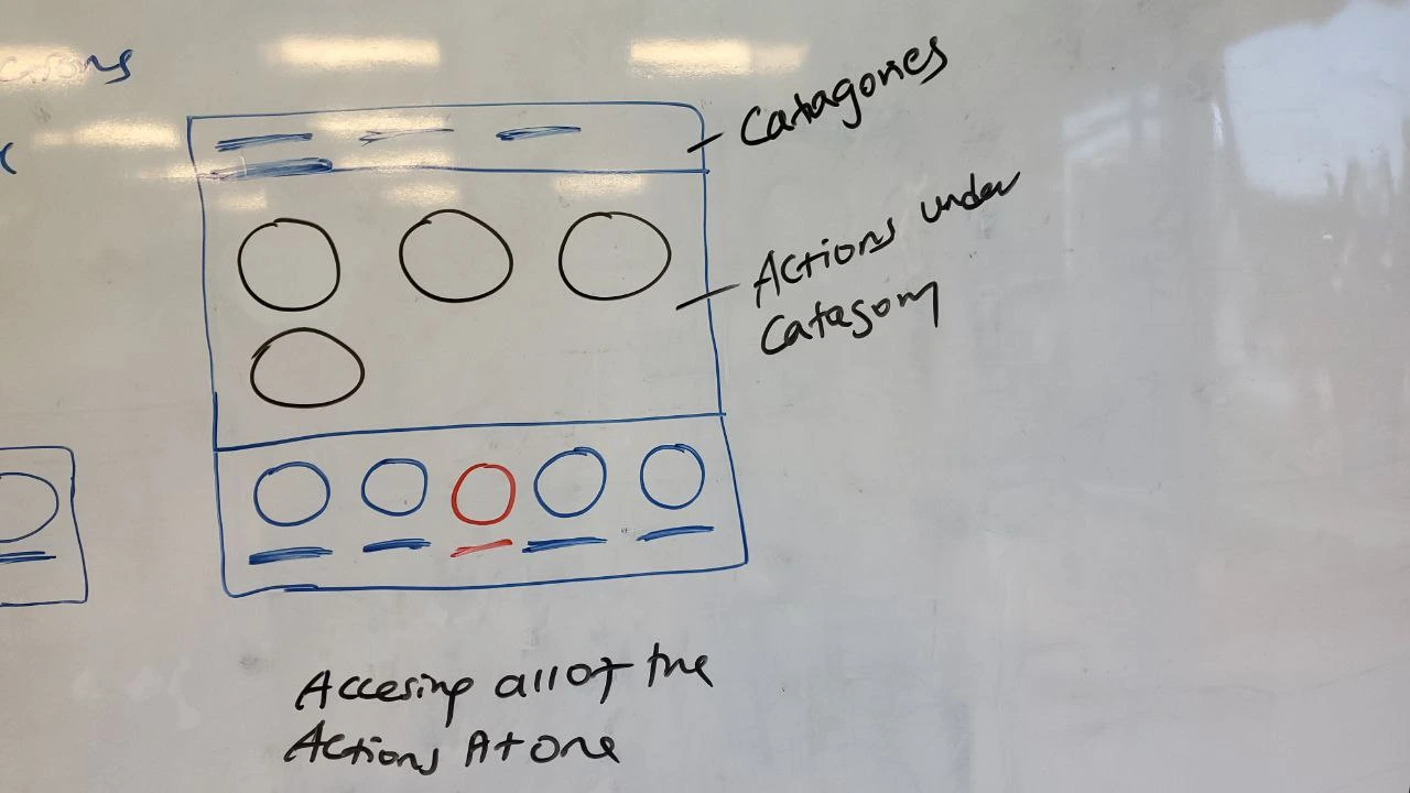
When it comes to Quick Actions, we wanted to make sure that every important task on M-PESA is always within easy reach. There are five main categories: Send or Request, Pay with M-PESA, Withdraw, Airtime, and Bundles each packed with the essentials users need daily. With over 15 actions in total, our primary mission was simple: make each and every one of these accessible, so users never feel lost or overwhelmed. Whether it's sending money, buying airtime, or withdrawing cash, everything is right at their fingertips, ready to go.
Iteration 2: BALANCE SECTION IS NOT THERE YET
Here is the design for the navigation section
HERE IS
THE FINAL DESIGN
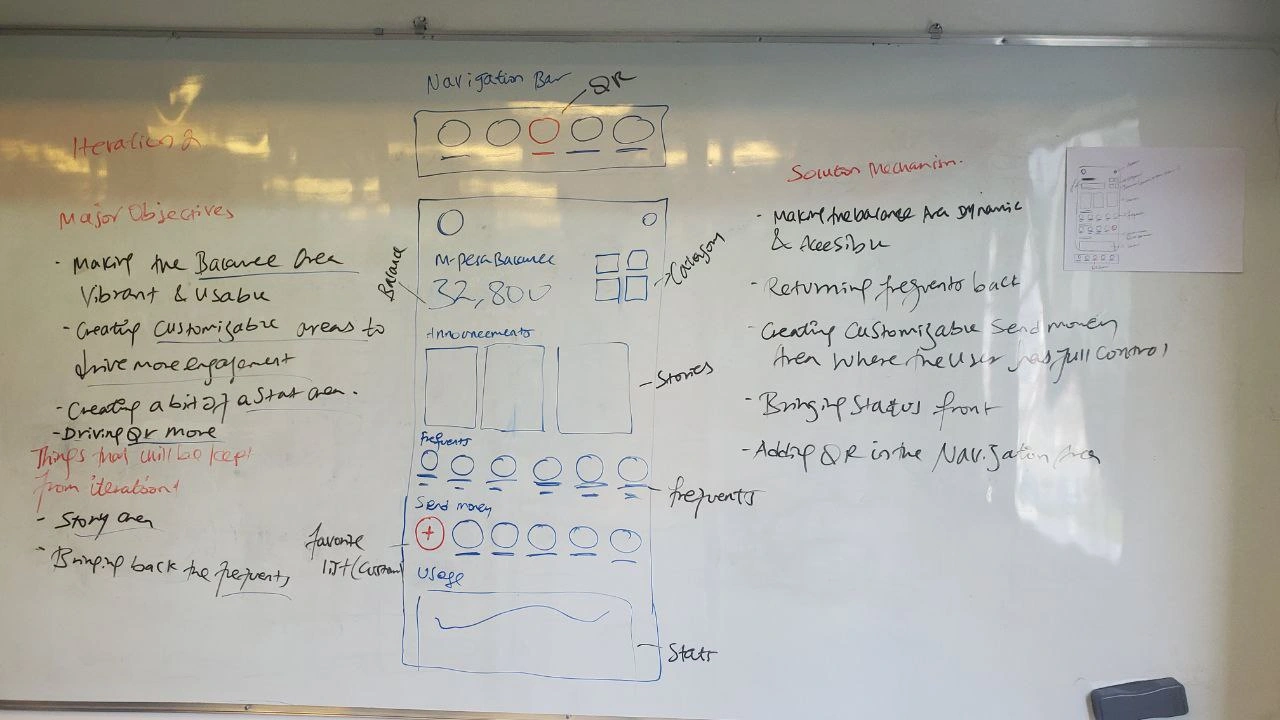
Iteration 2: BALANCE SECTION IS NOT THERE YET
Second Cup, Second Iteration:
After the first round of feedback and maybe one too many cups of coffee, I realized we were just getting started. The design was good, but it needed a little more zing. So, back to the drawing board I went, tweaking, refining, and adding that extra something to make it shine. Here's what came next!
UPTO THE NEXT OBJECTIVES
Lets make the balance area look better
Creating more dynamic and customizable areas for a curated experience
Let's put a bit of a stat area to give them usage understanding
Let's Try driving QR More
OUR SOLUTION MECHANISM OUTLINED
Making the balance are dynamic and accesible
Bringing back frequents
Creating transaction area that is totally customizable and gives the user any control needed
Since QR is one of the easiest way of transaction, lets put it in the core
Moving on the tiny details
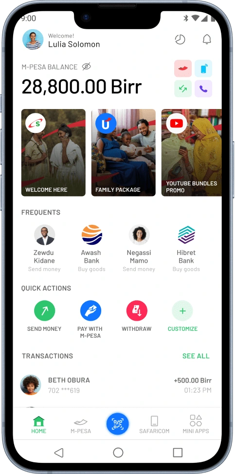
In this iteration, we focused on giving the homepage a more intuitive and user-friendly feel. We revamped the balance section, making it not just cleaner but visually appealing. To enhance personalization, we added customizable areas, allowing users to take full control of their experience. We also introduced a stats section for quick insights and, of course, added a QR section for seamless transactions. Each tweak was designed to add more function without losing simplicity.
We’ve transformed the balance area into a vibrant, eye-catching feature that instantly grabs attention. It’s not just about the numbers anymore—now it’s easier than ever to view and manage all your different balances in one glance. The sleek visuals and bold colors not only make it functional but also visually engaging, giving users a lively and modern way to stay on top of their finances.
We’ve introduced a customizable "Quick Send" option to make sending money even faster and more convenient. Users can now set up their frequently used contacts or amounts, giving them the power to tailor the feature to their needs. Whether it's a daily transfer or a one-time payment, it's just a tap away quick, easy, and personal!
We’ve added a handy glimpse of your financial stats to give you a quick, bird’s-eye view of where your money’s going. This feature offers a snapshot of your spending habits and transactions, helping you stay in control without diving into detailed reports. It’s all about keeping you informed at a glance!
THE ITERATION II
FINAL DESIGN
Moving to the final iteration
Habesha call it Bereka, third cup
The third but the last iteration
With the final iteration, we knew this was the one. After countless tweaks, feedback rounds, and yes more coffee we fine-tuned every detail to bring the design home. This version ties everything together, balancing function with a sleek, user-friendly interface. Here’s the polished result, ready to make its mark!
Moving on the tiny details
In this final iteration, we honed in on a few key areas to elevate the user experience.
Quick Actions: We kept the Quick Actions area front and center, ensuring it’s always accessible. Users now have the flexibility to customize and arrange it however they prefer, giving them total control over their most frequent tasks.
Simplified Spending View: Instead of overwhelming users with complex graphs, we opted for a clean, easy-to-read UI that presents spending information in a way that’s simple to grasp at a glance.
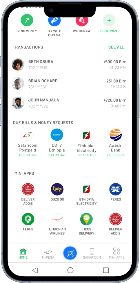
Mini Apps Integration: To enhance functionality, we introduced a mini apps section directly on the homepage. This area provides easy access to additional services and tools, all in one place.information in a way that’s simple to grasp at a glance.
We structured the layout to flow naturally and intuitively, starting with the Top Bar, followed by Balance, then Announcements, Frequents, Quick Actions, My Spend, Recent Transactions, Due Bills, and the new Mini Apps. We wrapped it all up with Navigation and the QR section, ensuring seamless access to everything users need.
Quick Actions: The Quick Actions area is always front and center, ensuring easy access to your go-to tasks. Users can now customize and arrange it to fit their needs, offering full control over their frequent actions.
Mini Apps Integration: We added a mini apps section right on the homepage, giving users easy access to extra services and tools. It’s a one-stop spot for added functionality, all within reach.
QR: The QR section is conveniently placed for quick scanning, making transactions faster and more seamless. Whether paying bills or sending money, a simple scan gets the job done.
The very final final
DESIGN we come up
And just like that, after hours of brainstorming, countless cups of coffee, and a whirlwind of iterations, my proposal was finally in the hands of the agency. While their side of the story remains a mystery, they took my input and came up with their own outcome. What they crafted was a unique spin on the ideas, and I’ll be highlighting their final design here.
The journey doesn't end with my proposal—it continues with their creative take. So, let’s see how they brought it all to life!
Like this project
Posted Oct 16, 2024
Abel Tegafaw, I am Digital product designer passionate about crafting seamless experiences across africa and all around the globe. I blend creativity with rese…