Wyrr Website Design
Wyrr, a Remittance payment gateway startup product, sends money to loved ones, pays tuition, and gives to a cause.
Timeframe: 2 months | My Role: Product Designer | Tools: Figma
Just so you know, I single-handedly managed some products, but I'm bound by a Non-Disclosure Agreement (NDA). This includes the backend dashboard for both the Wyrr app (Customers) and Wyrr business (Merchants). The following are just a few of the projects I worked on while at Wyrr.
Background
The global remittance market is highly competitive, with numerous platforms vying for user attention by offering seamless and secure money transfer services. Wyrr aims to differentiate itself by providing a user-friendly, aesthetically appealing platform that simplifies sending money, paying tuition, and donating to causes.
The Problem
Following a full brand identity overhaul, Wyrr recognised the need for a comprehensive website redesign to align with its commitment to excellence and ease of use. The old website's poor navigation and outdated design frustrated users, while the introduction of new product features further highlighted the site's inability to support them effectively. This disconnect created a disjointed experience between the app and the website.
Task
We aimed to redevelop a website that not only met functional needs but user-friendly and also connected with users emotionally, ensuring they navigate effortlessly for an optimal experience, highlight key features prominently to attract and retain users and maintain a consistent professional look across the site.
Business Impact?
Positive User Feedback
Client & Users gave overwhelmingly positive feedback on the redesigned interface, regarding its ease of use and intuitive navigation. Satisfaction ratings improved, with many users highlighting the enhanced visual appeal and clarity.
Increased App Downloads
The number of app downloads from the website increased by 50%, reflecting the improved user journey and clearer calls to action encouraging users to install the Wyrr app.
Enhanced Security Perception
Emphasis on bank-grade security and regulatory compliance has significantly boosted user trust, leading to a 50% increase in new user registrations and a strong foundation for future growth.
Higher Retention Rates
User retention rates increased by 35%, indicating that the new design has effectively fostered loyalty and repeat usage among our customers.
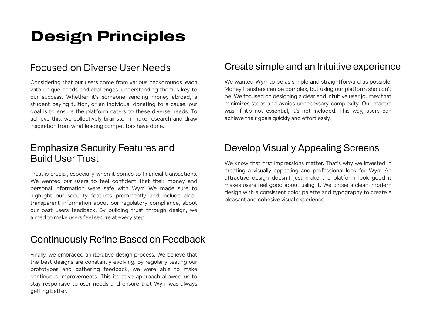
Designing the User Interface
The Hero Section
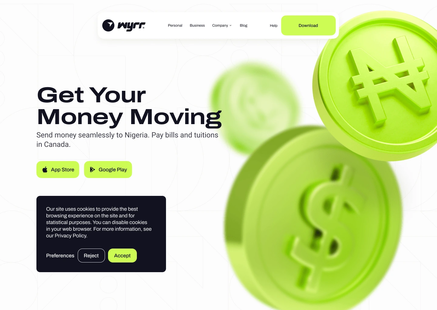
Our goal with the hero section of Wyrr's website was to immediately capture user attention and communicate the core value proposition, guiding users to take action efficiently. We knew that first impressions are crucial and that users need to quickly understand what Wyrr offers and how to get started.
A common scenario involves users visiting the website to send money to loved ones or pay bills abroad. They need a clear and immediate understanding of how Wyrr can help them achieve these tasks, and they want to feel confident and secure in using the platform.
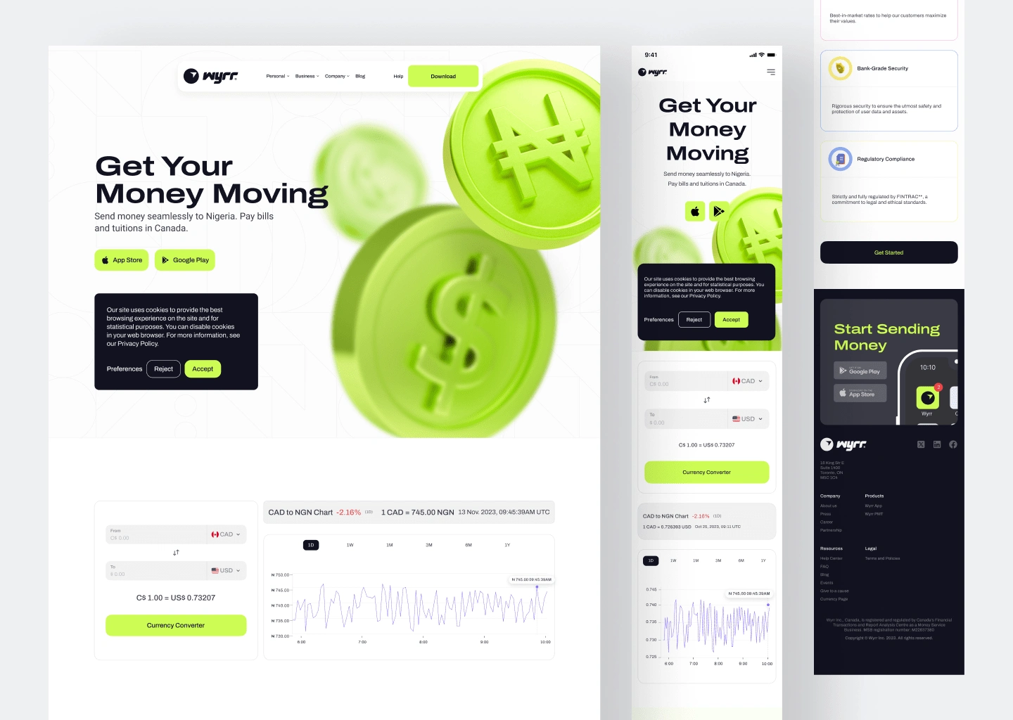
The navigation bar at the top of the hero section plays a critical role in this experience. It features clear, accessible links to key sections of the website such as Products, Business, Company, Blog, and a prominent “Download” button. This intuitive navigation ensures that users can easily find information and take action, enhancing the overall user experience by reducing frustration and time spent searching.
The hero section features large visuals of currency symbols (₦ and $), a bold headline "Get Your Money Moving," and a subheading "Send money seamlessly to Nigeria. Pay bills and tuition in Canada." This immediately conveys Wyrr's services. Prominent CTAs for the "App Store" and "Google Play" encourage app downloads, while secondary CTAs for cookie consent handle legal aspects without distraction.
Currency Converter and Chart
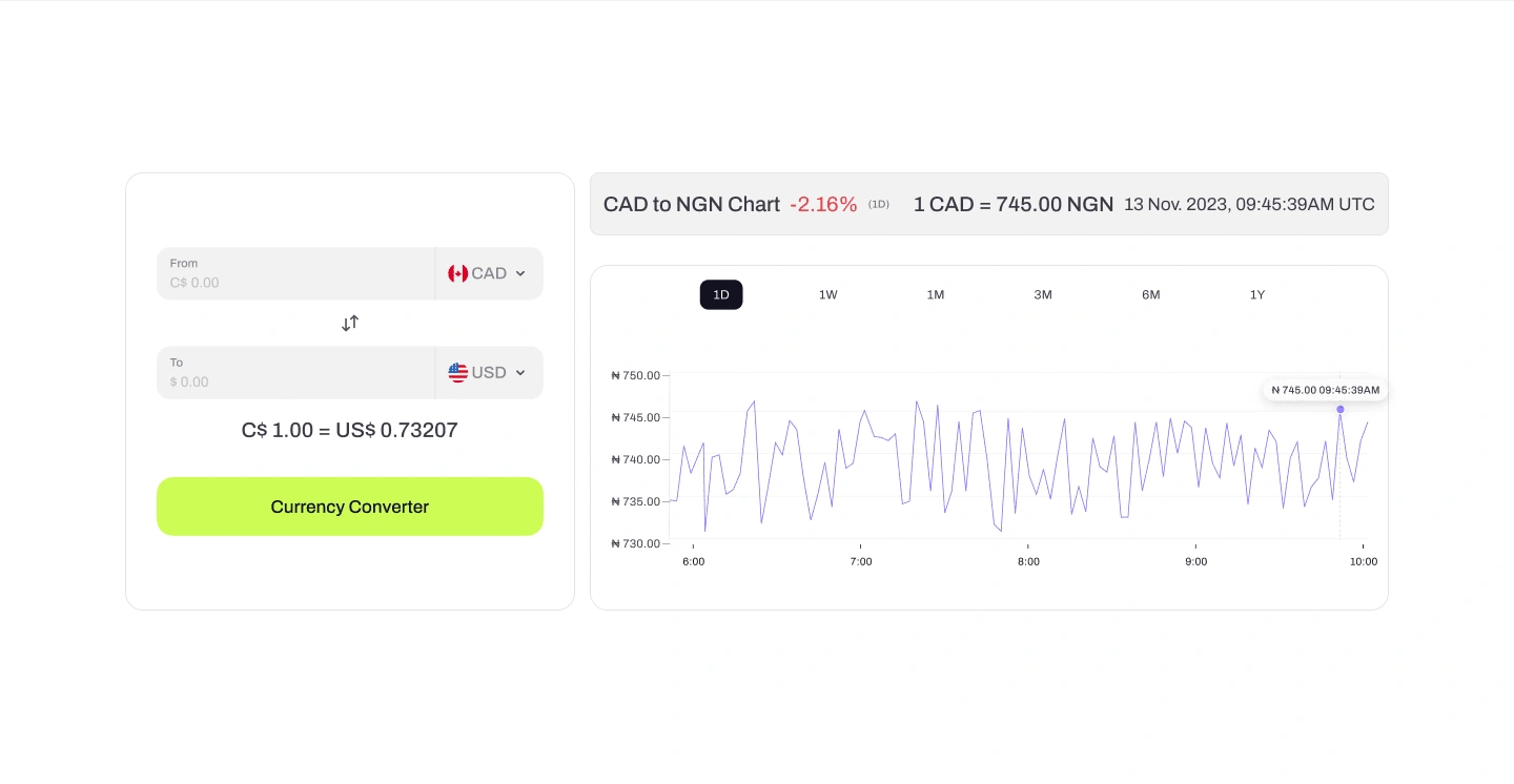
Here we wanted users to check real-time exchange rates, providing immediate value and showcasing Wyrr's functionality. This tool caters to users’ immediate needs, engaging them from the outset. Displaying a real-time exchange rate chart for CAD to NGN further adds transparency and functionality, helping users make informed decisions and demonstrating Wyrr’s commitment to providing up-to-date financial information.
Creating Emotional Connection
a relatable image of a smiling user engaging with the platform humanizes the experience. we wanted to see users envision themselves using Wyrr and create an emotional connection with them.

Social Proof from Users:
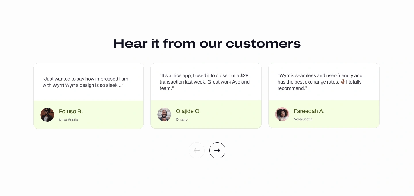
This section was to build trust and authenticity by showcasing real user experiences. Customer testimonials are powerful tools for establishing credibility and emotional connection, and we wanted this section to reflect that.
Users visiting Wyrr often look for reassurance if they can trust any financial platform with their important financial transactions. By featuring genuine stories from satisfied customers, we aimed to provide this reassurance effectively.
Mobile App Integration
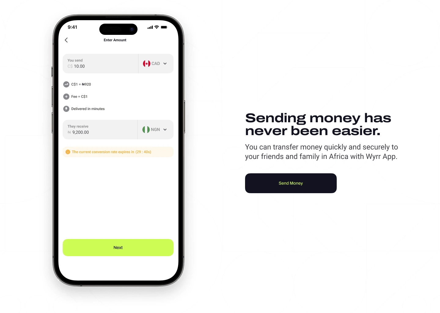
Our objective with the "Sending Money Has Never Been Easier" section was to demonstrate the ease and efficiency of using Wyrr for international money transfers. Users need to feel confident and see firsthand how straightforward the process is, all we wanted to do is to make sure everything is easy for them to navigate and understand.
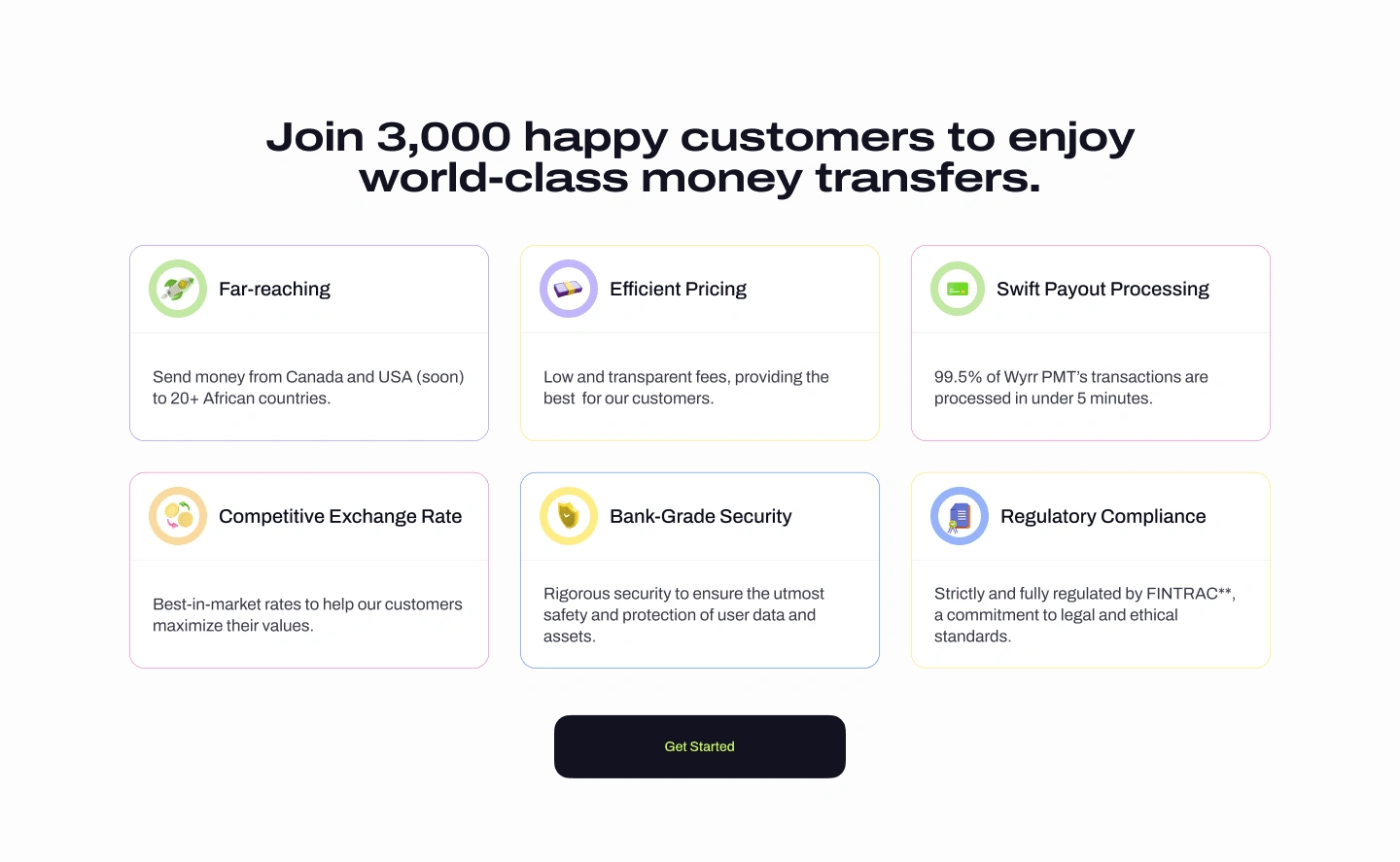
Building trust with numbers and value
Highlighting the key benefits of using Wyrr and building social proof by showcasing the satisfaction of our existing user base. We believe by combining a strong social proof statement with a clear, concise presentation of key benefits, this section will effectively build trust and encourage new users to join the Wyrr community, aligning with our design philosophy of user-centricity, simplicity, and trust.
Users Seeking Valuable Information
Our goal is to provide valuable information and engage our users through the Wyrr blog. We noticed that our users often seek financial tips, money transfer guidance, and stories that resonate with their experiences. Data from user feedback and analytics indicated that users spend significant time searching for specific articles and financial advice, which can be frustrating.
A typical scenario involves users wanting to learn about the best ways to save on international money transfers or find tips for financial planning. They need quick access to relevant content without sifting through numerous unrelated posts. With hundreds of blog articles, finding the right one can feel like looking for a needle in a haystack.
To address this, we implemented categorized content sections and clear headlines with summaries. These features make it easy for users to find exactly what they're looking for quickly. Additionally, the blog layout is visually appealing and consistent with the overall Wyrr platform, ensuring a seamless and engaging user experience.
The Wyrr website was launched in early 2024.
Iteration and Feedback
We iterated on the design based on feedback from colleagues, users and stakeholders. This iterative approach ensured that we addressed any usability issues and refined the design to meet user needs effectively.

Thank you for reading.🌟
Like this project
Posted Jun 10, 2024
Redevelop Wyrr website to meet functional need, user-friendly, also connect with users emotionally and help them navigate effortlessly for an optimal experience


