BuyWander
Andreea Ivan
BuyWander
(About)
BuyWander is a local, auction-driven marketplace for returned and overstock items. It blends online bidding excitement with the convenience of physical pickup and solid return policies, offering users a unique way to discover deals across many categories.
(Process)
One of the biggest challenges in designing this website was bringing clarity to complexity.
With so many different product types — from electronics to kitchenware to car parts — it was easy for the interface to feel overwhelming. The goal was to create a layout that felt clean, calm, and easy to navigate, no matter who was using it.
I focused on clear visual hierarchy, simple filtering, and gentle spacing to make sure users could explore freely, without feeling lost or overloaded.
(First iteration)
The first version of the updated website was a complete redesign of the previous one. The client’s main goal was to create a cleaner design with a strong focus on user experience.
The old website had several usability issues: users often got lost and couldn’t easily find what they were looking for. The overall design was overwhelming—featuring too many colours, inconsistent fonts, and a lack of visual coherence. As a result, both the conversion rate and the likelihood of users completing purchases were very low.
Following the research phase, I developed a new design that is cleaner, more modern, and minimalistic, with a clear emphasis on usability. I retained the brand’s bright pink color exclusively for primary call-to-action elements, such as key buttons and the logo. The rest of the color palette consists of various shades of grey to ensure a more cohesive and elegant look. Another significant improvement was the introduction of rounded corners, which soften the interface and create a friendlier visual appeal. The website’s navigation was also overhauled: it is now much more intuitive, with clearly labeled buttons and a well-organized sitemap, making it easier for users to find what they need.
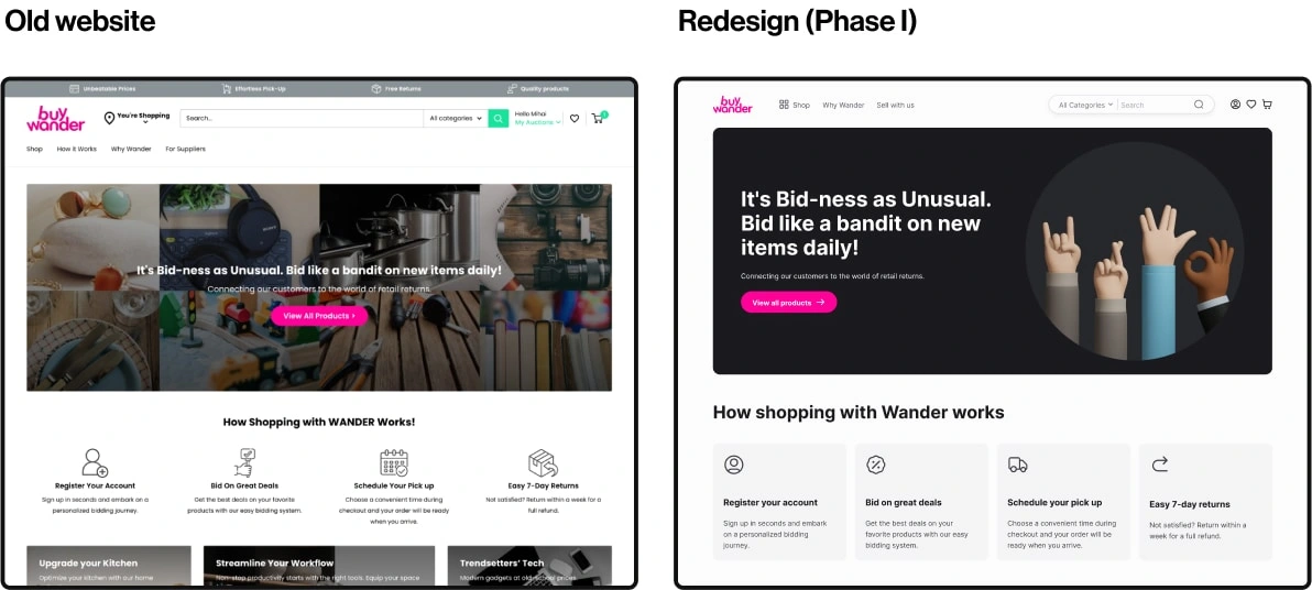
First Redesign (Hero Section)
Another key element of the redesign was the product card. In the original version, it was difficult to scan—the layout displayed too much information, with excessive use of colors that drew attention to multiple areas at once.
The new version is more compact and clean, with the main focus placed on the product itself. I streamlined the content by consolidating the product status details into a single "Notes" button. Additionally, I introduced a status tag and clearly indicated the pickup location for each product.
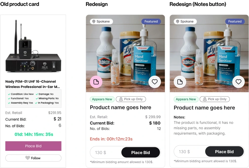
Redesign of the Product Card
(Testing first iteration)
After the new design was implemented, the conversion rate increased significantly. Users responded positively to the updated layout, noting that it was much easier to navigate on both desktop and mobile devices. As a result, the company's profit also saw a noticeable increase. Testing and iterative improvements continued to further optimize the user experience.
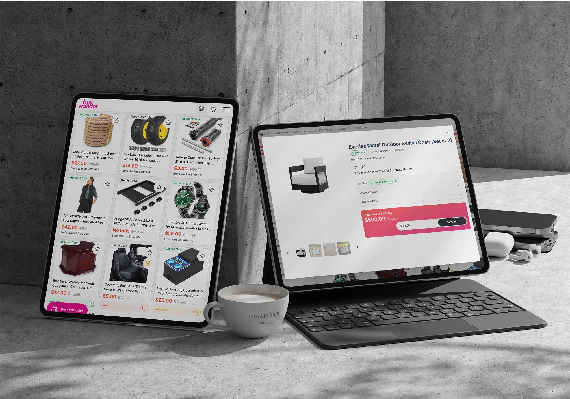
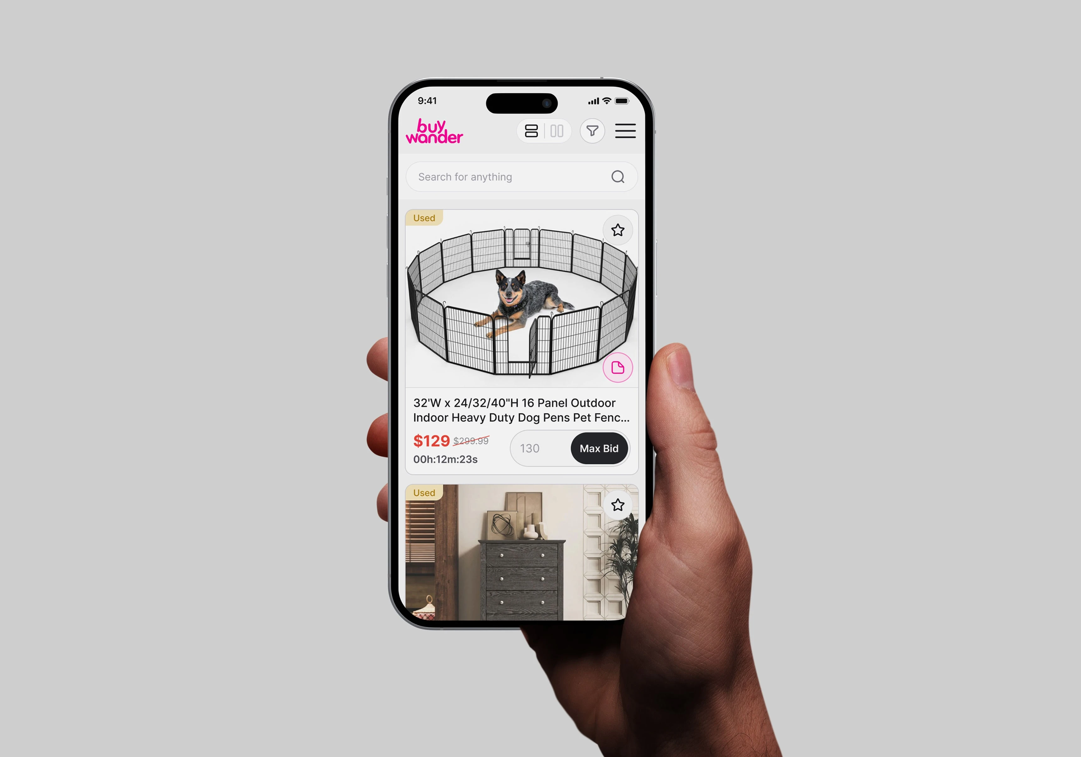
(Second iteration)
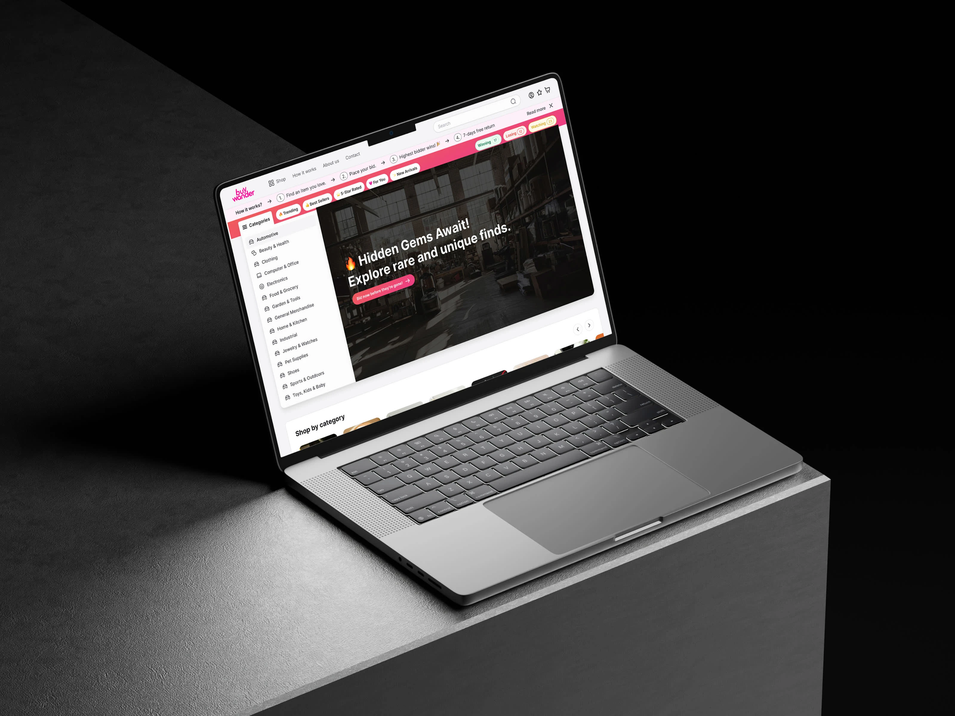
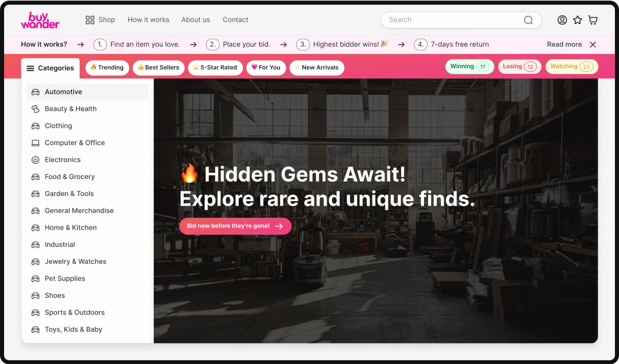
After conducting multiple user interviews, we identified further opportunities to enhance the design and introduce new features. The client proposed an idea inspired by a Treasure Hunt experience to encourage users to explore and discover more unique items.
At the same time, it was crucial to ensure that users searching for a specific product could find it with as few clicks as possible. One key insight from the interviews was that users were particularly focused on product images. With this in mind, I redesigned the entire experience once again—placing greater emphasis on visuals and improving the product card layout to better meet user expectations.
The redesign felt more personalized for each user. With the addition of top navigation tags such as Trending, Best Sellers, and For You, users received a more tailored experience, featuring items that aligned with their interests and needs.
New status tags like Winning, Losing, and Watching made the bidding process more engaging and competitive. Users could easily track the status of their favorite products in real time.
The Treasure Hunt feature is accessible directly from the hero section by clicking the main call-to-action button. At the same time, all product categories are clearly visible on the left side of the screen—ideal for users who know exactly what they’re looking for.
Second Redesign (Hero Section)
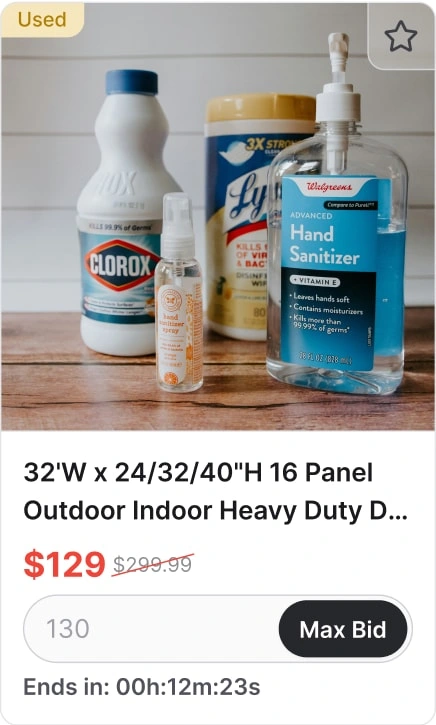
The product card also underwent further changes. To give priority to the product image, I kept only the essential information visible—such as the title, current bid, and retail price.
Second redesign of the Product Card
(Color Palette)
The brand’s primary color is a vibrant pink. To prevent the design from feeling overwhelming, I balanced it with a refined grayscale palette, ranging from the lightest shade #FCFCFC to the darkest #1A1A1E. This approach creates a cleaner, more approachable interface that naturally draws attention to the products. I opted for a softer off-white instead of pure white to reduce visual strain and enhance readability. Additionally, the pink was reimagined as a gradient, adding depth and a modern aesthetic while maintaining the brand’s distinctive character.
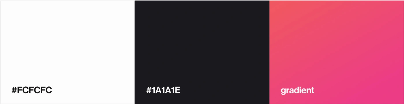
Primary Colors
(Typography)
Inter works well for a large e-commerce site because it combines clarity with versatility. Its proportions and open forms make text highly legible at every size, from detailed product descriptions to bold promotional banners. The typeface feels neutral but not cold, which allows it to adapt seamlessly to different product categories without competing with the visuals. Its consistency across scales creates a cohesive rhythm throughout the interface, while its digital optimization ensures smooth performance and reliable rendering across devices.
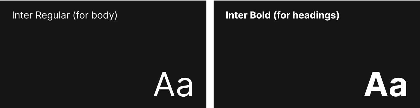
Typography
Like this project
Posted Sep 11, 2025
Redesigned BuyWander's website for improved user experience and increased conversion rates.