Ui/Ux Design for NineID Website
Andreea Ivan
NineID
(About)
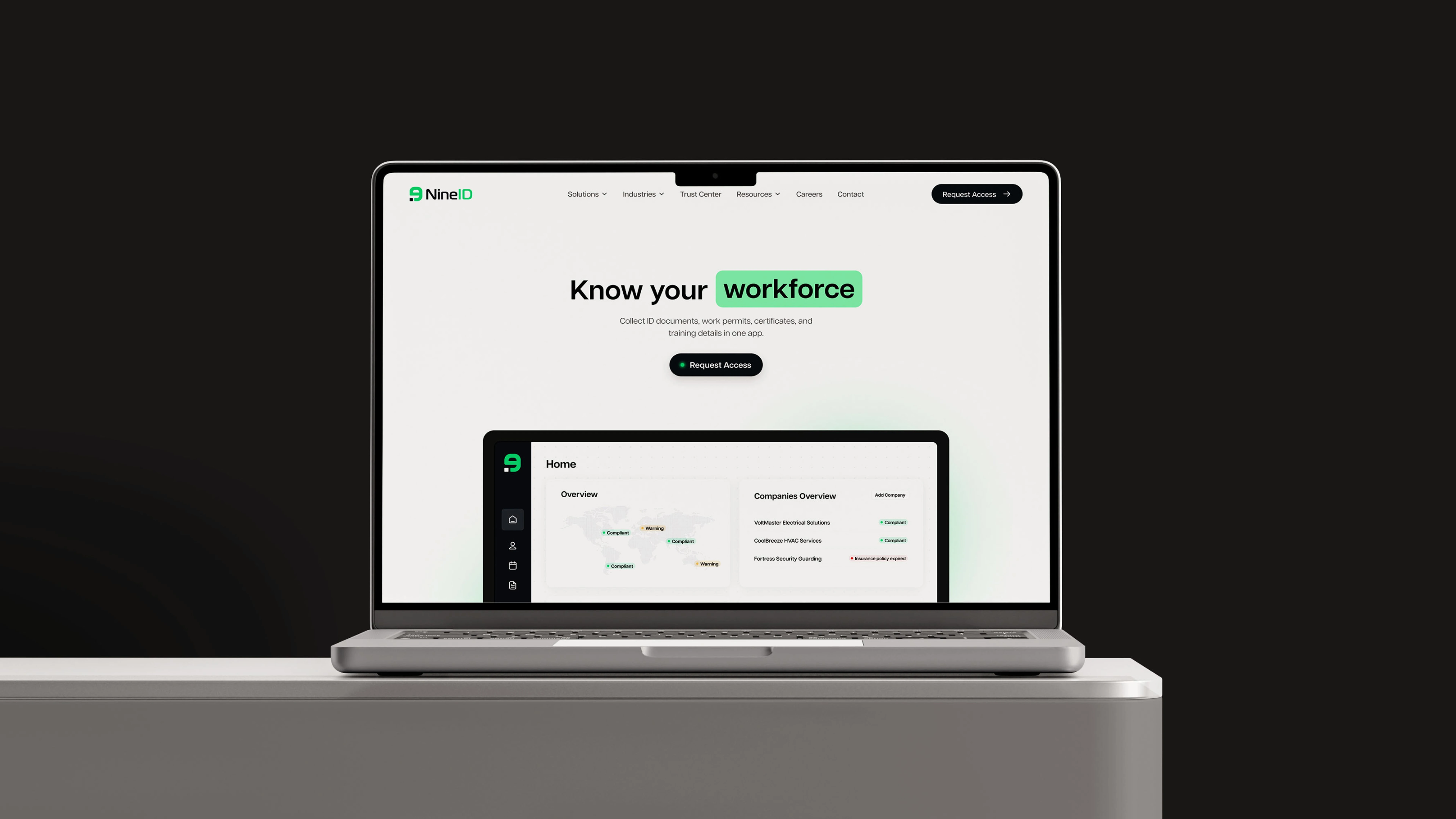
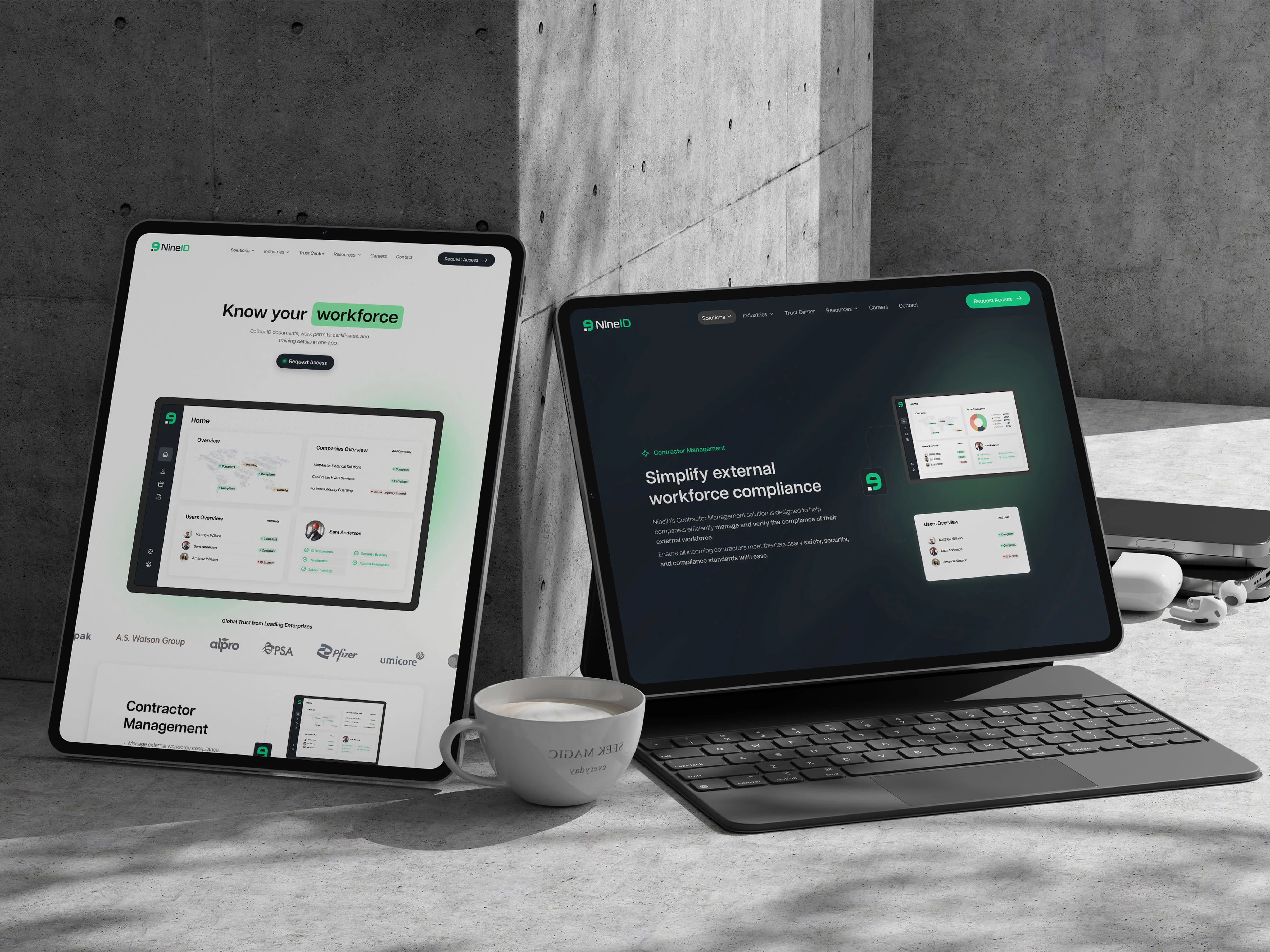
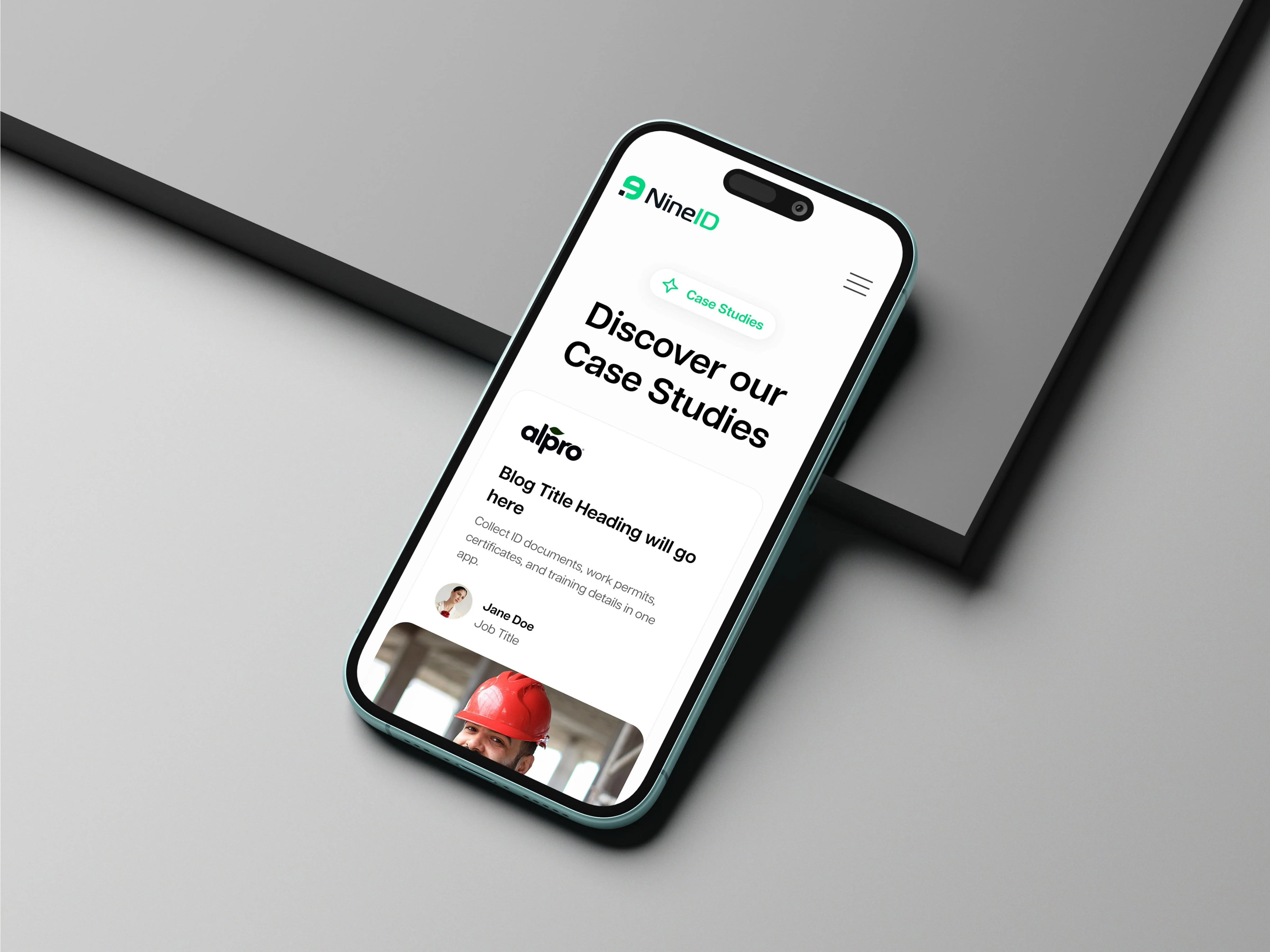
NineID is a company that developed a workforce and contractor compliance platform. The company's main purpose is to help businesses verify and manage all necessary documents, such as IDs and certifications, for both internal and external workforces.
(Process)
The overall design process was focused on creating a user experience that feels secure, intuitive, and scalable. From the beginning, I knew the interface had to simplify complex compliance workflows, so I kept the layout minimal and user-focused. The hero section leads with a clear message and product visuals to immediately show value. Throughout the site, I made sure CTAs are easy to find and consistent in style. I also used visual elements like dashboards, maps, and status indicators to communicate information quickly without overwhelming users with text.
Every design decision—from font choice to colour to spacing—was made to support clarity, trust, and usability. I wanted the product to feel as seamless and smart as the system behind it.
(Color palette)
For the colour palette, I wanted to keep things clean, modern, and professional. I used a white background to create space and clarity, making the interface feel open and easy to navigate. To contrast that, I brought in deep charcoal tones for the main text and key UI elements—this keeps things readable without being too harsh. Lighter greys help to define secondary content without drawing too much attention.
Primary Colors
(Typography)
Articulat CF perfectly balances modernity with clarity. It’s a geometric sans-serif with clean lines and a strong, confident feel—which really helps communicate trust and professionalism.
Articulat CF is super legible at all sizes and feels very structured, which fits nicely with the organised and data-driven nature of the platform. It also pairs really well with the overall layout and colour scheme, giving everything a consistent and polished feel.
Like this project
Posted Sep 11, 2025
Designed a clean, intuitive user experience for NineID's website.