Designing a Native Educational Mobile App for High School Stude…
Designing a Native Educational Mobile App for High School Students
--
Tools: Miro, Figma, Lookback, Zeplin
Design Brief:
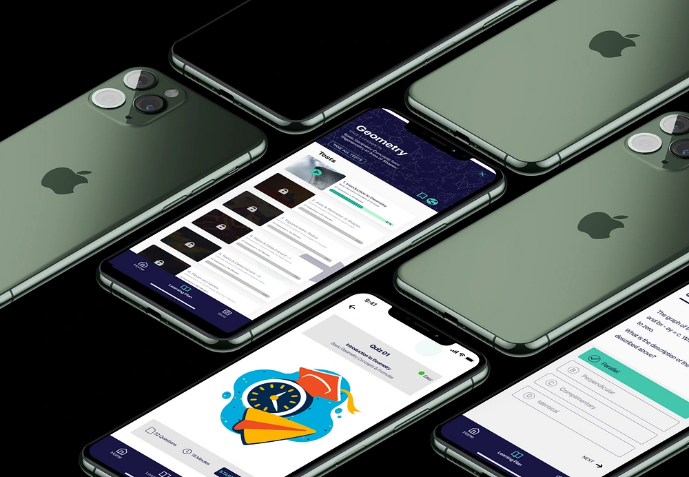
To design a native educational mobile application for high school students towards preparation of their GCSE Examinations called MathWhiz. Mathwhiz is a tool that would serve as an omni-channel of knowledge testing for these students by adopting a quiz style, engaging platform for the user group.
Design Challenge:
To design a mobile application that is appealing and engaging to the specified user group with sufficient resources and testing tools required for students to learn within a single platform.
Research
I conducted research to understand how the target demographic perceives digital platforms as a learning resource and what they are trying to achieve while using the application. I also seeked to explore what potential features are of the highest importance to the intended users.
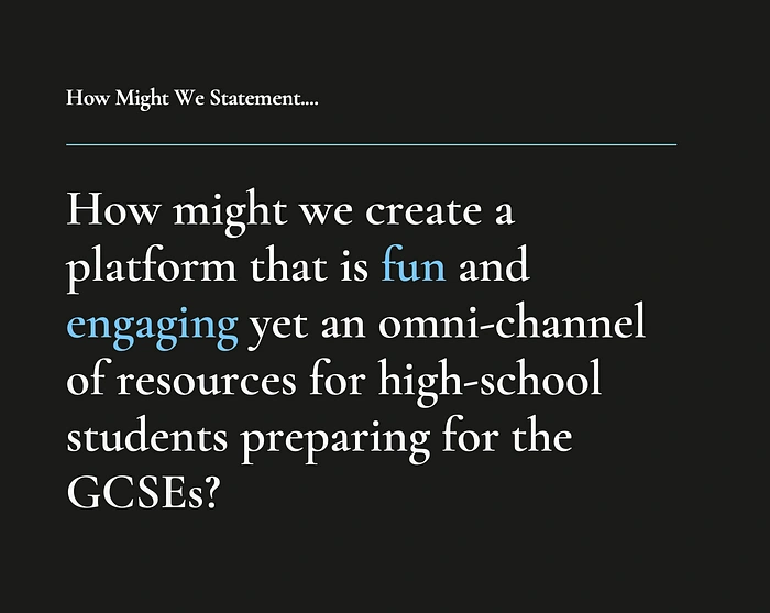
Problem Statement Definition using “How Might We” Framing
User Interviews:
“I like to go through my scheme of work and start from the last topic studying backwards to the first. This way i am sure i have covered all the examples from the current term’s work” — Dunni
I carried out interviews with users between the ages of 13–18 who are actively preparing towards their GCSE examinations — MathWhiz’s target audience. I asked the main research questions:
· Share your most recent study experience with me; particularly while studying math
· How often do you consult digital resources while studying?
· What feature do you consider as important in a digital resource?
· What is missing from your current study sessions?
Affinity Mapping
Inspired by the problem, research interviews were carried out with particpants within the demographic of the intended user group. Using the Affinity Mapping method on Mira.

Affinity Mapping results from User Interviews
“I think that an app would be easier to use and be more engaging. It would also encourage my friends and I to study for longer and would be preferred to using a textbook or other traditional means of studying” — Ola
Key Findings:
· All the participants use digital resources as their last resort after all options within their readily available traditional resources have been exhausted
· They expressed frustration in not being able to find all they need for their study sessions in one resource as there was a general perceived lack of availability for a product that could serve as both a studying and testing tool.
· Some users would like an opportunity to test their knowledge by competing with other participants on the platform while other participants find it rather distracting and a potential source of bullying.
The Persona
Following the research results, I built a primary persona, Diane, who served as a reference point throughout the design process.
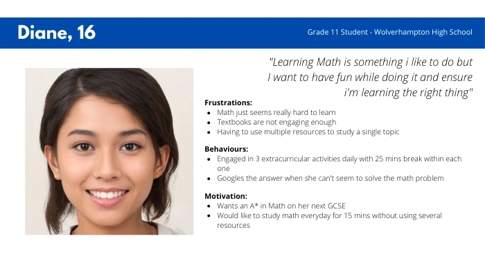
MathWhiz Persona — serving as guide throughout design process
Conceptualisation & Sketch:
Upon concluding the research and building the persona, 90% of the users expressed concern about wanting a tool that serves as an omni-channel resource and also serves as a testing tool. A main touchpoint considered was the level of detail required in the App and how to make the App engaging. Furthermore, users expressed delight in carrying out tests that can be done in their free time i.e 15 mins. Designing in this direction commenced with hand sketches using the Crazy 8 method after which a low-fidelity prototype was developed using Figma.
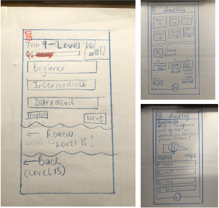
Sketches derived using “Crazy 8” method for the Homescreen, Dashboard & Quiz Page.
With findings from the above, I determined that the navigation which is the system that walks the user through the app is the most important component to focus on at this stage.
Design
Style Guide & Pattern Library
After carrying out the research and developing the project idea, I went ahead to create a style guide and pattern library for the project highlighting the design Do’s and Don’ts as a guide for the developers.
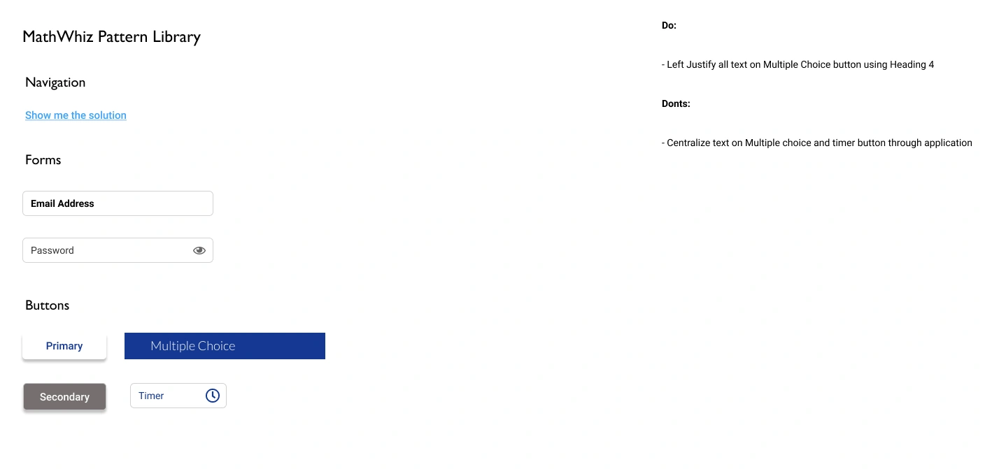
Initial Style Guide and Pattern Library for Application
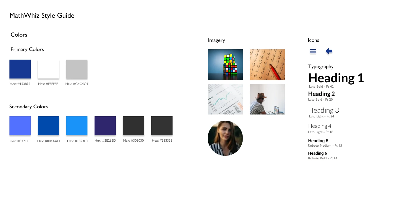
Initial Style Guide and Pattern Library for Application
The main colour used in creating the App is Blue. This is because this a non-threatening colour that calls serenity and calmness to the mind of the user. It is essential that the app environment is welcoming and users feel relaxed while performing tasks that are usually perceived as difficult or unapproachable.
The primary colours are primarily used in headers, shapes and borders while the secondary colours are mostly used to highlight CTA text and action buttons in the application.
Logo Creation
Following the creation of the style guide and pattern library, two renditions of the logo were created and random user testing was carried out to determine the more favourable logo. The first option had 11 votes while the second option had 8 votes and 1 voter remained undecided.
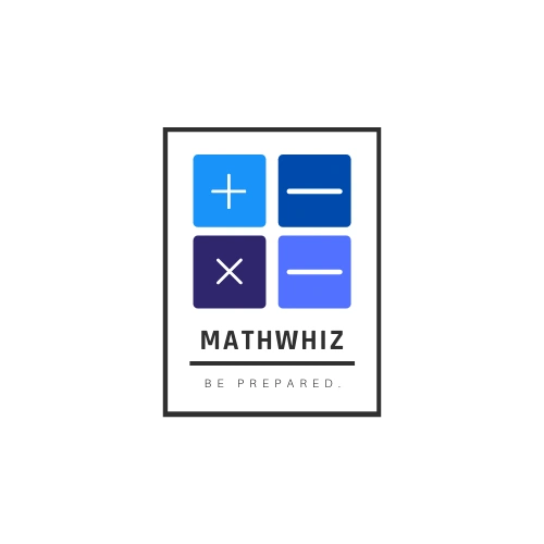
Logo Options presented to Users for A/B Testing

Logo Options presented to Users for A/B Testing
Development
The image below described the main user flow showing Diane’s journey while using the mobile application from login to answering a quiz question and viewing additional resource for further understanding. These served as a guide for the screens designed for the prototype.

Persona user flow from Login to answering a quiz question
Using Figma, I commenced the wireframing of the application using the sketches from the “Crazy 8” exercise — as shown above as a guide. I carried out usability testing upon completion of the early prototype in order to implement the feedback in the subsequent iterations. Using a usability guide I developed, 3 participants were recruited to carry out the following task points and notes were taken to determine the ease of use of the application with early prototypes.
· Application Login
· Viewing Profile Points
· Choosing a card of interest
· Navigation to the Explanation Page
· Navigation to Homepage
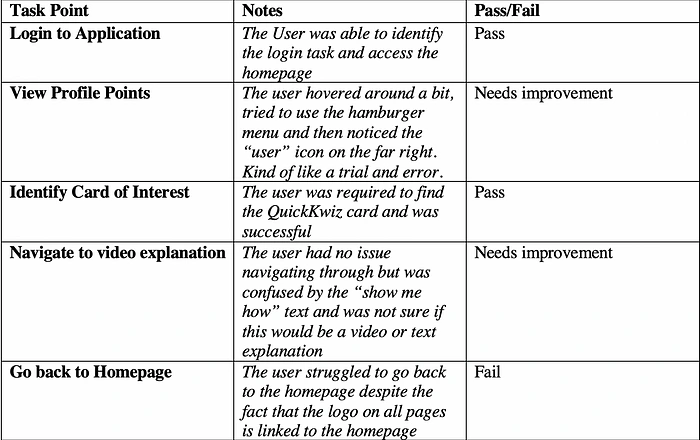
Excerpt from Usability Testing session showcasing notes taken from participants testing.
Feedback:
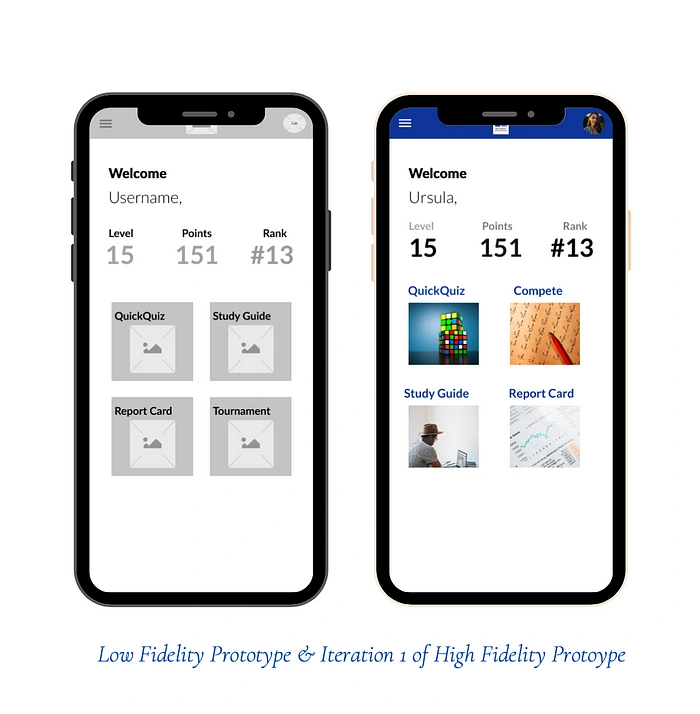
Following a review of the participants responses, the following changes were implemented to the low-fidelity prototype to give the first design iteration in high fidelity as shown below.
· Navigation to homepage from explanation page was not clearly defined so users found it difficult to navigate back to quiz or back to homepage without interfacing with all the previous screens they have encountered.
· User was not sure what to expect when they clicked on the CTA leading to the video explanation.
“I’m not sure what to expect when I click on this button — “show me how”. Maybe it could be the explanation and would it be in text or video? I’d have to find out”. — Mary-Anne.
Design Iteration 2: MathWhiz Splash Screen & Dashboard
The Low-Fidelity Prototypes of the App were created — this included the splash screen, home page, Quiz page as well as an interaction page for further explanation. Once the low fidelity version of the App was complete, themes and concepts were added to the application to create the High-Fidelity version.
Validation, Usability & Feedback:
Upon review of the first iteration, changes were made to the color scheme, illustrations and accessibility within the application from user feedback. This prototype was then used in carrying out User Testing. 10 Users engaged in user testing via the testing tool Lookback, for the first iteration of the app and the feedback was documented.
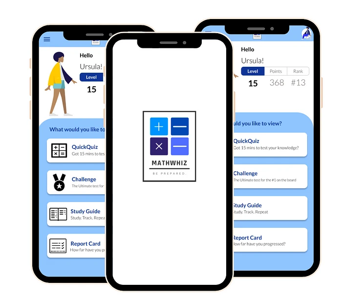
Design Iteration 2: MathWhiz Splash Screen & Dashboard
The central feedback was in relation to functionality of the quiz page of the prototype. This was updated accordingly to give the final product and then handed over to engineering via Zeplin. The figures show the primary changes made to the Quiz page and how the feedback from the User Testing sessions were implemented.
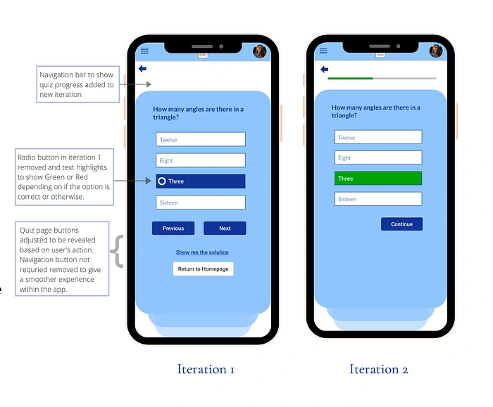
User Test Feedback Implementation: Quiz Page
Visual Design/UI Design Iteration
In order to enhance the UI of the application, I carried out several iterations to the existing design, considered Dark Mode creation as well as a theme switcher but eventually expanded the design in the direction of a light mode theme based on feedback received from A/B Testing of the different design options. This then led to creation of the pages with focus on the following features.
Interface Color Scheme & Typography
Logo Redesign
Usability of the features on the application
Interface Colour Scheme & Typography
Given the projected screen time on the application and the age bracket of the target audience, I needed to design a platform that was easy on the eye yet colorful enough for the user to engage with the product for a long period of time.
To achieve this, the following colors were used as the primary colors of teh application. Blue (#191645), Green (#43C6AC) and White (#FFFFFF & #FAFAFA). These three colors were used with the 60–30–10 principle in mind while designing such that Green (#43C6AC) served as the accent color and there was a good ground to figure ratio between the other two primary colors. The style guide (as shown below) also shows the secondary colors used on the project.
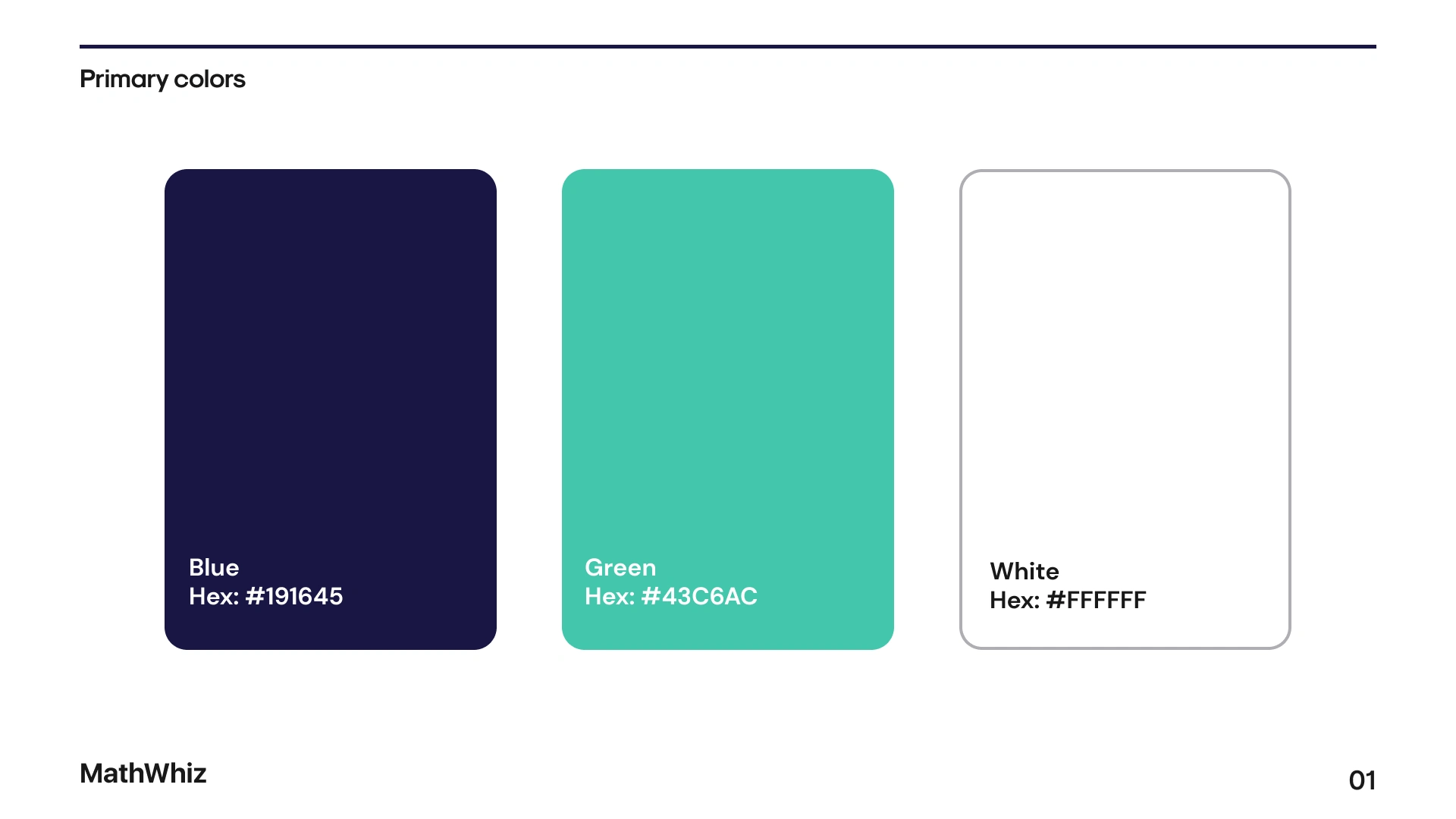
Primary & Secondary colors used within the application
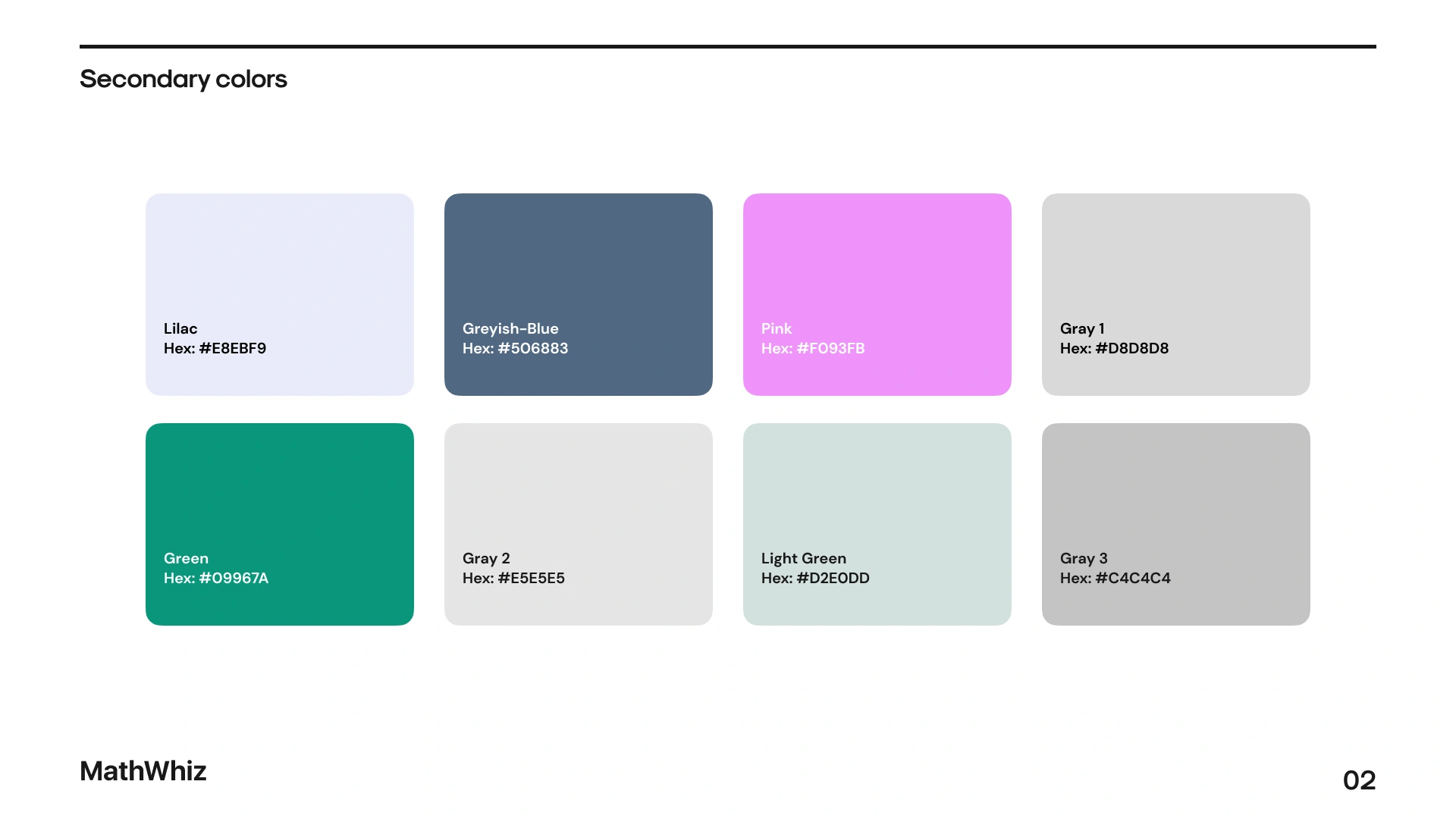
Primary & Secondary colors used within the application
Also, to ensure that the platform doest have a “flat” look or two many colors, different shades of grey were used while elevating the design to effectively emphasize sections in the application as necessary and improve the overall look of the application without increasing the cognitive load for the user.
With regards to Typography, different font types were used within the same font family — SF UI Display to display heirachy. This sans-serif font family was chosen because it conveys simplicity and it’s is also consistent, legible at all font sizes used and friendly.
Logo Redesign
To recreate the logo, a minimalist logo was created to replace the current logo. The design challenges experienced with the current logo were primarily with scalability and how the elements appeared when placed in different areas within the application. To resolve this, most elements were reduced and the “greater than” and “less than” symbols were used. This conveys a message that all users are equal despite how they start off using the app (Mathematical skill wise). The aim of the app is to support them with their learning goals until they are at par with their peers with regards to the standard of the governing examination body. Two primary colors were integrated into the symbols which produced the logo below.
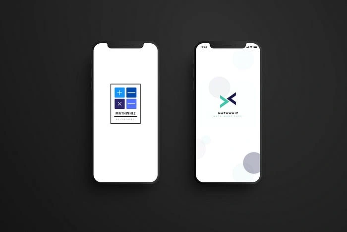
Image showing updated logo for Maths Application
Usability & Accessibility of Features
Onboarding screens were included to give a new user a feel of the application and it’s core function. Also, the Login screen and sign up pages were redesigned to feature larger buttons (optimised for mobile) and a balance of the primary app colors used across the screen. To ensure ease of access to key features within the application, the home screen was updated to include a modal and a navigation bar. This ensures quick and easy navigation between sections in the application.
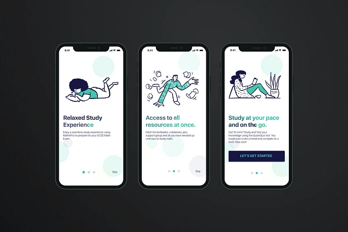
Splashscreen redesign showing improved functionality within the application
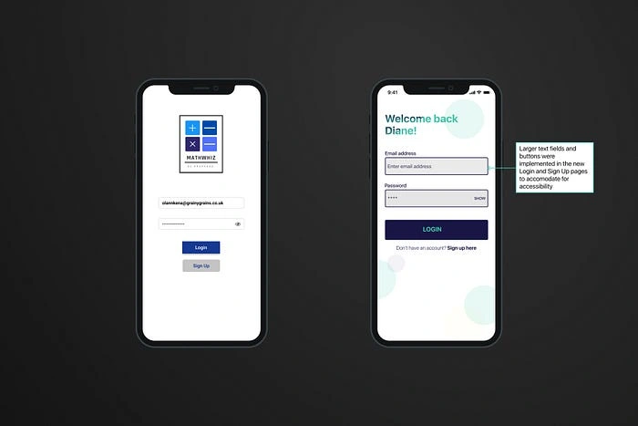
Splashscreen redesign showing improved functionality within the application
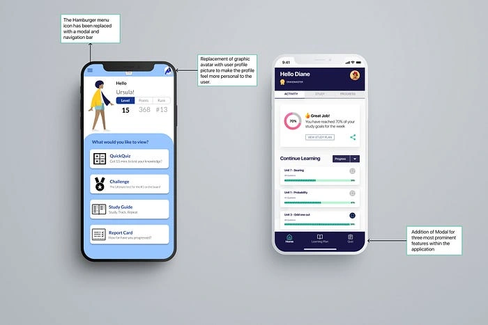
Splashscreen redesign showing improved functionality within the application
Furthermore, the quiz pages were updated to feature a minimalist look so the user feels more relaxed while interacting with the pages given the general perceived notion usually associated with Maths in general.
If the option chosen by the user is correct, the option turns green while the wrong answer turns red. Upon choosing the wrong option, the user is given an option to watch a video via a pop-up modal.
Prototype Video
The video below shows a walk-through of the selected navigation path in high fidelity. This is from the splash screen to the video explanation page with both positive and negative feedback for the user based on the selected option.
Resolved Steps in New Iteration
Implementing further feedback received from User Testing sessions on Dashboard & Video Explanation Page
Creation of more feedback pages to make the application more interactive
High-Fidelity Prototype for further navigation paths within the application
Thank you very much for reading my Case Study. If you would like to know more about this project please contact me at dedamioloketuyi@gmail.com
Like this project
Posted Feb 27, 2024
To design a native educational mobile application for high school students towards preparation of their GCSE Examinations called MathWhiz. Mathwhiz is a tool t…
Likes
0
Views
10
