Designing an Application for Saving & Investment — A UX Case St…
·
9 min read
·
Dec 28, 2020
--
Design Brief
To design an online banking dashboard that inspires millennials to save and invest without viewing it as a foreign concept regardless of their prior saving and investment knowledge with focus on simplifying the dashboard and ease of buying and selling of stocks for the user. The overall aim for the business is make the platform easily assessable so users are more inclined to invest frequently.
My Key Roles
Lead Product Designer
Product Strategy
User Interface Design
Creating of the user interview script, storyboarding and analysis of results obtained from interviews. I was also a key part in deciding what features should be prioritised in the application and key design and branding decisions — on varying fidelity levels and user tests.
Part I: UX Research
I. The Challenge
Given the rise in financial literacy in middle income earning households over the last 17 years, there is a general desire for millennials (18–30) to save, invest and create wealth. However, the avenue to do this easily is not readily available. 83% of the participants interviewed have a distant relationship with investment as they associate investment directly with loss and risk and believe a certain level of expertise is required to understand investment and wealth generation. In comparison to Gen X (38 -53) and Baby boomers (54–72), 66% of Millennials believe that they have the capacity to create wealth if they are properly equipped with the right information.
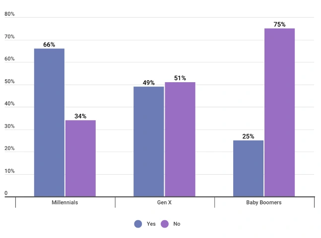
Source: MagnifyMoney survey of 1.029 Individuals asking of they think they would ever be wealthy.
Design Opportunity
With the increasing interest and capacity of millennials in Nigeria and the associated business exposure they possess, it is projected that digital banking services which offer an opportunity to invest and trade in foreign currencies would influence the way Nigerian Millennials view investment and propagate a new age of “e-nvestors”.
Hypothesis
Upon receiving the brief for this project, I had a hypothesis which I needed to validate or restructure based on the feedback received from users. The hypothesis was thus — Millennials in Nigeria would want a digital banking application which had the following features:
- Long-Term Saving Goals e.g. purchasing their first property
- Investment: stock, bonds, real estate and agriculture
- Tracking of spend and rounding up transactions to invest the change.
To validate the following, I proceeded to carrying out user research
II. The Research Process
Competitive Analysis
We looked at 5 direct and indirect competitors and commonly used applications by this user group. The main focus of comparison were:
- Onboarding experience
- Sign-ups
- Simplicity of data presentation
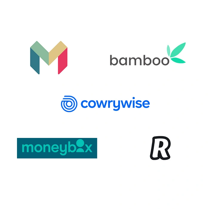
The key learnings while carrying out the competitive analysis within the feature scoped defined were as follows:
- Use a personal tone of voice to gain the user’s trust
- The use of illustrations make the platform more approachable
- Use playful iconography but ensure that it is purposeful
- Give feedback to users when they carry out actions
- Summaries are useful for key information so the user can digest it easily and quickly
User Research
In order to validate the research hypothesis and to better understand who we are designing for, we carried out user research on 5 participants. The initial goal was to interview 3 participants but upon concluding these interviews, we needed more robust responses to validate what some of the participants responses. All the interview were carried out remotely with permission from the interviewees. I also observed that a lot of the users interviewed had created workarounds to achieve their saving and investment goals so I took time out to dig further into this with the participants to understand how they approach these workarounds so we could design for them appropriately in such a way that the platform feels natural for them to use and also addresses the pain points. The questions asked aimed at understanding:
- Current experience of service
- Motivations
- Access to Service
- Mental Model
- Preferred and used channels
- Workarounds that have been created
After the interview, I listened to the recordings and took notes from all the participants categorising the information from each of the participants under Pain points, Motivations, Behaviours, Ideas & Fears.
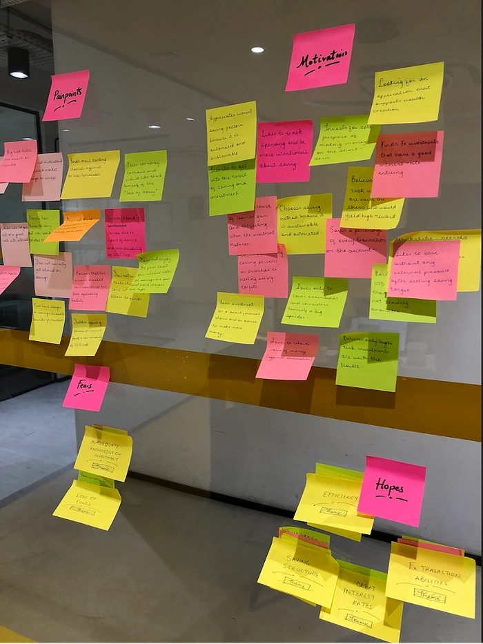
Diagram showing Thematic Analysis Process: Affinity Mapping
I was able to draw the following key insights from the synthesis of the information analysed:
· Interviewees would like an application with great interest rates and a realistic saving structure. They are also concerned about the efficient of the application and the ease of carrying out transactions.
· Interviewees would like to choose the currency they save and invest in. i.e. a flexible currency saving and investment facility.
· Interviewees are encouraged to save based on the availability of effective and sustainable saving plans that present an opportunity to choose the time-frame of their investment.
· Interviewees would like an application that has no bank charges and is reliable and also has a favourable exchange rate for converting foreign currencies to the local currency.
· Interviewees indicated that they would appreciate the availability of investment information in simplified terms and investment profiles as a guide for them to invest as their primary fear is loss of funds due to lack of investment information.
· Interviewees would like to invest on an automated platform that is secure and has different investment options in varying currencies and
· 100% of the participants plan their tasks for the day ahead and carry out leisure tasks at the beginning of the day. They would also like to create a saving culture over time to make interest and grow their wealth.
“I wish I could buy Nigerian stocks through the bank and trade. I also wish that information for stock knowledge was available in general and would like tips, wealth profiles etc if there is a history of making profitable suggestions and there is no “agenda” from the bank to take my money”
- Quote from Interviewee
From the insights we got, we highlighted the key features and themes which the user’s needed the application to focus on.
Receiving Foreign Exchange
Information of Investment
Investment Profile
Ease of use
No bank charges
Variety of investment plans
Security of investment by 3rd party
III. The Persona
To represent the typical user based on our findings, we created a persona to capture the user’s primary motivations and frustrations and to serve as a reference point through the design process.
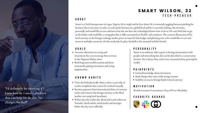
Problem Statement
In order to ensure that we were all aligned in terms of addressing the problem through design, we crafted the question:
How might we create a platform that is easy to use for millennials to save, invest and grow their wealth over time?
IV. Ideation
Feature Prioritisation
In order to maximise our resources, we decided to prioritise the most important features which had been outlined by the user and we could produce given the time constraint.
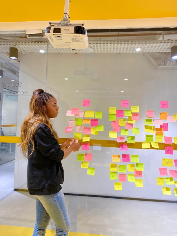
Feature prioritization process
User Epic & User Stories
For the design solution, the key experience is the epic “investing in shares”. This is also the Minimum Viable Product which could be achieved in the given timeframe.

User Journey/Task Flow
We created Smart’s journey on the application taking into consideration the key features that had been prioritised in order to determine what screens to design. Also, we kept in mind that the Key Experience that was being considered was “Purchasing stock on the application”. This is also the Minimum Viable product that can be designed and developed within the given timeframe.

Sketches & Wireframes
After gaining an in-depth understanding of the User through their interview, tasks and stories, I created sketches with the key features required in mind. I started off using storyboarding to walk-through a scenario in which Smart would make a stock purchase through the application. After which I used the “Crazy 8” method in sketching various rapid alternatives for pages on the application. The sketching session helped me in conceptualising ideas and trying out content placement.
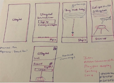
Initial Sketches for App screens using Crazy 8’s method.
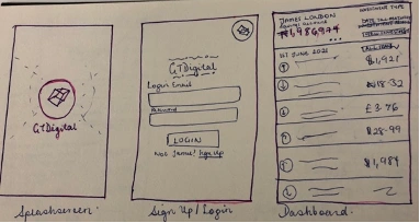
Initial Sketches for App screens using Crazy 8’s method.
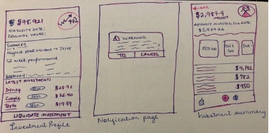
Initial Sketches for App screens using Crazy 8’s method.
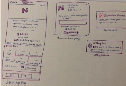
Initial Sketches for App screens using Crazy 8’s method.
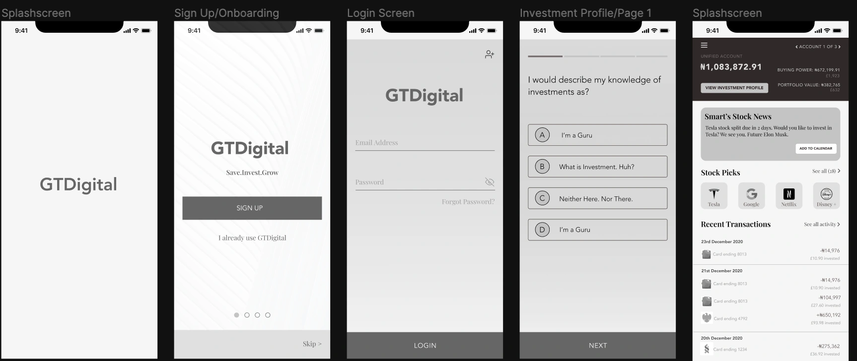
First & Second Iteration of Wireframes (L-R). Second iteration produced after testing.
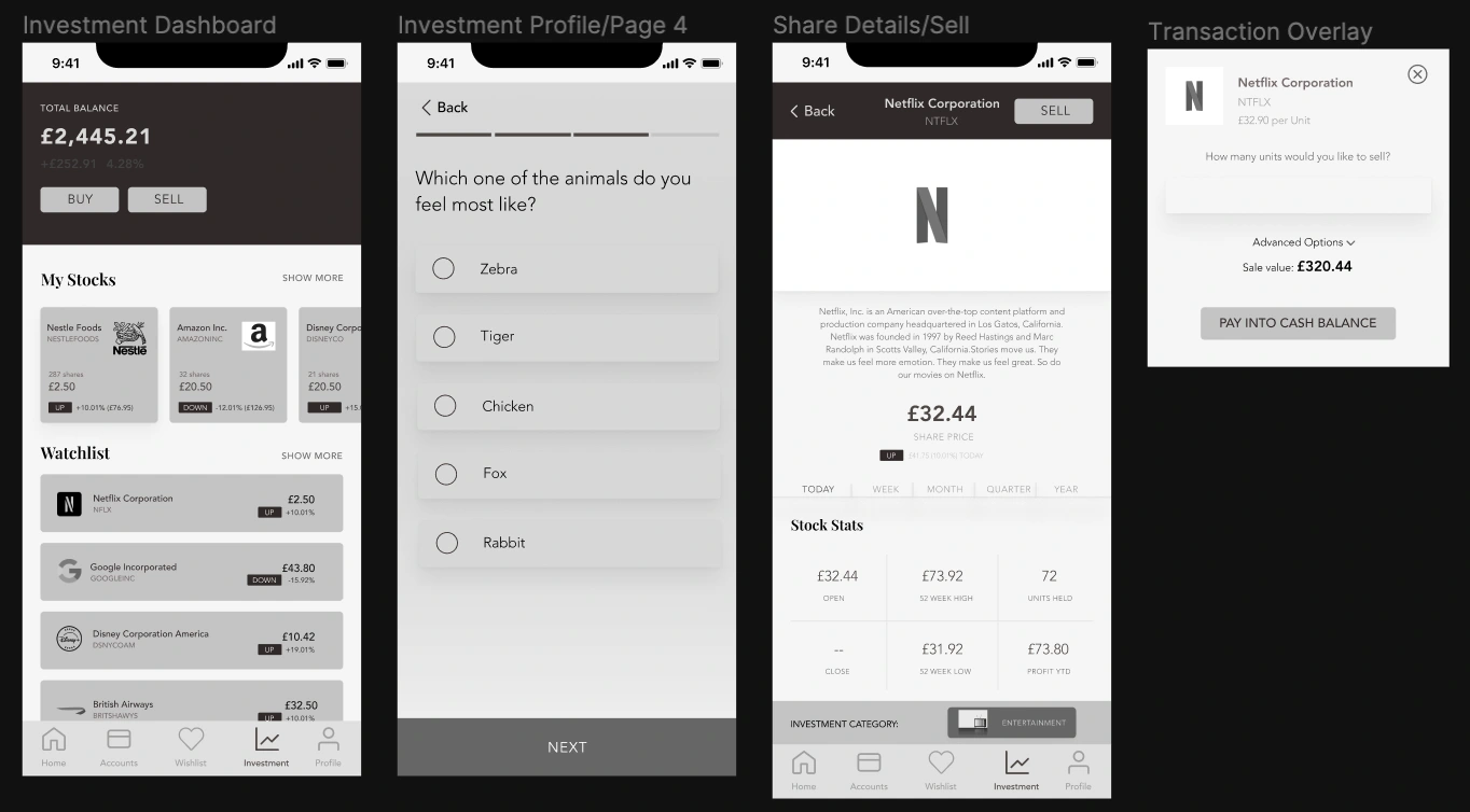
First & Second Iteration of Wireframes (L-R). Second iteration produced after testing.
Usability Testing
Testing. Testing. Design Check 1, 2.
The design solution went through two rounds of testing. The aim was to observe the ease of use of the application while completing the task and if the user found any of the terms used in the application complicated to understand.
Insights from User Testing:
- Users considered illustrations more user friendly and gender neutral and preferred to see this rather than actual images across the application.
- Users preferred radio buttons rather than alphabets or numbers for the options in the Investment Quiz as they felt using numbers or letters made it feel more like a test.
Part 2: UI Delivery
I. Brand Colours
Considering the fact that the application is an investment and banking application, we wanted to create a feel that was fun and approachable yet made users feel secure. We also wanted to project stability as these are the features that users described they would like from a banking/investment service.

II. High-Fidelity Mock-ups
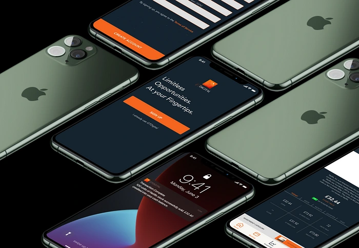
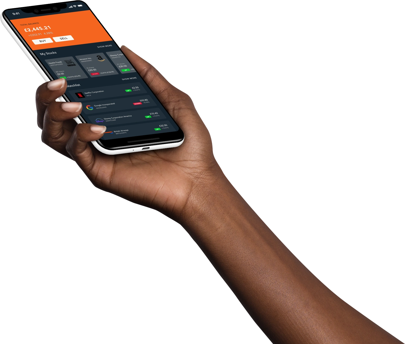
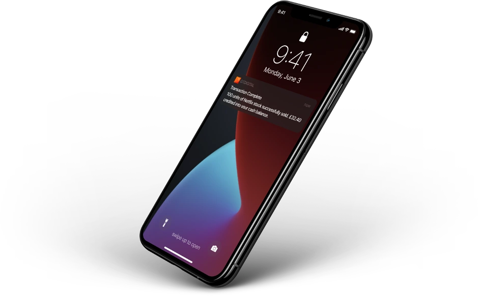
We designed for iOS using the iPhone XR/11 screen. Patterns that were used were in line with the Human Interface Guideline for iOS Devices. For the look and feel of the application, it was important to create the feeling of the stock market screens which is traditionally black in colour. For this project, I used free illustrations from Storyset (www.storyset.com). While comparing the colour scheme to the background, we ensured that the icons and colour scheme fit into accessibility standards. We achieved this by lightening or darkening features where necessary until the AAA accessibility standards were achieved.

III. Final Prototype
We developed a prototype based on the following Scenerio.
Smart was referred by a friend to download and use GTDigital. He wants to sign up and purchase stock through the application.
Click the button to begin viewing the prototype.
Overall Key Learnings:
I found this project inspiring as I was able to experience the process of designing for an application in dark mode. It also exposed me to relative sizing of text and elements in an application that would use many icons and images. Working with design professionals also gave a good view into the agile process and how it works. Making decisions on design trade-offs was also a key take away for me during this project.
From the user’s stand point, I learnt that:
· For a product that involves money, users want a secure, easy to use and accessible platform
· The look, feel and tone of voice of a product impact greatly on how the user interacts with the product
· Simple yet detailed design communicates a sense of class to the user
Suggested Next Steps
Work on the remaining pages of the report.
Develop the banking and profile pages of the dashboard.
Create a seamless process for users to verify their documentation.
Design for different viewports/device options.
Thank you for reading my case study!
Let me know if you enjoyed it or would like to find out more.
Contact : dedamioloketuyi@gmail.com
Like this project
Posted Feb 27, 2024
To design an online banking dashboard that inspires millennials to save and invest without viewing it as a foreign concept regardless of their prior saving and…

