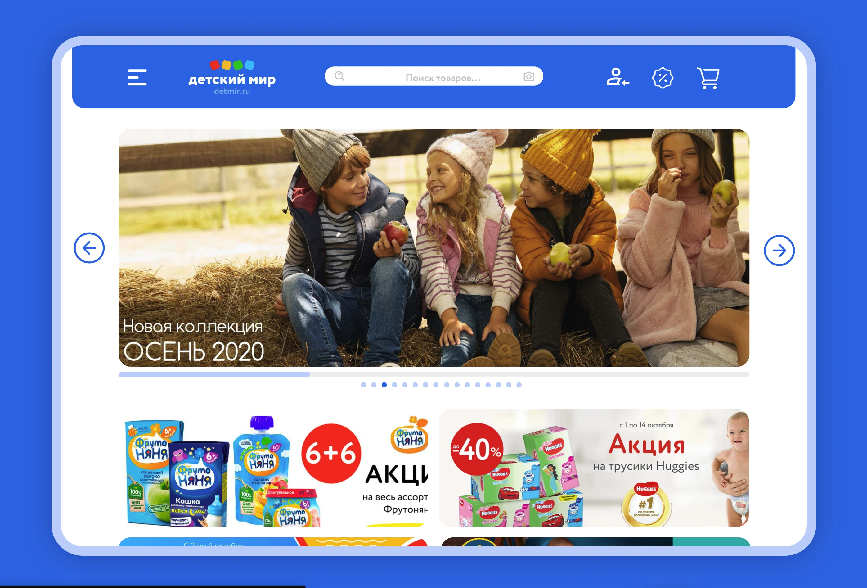
Toys shop "Children's world" website re-design
Detskiy Mir is a leading retail chain in Russia, celebrated for its vast and thoughtfully chosen selection of children’s products. Known as a one-stop destination for parents and caregivers, it offers everything from toys, clothing, and school supplies to essential items for babies and toddlers. With a strong emphasis on quality and safety, Detskiy Mir meticulously curates its offerings to ensure they meet the diverse needs of families, providing products that parents can trust. The chain is also dedicated to creating a delightful shopping experience, featuring friendly, knowledgeable staff and a welcoming atmosphere where customers can easily find exactly what they need for their little ones.
My goal was to enhance the overall customer experience and build a streamlined user journey that would make finding the right products simple, enjoyable, and accessible for every family.

Main Tasks
Redesign outdated UI and increase current conversion: Update the user interface to be more modern and effective, with the aim of boosting conversion rates.
Simplify and improve product search process: Enhance the search functionality to make it easier and more efficient for users to find products.
Work Done
Analyze Current Scenario: Conduct an in-depth examination of the existing workflow or design to identify its strengths, weaknesses, and limitations. This involves assessing user feedback, reviewing process efficiency, and understanding the broader context within which the workflow operates. This foundational step is essential to determine areas that need improvement.
Analyze Competitors and Their Solutions: Research competitor products and solutions to gather insights on industry standards and innovative approaches. This competitive analysis provides a benchmark and potential inspiration for improvements, highlighting how other companies address similar challenges and what elements resonate well with users.
Improve Current Scenario and Create Prototype: Based on the insights gathered, make strategic enhancements to the current workflow, aiming to address identified pain points and introduce new features or improvements. Develop a prototype that reflects these optimizations, allowing for initial user testing and feedback before moving forward with final design.
Create Prototype and Design on Improved Scenario: Build a refined prototype incorporating all feedback and improvements, transforming the optimized flow into a final, polished design. This stage ensures the solution is ready for seamless integration, aligning closely with user needs and providing a user-centered, well-rounded experience.

Delivery:
Client feedback improved by 13%: Positive feedback from clients increased, reflecting higher satisfaction with the updated design.
A/B testing results: A/B testing revealed a 7% reduction in visitor drop-off, indicating a more engaging and user-friendly experience.
Like this project
Posted Jul 15, 2024
Detskiy Mir is a prominent retail chain in Russia. My goal was to enhance the overall customer experience.
Likes
0
Views
21


