Clean Arc™ — Luxury Barrier Support Skincare
Jerie Mehari
Clean Arc™ is a premium tallow-based skincare brand built around barrier support, climate resilience, and minimalist luxury. The brand architecture positions tallow not as a trend ingredient but as a foundational skincare philosophy rooted in skin barrier science.
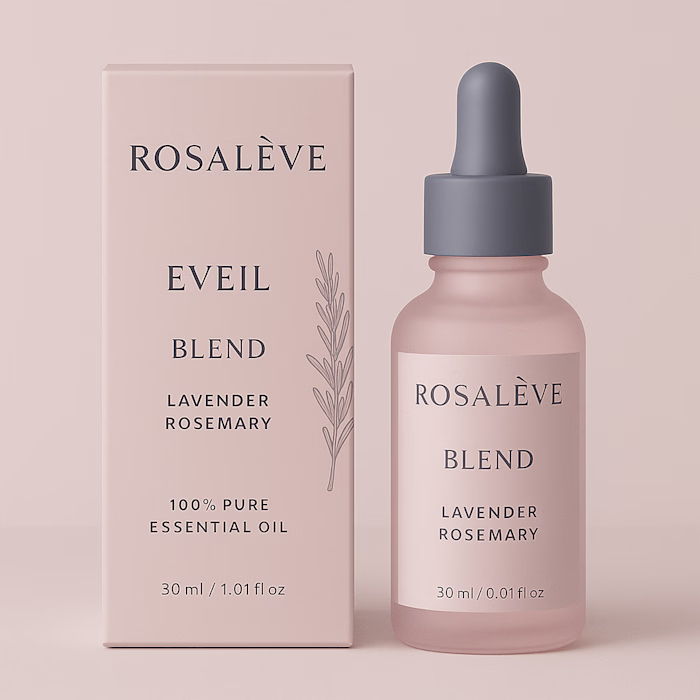
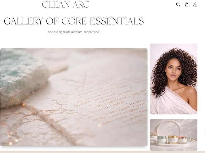
The visual direction was developed to communicate clinical credibility through luxury aesthetics rather than medical or pharmaceutical visual language. The brand feels calm, premium, and intentional.
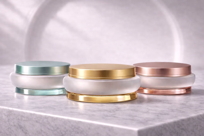
The identity system explored restrained typography with editorial weight, mineral and earth-toned palettes, frosted and matte material finishes, gold accent detailing as a signature element, and spatial compositions that prioritize breathing room.
The brand architecture was designed to scale across skincare, hair care, and body care while maintaining a unified visual identity. Each sub-line carries tonal variation within the same design system.
Deliverables included brand architecture and positioning, visual identity and logo direction, typography hierarchy, color and material palette systems, packaging direction, and scalable design system documentation.
The goal was to build a skincare brand that communicates barrier support and climate resilience through quiet luxury rather than clinical austerity or wellness clichés.
Like this project
Posted Dec 20, 2025
Luxury wellness ecosystem for CLEAN ARC™ focused on barrier support, climate resilience, packaging systems, editorial e-commerce, tactile visual direction, and AI-assisted brand development.