Brand Identity and Packaging Design for WellMija
Adriana Guillén
Overview
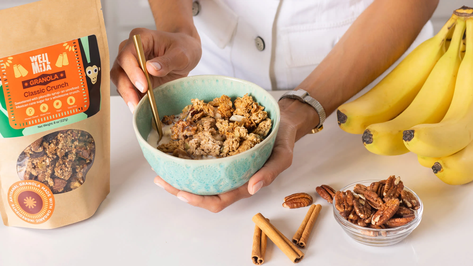
WellMija was born from the desire to celebrate health, honor Mexican culture, and connect with flavors that nourish the body and soul. The goal of this project was to create a distinctive visual identity in the crowded healthy products market, combining cultural authenticity with emotional impact.
The Challenge
The main challenge was to design an identity that felt authentic and approachable, communicating wellness while standing out in a market full of neutral, generic brands.
The Solution
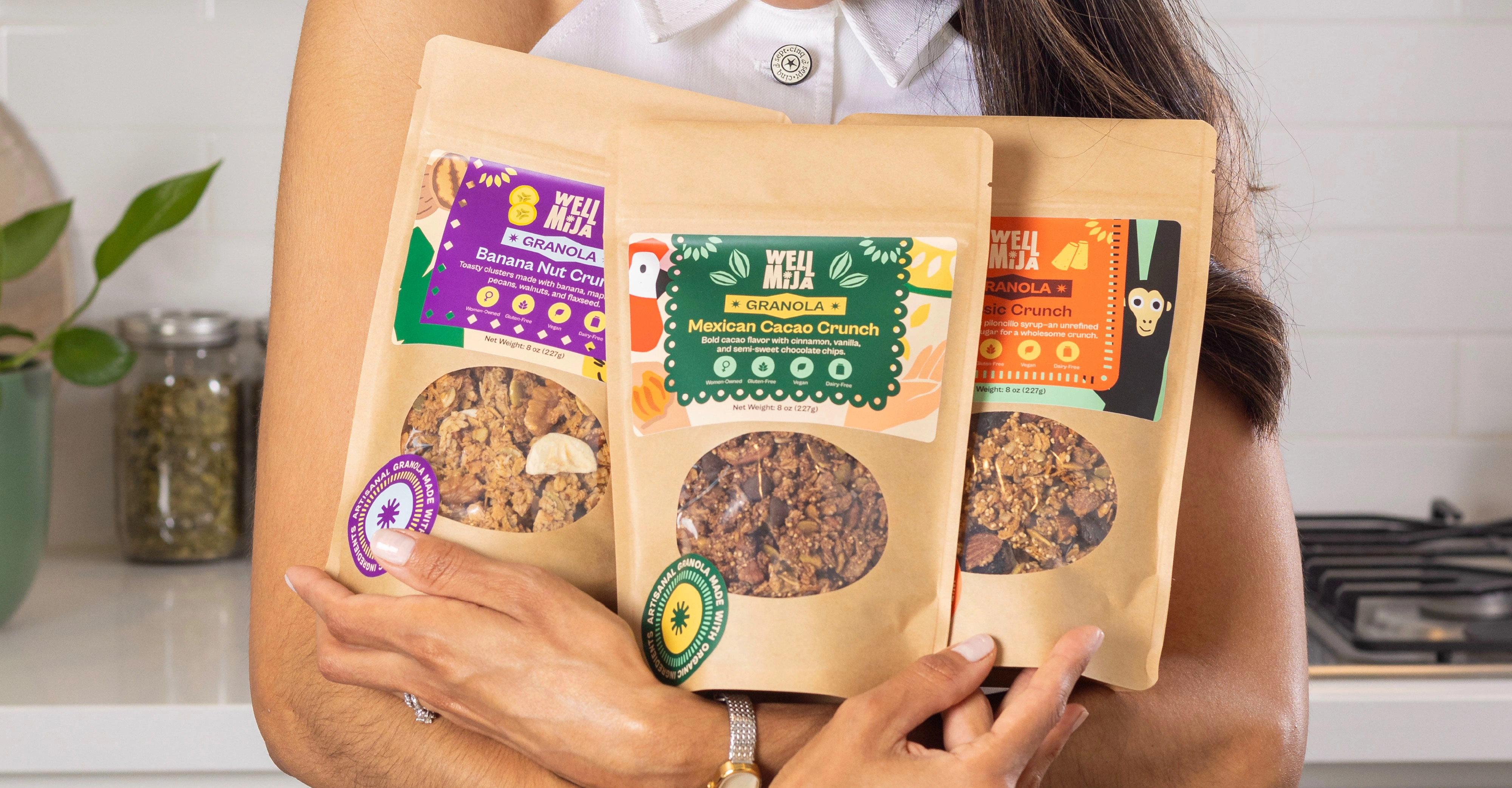
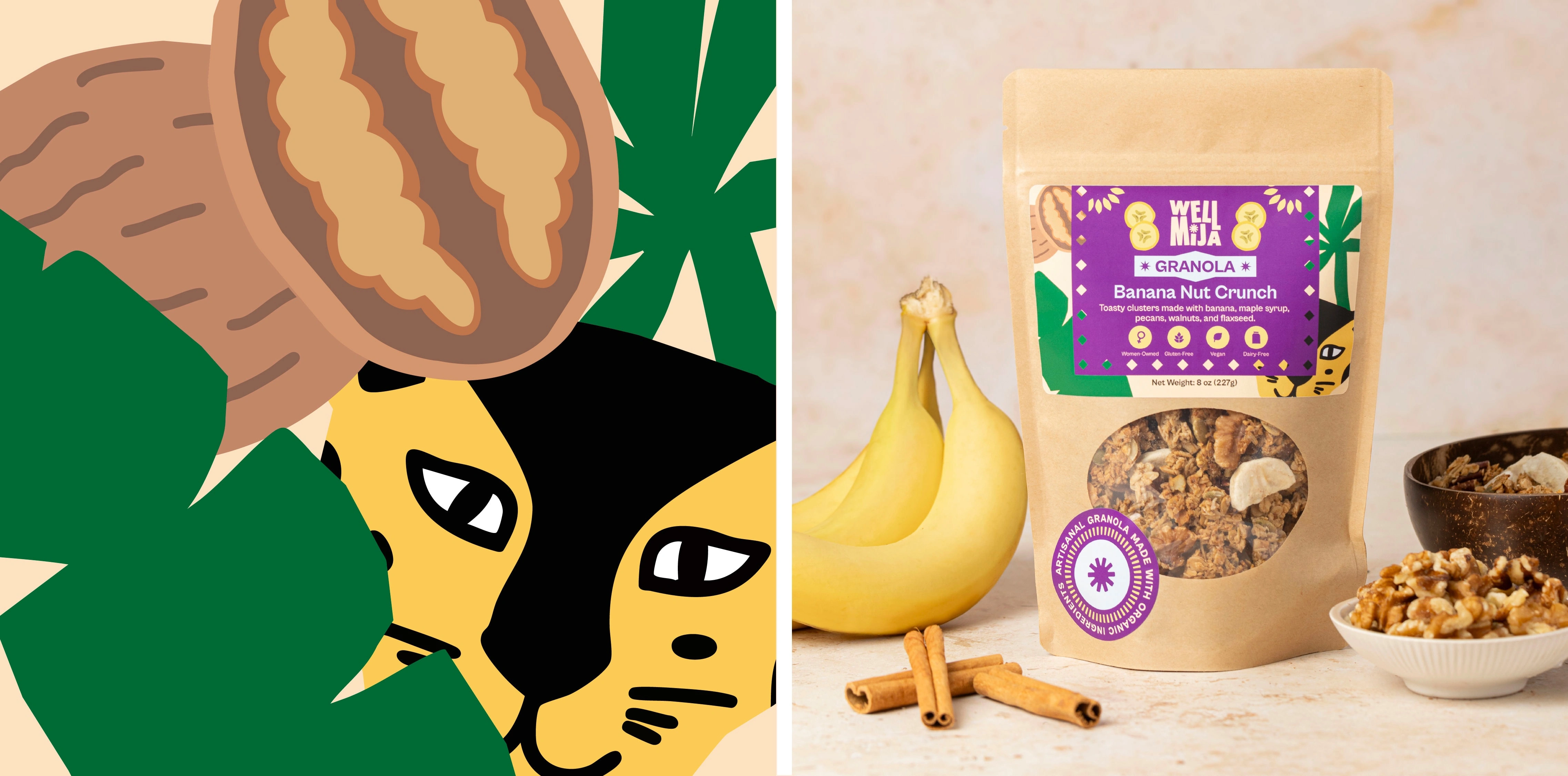
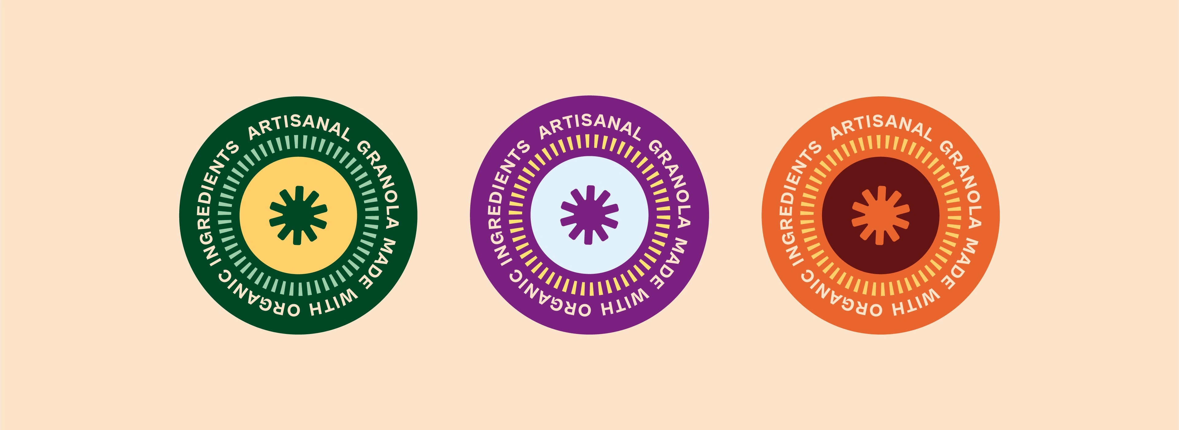
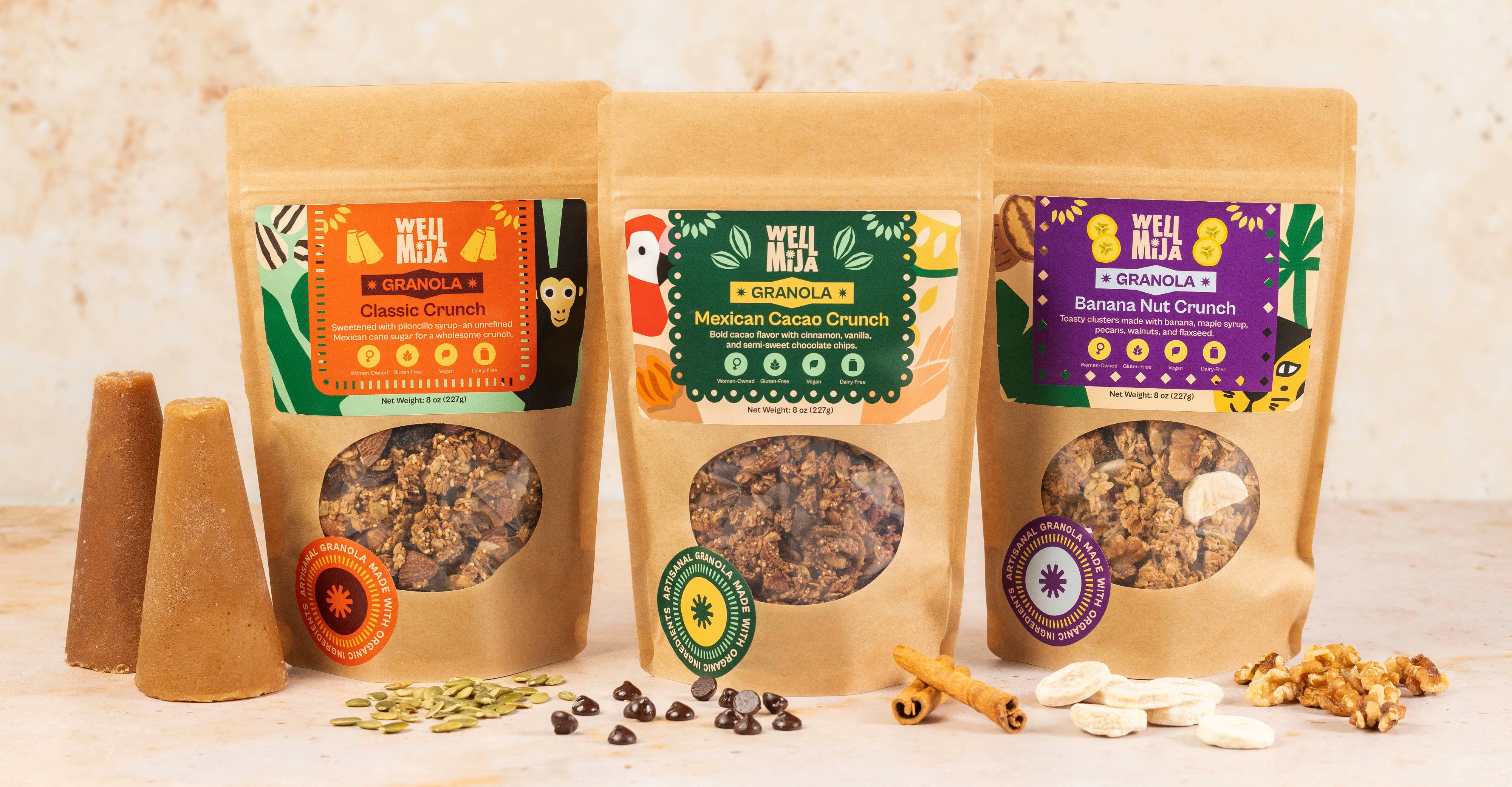
The visual identity was built around three core concepts: craftsmanship, natural energy, and joy. The logo reflects these ideas through its typography, with letters wrapping around the sun to symbolize vitality and origin. The playful rhythm of the lettering adds movement and a cheerful tone.
The system is completed with a bold, contrasting color palette balanced with warm tones, paired with organic illustrations inspired by Mexican culture, the brand’s origins, and its natural ingredients.
Project Scope
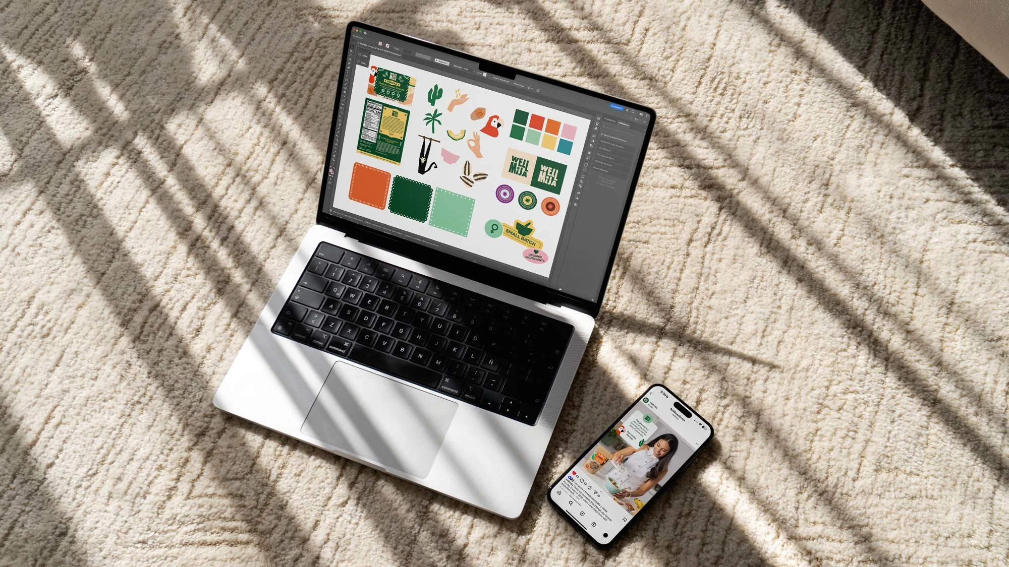
Brand strategy, brand identity, packaging design and art direction.
Result
The result is a memorable and expressive brand identity that connects emotionally with consumers, celebrating health through a cultural, approachable, and energetic perspective.

Like this project
Posted Jan 13, 2026
I created a distinct visual identity for WellMija in the healthy products market.