Mobile App Redesign | Starbucks
Overview 🔎
This project aimed to improve the Starbucks Mobile App by identifying and addressing common issues users encounter, through a heuristic review based on design principles and best practices. The main goal was to enhance the app's usability and overall user satisfaction.
What is Heuristic Evaluation?
To create a product that users can easily engage with and derive value from their interaction, a crucial step in the design process is heuristic evaluation. This involves a comprehensive analysis of the product's user interface to identify any potential usability issues that users may encounter while interacting with the product, and to determine effective solutions to address them.
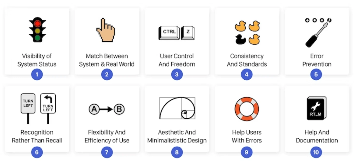
Nielsen's 10 usability heuristics:
Nielsen's 10 usability heuristics are a set of rules or guidelines that evaluate the usability of a user interface. They were created by Jakob Nielsen, a renowned user interface expert, and are used by UX designers and researchers to identify usability issues in software and web applications.
Here is a brief overview of the 10 usability heuristics:
Visibility of system status: The system should always keep users informed about what is going on, through appropriate feedback within a reasonable amount of time.
Match between system and the real world: The system should speak the language of the users, with words, phrases, and concepts familiar to them.
User control and freedom: Users should be able to undo actions, easily navigate, and feel in control of the interface.
Consistency and standards: Users should not have to wonder whether different words, situations, or actions mean the same thing.
Error prevention: The system should prevent errors from occurring and help users recover from mistakes.
Recognition rather than recall: Users should be able to recognize what to do, rather than having to remember things from memory.
Flexibility and efficiency of use: The system should cater to users with different levels of experience and expertise, allowing them to accomplish tasks quickly and easily.
Aesthetic and minimalist design: The system should be visually appealing and simple, without unnecessary elements.
Help users recognize, diagnose, and recover from errors: The system should clearly communicate errors, provide solutions, and help users recover from errors.
Help and documentation: The system should provide adequate help and documentation, but not rely on it to compensate for poor usability.
Overall, Nielsen's 10 usability heuristics provide a useful framework for evaluating and improving the usability of a user interface design.
My Role:
Analysed the flow and purpose of the current Starbucks mobile app by attempting to complete an order of a caramel macchiato.
Conducted a heuristic evaluation and review of the app using Nielsen's 10 usability heuristics.
Conducted user research to identify pain points and areas for improvement in the app.
Discussed findings and collaborated with the team to come to a suitable agreement.
Brainstormed and iterated possible solutions to address identified issues.
Finalised redesigns and proposed changes to improve the app's user experience.
Timeline:
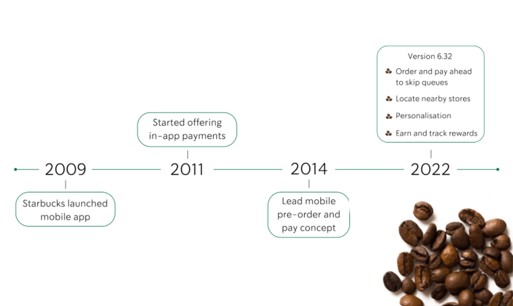
Current Starbucks app timeline
Problem & Solution 🤝
How might we streamline the Starbucks order and collect interface, so that users can have an accessible and efficient checkout process?
Heuristic Review:

Heuristic review legend
Heuristic Review Explained:
In the case of Nielsen's 10 usability heuristics, each heuristic has a score from 0 to 5 assigned to it.
0: A usability issue is not present or is negligible.
1: A usability issue is cosmetic in nature, with no significant impact on the user experience.
2: A minor usability issue is present, with some impact on the user experience, but the user can still complete the task.
3: A moderate usability issue is present, with a noticeable impact on the user experience, and the user may need assistance to complete the task.
4: A serious usability issue is present, with a significant impact on the user experience, and the user may not be able to complete the task.
These scores are used to evaluate the severity of usability issues found during a heuristic evaluation and to prioritise which issues should be addressed first in the redesign process.
Top Inquiries & Complaints
As avid Starbucks app users, our team discovered the top three inquiries and complaints among fellow coffee lovers were:
Payment and reward issues
Technical glitches
Difficulty customising orders
We conducted a heuristic evaluation of the Starbucks app's order process, and found that some of the issues reported by users, such as payment and reward processing failures, app freezing or crashing, and difficulty in customising orders, we also experienced firsthand during our testing. Although the app is popular and convenient for ordering coffee on the go, these issues can be frustrating for users. Despite these issues, the app remains a popular choice for many coffee lovers, and we hope that Starbucks continues to work on improving its functionality for a better user experience.
Heuristic Evaluation: Improving the Starbucks App Order Process
Our team further conducted a heuristic evaluation of the Starbucks app's order process using Nielsen's 10 usability heuristics, explained above. We then proposed changes to improve the user experience and redesigned the order process to be more intuitive and user-friendly. We identified several usability issues with the original design, such as confusing language, inconsistent navigation, and a lack of customisation options. To address these issues, we simplified the language and layout, provided clear and consistent navigation, and added more customisation options for users. These changes aim to make the app's order process more streamlined and enjoyable for Starbucks’ loyal coffee fans.
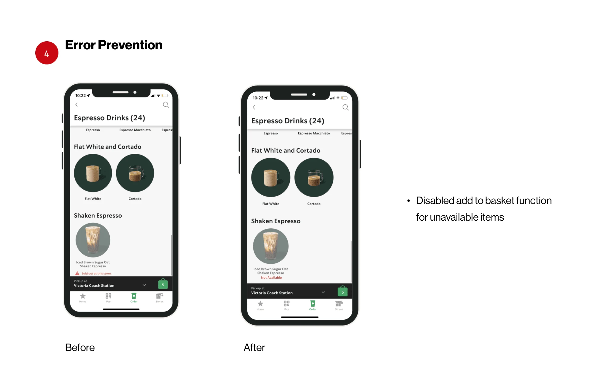
Original rating of 4 (catastrophe) for Error prevention: The system should prevent errors from occurring and help users recover from mistakes. Redesign demonstrates possible solution.
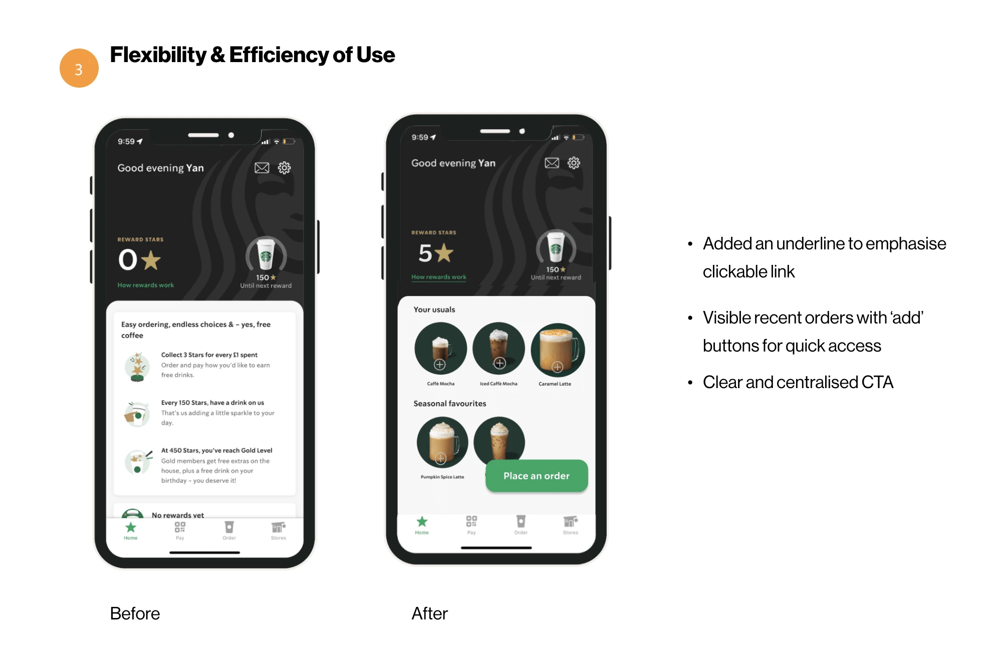
Rating of 3 (major problem) for Flexibility and efficiency of use: The system should cater to users with different levels of experience and expertise, allowing them to accomplish tasks quickly and easily. Redesign demonstrates possible solutions.
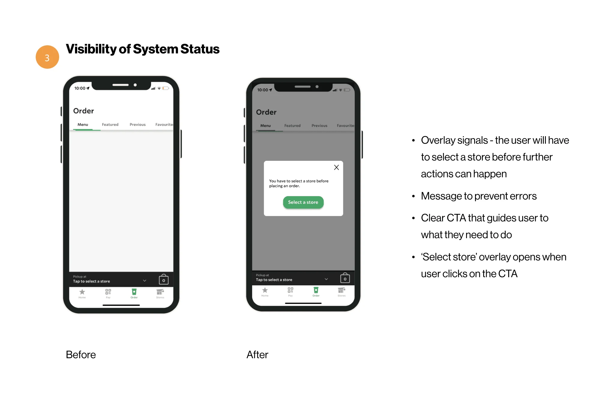
Rating of 3 (major problem for Visibility of system status: The system should always keep users informed about what is going on, through appropriate feedback within a reasonable amount of time. Redesign demonstrates solution.
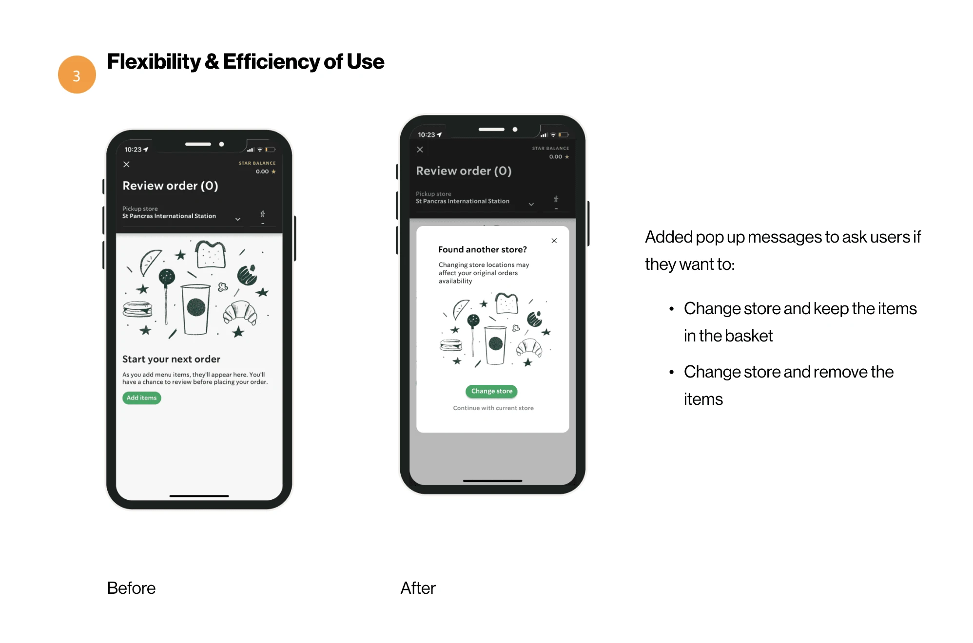
Rating of 3 (major problem) for Flexibility and efficiency of use: The system should cater to users with different levels of experience and expertise, allowing them to accomplish tasks quickly and easily Redesign demonstrates possible solutions.
Final Takeaways 📝
Conducting user research and heuristic evaluation can help identify pain points and areas for improvement in a product's design.
Simplifying language and layout, providing clear navigation, and adding customisation options can make a significant difference in the user experience.
Even popular and well-established apps like Starbucks can benefit from ongoing improvements to ensure a better user experience for their customers.
Like this project
Posted Mar 24, 2023
Revamping the Starbucks Mobile App - project involves a heuristic review and redesign of the Starbucks app to improve its usability and enhance the overall exp.


