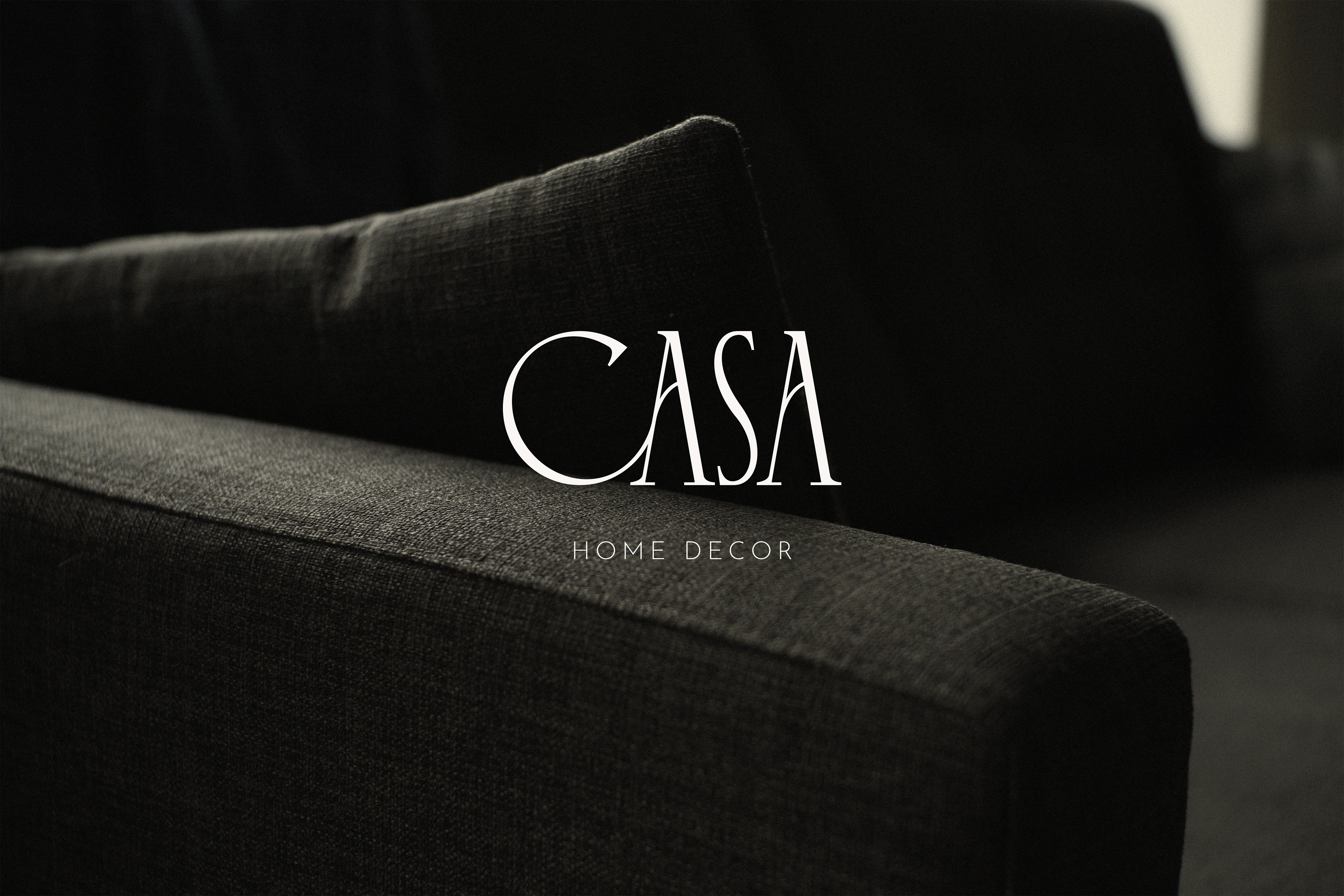
CASA — Brand Identity

Bianca Santiago


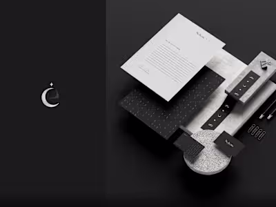
CASA / Home & Decor — Brand Identity Design
Casa is a home decor studio, specialized for providing a wide range of decoration items ranging from furniture, lightning textures, to decorative items such as vases, painting walls, and much more, bringing an aesthetic and artistic touch to their products.
They wanted a visual identity that could transmit all the elegance, aesthetic and artistic vibe, having Art as their main inspiration, and that could also bring a soft and vintage approach to their image.
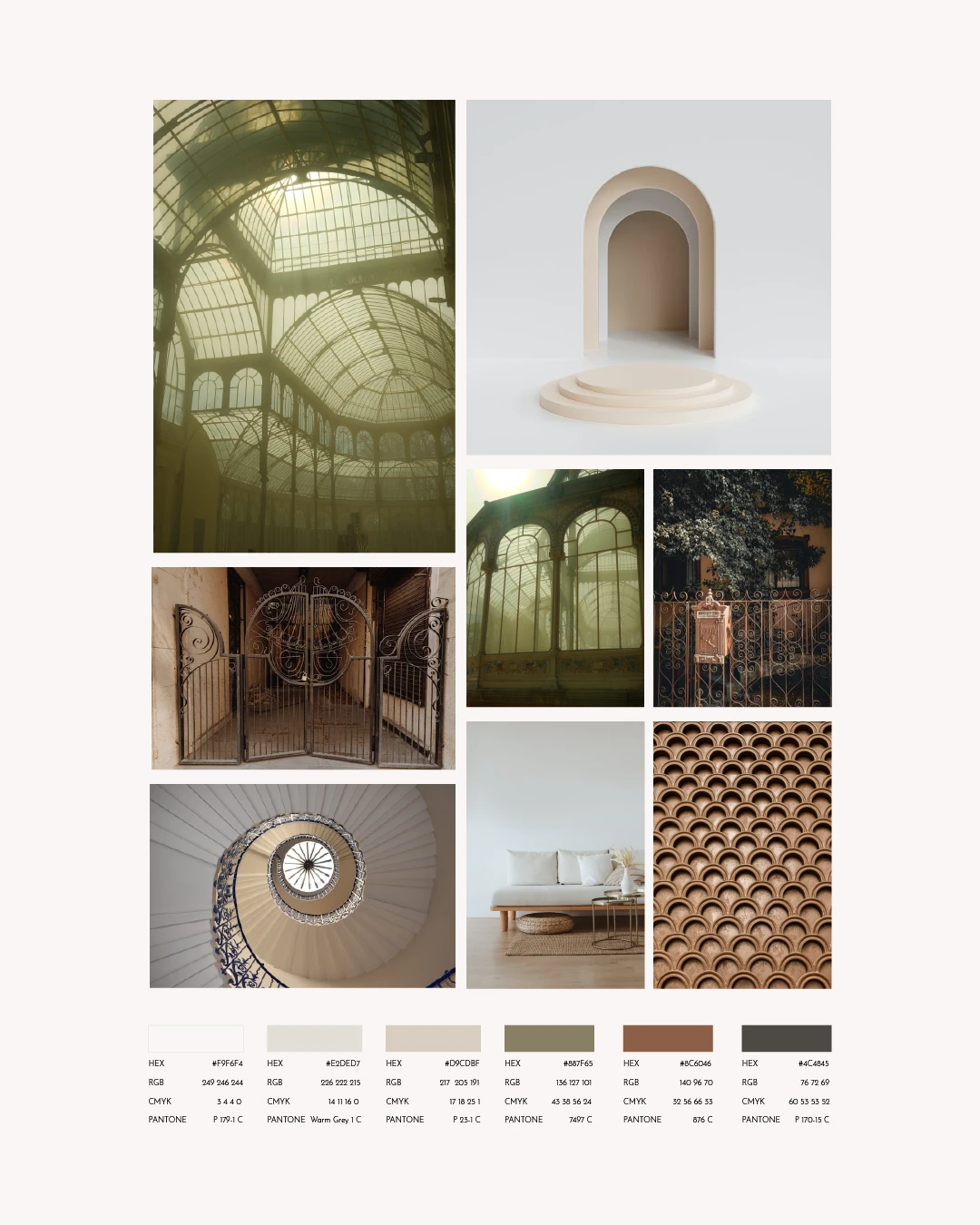
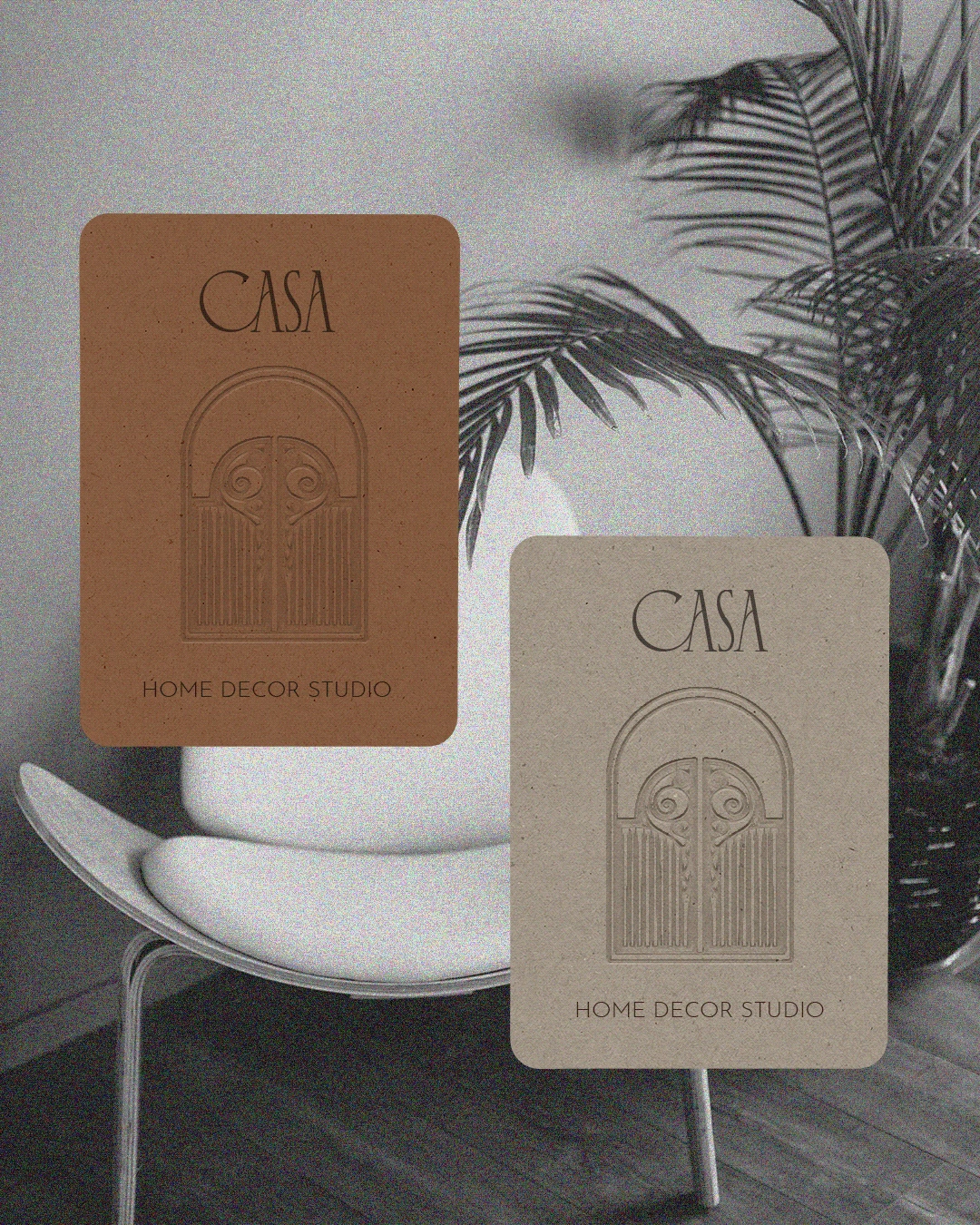
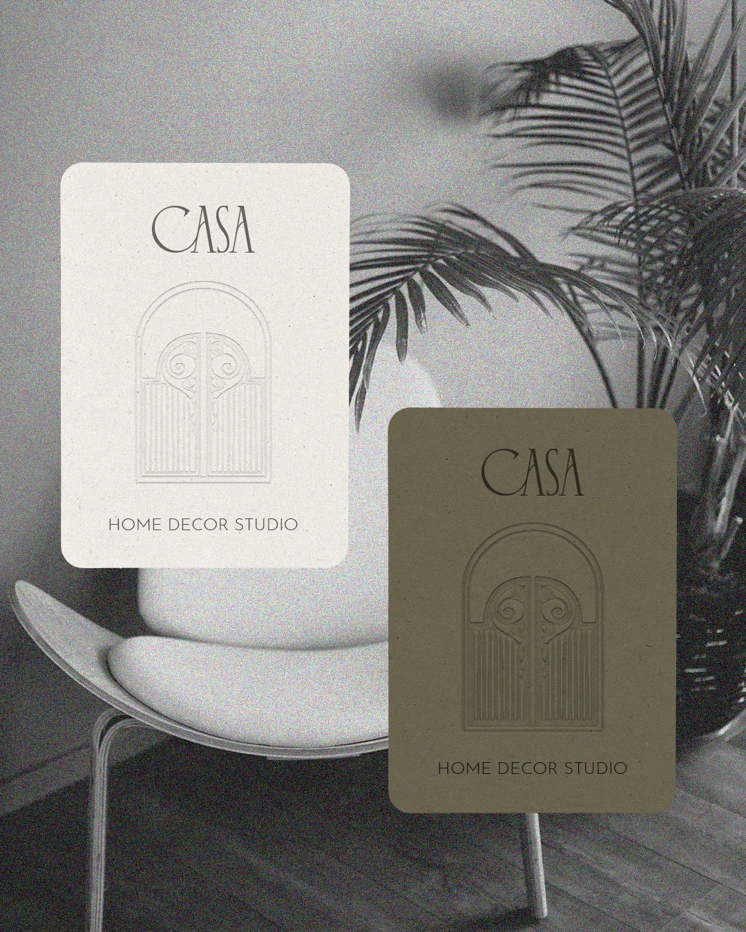
Following all these attributes, for the logo construction I had the idea to bring some slightly elements from Art Nouveau (famous for its elegant curves and long lines), using of geometric shapes and organic lines to bring the artistic and vintage vibe, having also as reference, the ornaments presented in old house gates, following the idea of "Your Own Palace", also presented in the initial project brief, and to bring the ornaments presented in this Art Movement.
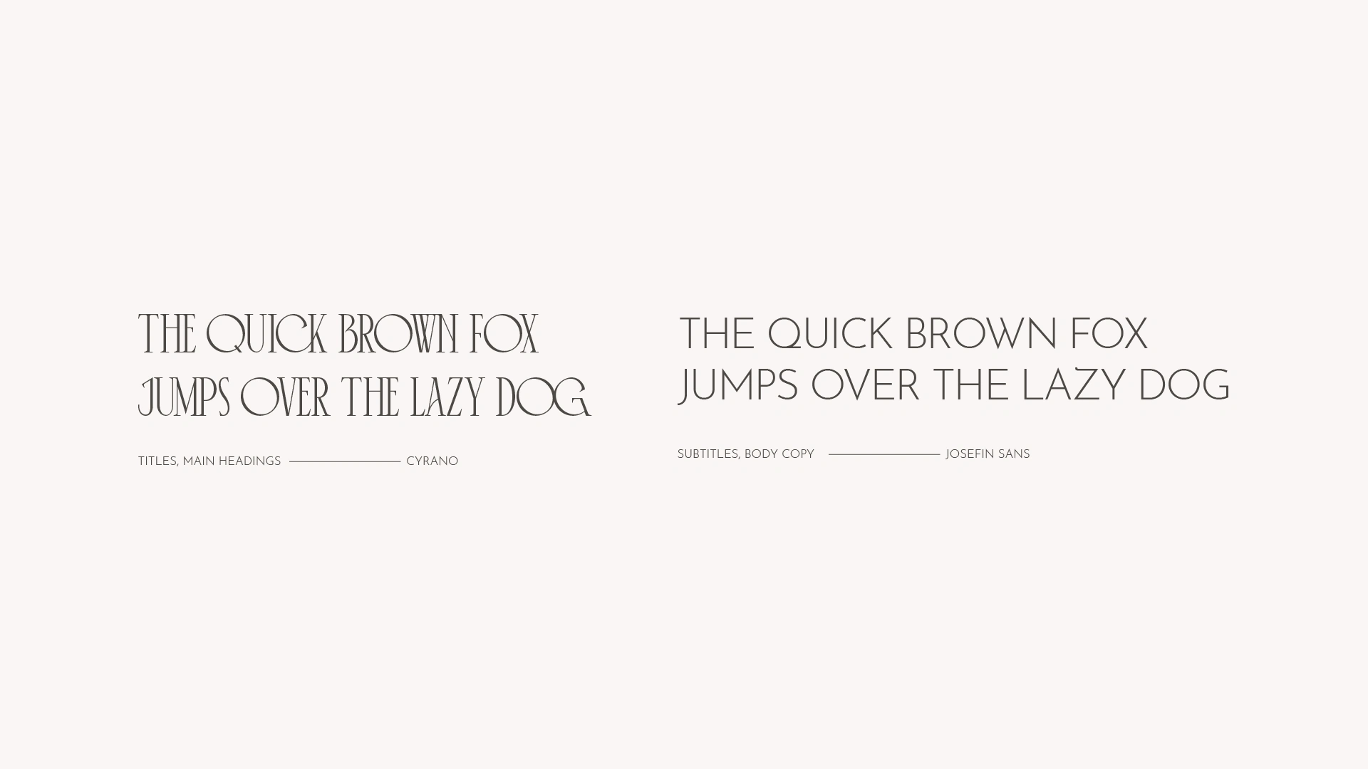
To transmit a vintage and soft vibe, a set of colors that ranges from neutral to earthy tones was chosen, and which together, provides the sense of softness and elegance for the brand. The typography was chosen to bring this artistic and modern vibe, fitting also with the ornaments and geometry presented in the logo.
Project Details
Business Type: Furniture & Home Decor
Keywords: Vintage • Artistic • Creative • Elegant • Classy • Authentic
Deliverables: Logo Design Suite • Color Palette • Typography • Brand Guidelines Book • Stationary Design • Packaging Design • Merchandise • Social Media Templates
Timeframe: 4 weeks
Project Objectives:
Develop a refined and artistic brand identity that embodies CASA’s elegance, aesthetic sensibility, and vintage charm.
Incorporate Art Nouveau-inspired elements, blending geometric shapes and organic lines to enhance the brand’s artistic appeal.
Design a sophisticated logo influenced by classic architectural ornaments, aligning with the concept of "Your Own Palace."
Establish a harmonious color palette of neutral and earthy tones to evoke softness, warmth, and timeless elegance.
Select typography that complements the artistic and modern vibe, ensuring cohesion across all brand elements.
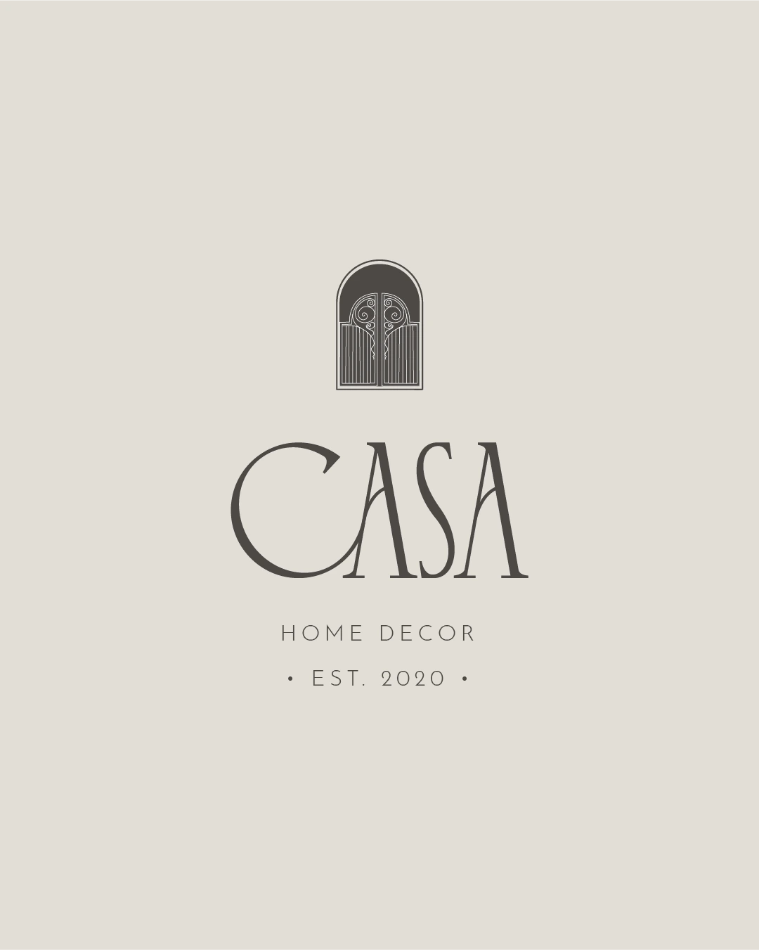
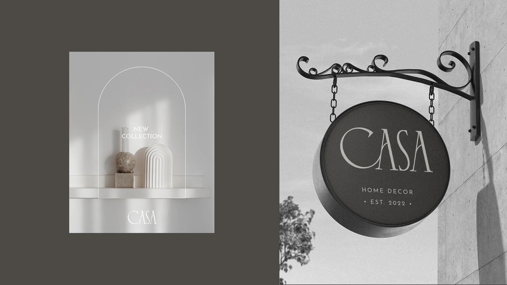
Brand Logo Design
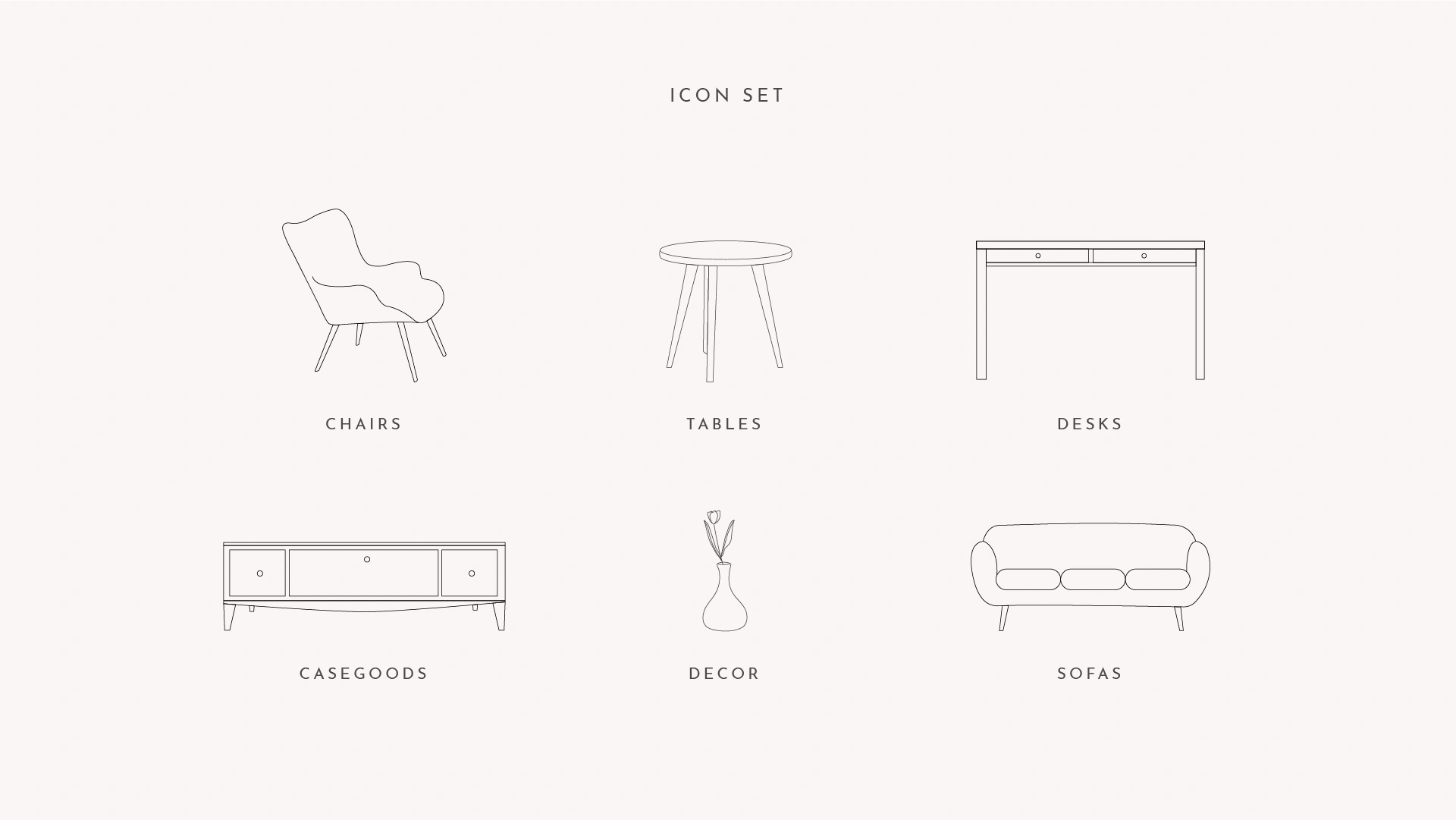
Iconography
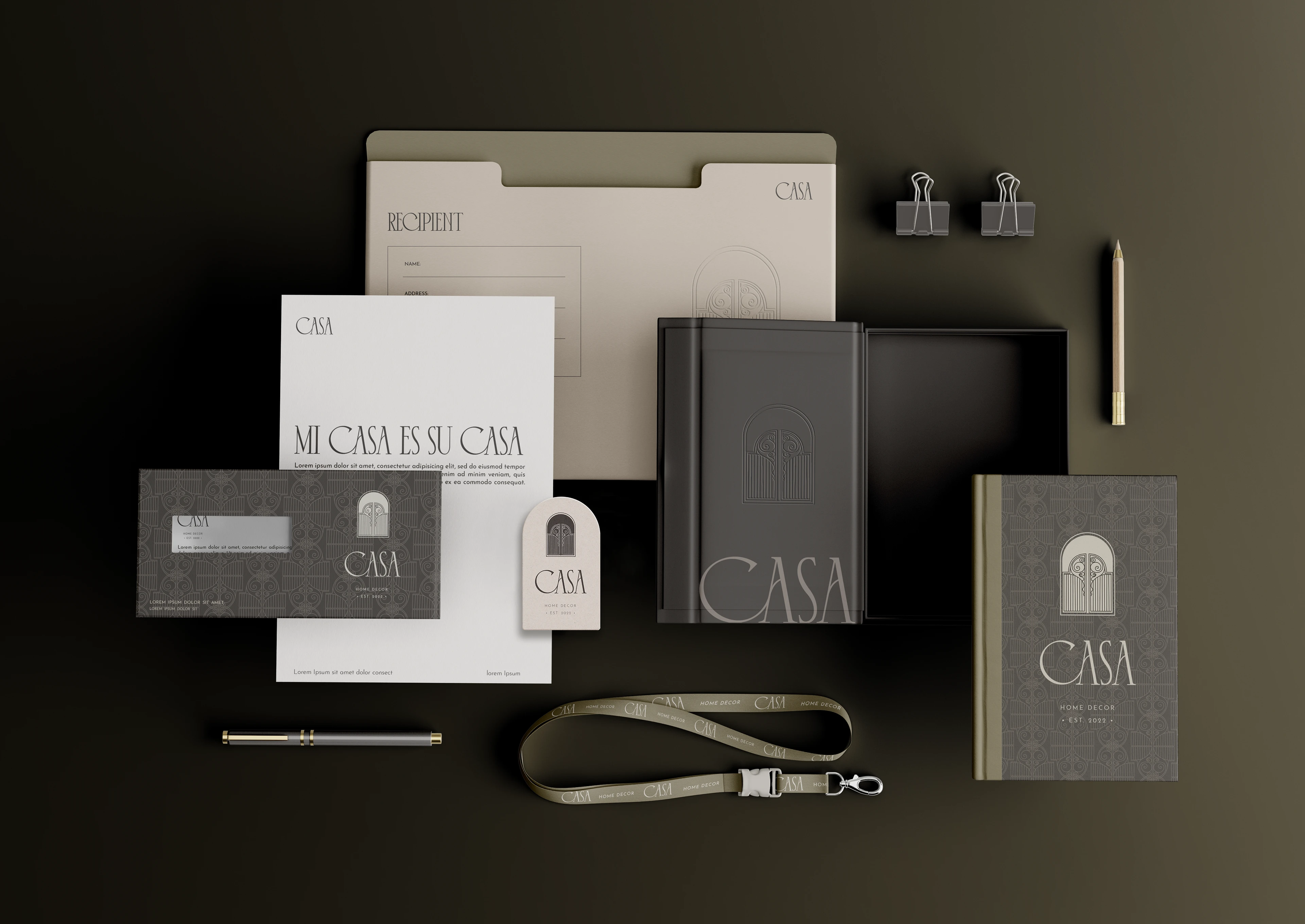
Brand Stationary
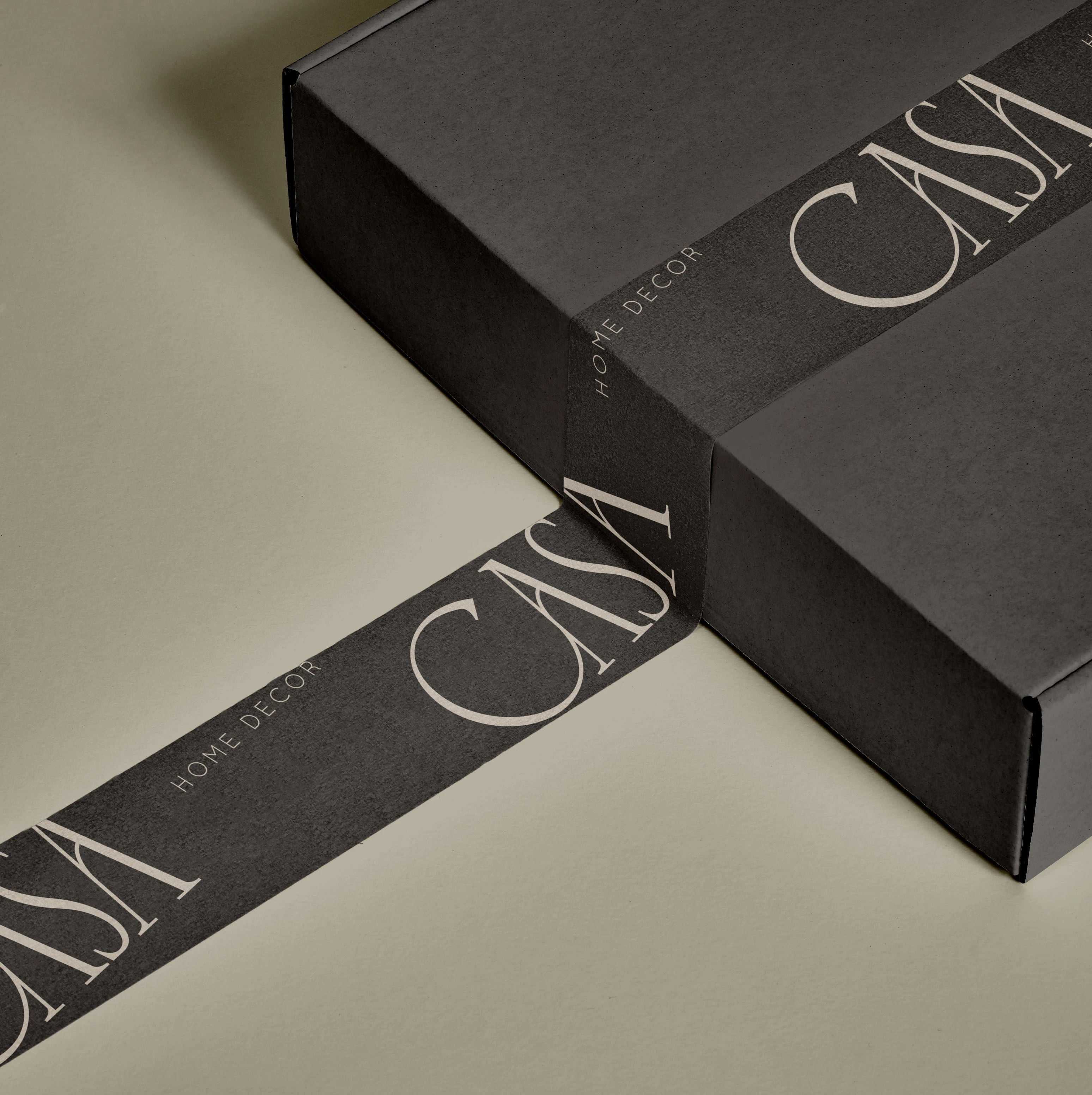
Packaging Design
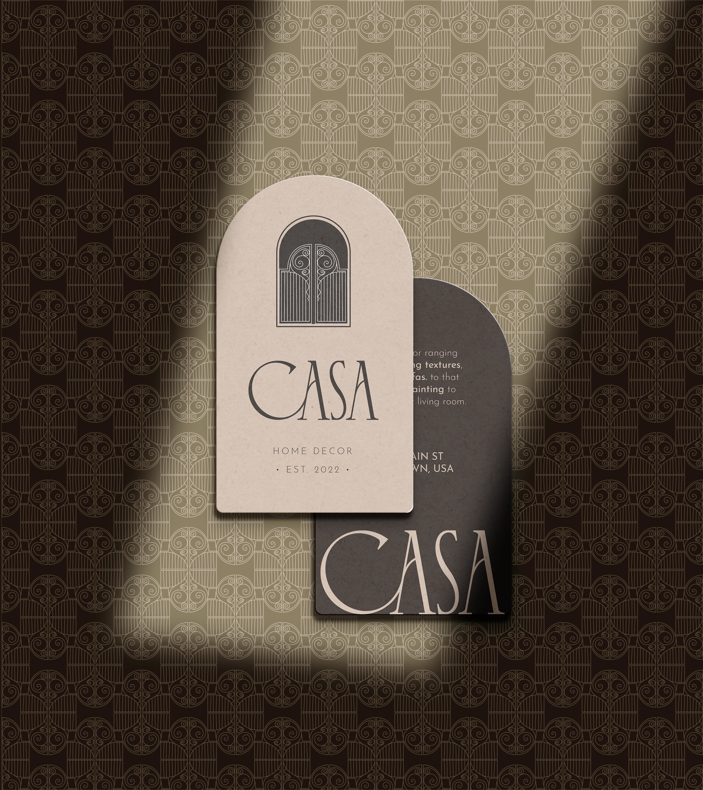
Business Cards
Business Cards
Business Cards
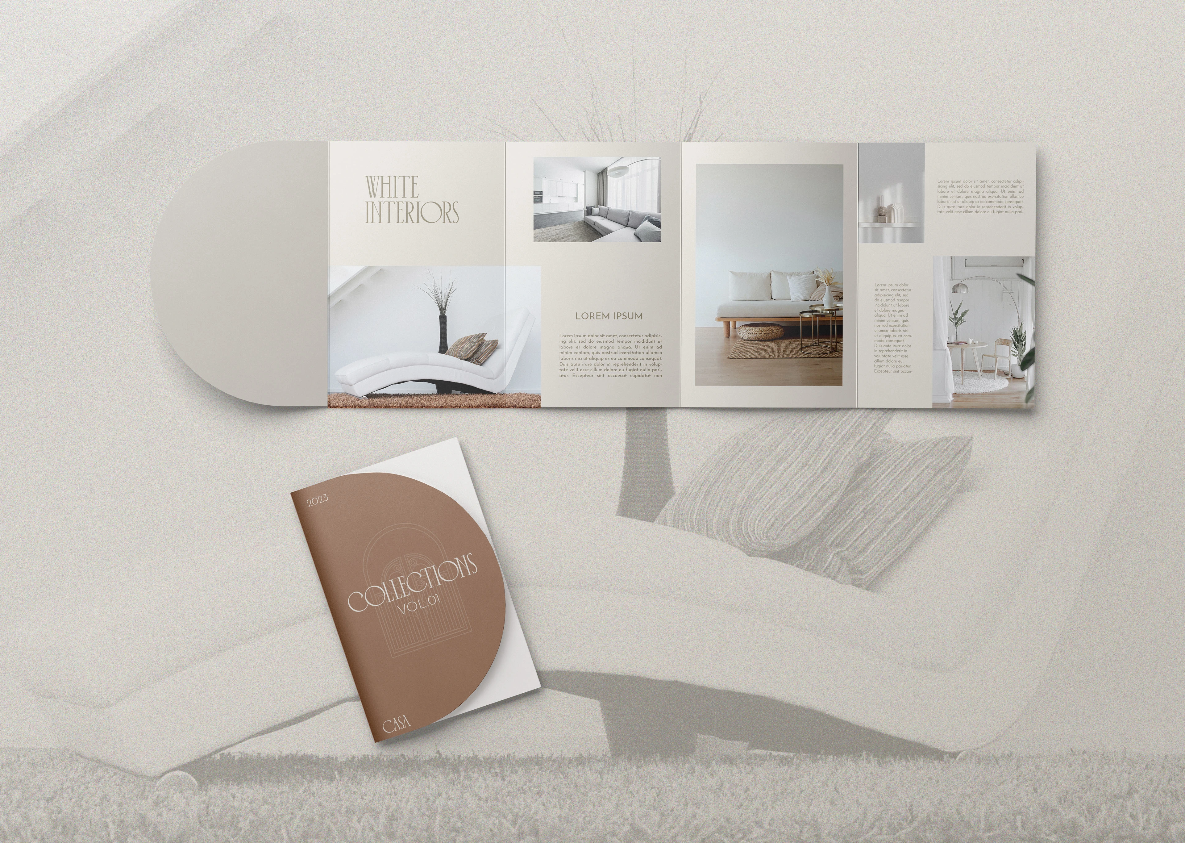
Brochure Design
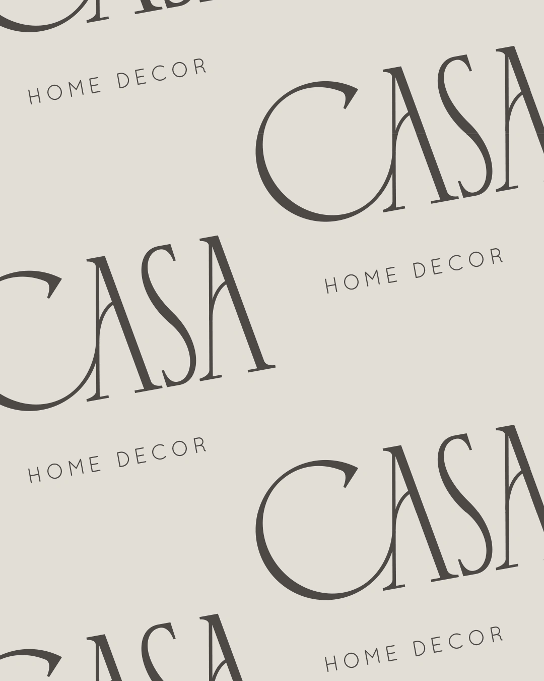
Brand Patterns
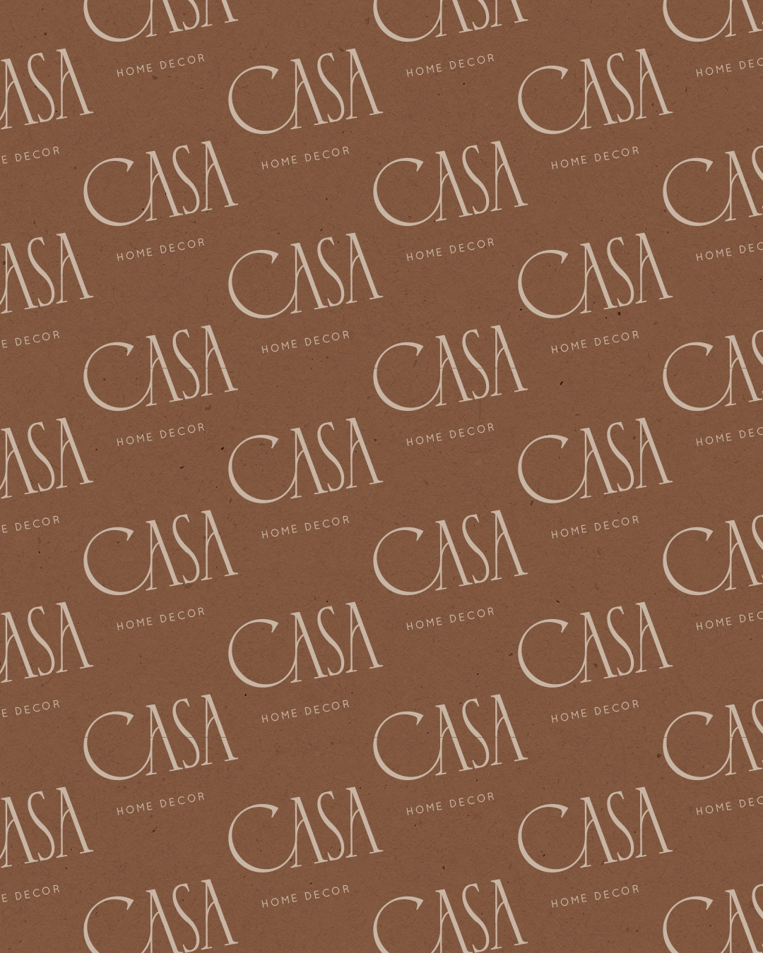
Brand Patterns
Like this project
Posted May 8, 2024
CASA blends modern elegance with artistic expression, featuring sleek typography, refined colors, and a design that embodies contemporary home aesthetics.


FLORA / Atelier — Logo & Brand Identity Design
JAYLISSA LEA — Personal Logo & Brand Identity Design
SELENE — Brand Identity Design
GEORGIA BAUTISTA / Tattoo — Brand Identity Design