Designing a Culinary Adventure for KidChef Adventures
Cover
Introducing Kid Chef Adventures Mobile App
I was approached by Kid Chef Adventures to design a product that introduces kids to the world of culinary arts, encourages healthy eating habits, and fosters essential life skills. In this case study, I share my thought process in designing this solution.
Kidchef Adventures Mobile App Snippet
Product overview
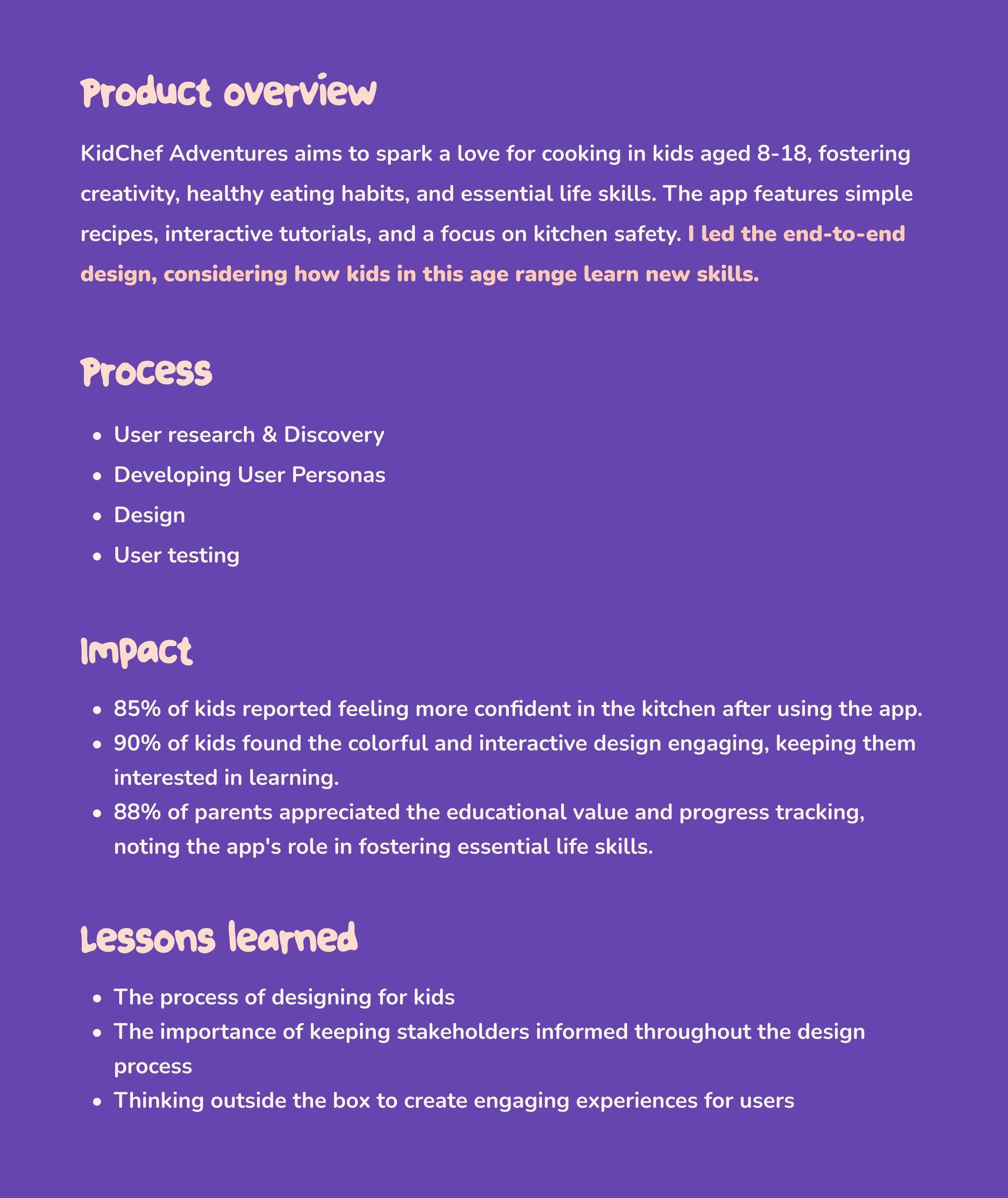
Case study summary
Designing a Fun, Engaging Culinary App for Kids
How can I design a mobile app that enhances culinary skills, promotes healthy eating, sparks creativity, engages kids ages 8-18, and ensures their safety in the social media era?
Visual Snippets 👇
Short Snippets
Understanding How Kids Learn and Engage
To design an engaging and effective mobile app for kids aged 8-18, I needed to understand how they learn best, what they find engaging, and how to keep them safe throughout the experience. This involved studying design guidelines specific to children and conducting comprehensive research to answer the following key questions:
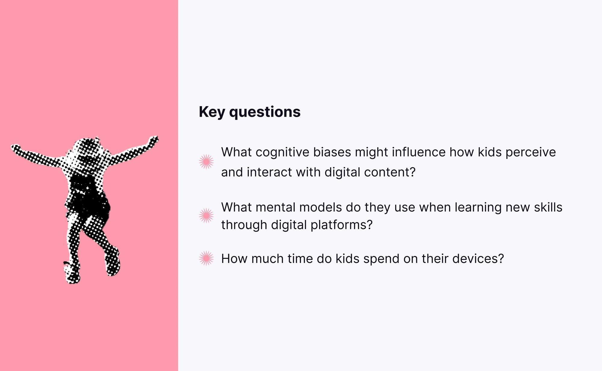
Key questions I wanted to be answered from my research
Identifying user needs and pain points from research
Synthesizing the data from the research enabled me to identify the following user behavior patterns:
Identified user patterns 👇
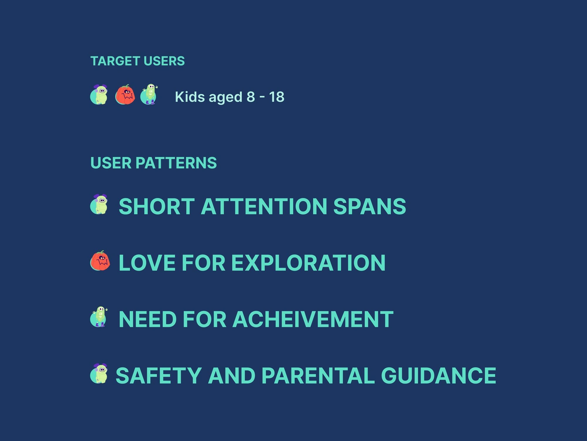
User patterns
From these insights, I developed user personas for two main groups: kids and parents. Parents were included because they are vital in monitoring their kids' activities and learning on digital devices.
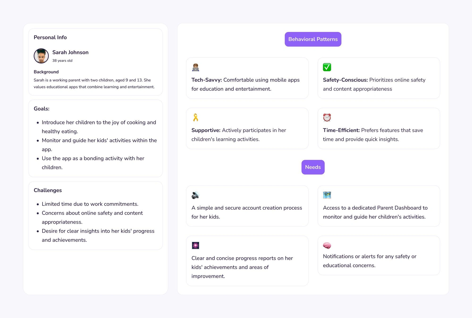
Kids user persona
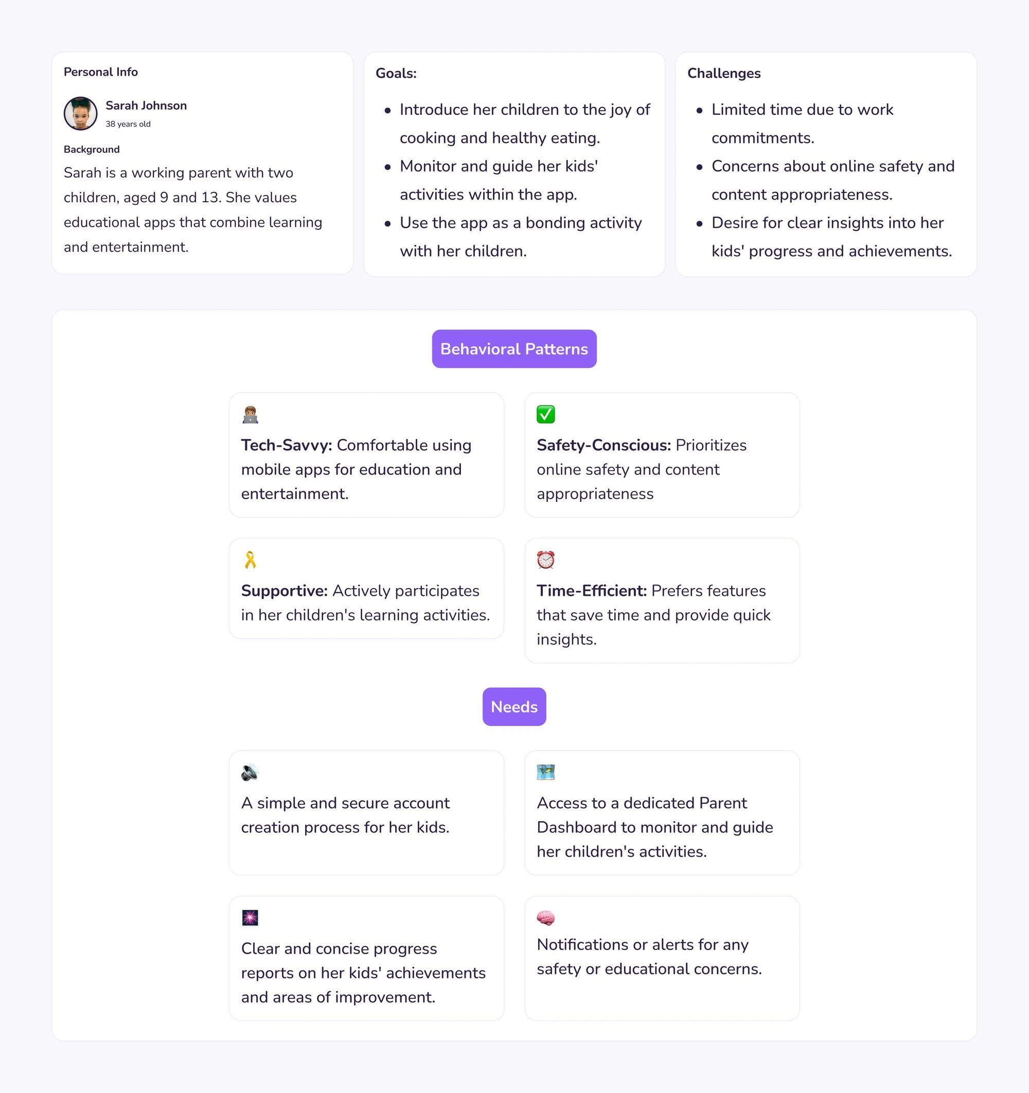
Parent's user persona
What would the interface look like?
After defining the personas for our two user groups, the next step was to think about how the interface would look. I curated a mood board designed to evoke a childlike user interface, featuring bubbly elements, large strokes, and shadows.
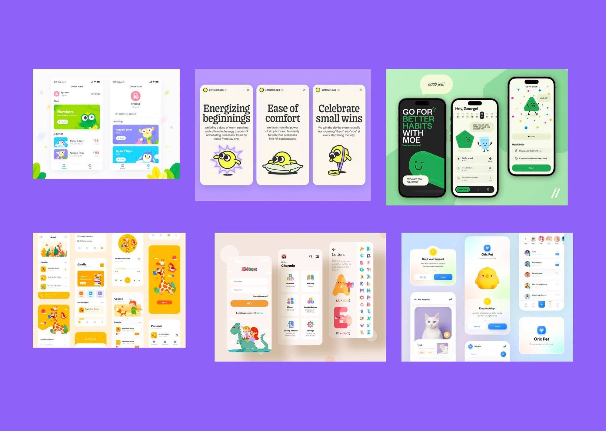
Mood board
Moving from ideation to UI design
Armed with a moodboard and research data, I began designing the interface, defining the style guide and UI patterns for the product. I chose purple as the primary color for the brand because it resonates well with kids due to its vibrancy and playful nature.
For the typeface, I selected a bubbly font to appeal to our target audience, creating a fun and engaging visual experience.
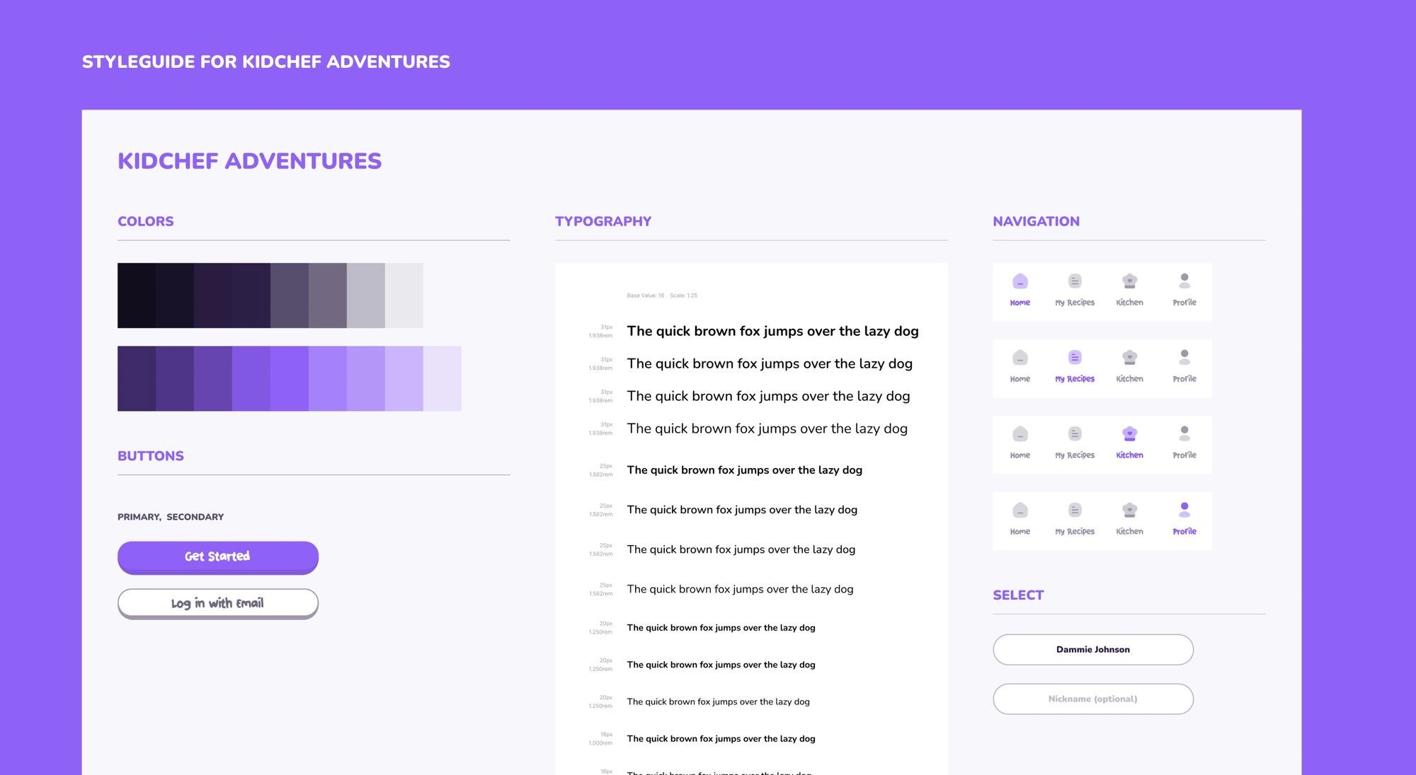
Styleguide
How do we onboard our users?
I designed the onboarding process to offer a sneak peek into the app's features. I aimed to create an engaging and animated experience that captures kids' attention, fostering excitement about the product. Users get sound feedback when they click on a button to make the interface more engaging and interactive.
Onboarding GIF
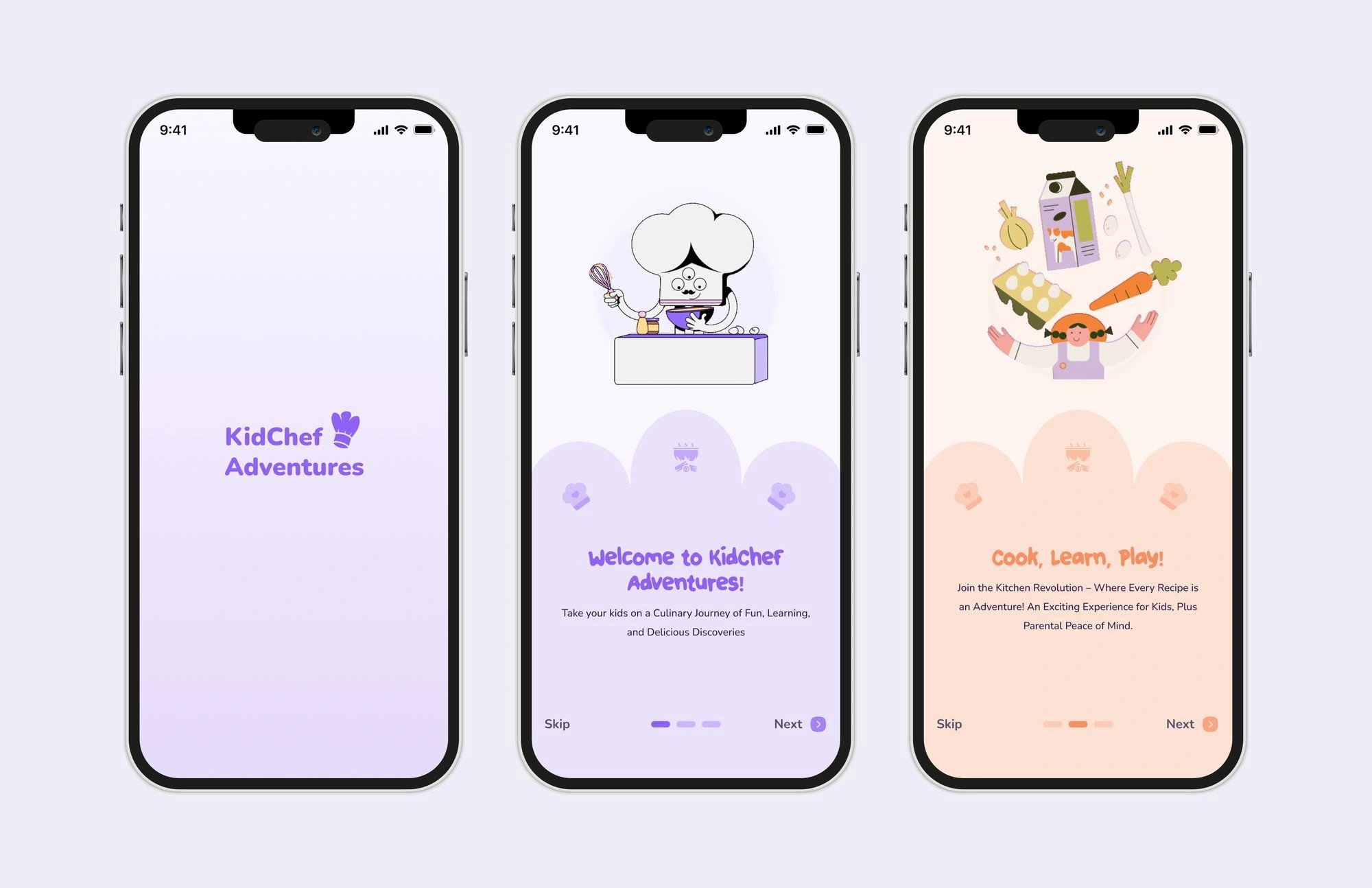
Onboarding screens
Setting up your account
Parents can set up accounts for their kids, and to tailor the kid's experience, I crafted a set of questions designed to create a more personalized and engaging experience
Setting up your account flow
GIF of setting up your account flow
Navigating the Kid Chef Mobile App
I designed the home screen to be colorful, engaging, and full of personality to keep it visually interesting for our target users. This design follows the guidelines for creating interfaces for kids aged 8-18.
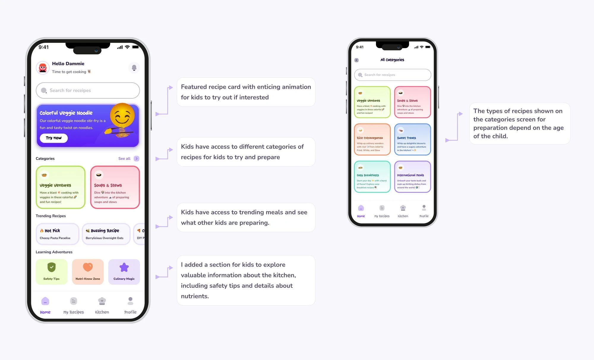
Homecreen annotations
Due to technical constraints, zooming in directly isn't possible. To view the details, please click on this link
Home screen
Meals are split into categories so users can click on a category to see different recipes that they can try to prepare
Categories
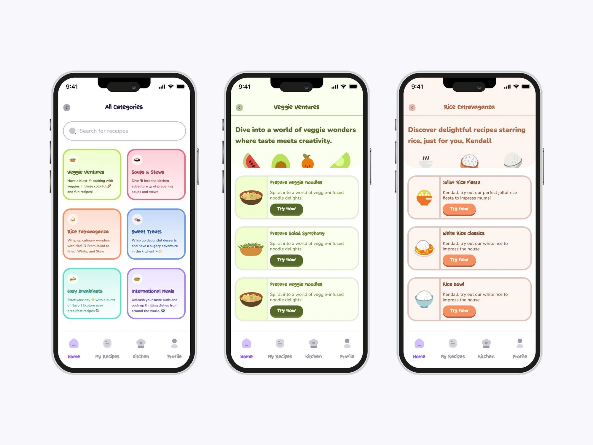
Categories UI
How might we design an educational cooking experience that’s fun and engaging for kids?
This was the million-dollar question: To find answers, I studied other ed-tech apps like Ulesson, which is designed for secondary school students in Africa, and Duolingo, known for its language learning.
Cooking experience
Explanation of the design decisions behind creating the learning experience
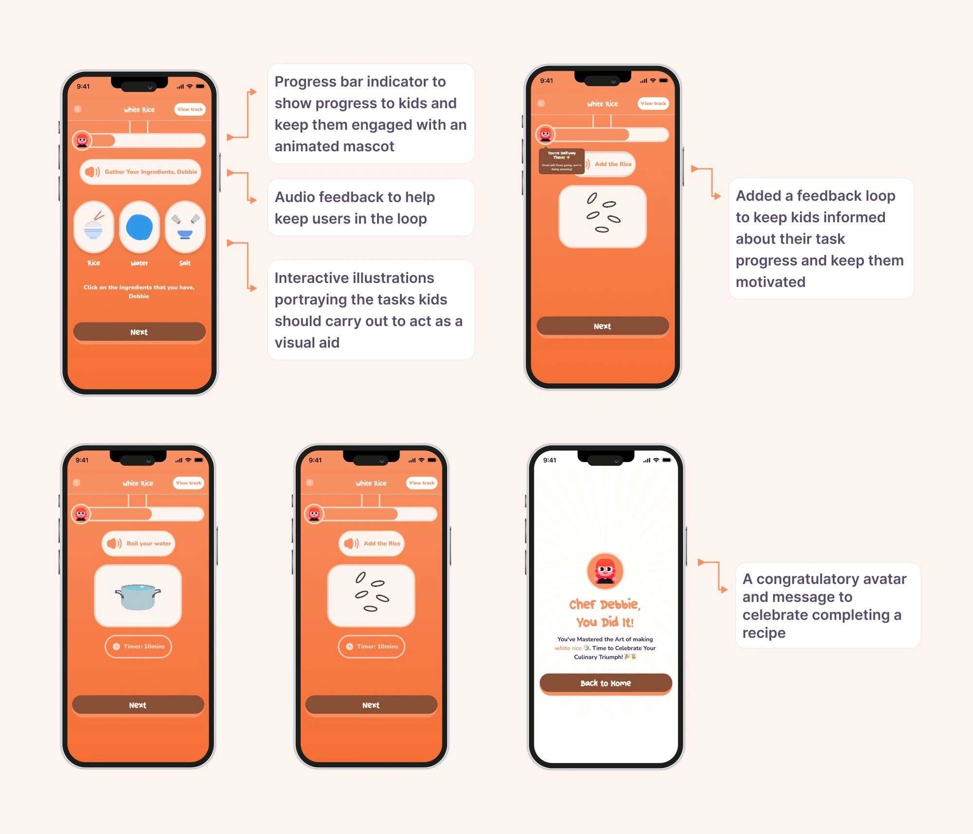
Cooking experience annotations
Due to technical constraints, zooming in directly isn't possible. To zoom and view the details, please click on this link
Tracking your recipes and User profile
To keep kids engaged with the product, I incorporated gamification principles by adding badges, progress updates, and rewards for completing recipes.
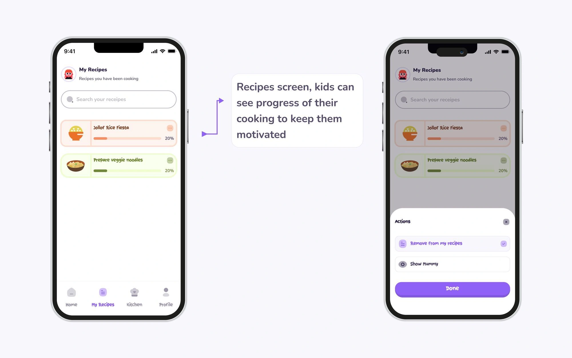
Recipe Screen Annotation
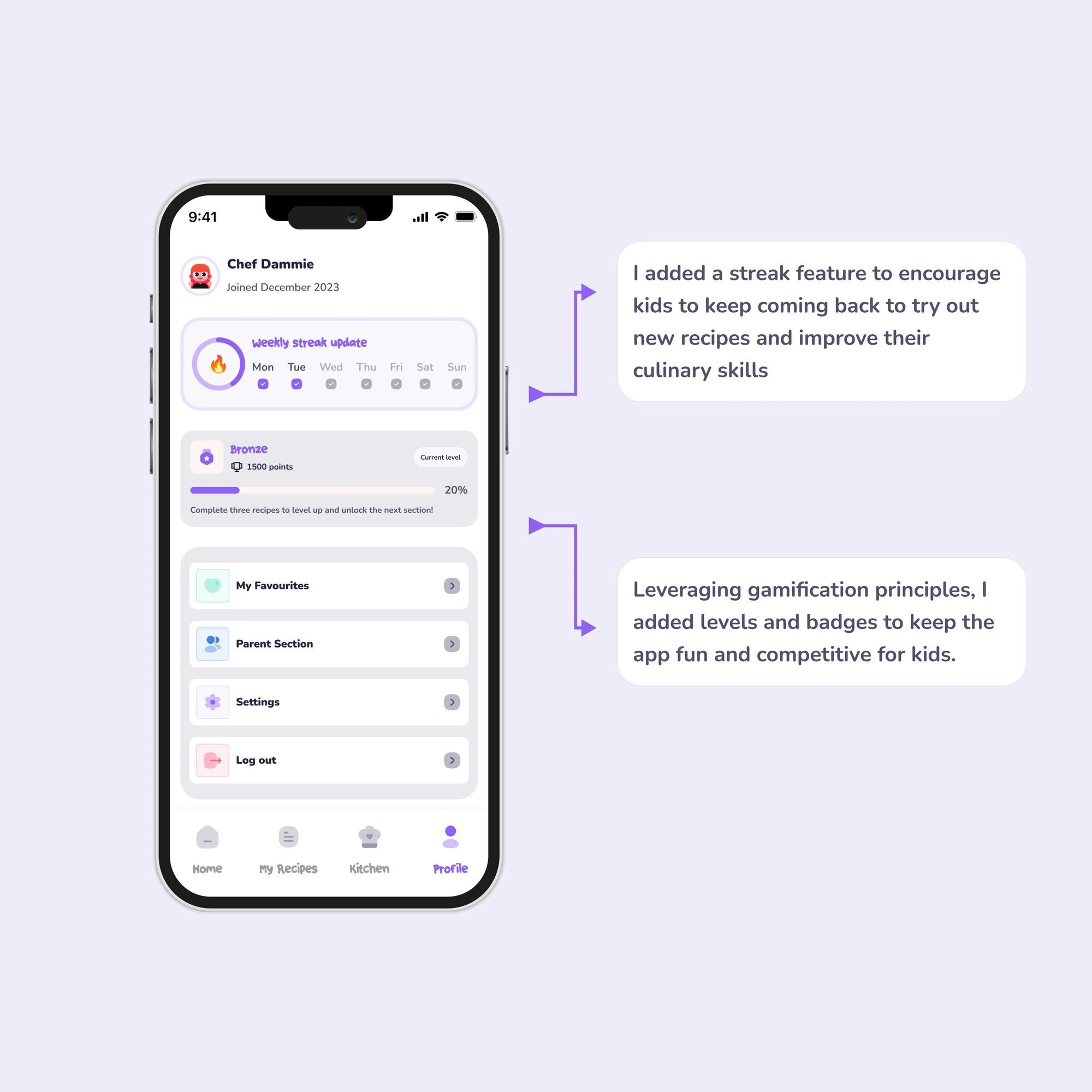
Kids' profile UI and annotations
How do parents keep track of their kids learnings?
From the parent persona, I understood that parents wanted to be able to:
👁️ See clear and concise progress reports on their kids' achievements and areas of improvement
📈 Access their dashboard to track progress and monitor their children's activity and performance
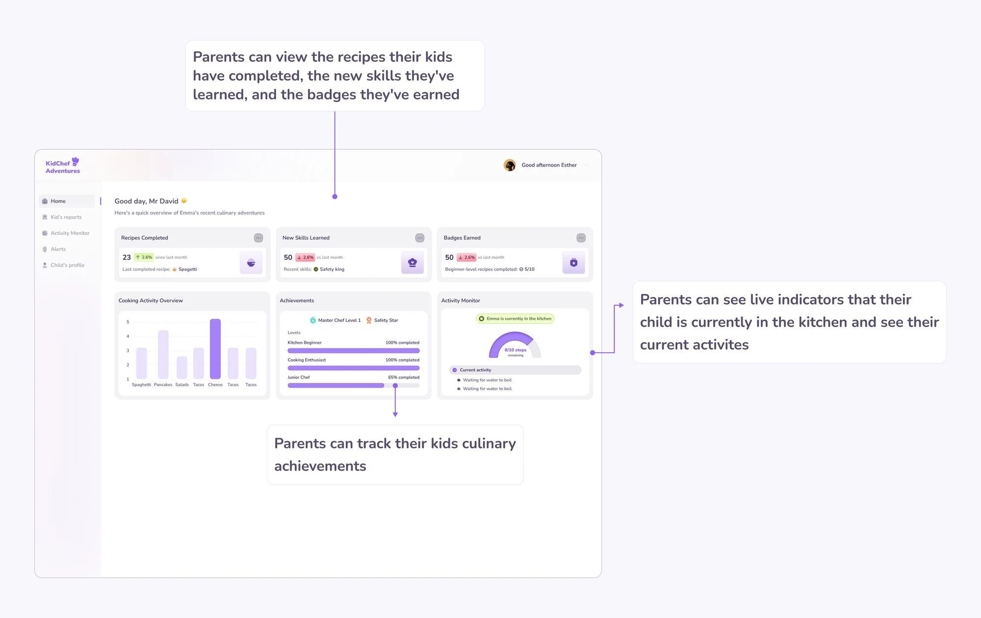
Parent's dashboard UI
Due to technical constraints, zooming in directly isn't possible. To view the details, please click on this link
Parent's UI GIF
Everything seemed ready to go, but I overlooked one critical aspect: the safety of the kids.
During my presentation to stakeholders, I realized I hadn't fully addressed kids' safety throughout the cooking process. I had focused only on safety tips and needed to consider measures before, during, and after cooking. So, I went back to the drawing board to fill in these gaps.
How Do We Ensure Children’s Safety Throughout the Cooking Experience?
I thought about different ways in designing the safety experience for kids, one of them was adding a safety checklist which kids have to complete before starting a cooking session.
Safety checklist flow
Safety checklist gif
Each step must be shown and verified before it can be marked as completed.
Another idea was having safety tips during the experience
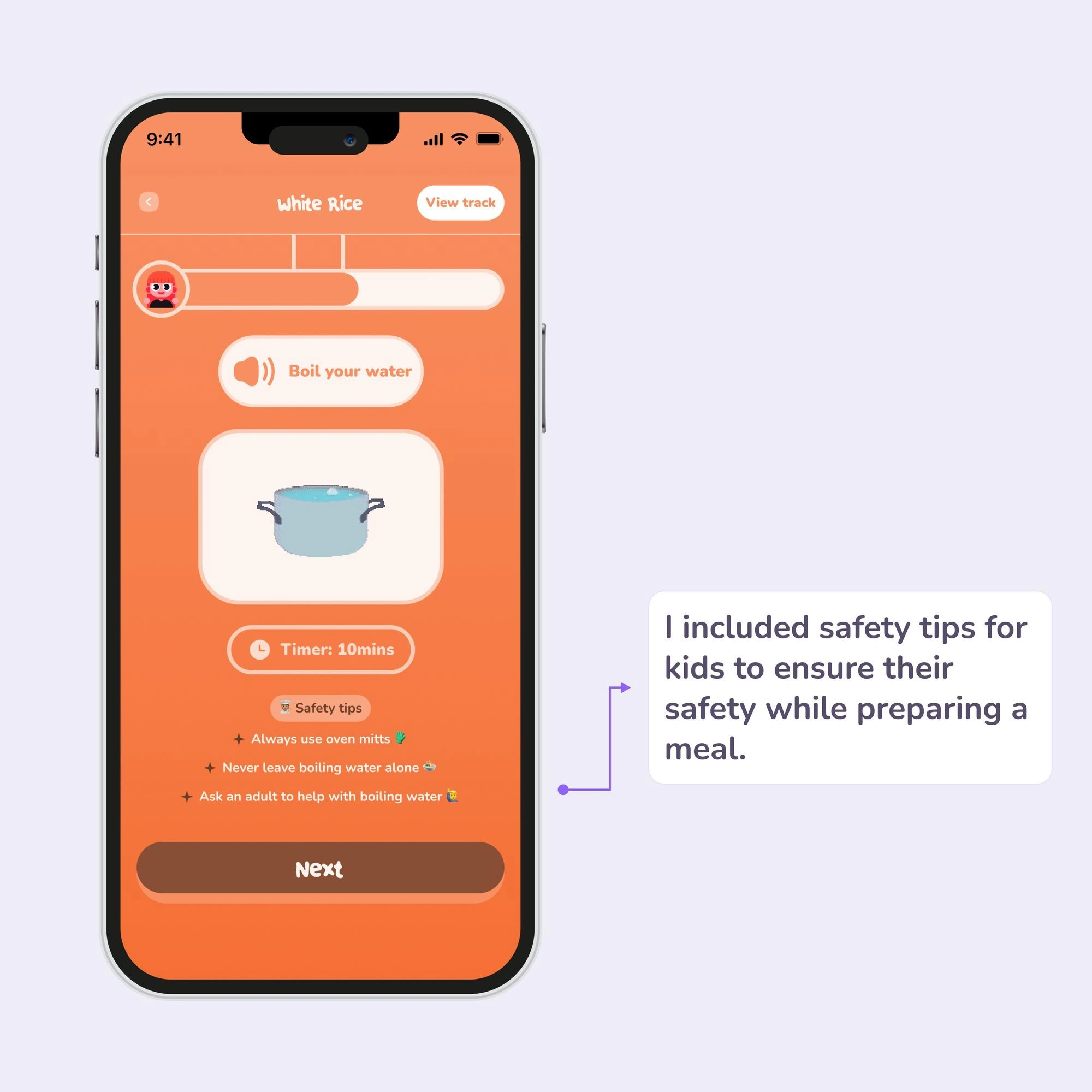
UI
Did the new updates work with stakeholders and users?
You bet they did. I presented the new updates to stakeholders and got positive feedback on how I designed the safety experience for children. We facilitated a user testing session with the beta release of the app, inviting kids and parents to see how my designs perform with real users.
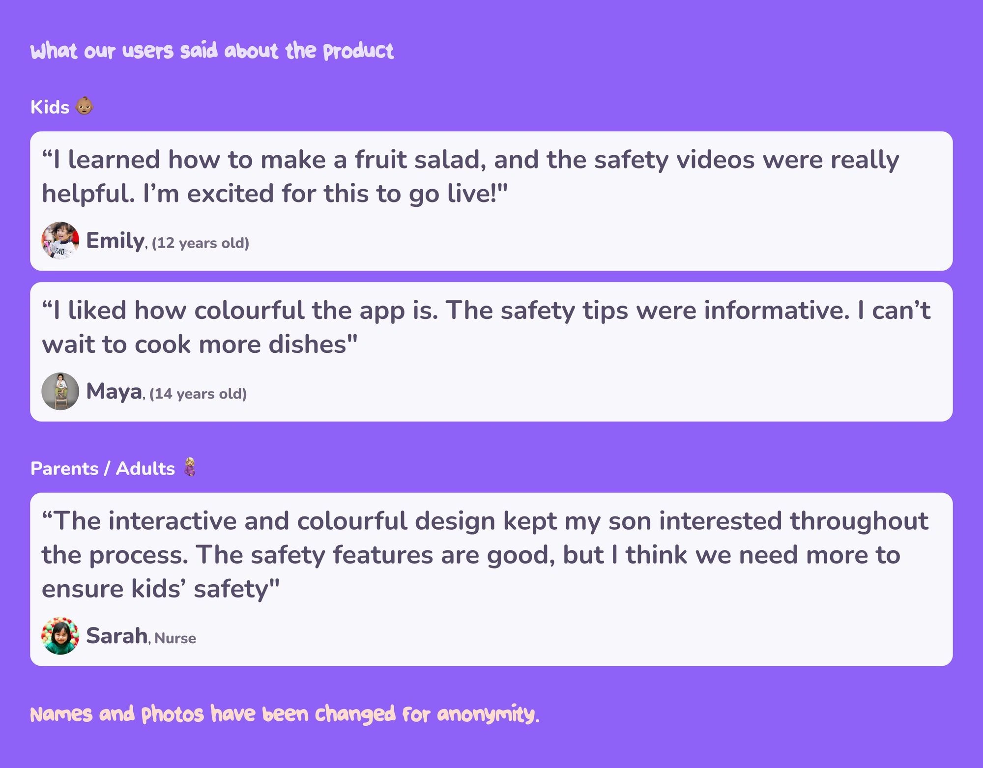
User Feedback
Challenges, learnings, and next steps
Designing for kids presented unique challenges, and I encountered several hurdles during this project.
😞 One major challenge was defining the illustrative style. Due to time constraints, I couldn’t create a consistent illustration system, so I opted to use Lottie for animated illustrations, which met our needs perfectly.
Throughout this process, I learned the importance of keeping stakeholders informed and thinking outside the box to create engaging user experiences. Moving forward, we are committed to continuously improving the product based on user feedback.
This is just the beginning; we are always working on enhancing the product and incorporating user feedback to make KidChef Adventures even better.
Thank you for reading!!
Like this project
Posted Aug 10, 2024
How I Crafted Kid Chef Adventures' Perfect Mobile App for Budding Chefs
Likes
0
Views
2

