Investment company website
Dana Jeleapova
For this project, I designed the entire Car Hauling Investment website, including the Onboarding, Personal Account, and Dashboard pages. My goal was to create a seamless and engaging experience for users, ensuring intuitive navigation and a professional aesthetic.
Step 1. Wireframes creation
I began the project by developing detailed wireframes to define the website’s structure, user flow, and content placement. Since the platform serves investors and business users, it was crucial to create an intuitive layout that allows for easy navigation and quick access to key information, such as investment opportunities, services, and account management tools. The wireframes helped map out the onboarding process, personal account sections, and dashboard elements, ensuring a logical and structured user experience before moving into the visual design phase.
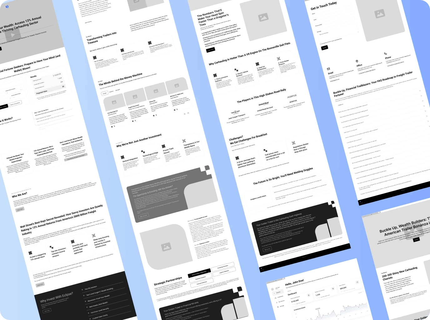
Step 2. UI Options Creation
To ensure the final design aligned with the client’s vision, I created two distinct UI design options, each with a unique visual approach. One concept focused on a sleek and modern corporate look, while the other incorporated a more dynamic and visually engaging style. These options allowed the client to compare different aesthetics, typography choices, and color schemes, making it easier for them to select the direction that best represented their brand. After presenting both versions, the client reviewed them and selected the one that best suited their needs.
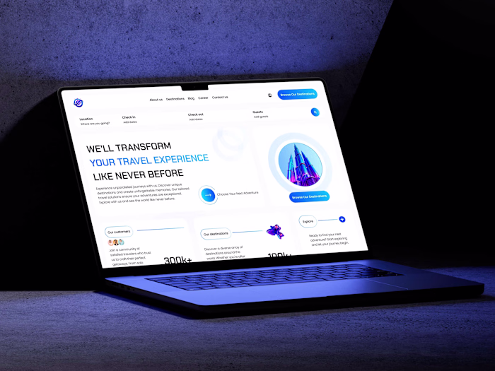
Step 3: Home Page Design & Approval
Once the client chose a preferred UI style, I designed the homepage as the foundation for the rest of the website. The homepage needed to immediately communicate trust, professionalism, and investment opportunities, so I carefully structured the hero section, key services, and call-to-action elements. Additionally, since the client had a substantial amount of text content, I leveraged a Bento grid layout to break down information into visually digestible sections, making the content more engaging and readable. After finalizing the homepage design, I sent it to the client for approval before proceeding with the full website.
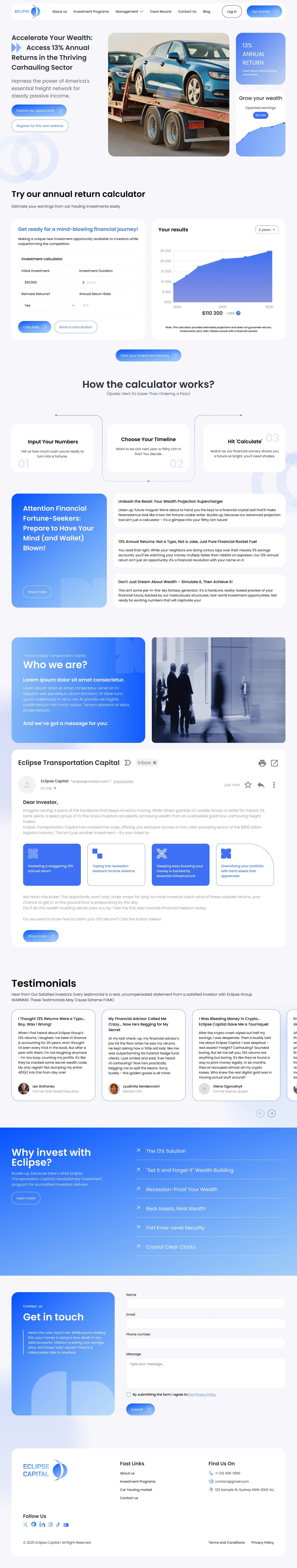
Step 4: Full Website Design & Approval
With the homepage approved, I proceeded to design the entire website, ensuring a cohesive and consistent visual language across all pages. This phase involved structuring detailed service pages, investment sections, and informational content while maintaining a clean and engaging aesthetic.
Since the platform required an investment dashboard and personal account functionality, I considered how users would interact with financial data, reports, and account settings. The design was optimized for clarity, ensuring that important numbers, statistics, and user actions were easily accessible. Once the full website design was complete, I presented it to the client for feedback. After reviewing, the client approved the design and requested additional pages for personal account management, dashboards, and onboarding experiences.
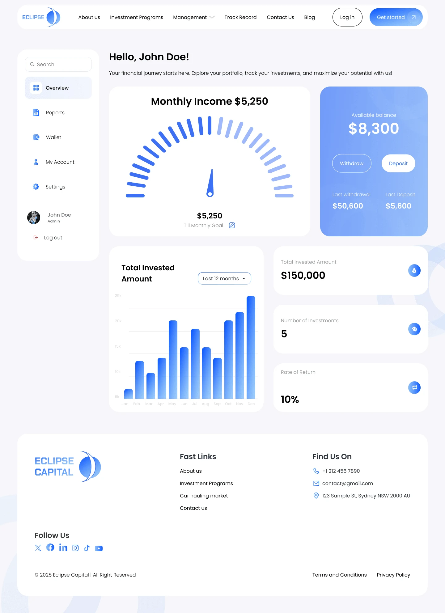
Step 5: Personal Account, Dashboard & Onboarding Design
Based on the client’s request, I designed additional pages for user onboarding, the personal account section, and dashboard interfaces. These pages were essential for guiding users through the registration process and providing a structured, informative experience within their accounts.
Onboarding: The onboarding process was designed to be clear and engaging, helping new users set up their accounts smoothly while understanding the platform’s key features.
Dashboard: The dashboard was structured to display key financial metrics, investment status, and user insights in a digestible format. I used data visualization techniques to ensure that important numbers were easy to understand at a glance.
Personal Account: The personal account section was designed with ease of use in mind, allowing users to manage their profiles, view investment history, and access key documents seamlessly.
Throughout this phase, I ensured that the interface was clean, professional, and functional, making it easy for users to navigate their accounts and interact with investment-related data.
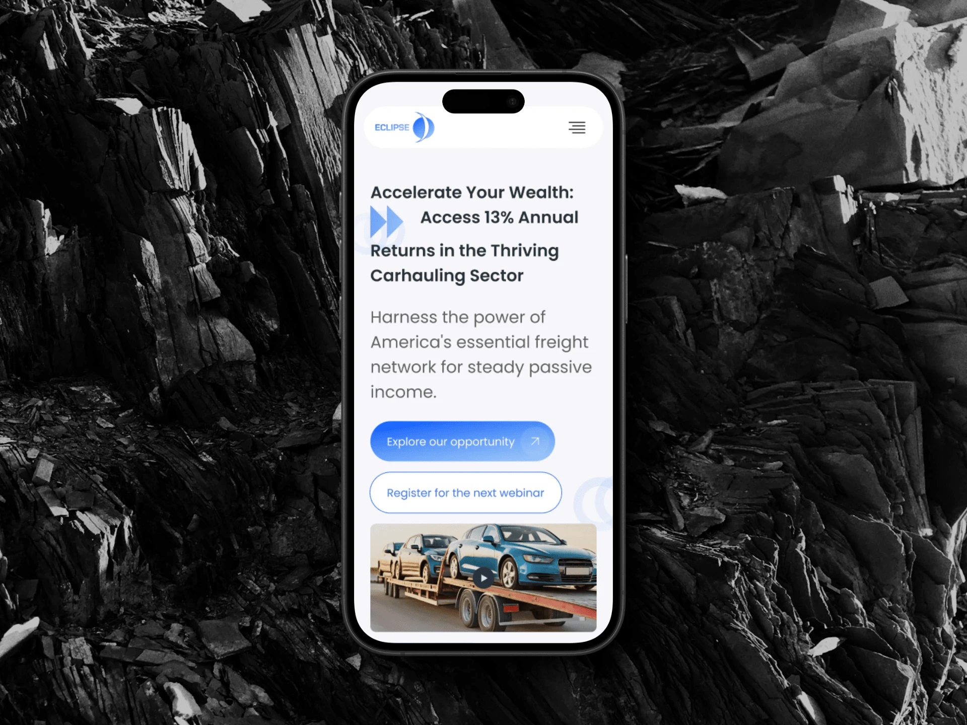
Step 6: Preparation for Development & Mobile Version Optimization
After finalizing the desktop designs, I prepared the project for handoff to the development team. This involved:
Organizing design assets, components, and style guides for a smooth transition into development.
Providing detailed specifications and UI documentation to ensure the implementation remained true to the original design.
Optimizing the design for mobile devices, ensuring a seamless experience across various screen sizes.
Since the platform had a significant amount of textual content, I ensured that the Bento grid layout adapted effectively to smaller screens, maintaining readability and usability. The onboarding flow, dashboard, and account management features were optimized for touch interactions, smooth navigation, and fast access to key actions on mobile devices.
Final Outcome
This project resulted in a visually cohesive, user-friendly, and well-structured platform, ensuring a smooth onboarding experience and intuitive account management. By implementing a Bento grid layout, I successfully maintained a clean aesthetic while presenting a large volume of content in an accessible and engaging manner. The final design provided clarity, professionalism, and ease of use, enhancing both the desktop and mobile experience for investors and platform users.
Like this project
Posted Nov 22, 2024
I designed a website for a investment company, emphasizing a clean and user-friendly experience.
Likes
1
Views
3