Stroberi Tagihan - Billing Management Web App
Introduction
Stroberi Tagihan is a website-based platform that is used to make it easier for companies, customers and market managers to monitor and evaluate bills.
Key Features:
Sleek and Intuitive UI Design: The website boasts a modern and visually appealing interface, offering an engaging and user-friendly experience.
Real-Time Online Payments: The website supports secure online payment options, providing convenience and flexibility to users during the checkout process.
Search and Filter Functionality: Users can easily search for specific invoice or use filters to narrow down their search results, saving time and makes billing easier.
Responsive Design: The website is designed to be responsive across different devices, ensuring a seamless experience for users on desktop, mobile, and tablet devices.
Analytics : Analyze bills over a certain period with analytics features, and identify trends to make data-driven decisions that drive your business growth.
Automatic Billing : You can customize your billing schedule, add targeted customers, and easily enable automatic billing with just a few clicks.
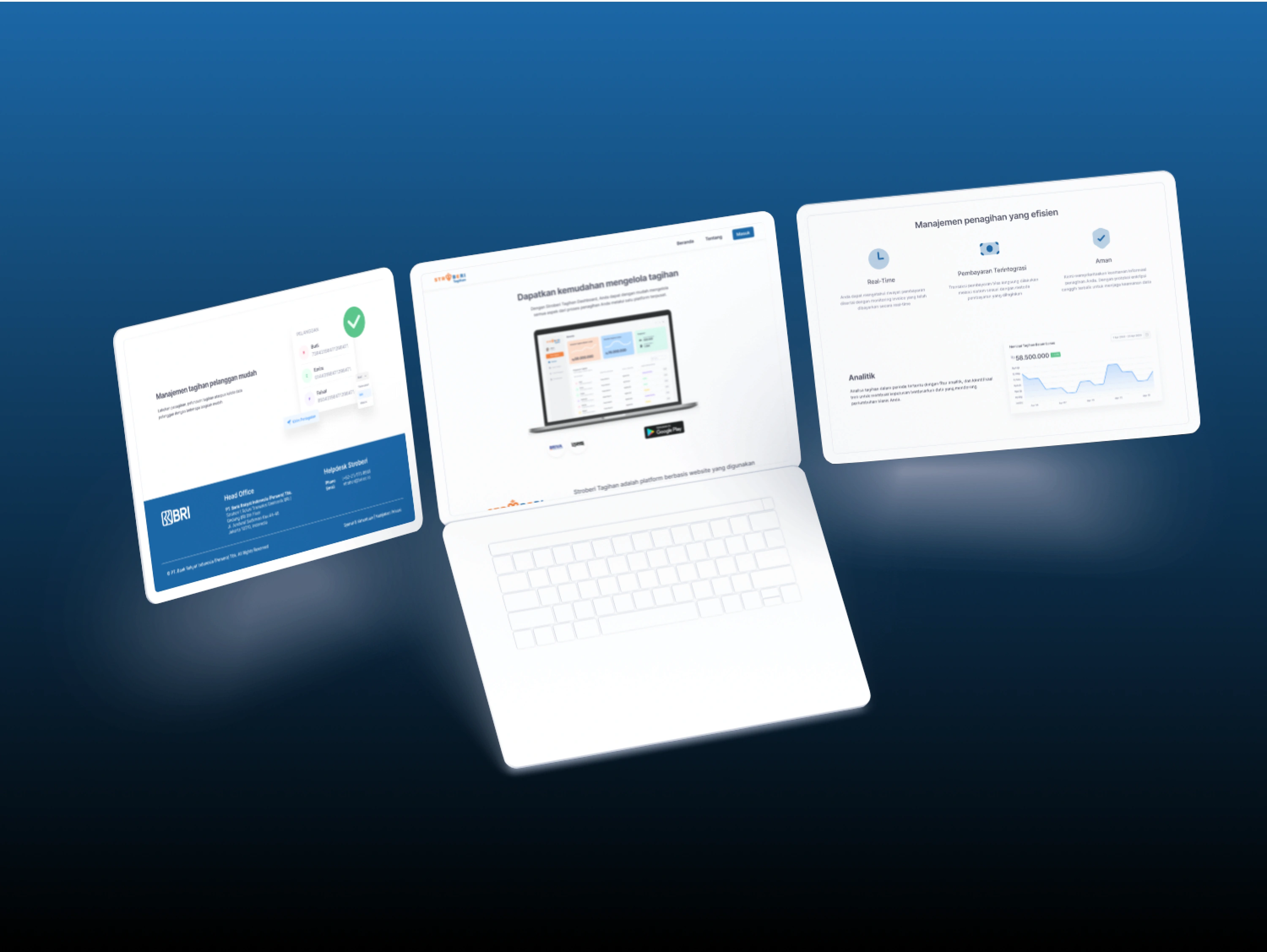
Stroberi Tagihan Landing Page
Role
As a UI/UX Designer, my role involved problem identification, user research, ideation, prototyping, user testing, and final implementation.
User & Audience
Small business owners (UMKM), market managers (Pengelola Pasar), and billing collectors.
Process of what I did
This is the process that my team and I worked on together
1. Design Process:
As we embarked on the design journey for "Stroberi Tagihan," our initial focus was on identifying and understanding the existing issues through a comprehensive analysis.
Problem Identification:
The team and I identified several issues with the existing "Stroberi Tagihan" application, such as an outdated design, a lengthy onboarding process, unclear login page, and complex billing processes.
User Research:
Conducted research to understand user pain points and frustrations.
Analysis:
Analyzed the existing UI/UX issues, including a cumbersome billing process, lack of customer information, and inefficient menu structures.
Ideation and Conceptualization:
Brainstormed ideas to address the identified problems and improve the overall user experience.
Prototyping:
Created prototypes with significant design changes, including a revamped onboarding process, simplified menu structure, and enhanced billing workflows.
User Testing:
Conducted user testing to gather feedback on the redesigned features and iterated based on user responses.
Final Implementation:
Incorporated the final design changes based on user feedback and usability testing results.
2. Design Thinking:
In the evolution of our design approach, we adopted a human-centric design thinking methodology to create an empathetic and user-friendly experience.
Before:
The existing design lacked user-centric elements, leading to confusion and frustration.
After:
Empathy: Addressed user confusion during the registration process by implementing a stepper to guide users through the steps.
Definition: Defined core features through a video on the login page, providing users with a quick overview of the application's capabilities.
Ideation: Streamlined the menu to focus on five core elements, simplifying navigation.
Prototyping: Utilized a stepper to guide users through the billing process, reducing confusion.
Testing and Feedback: Collected user feedback to refine and improve the design further.
3. Comparison Before and After:
Visualizing the transformation, let's explore the specific improvements made through side-by-side comparisons of key elements.

Impact and Results:
Measurable improvements included a surge in customer count from 20,059 to 35,878, transactions from 94,678 to 132,488, and invoices from 107,079 to 153,404.
Percentage increases of approximately 78.6% in customer count, 39.9% in transactions, and 43.3% in invoices demonstrated significant growth and engagement.
These remarkable improvements in customer count, transaction volume, and invoice numbers highlight the positive impact of the UI/UX redesign. The application not only attracted more customers but also facilitated a considerable increase in transaction and invoice activity. The percentage increases emphasize the substantial growth, showcasing the effectiveness of the design enhancements in fostering user engagement and interaction with the platform.
Login Page
Like this project
Posted Dec 19, 2023
Increase 78.6% in customer count, 39.9% in transactions, and 43.3% in invoices demonstrated significant by revamping the website.


