
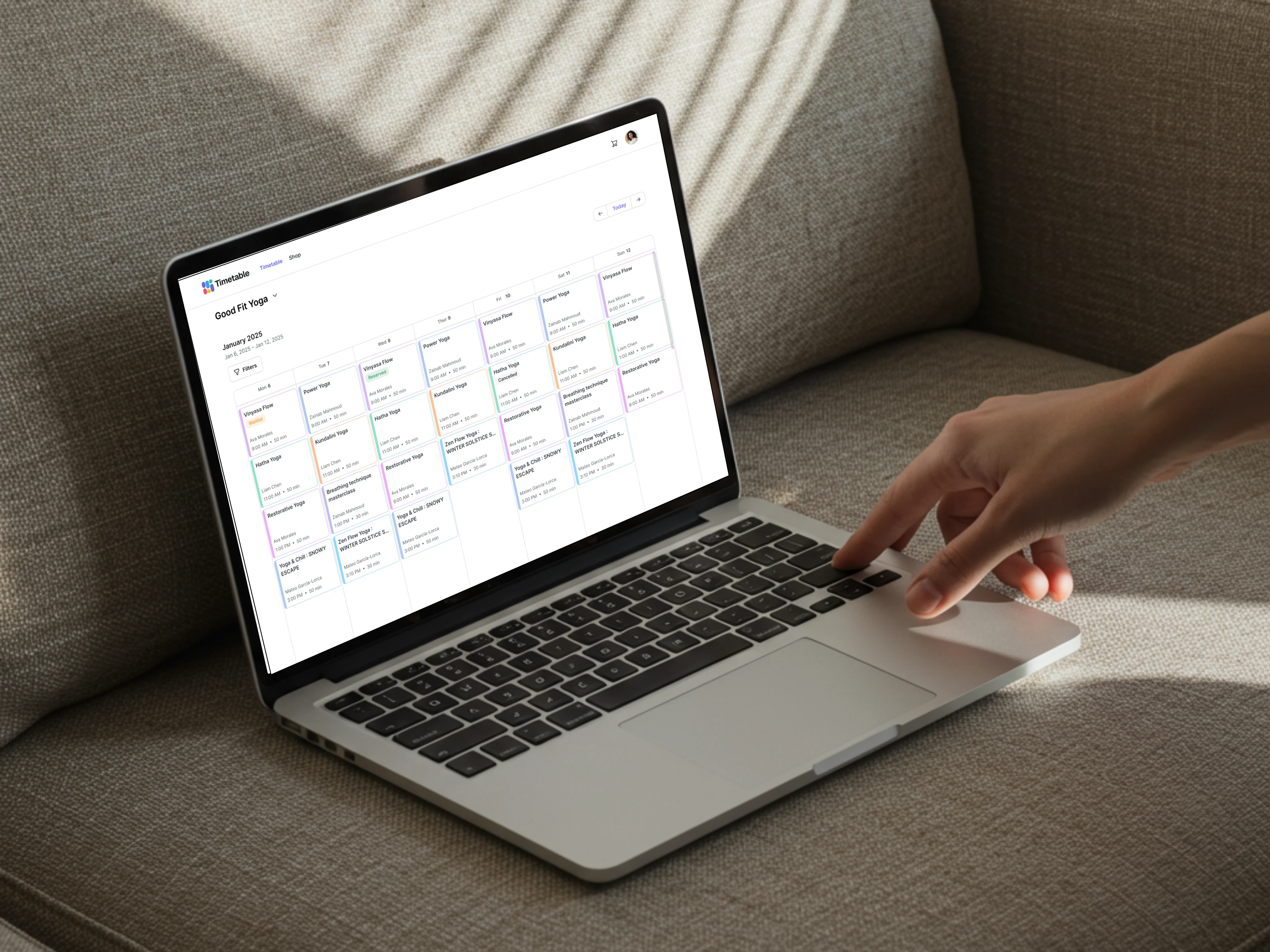
Timetable is a scheduling and payment automation platform serving fitness studios in Malaysia. As the platform’s clientele expanded to include larger enterprises, the product required a significant upgrade to solve complex business challenges. This project involved designing a new, highly customizable theme focused on enhancing member retention and acquisition through a superior user experience.
The Challenges
UI/UX Fragmentation: The legacy theme lacked consistency. Interactive elements behaved unpredictably across different locations, and many components had ambiguous roles, leading to a disjointed user journey.
Feature Gaps: Competitive analysis revealed that essential features—such as advanced filtering and intuitive social sharing—were missing from the core product.
Restrictive Customization: Branding options were overly limited. Studios could only modify basic elements like button colors, while critical touchpoints like badges and links remained static.
The Approach
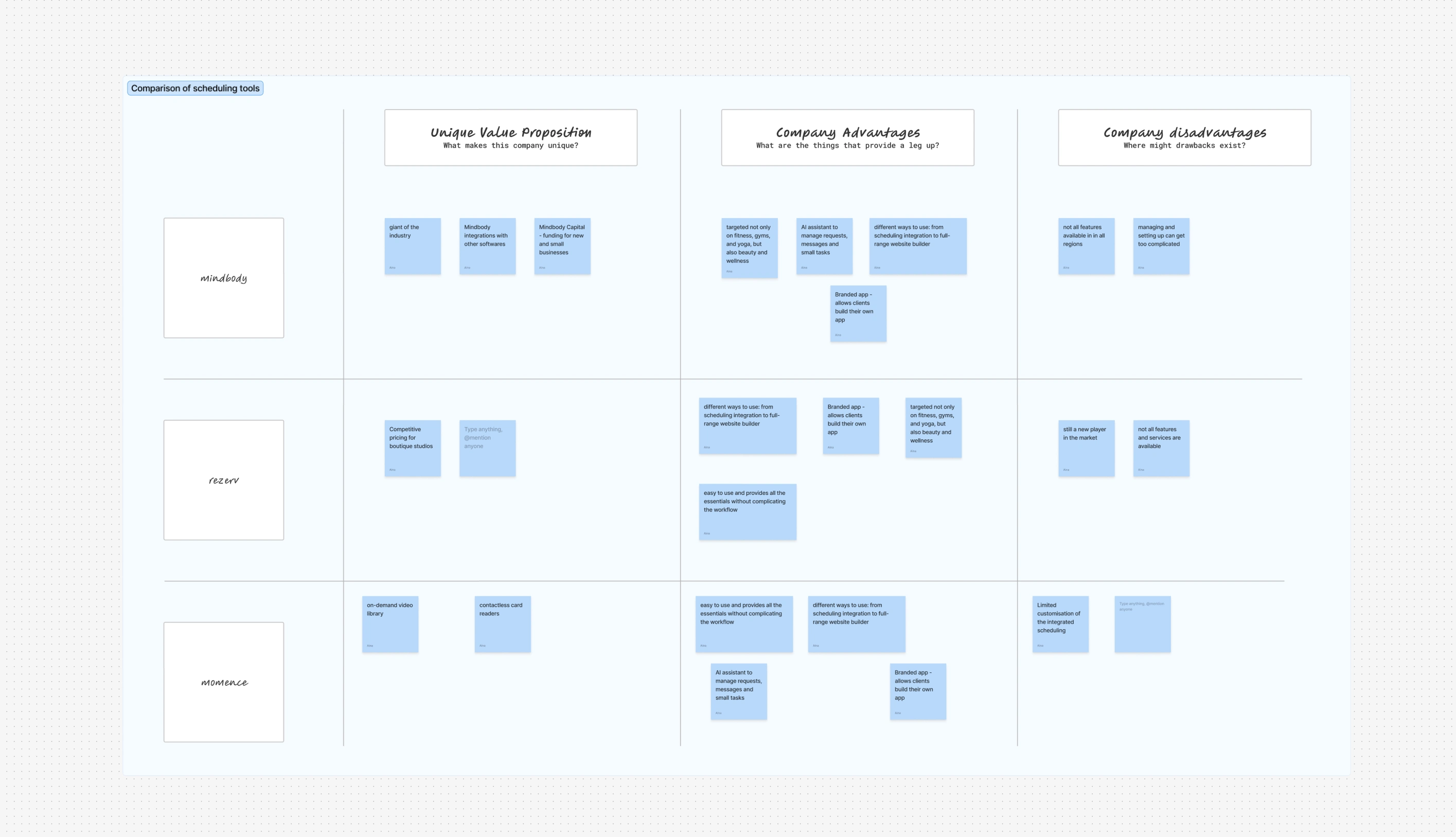
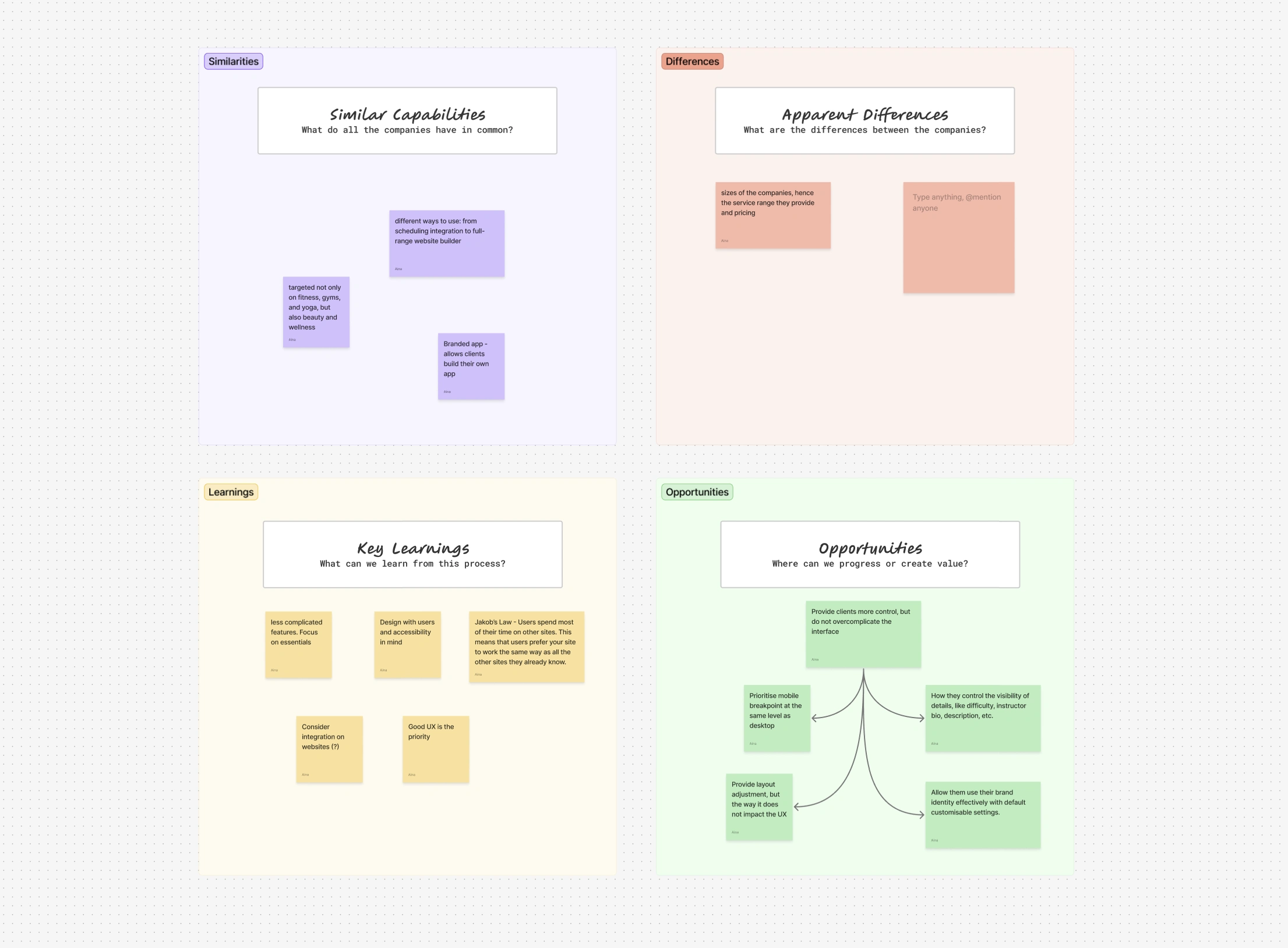
UX Audit & Benchmarking: We began with a comprehensive audit to identify friction points. By analyzing competitors, we identified a key opportunity: most platforms offer "generic" interfaces that fail to represent unique brands and often neglect accessibility.
Strategic Wireframing: We developed wireframes with a "Flexibility-First" mindset, carefully defining which core structural elements would remain fixed for usability and which could be fully customized by the studio.
Adaptive Design System: The final phase involved building a robust design system. This allowed for diverse brand expressions—ranging from sharp, "zero-radius" corners with flat shadows in dark mode to soft, pill-shaped elements in light mode—all while maintaining a cohesive architectural foundation.
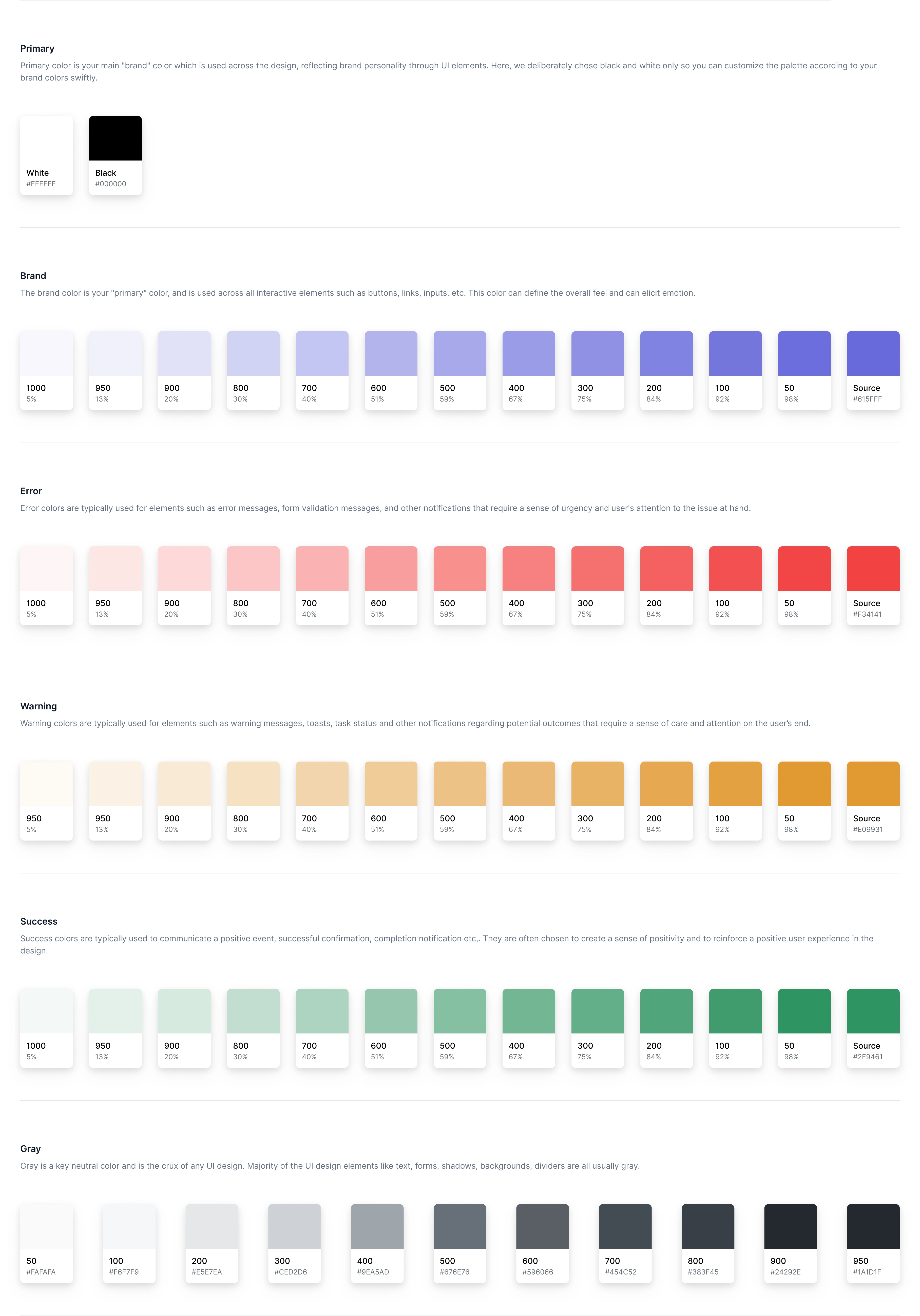
Color
Typography
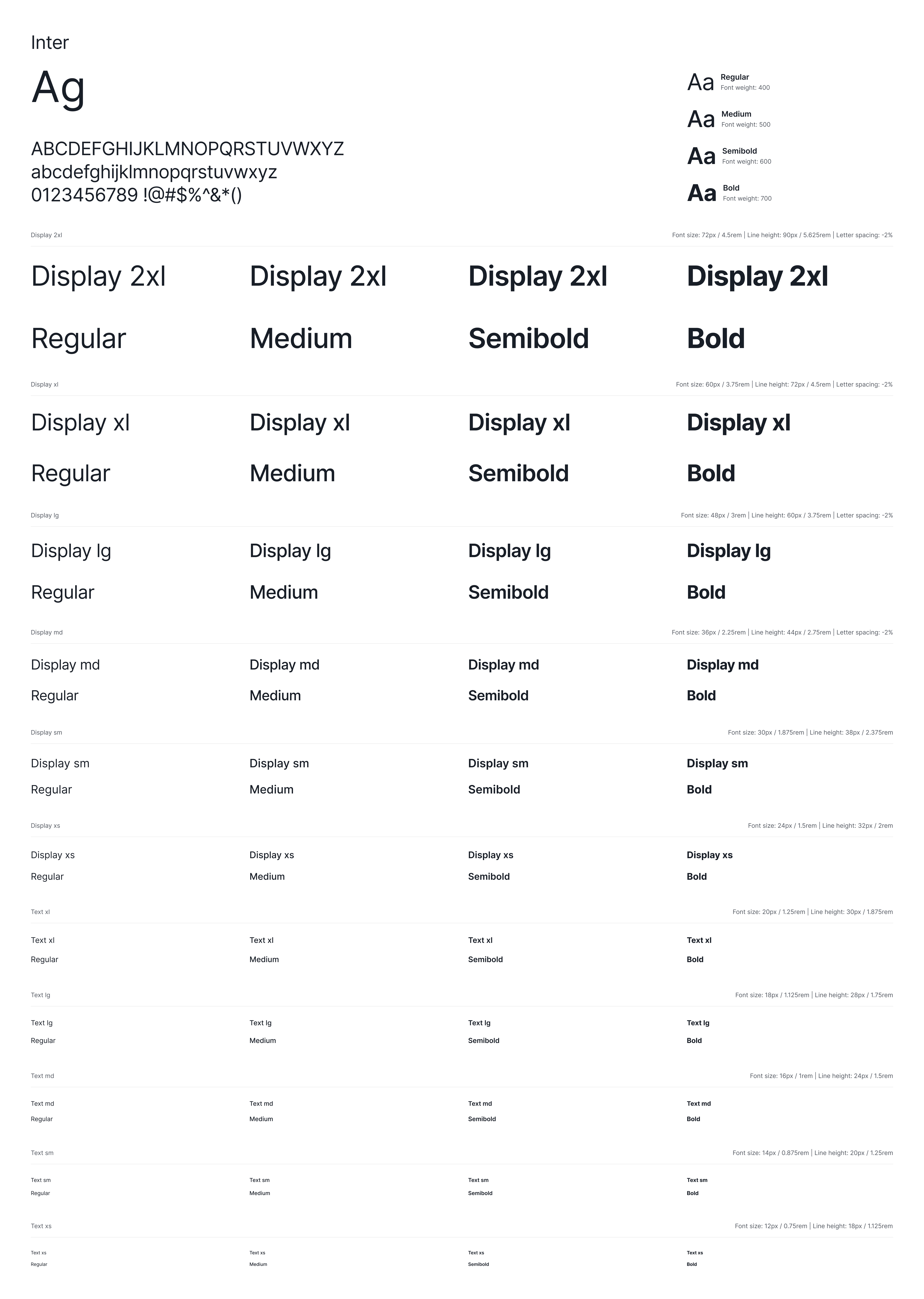
Design System
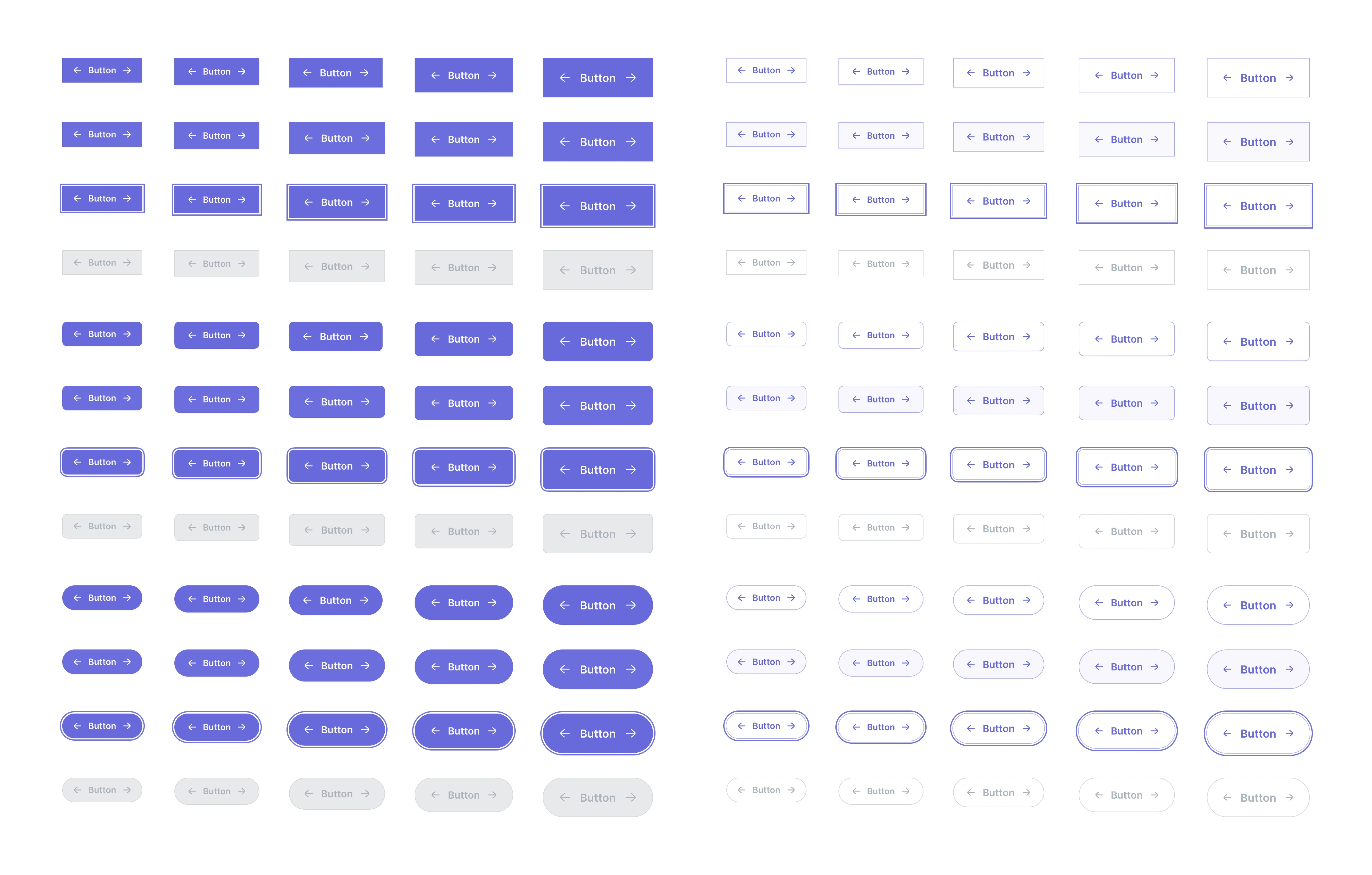
Button component with 3 types of corner radius
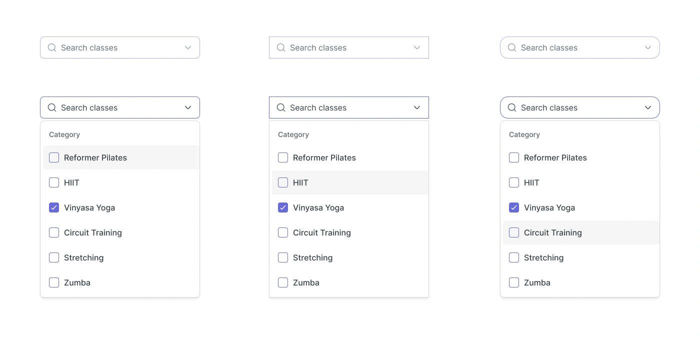
3 types of input dropdown variations
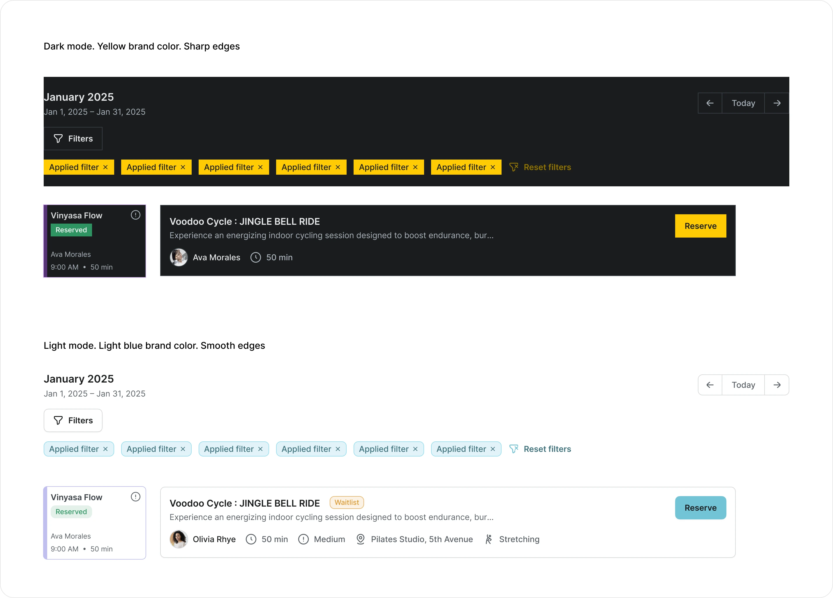
Translating color modes into customised themes
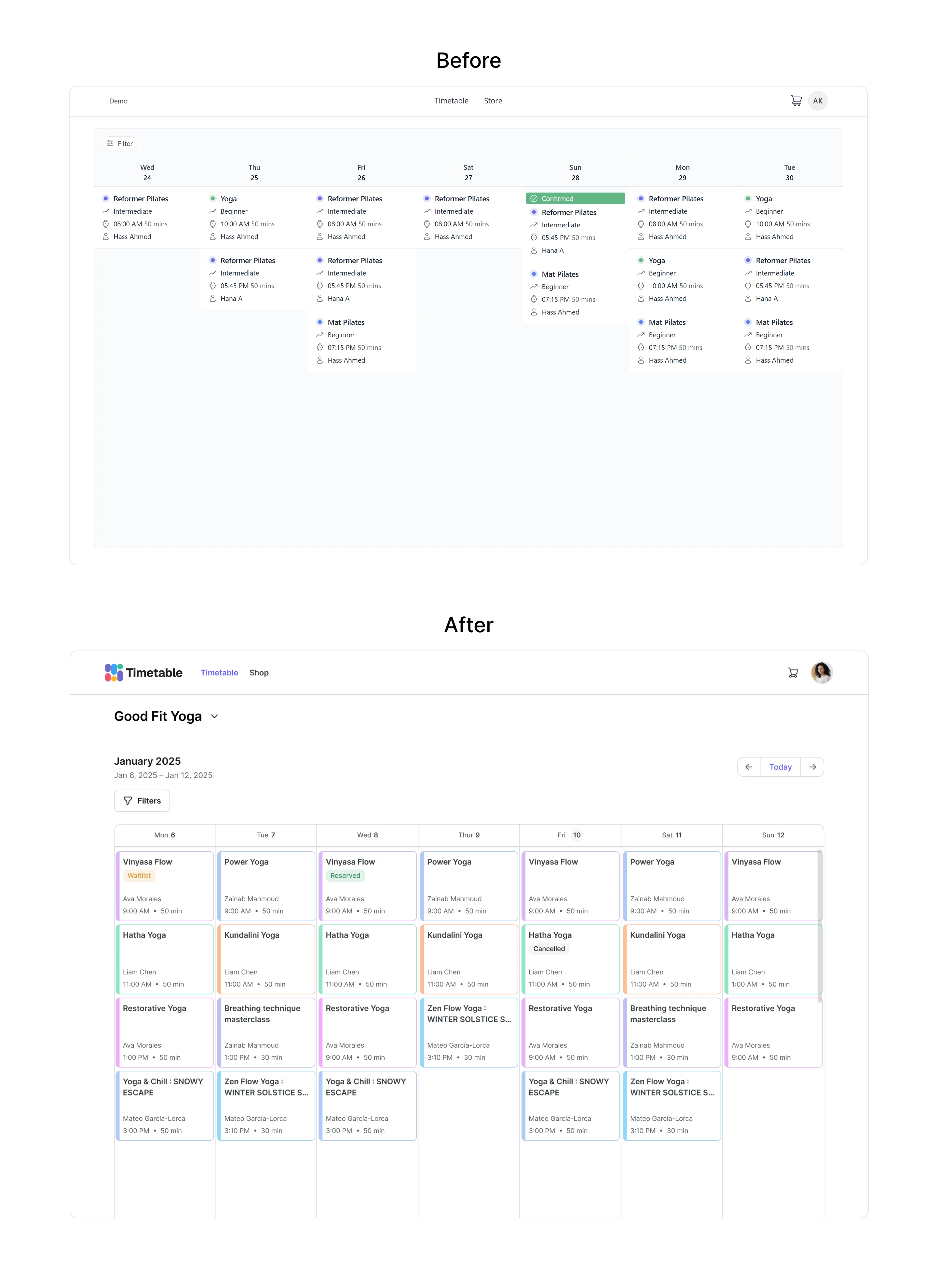
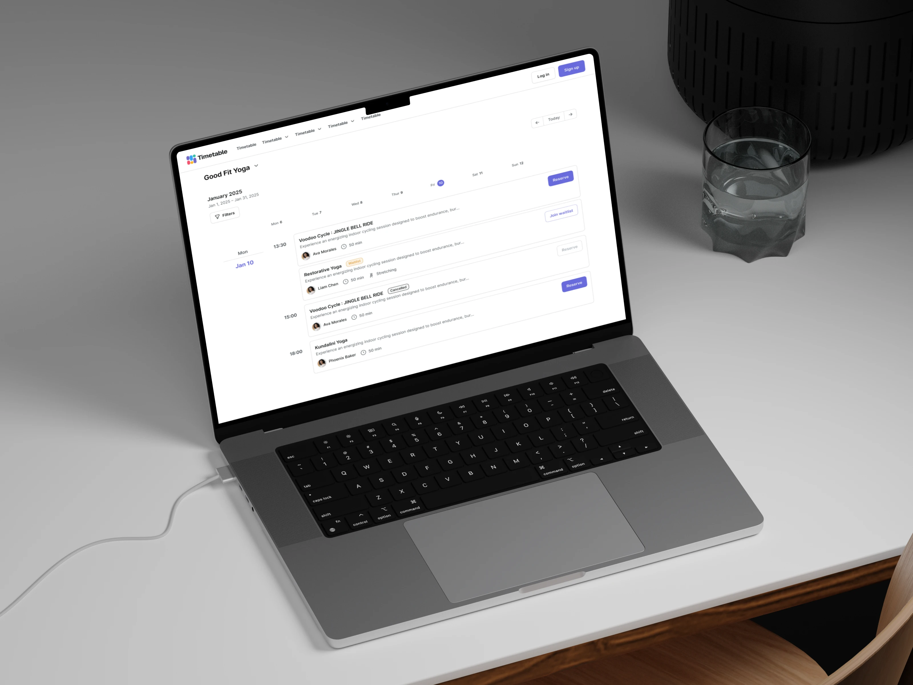
Timetable screen. Before and after redesign
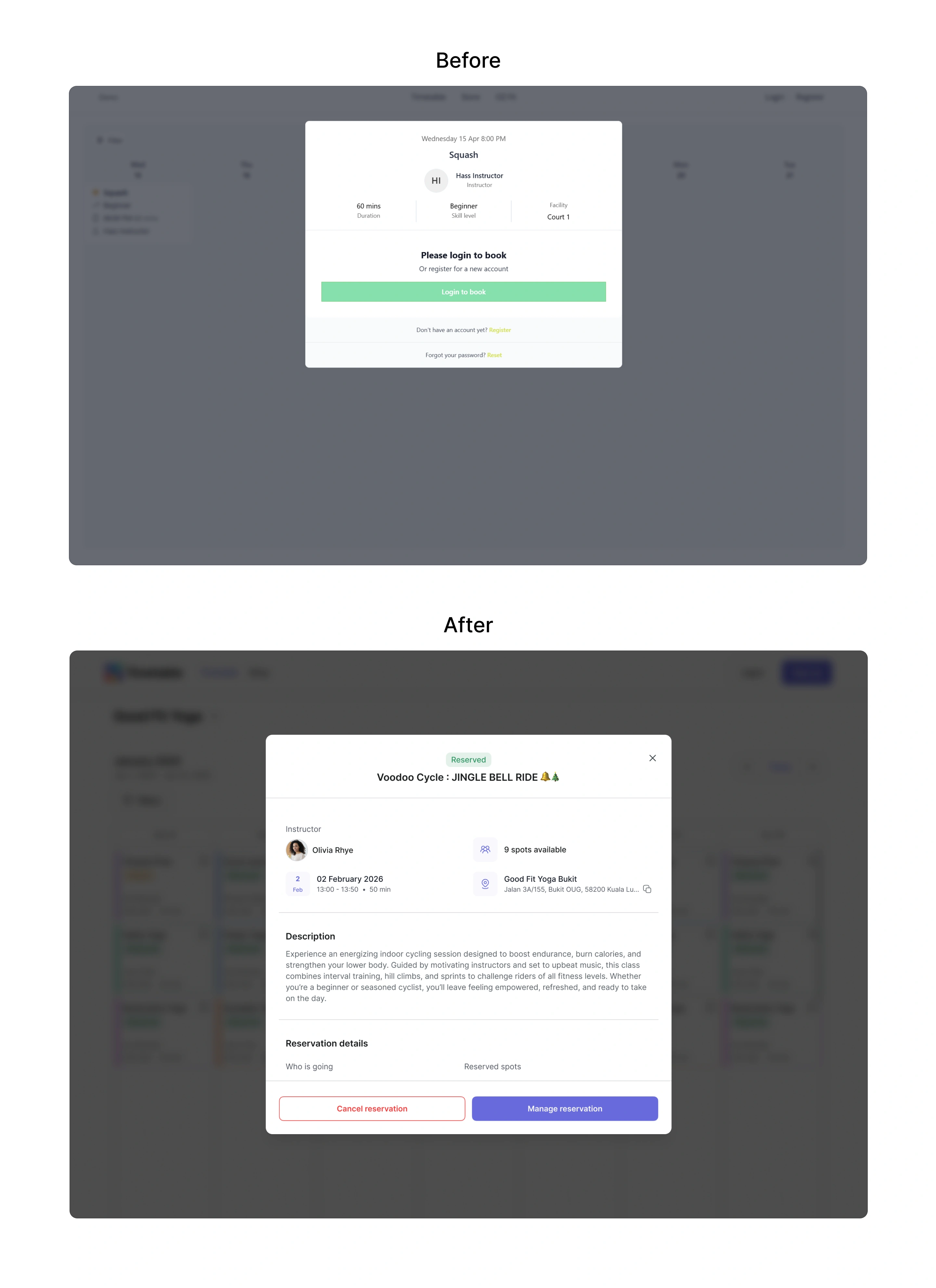
Class and reservation before and after redesign
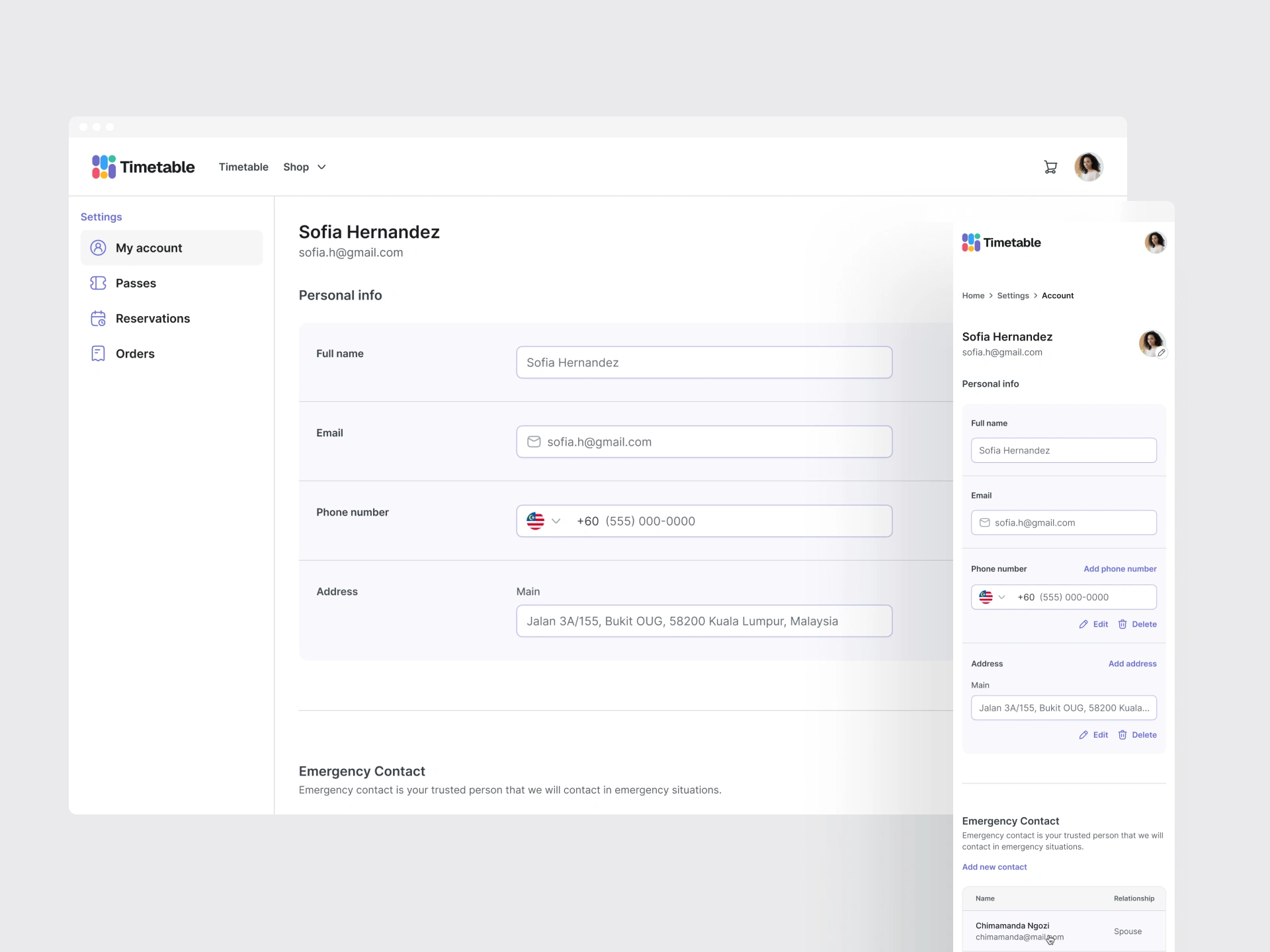
User profile
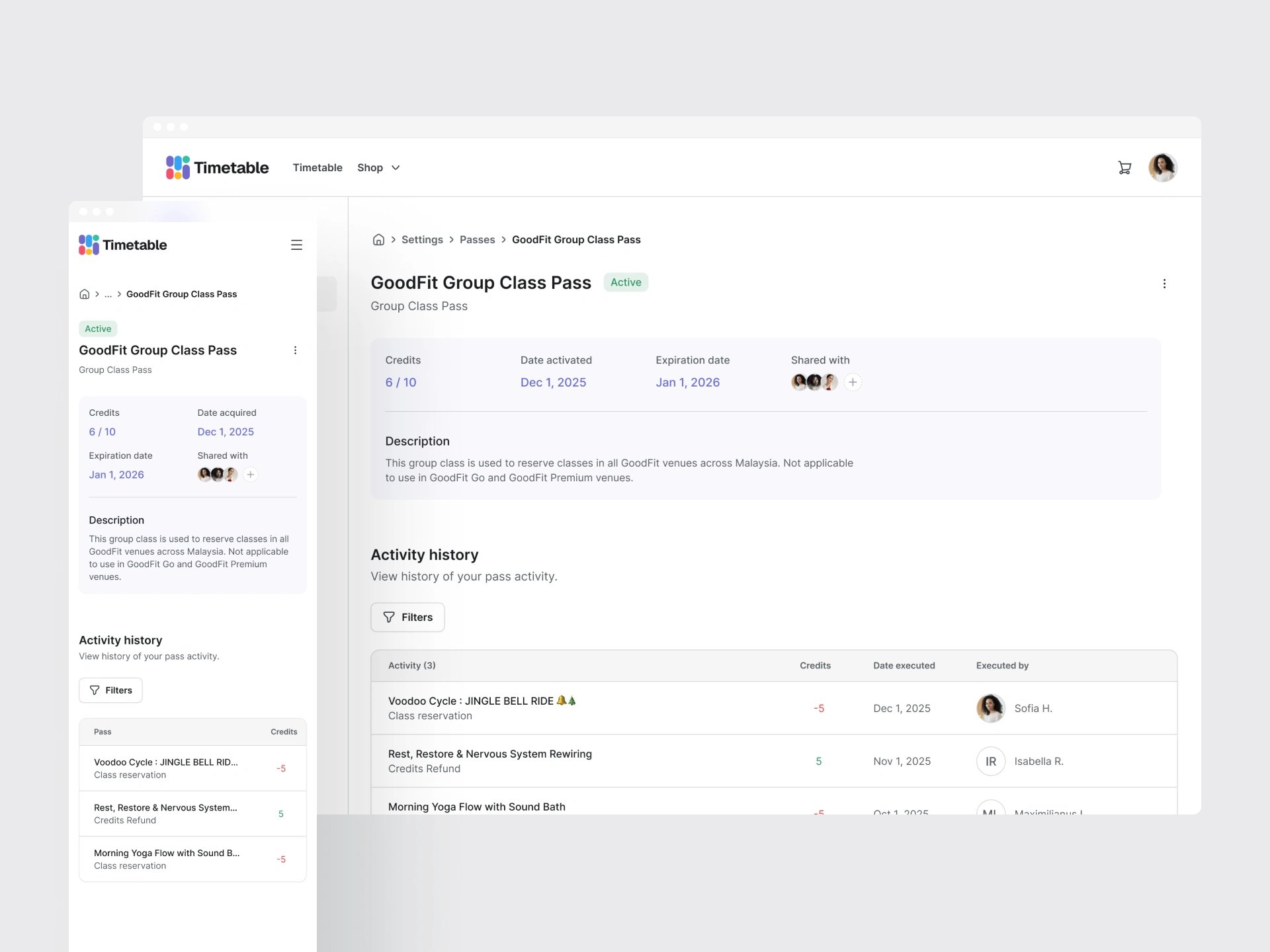
Pass / Pack details
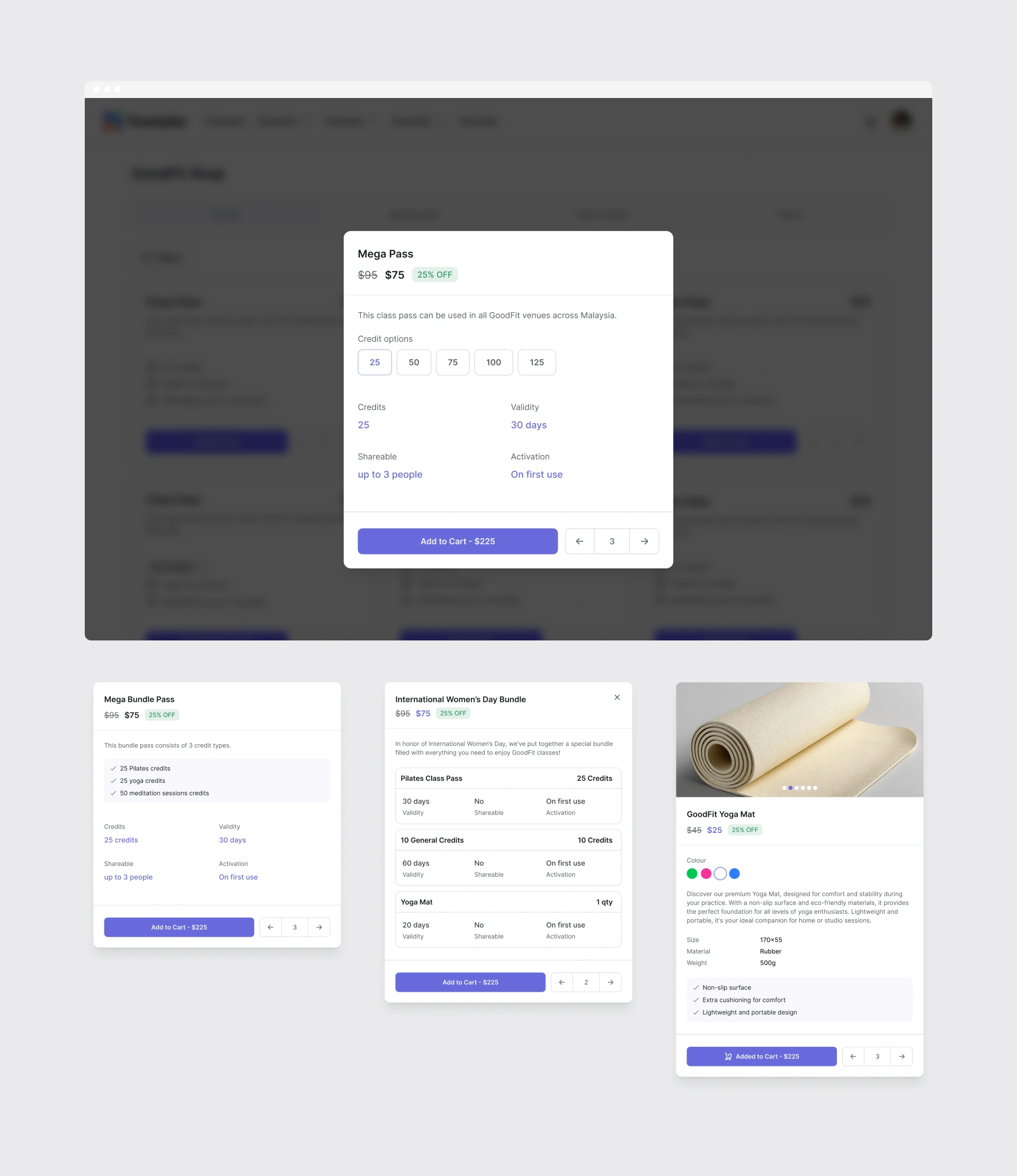
Store item details
Impact
While business-level metrics are currently being gathered, the internal development workflow has improved significantly.
Reduced Design-to-Dev Gap: Standardized components with clearly defined roles have streamlined the handoff process.
Accessibility Excellence: We implemented tooltips, labels, and color schemes that meet WCAG standards, ensuring an inclusive experience for all users.
Enhanced Functionality: Introduced improved management workflows for purchases, reservations, and personal data.
Monetization & Retention: The redesigned storefront now supports diverse product types, allowing larger studios to integrate merchandise sales directly into their scheduling flow.
Key Learnings
Iterative Scaling: In an ambitious project, it is easy to fall into the trap of "thinking too big" and overwhelming existing users. We pivoted to an incremental approach, starting with high-impact brand asset customization to provide immediate value without breaking the user's mental model.
Solving the Color Scale Problem: Generating accessible color scales for diverse brand identities proved challenging. We explored various methods, including Tailwind-style opacity leveling, but found they failed for lighter brand colors. This led us to develop a more flexible, custom color-scale logic that maintains accessibility across the entire spectrum.
The "Clean UI" Balance: We faced the challenge of removing heavy visuals (like large studio imagery) to improve performance while keeping the interface engaging. We found that by offering deeper customization of UI elements themselves, we could create an interesting, premium feel that keeps users engaged without overwhelming them with unnecessary media.
3 likes · 119 views · Apr 15, 2026
Designed a customisable theme system for Timetable — a SaaS platform for fitness studios.
Timeline
Oct 29, 2025 - May 26, 2026
