Meditation App In Spatial Design
Hello there! Here is my spatial design project.
After Michal Malewicz and Adam Moucka published their case study for Vision Pro on Medium, I wanted to investigate it since every design or analysis I see is more visually appealing than logical.
Do check out my beautiful as well.
Some Key Points of Spatial Design from Michal’s Case Study:
Strike a balance between novelty and familiarity by incorporating common interface elements, facilitating easy navigation for users.
Design windows that offer flexibility, adapt to lighting conditions, and provide users with a heightened awareness of their environment.
Leverage points as a unit of measurement to ensure adaptability and maintain legibility across different distances.
and here is also a video from Apple Vision Pro Guidelines: here
The Idea
I wanted to design a simple spatial meditation app with the ability to see and feel the mindful sections in your room.
We’ll at least build the foundation and build from there. The key to designing for new devices is to keep it simple and intuitive for users of their current and most popular devices, such as the iPhone, Mac, or iPad.
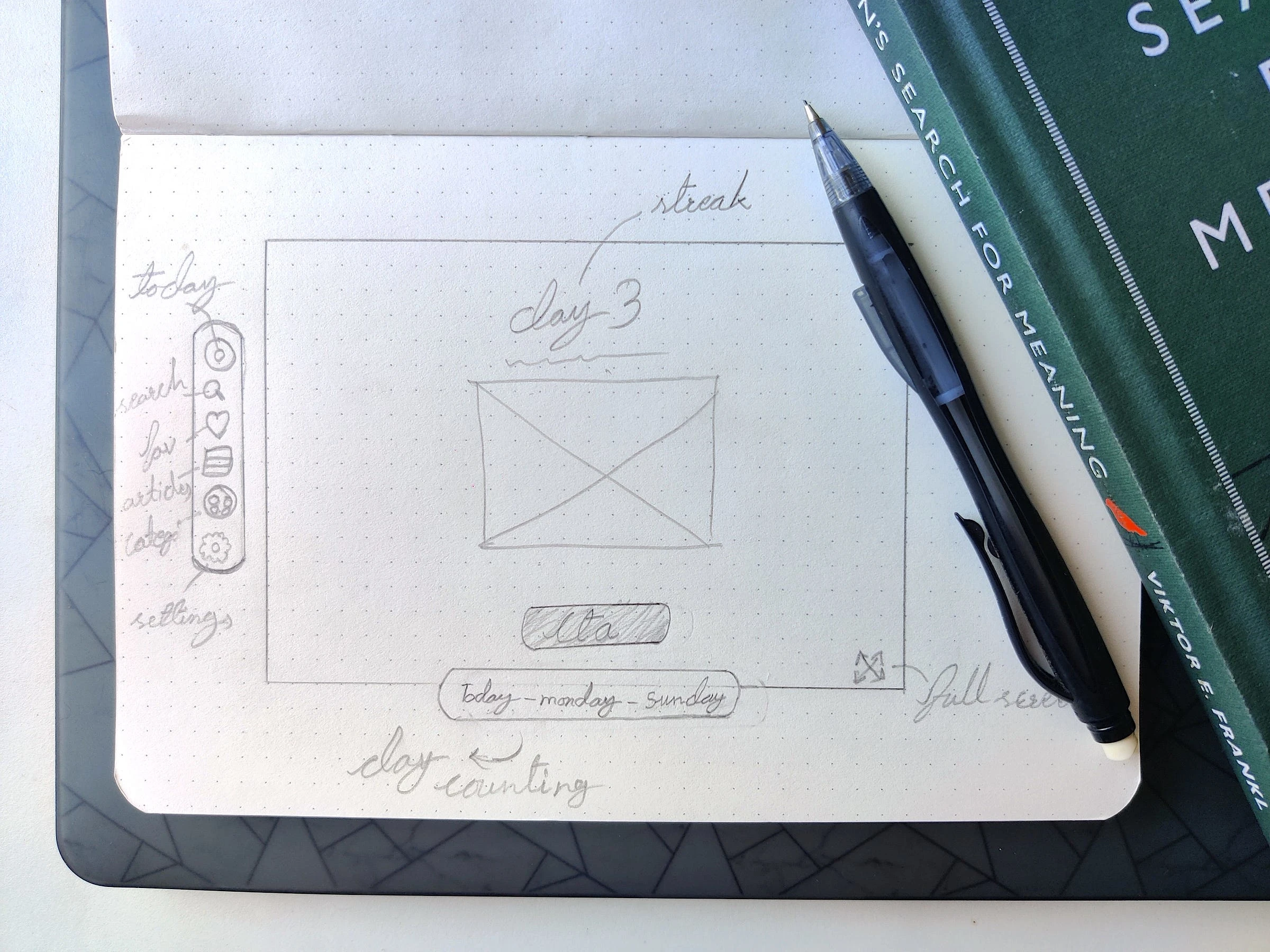
Here is my basic sketch wireframe. Before diving into it, let me show you the basic principles and guidelines of spatial design.
The Basics
Before designing for any new device, we should always go and check the basics of the platform or device. That’s precisely what I did. I went to Apple’s website and read the basics of layout, typography, colours, styles, sizing, spacing, and principles of spatial design from WWDC.
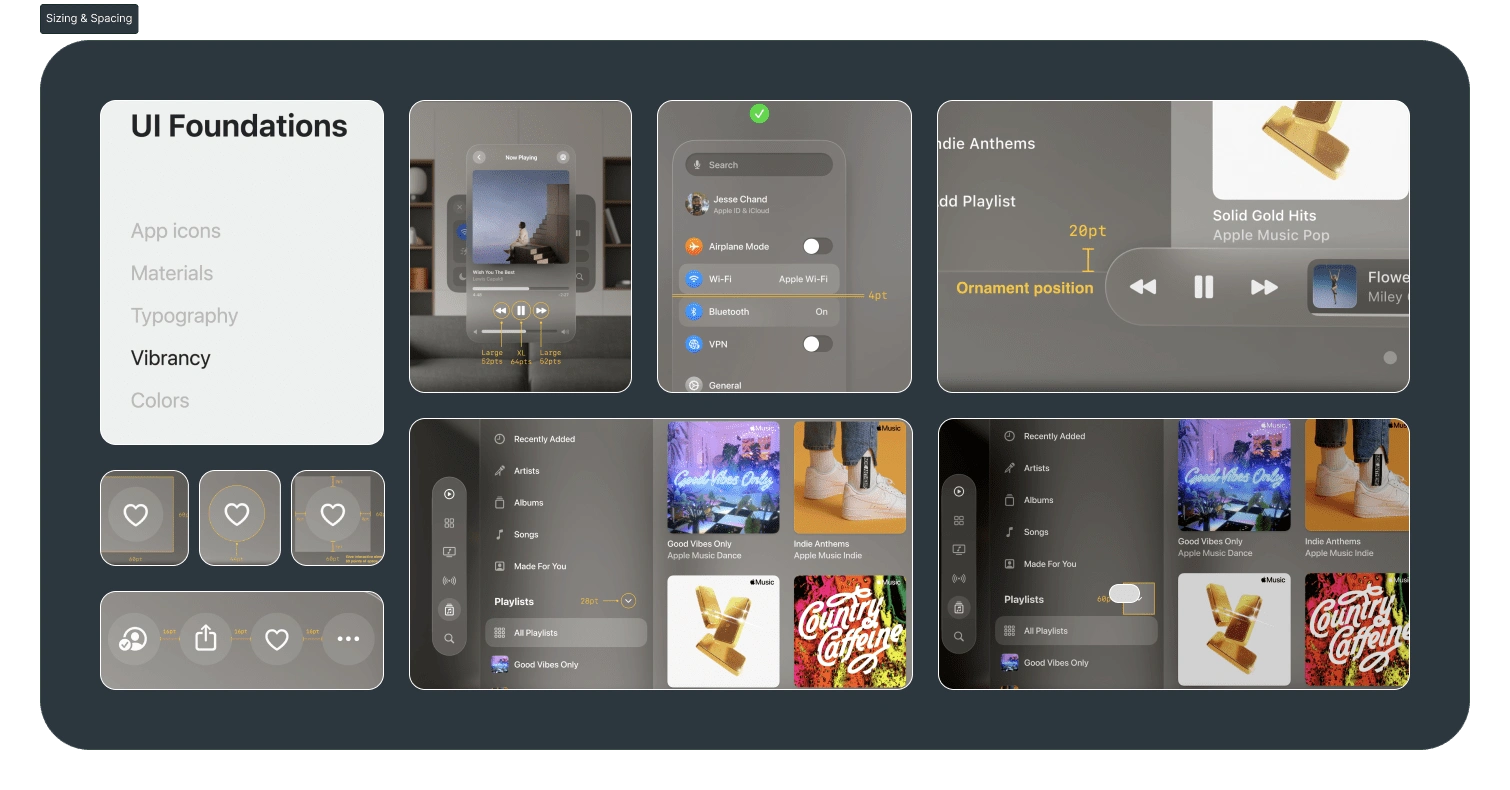
Some screenshots I have taken from the web that I thought were important.
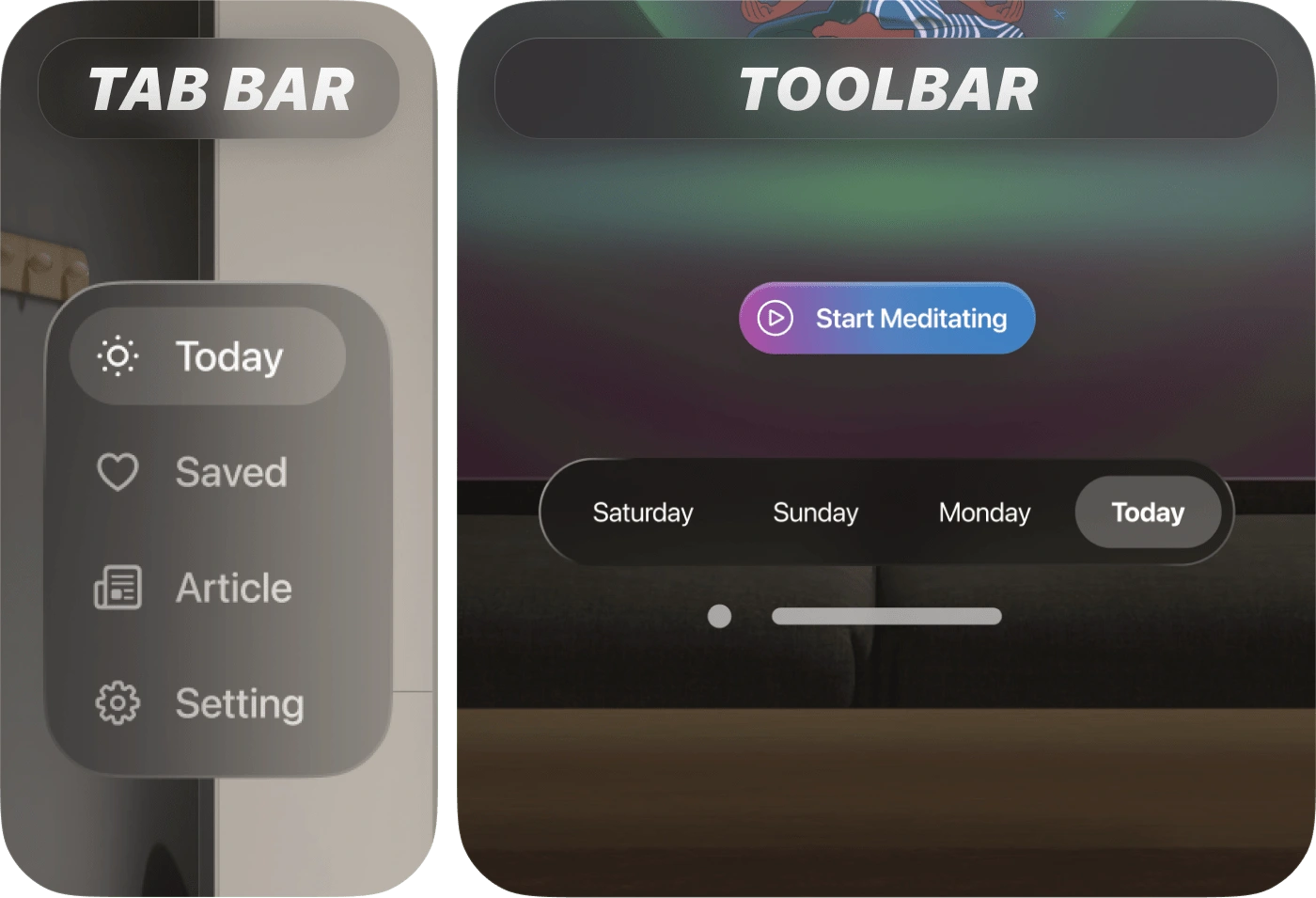
On the other hand, I have noticed that many designers make the mistake of using both the tab bar and the toolbar at the same time, even though spatial design principles suggest not using them both at the same time.(According to Apple’s Developer Documentation, toolbars and tab bars should not appear together in the same view.)
Then I created a moodboard of what I would do. Here are the key points I wanted to reach:.
A meditation app for beginners to intermediates that can be used for the best simple yet minimal effort experience.
It shows only essential points and is easy to use.
Do not limit the design just to Vision Pro; try to implement the idea on mobile as well.
At the same time, users can also be educated by our article’s page.
The Design
When I was researching spatial design principles, I also made a moodboard for my project. Now I know the principles and also have an idea. Now it’s time to bring it to life.
Let's Start with onboarding
During the onboarding process, users are presented with a crucial decision: whether to continue using the app or not. This step is of utmost importance as it determines the user’s interest in and engagement with the app.
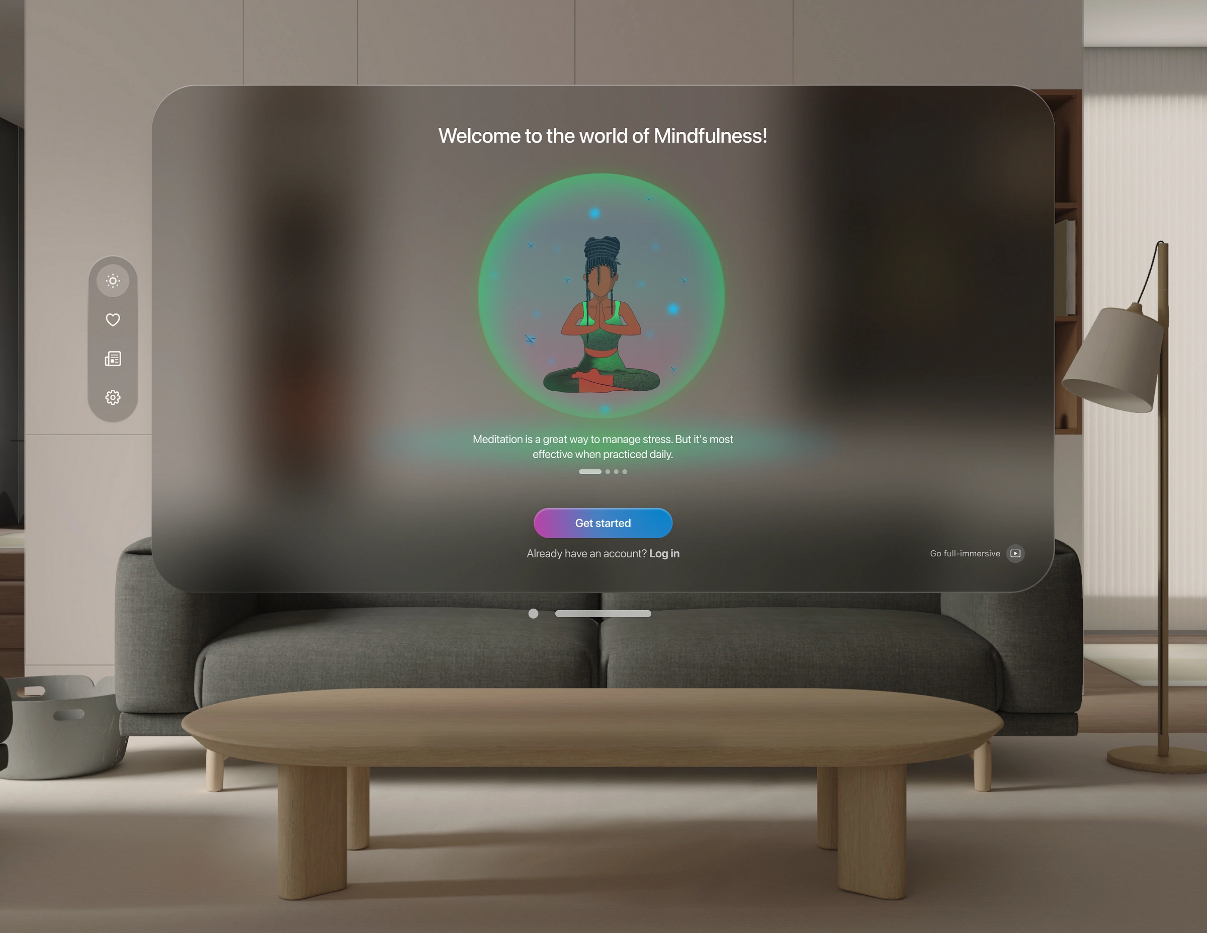
I don’t want to waste my time creating login screens. Let’s dive into solving the problem. It was challenging to figure out how to present the screen without adding cognitive load to the user. There’s a great quote by Antoine de Saint-Exupéry that says, ‘Perfection is achieved, not when there is nothing more to add, but when there is nothing left to take away’.
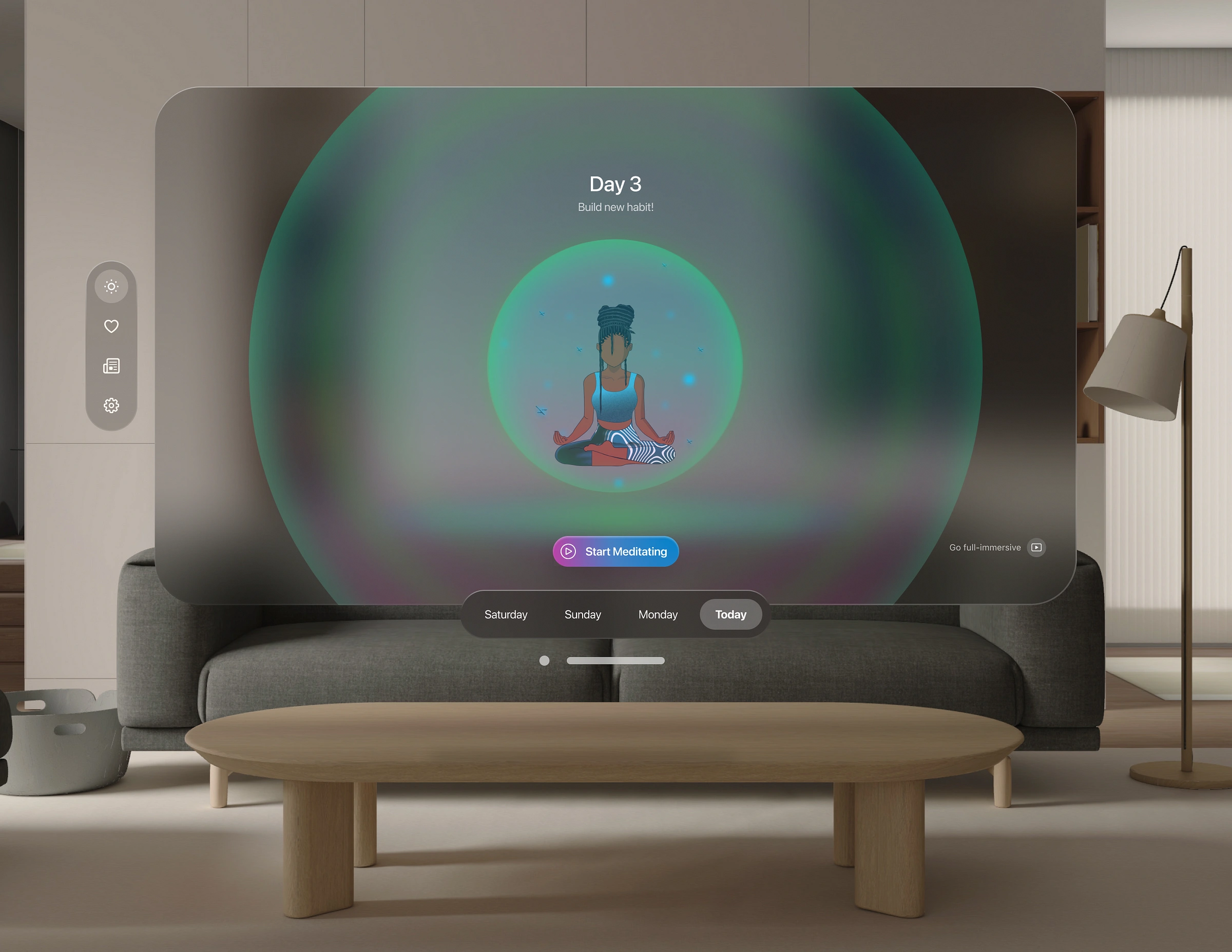
And don't overlook the realistic shadows; lots of designers forget about them.

Small details, shows on the table.
Second Page
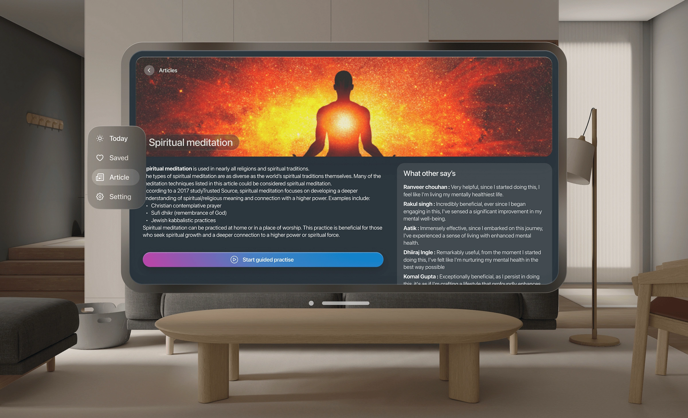
On the second page, you don’t need to add a toolbar or ornaments; fewer options are more functional.
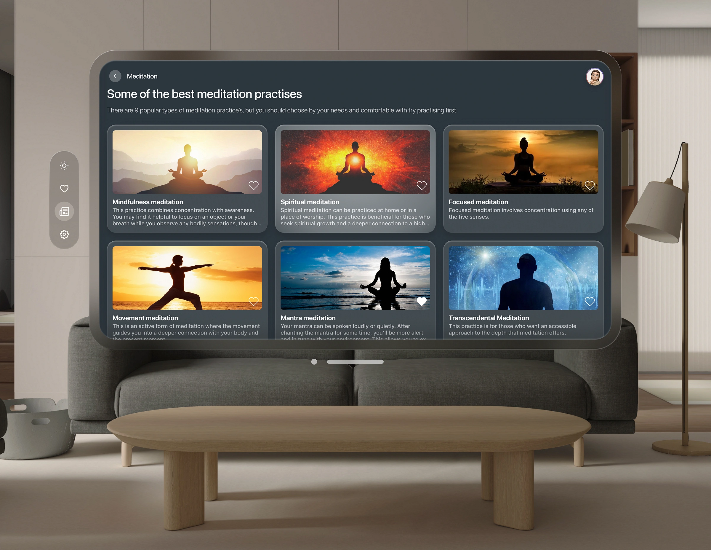
Whenever you want to motivate someone, it’s best to explain the benefits. I have also created “What others say” to make it more engaging by sharing what others think about this article or practice.
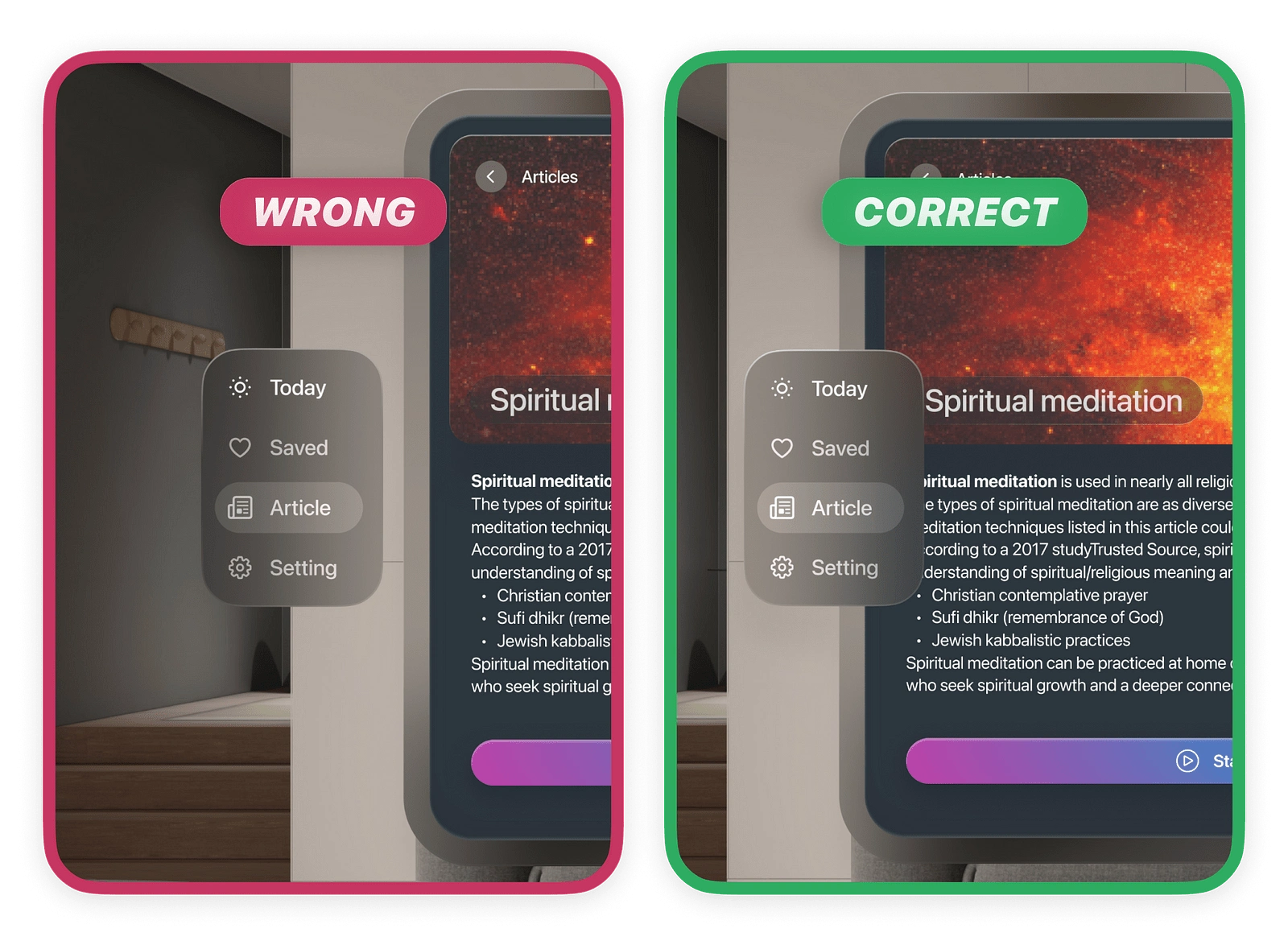
Hover state
In the hover state, many designers mistakenly animate it sideways instead of overlaying it on the window.
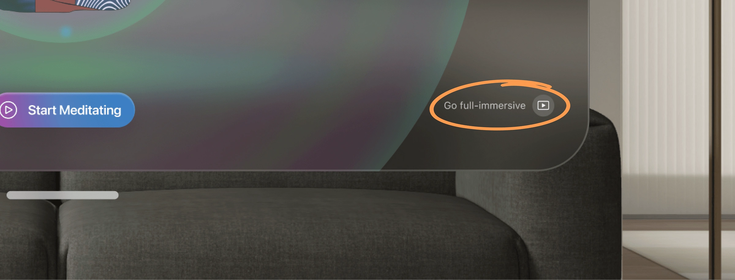
Immersion
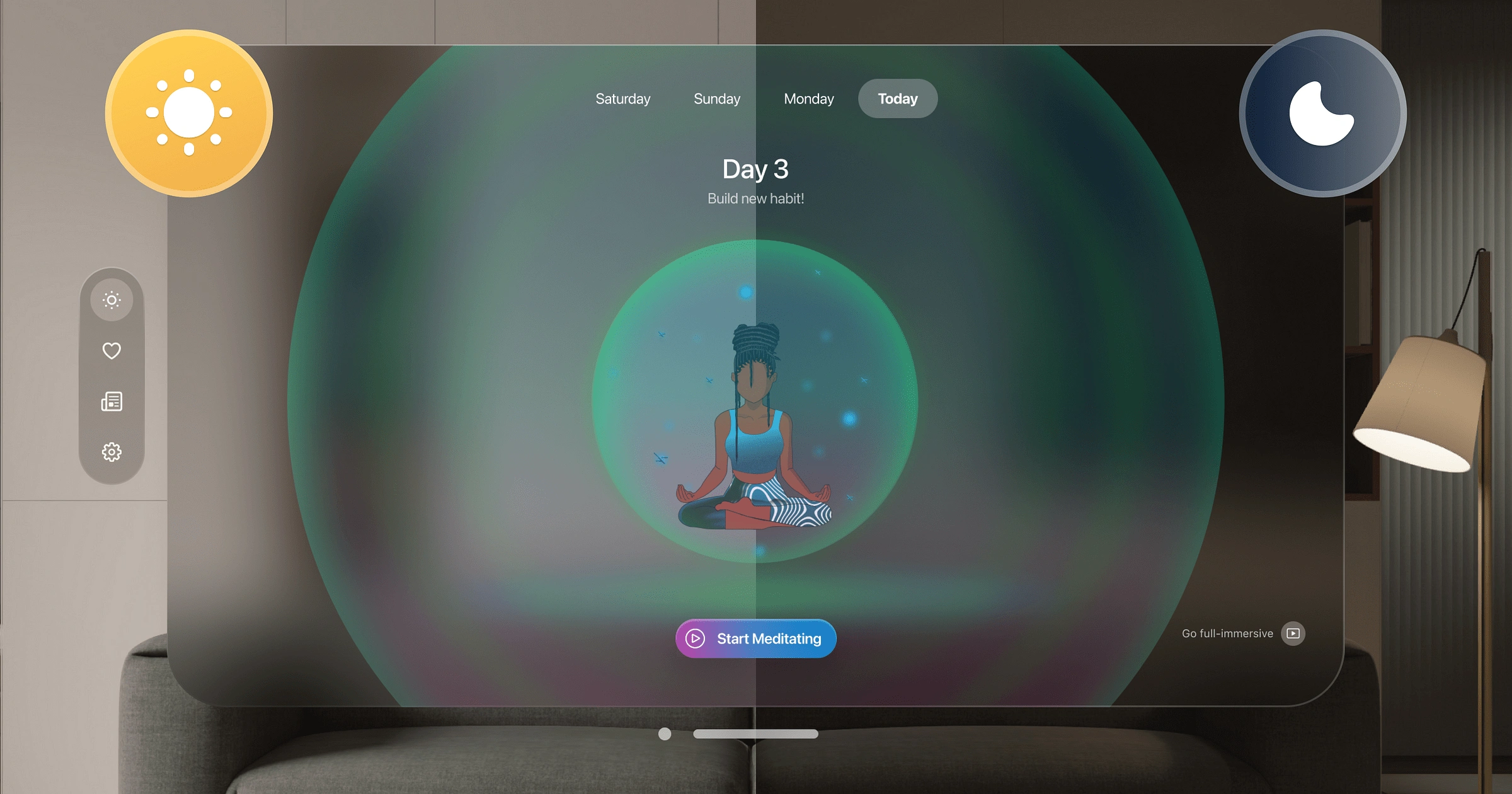
Now here is the core feature of Vision Pro: GO FULL-IMMERSIVE!!!
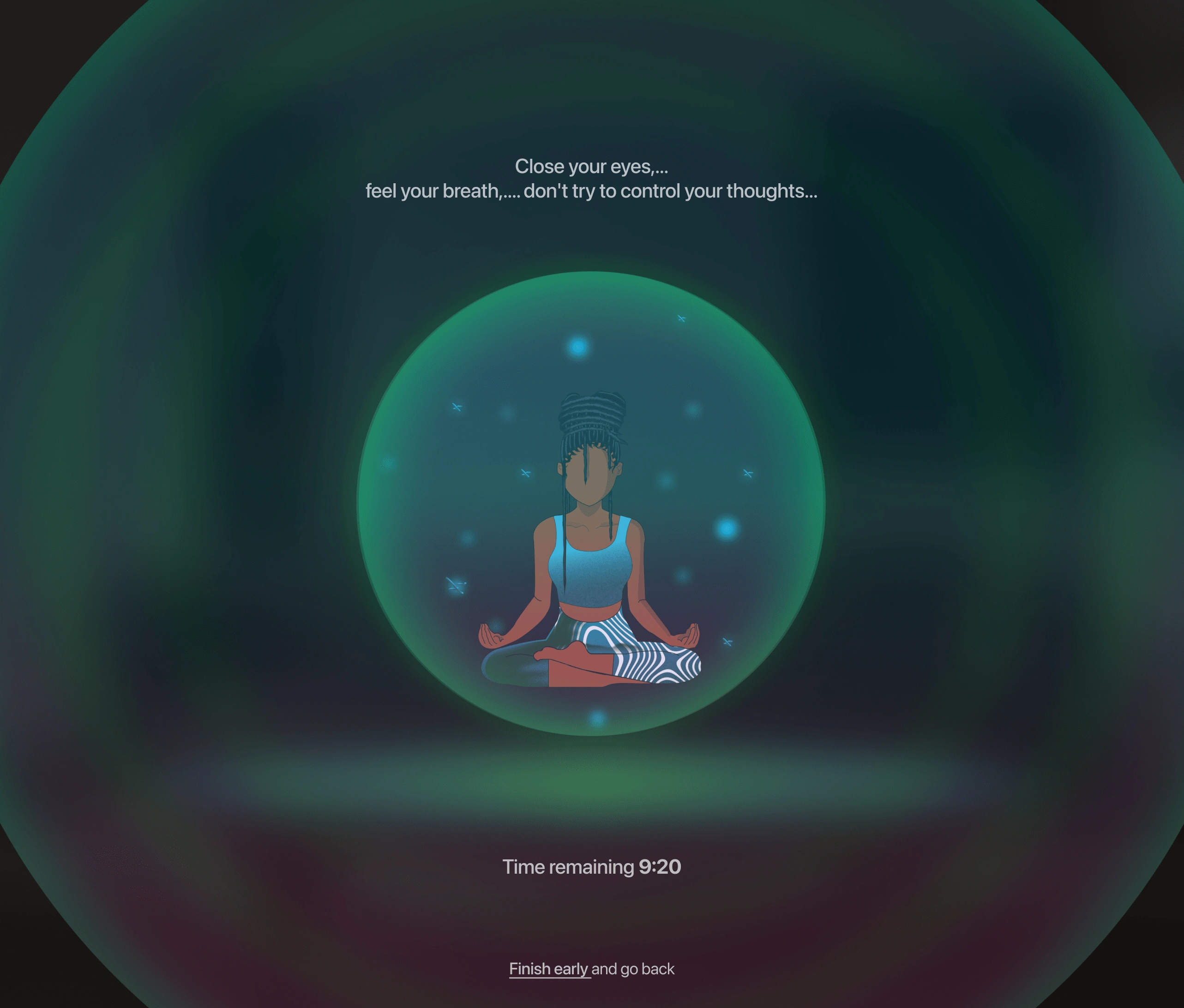
I tried to fully utilise it wisely in my app so users could enjoy their mindful stations.Tabbing on this button brings up a full view that creates a perception of being in a different environment than normal.
Immersive content is about the viewer engaging with what they’re seeing, and feeling present in the experience.
Accessibility
There are no issues with visibility at night or during the day, as we can easily read all the text on the screen even in dim lighting.
Back to reality
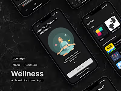
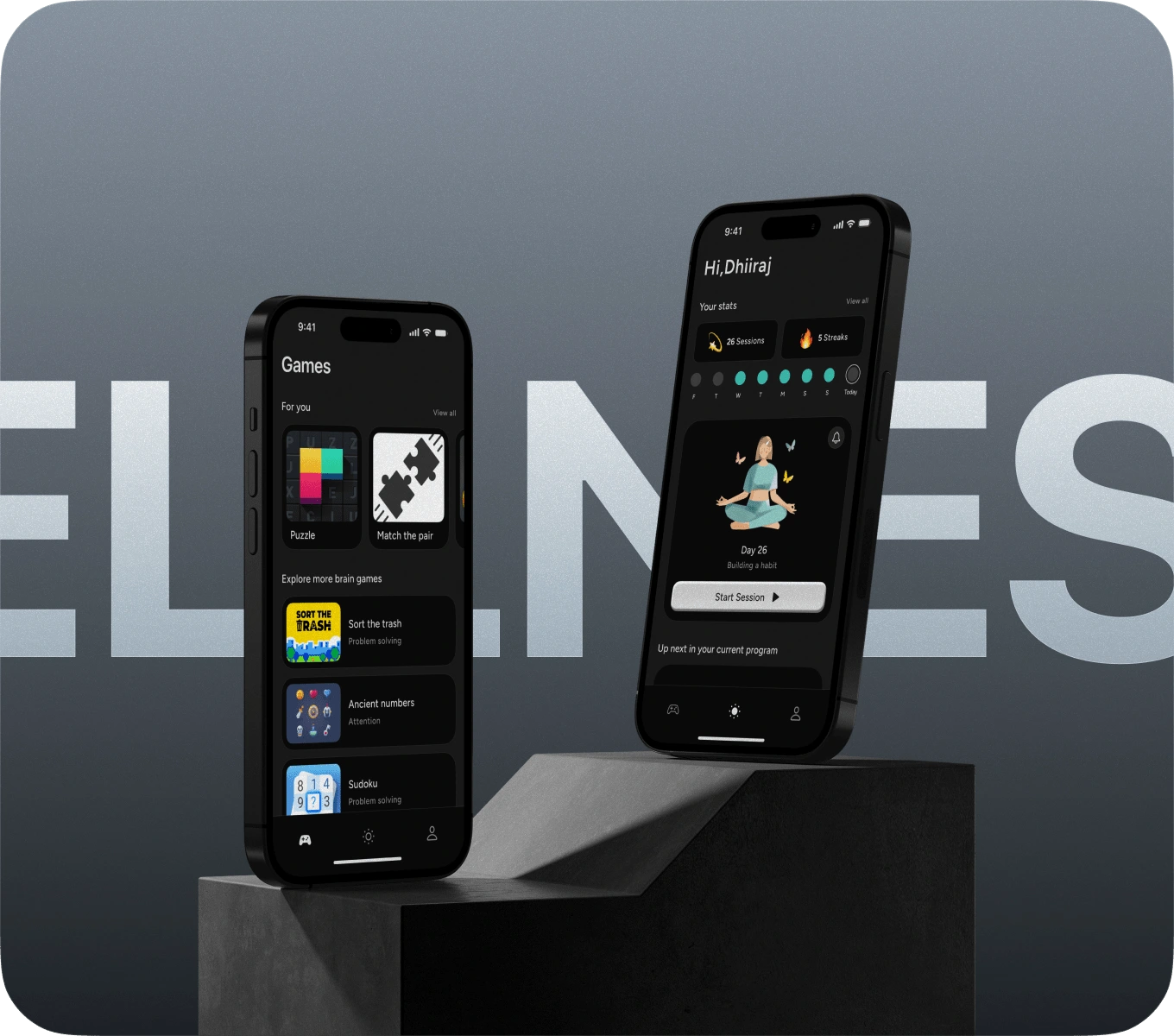
Now for the last part of this case study. I don’t think everyone will go and buy this expensive headset. And if all people don’t buy this, then this whole concept isn’t that beneficial, so I made it for mobile too.
I would like to provide a brief explanation of the problem statement in this case study.
Many elderly individuals experience difficulties maintaining their cognitive function and mental sharpness as they age, which can lead to concerns about memory loss and declining cognitive abilities.
In fact, this was a problem that my mother faced, and I have elaborated on it further in this article. Please take a look.
Final thoughts
This type of project takes a lot of time. It takes a lot of research and trial and error.
And it was my intention that I encourage everyone out there to try these things. Push yourself out of your comfort zone. In the end, I hit a few bumps in the road, but I now feel more confident designing for Vision Pro.
That’s it for today!
I wish you all a lovely day and hope to see you next time!!!
Check out my other articles on Medium.
Did you know?
You can give up to 50 claps for this article. Just hold the clap 👏🏻 button for a few seconds and bam! Tr. it out 😋.
My Socials
Like this project
Posted Mar 16, 2024
This was the project I worked on when Vision Pro was just announced; it was like a year before its release I have showcased my research capabilities & UX skills
Likes
0
Views
6


