Built with Webflow
Avenir - Consulting Webflow Template

Milan Bundalo
Verified


Avenir started with a simple problem: many consulting websites feel either too corporate or too generic. The goal was to create something more confident and editorial, while keeping the structure practical enough for a real consulting or advisory business.
I developed Avenir for BYQ Studio, translating its visual direction into a complete, scalable Webflow template. The finished project includes more than 20 pages covering services, case studies, insights, careers, contact flows, legal pages, and the smaller utility pages that are often overlooked.
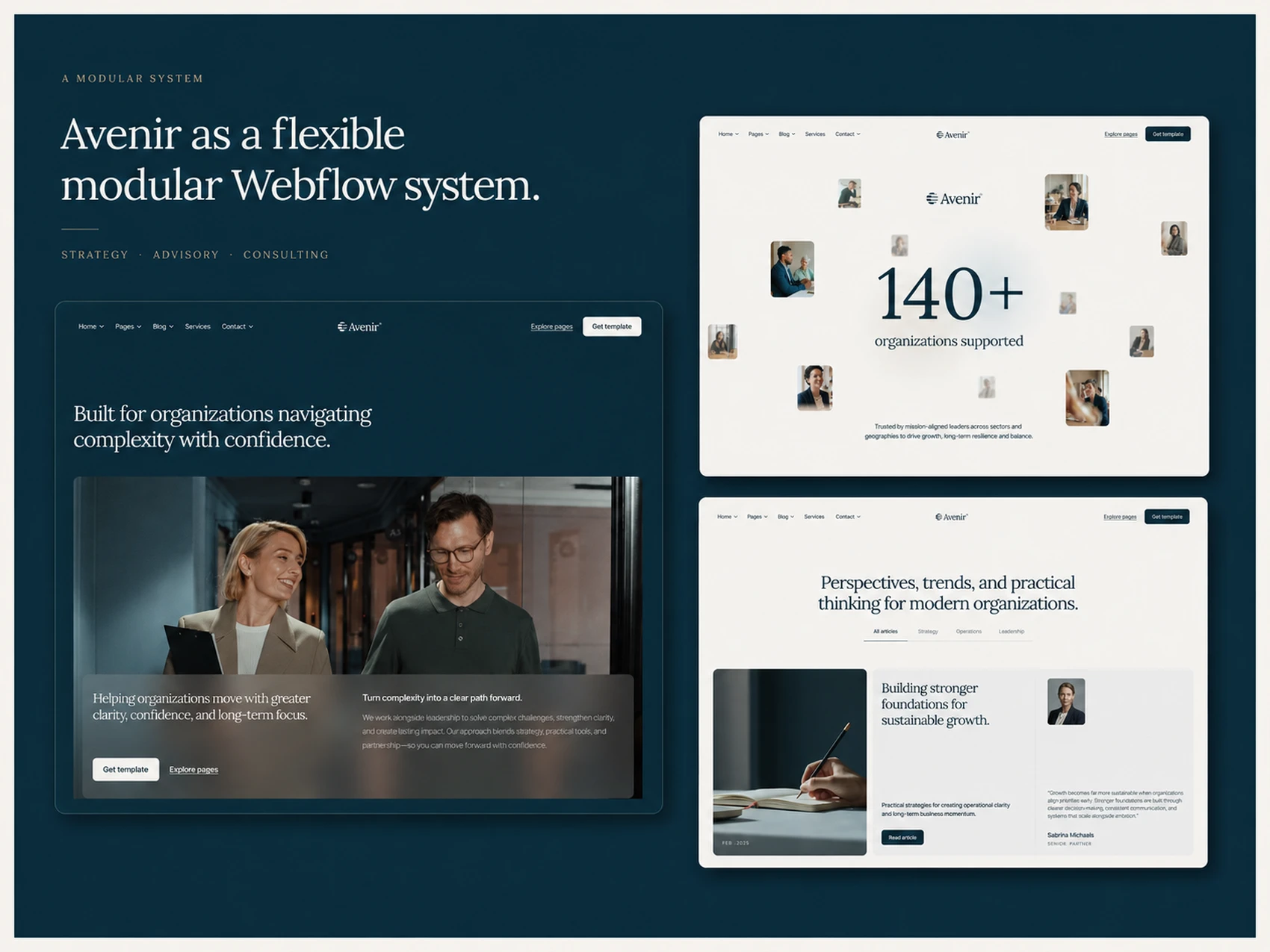
Building one connected system
Instead of treating every page as an isolated layout, I approached Avenir as one connected Webflow system.
I created reusable components, global variables, shared layout classes, and consistent spacing rules that keep the entire website visually aligned. This makes it much easier for someone using the template to change colors, typography, content, and imagery without having to rebuild individual sections.
The template also includes multiple homepage and inner-page layouts. Each variation has its own composition, but still feels like part of the same brand. The goal was to offer genuine flexibility without turning the project into a collection of disconnected pages.
Content that can grow with the business
Avenir was built for organizations that regularly publish new work, insights, and opportunities.
I structured the CMS around case studies, articles, careers, and job listings, allowing important content to be managed directly through Webflow’s Editor. The individual collection pages were given the same attention as the main marketing pages, with clear typography, reusable content blocks, and layouts designed for longer-form information.
This makes Avenir suitable not only for a small consulting firm launching its first website, but also for a growing organization that needs to keep adding content over time.
Motion with a purpose
The visual direction is intentionally calm, so the interactions needed to support that feeling rather than compete with it.
I used smooth Webflow and GSAP interactions to introduce content, guide attention, and add a sense of polish throughout the experience. Movement remains controlled and understated, keeping the focus on the message, imagery, and editorial typography.
I also spent time refining responsive behavior across desktop, tablet, and mobile. The layouts were not simply compressed for smaller screens—spacing, content order, typography, cards, navigation, and interactions were adjusted to work naturally at every breakpoint.
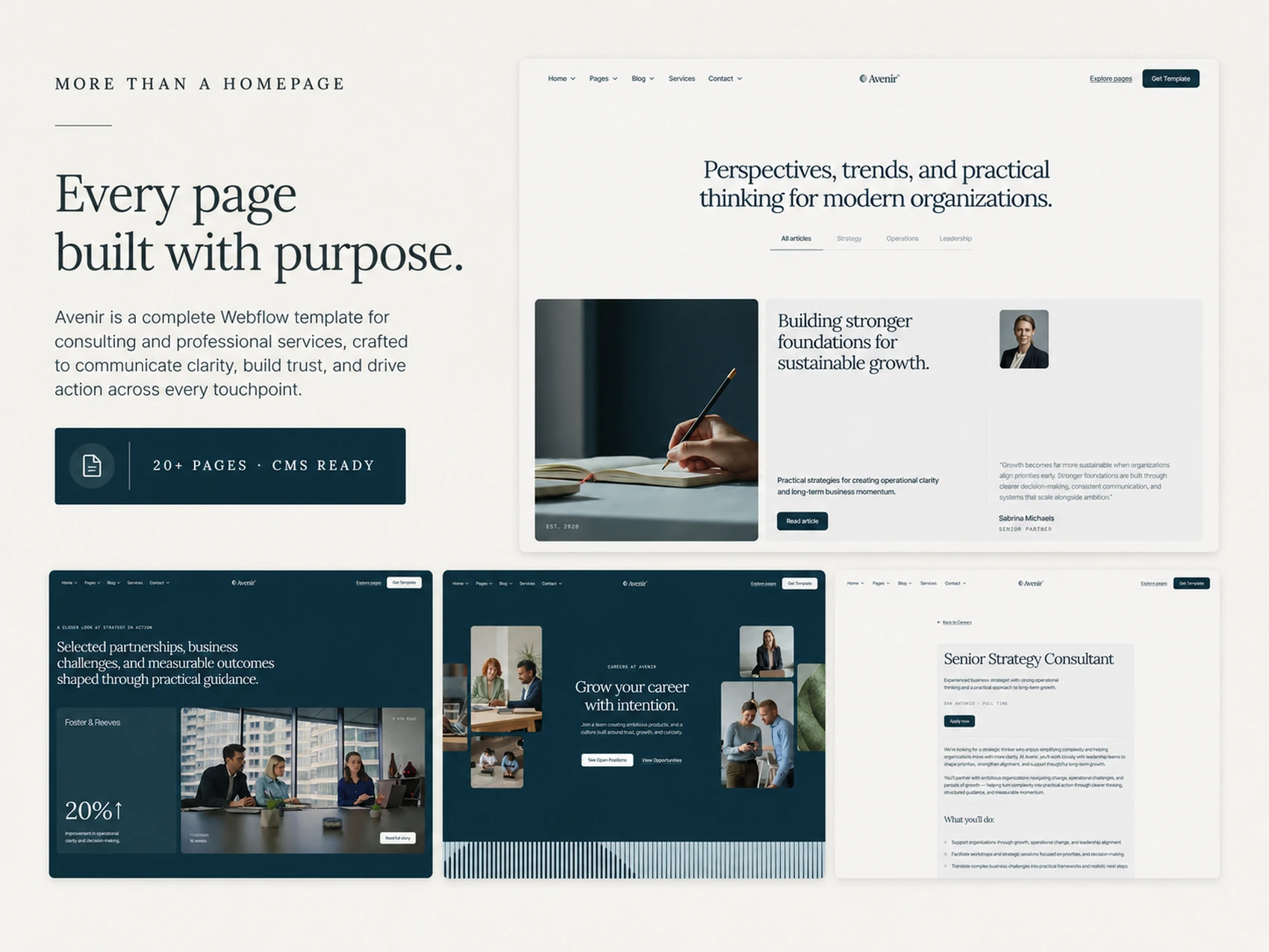
The final result
Avenir combines the polish of a custom consulting website with the flexibility of a reusable Webflow template.
It gives consulting firms, advisory businesses, strategy teams, and professional service organizations a strong starting point without forcing them into a rigid structure. Underneath the visual presentation is a carefully organized system that is responsive, CMS-ready, easy to customize, and built to support long-term growth.
For me, the most important part of the project was finding the balance between character and usability: creating something that looks distinctive when first opened, but remains practical for the person who eventually needs to manage and adapt it.
Like this project
Posted Jul 31, 2026
Developed Avenir, a modular multi-layout Webflow template helping consultancies and professional service firms communicate with clarity and trust.
Likes
1
Views
9
Clients
BYQ® Studio