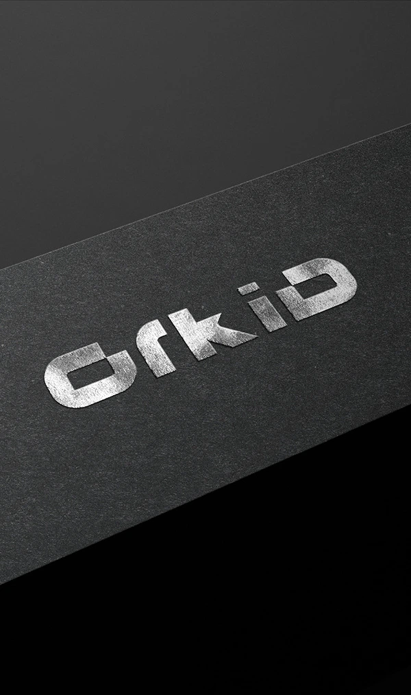
ORKID | Wordmark Logo Branding Design
Md Rezaul
ORKID is a champion of sustainability and environmental stewardship. With a firm commitment to reducing its carbon footprint and promoting eco-friendly practices, ORKID leads by example, inspiring others to follow suit in the quest for a greener, more sustainable future.
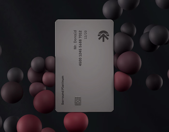
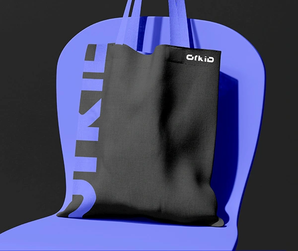
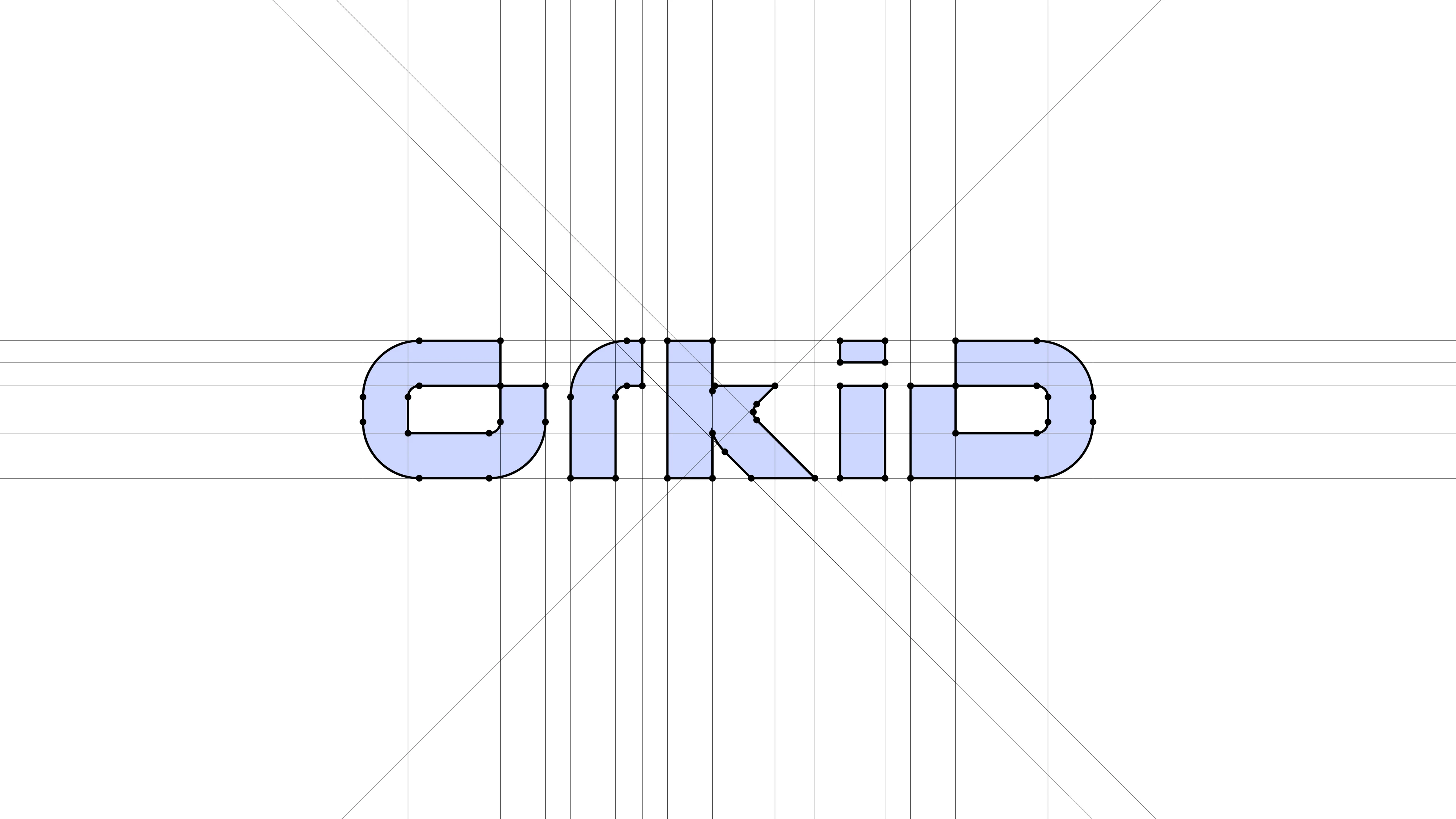
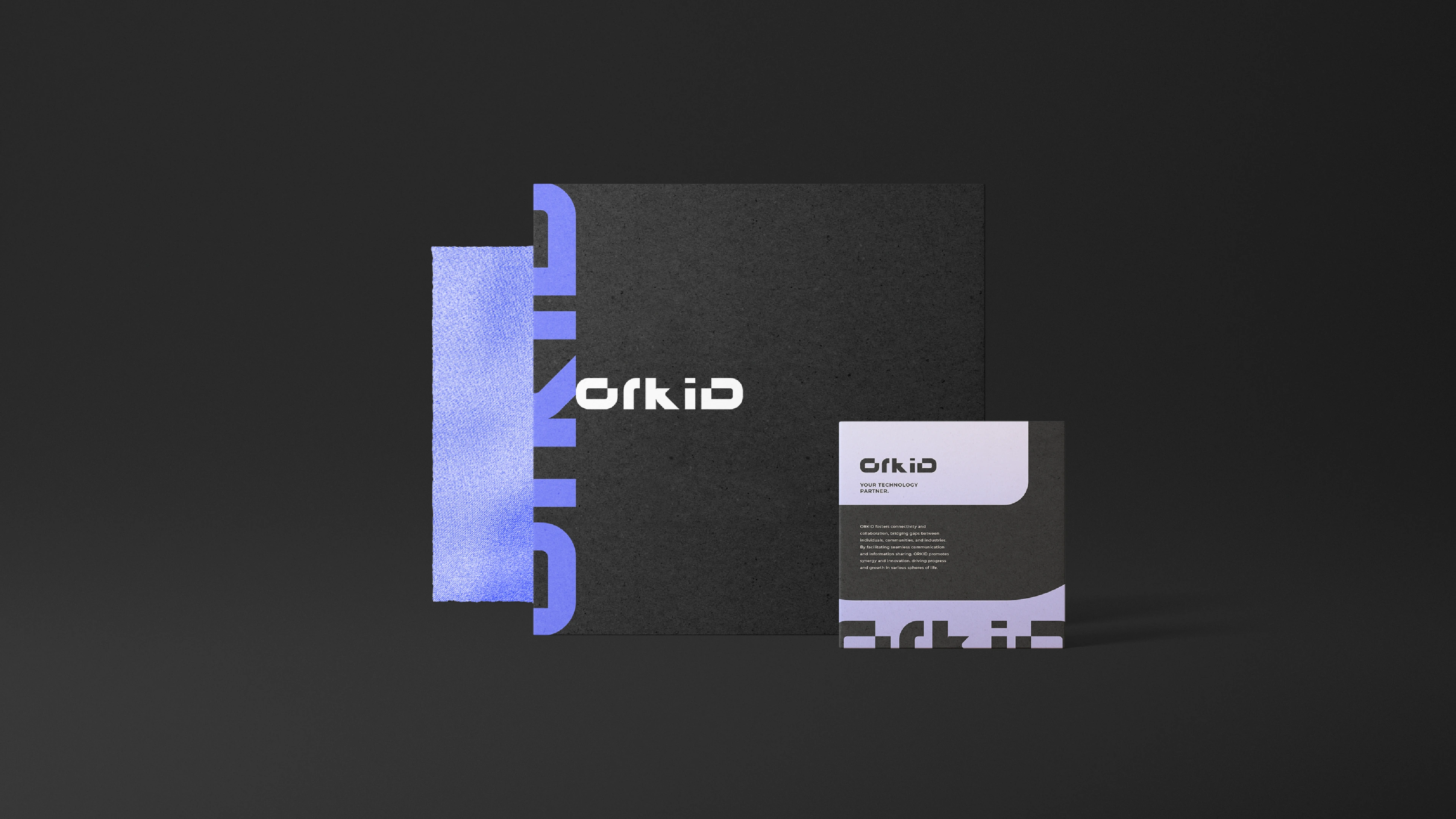
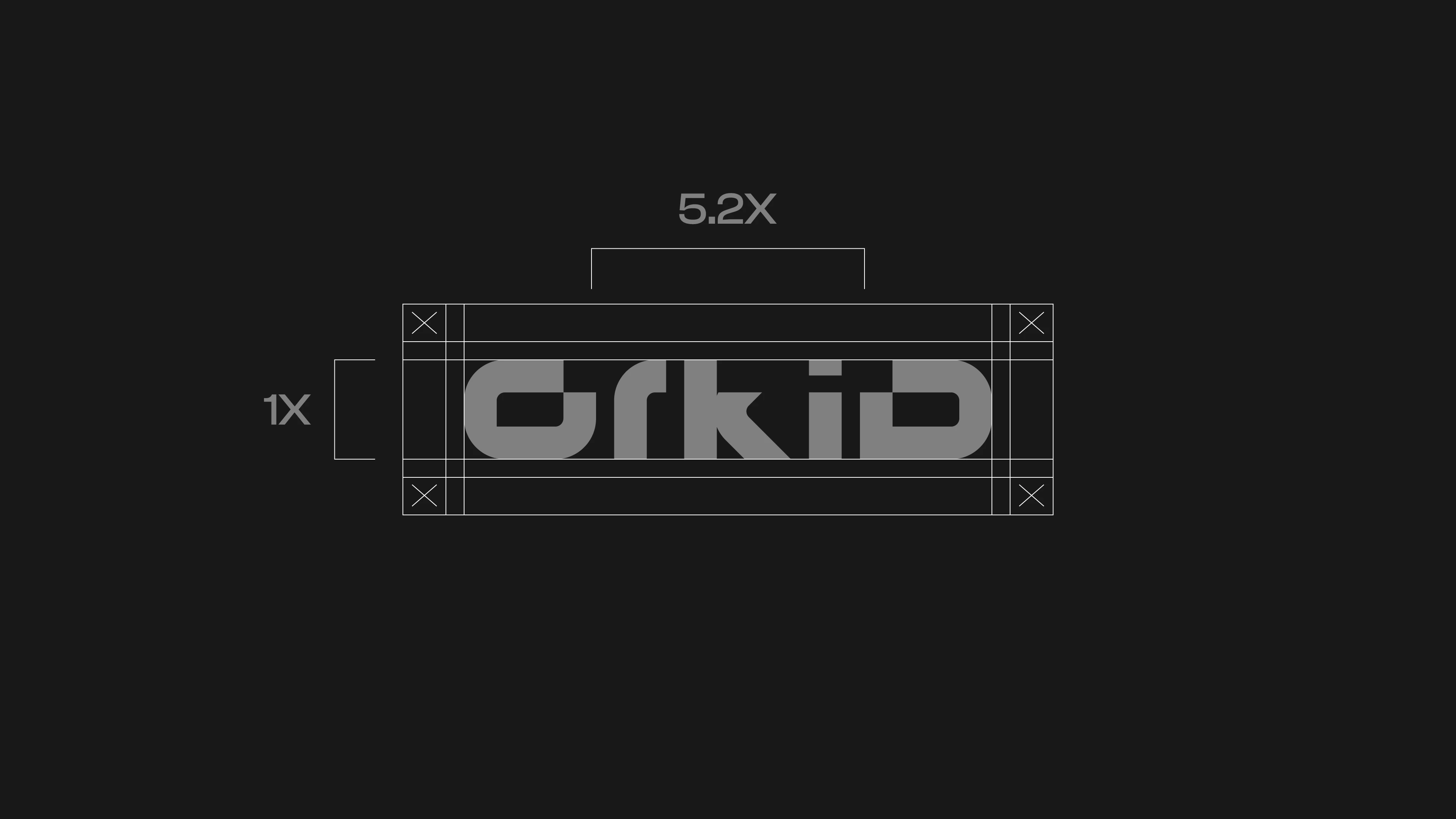
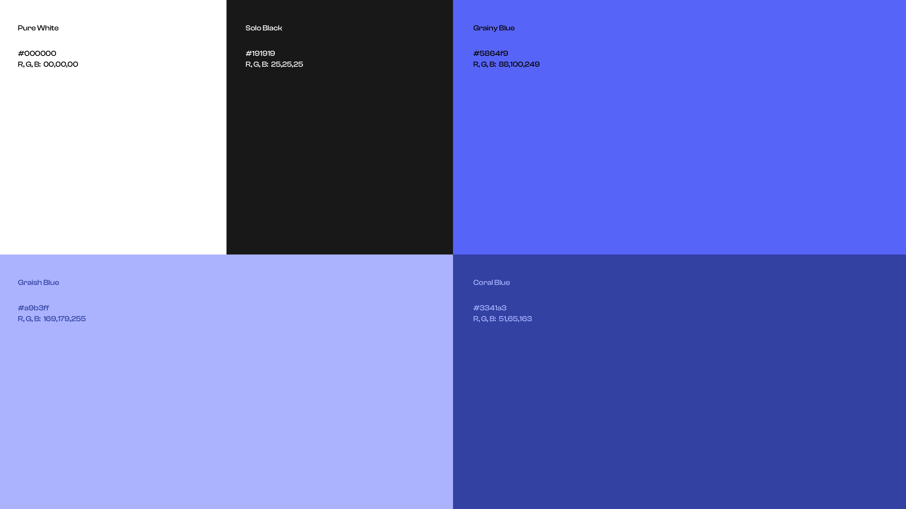
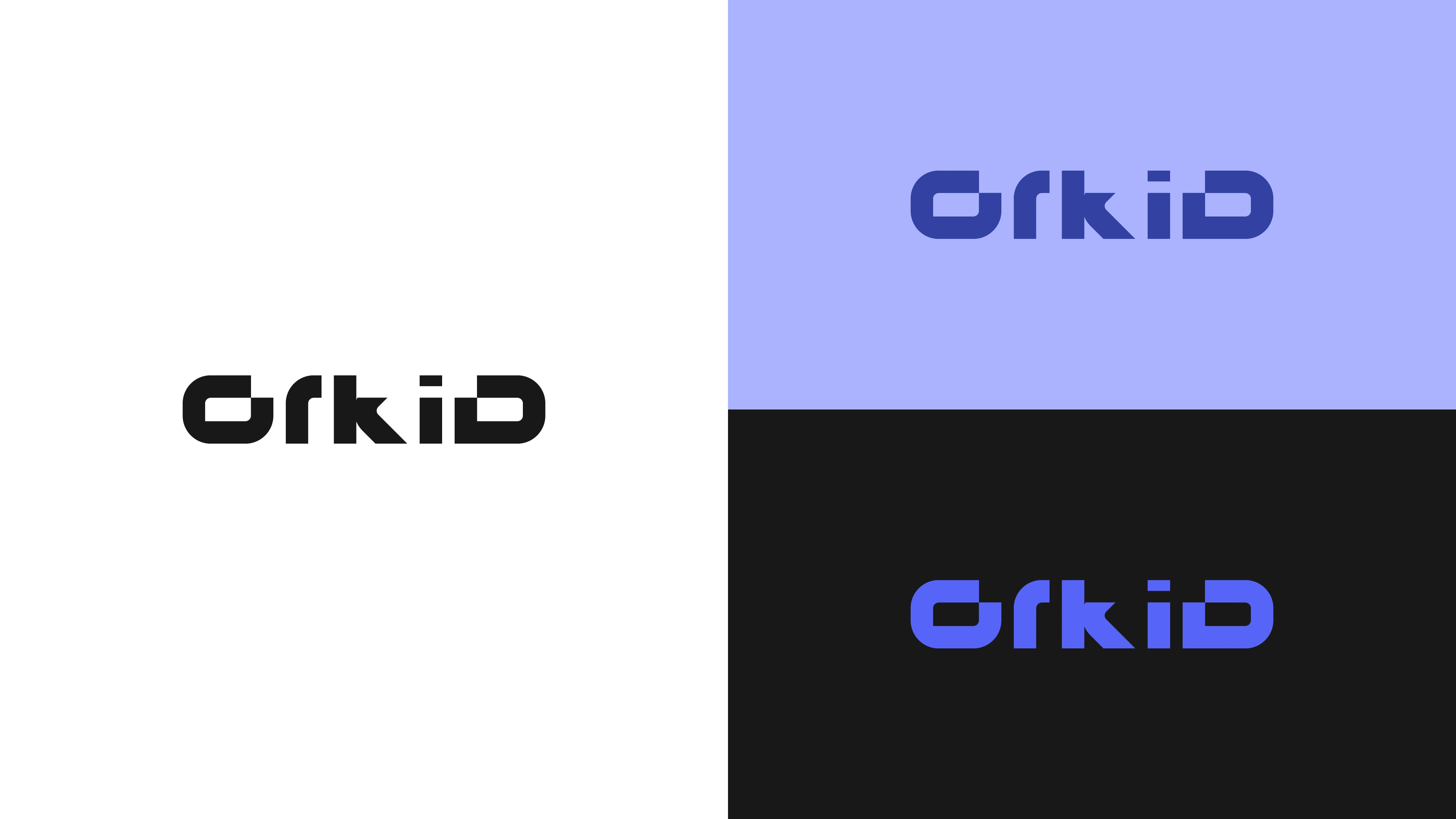
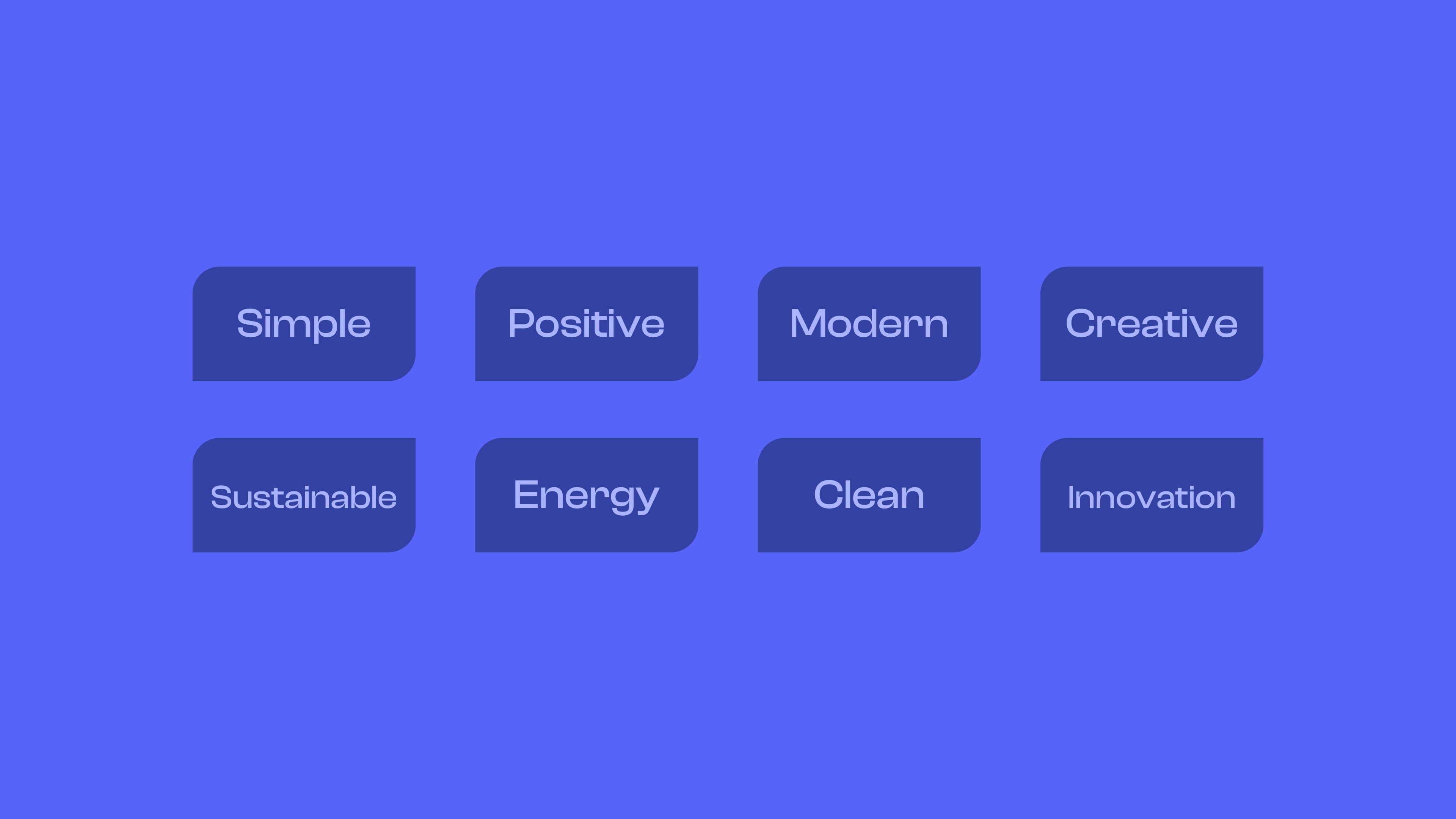
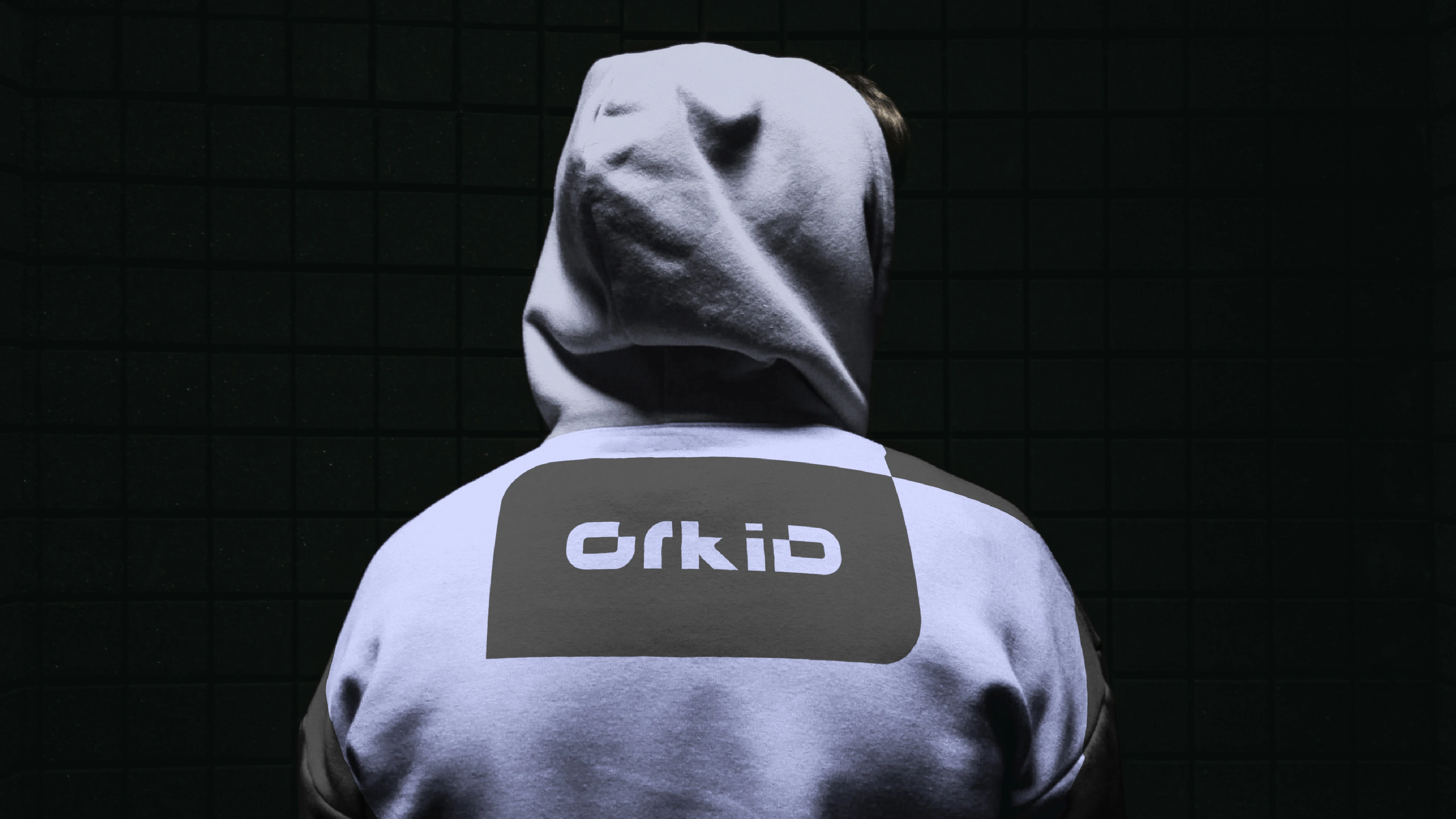
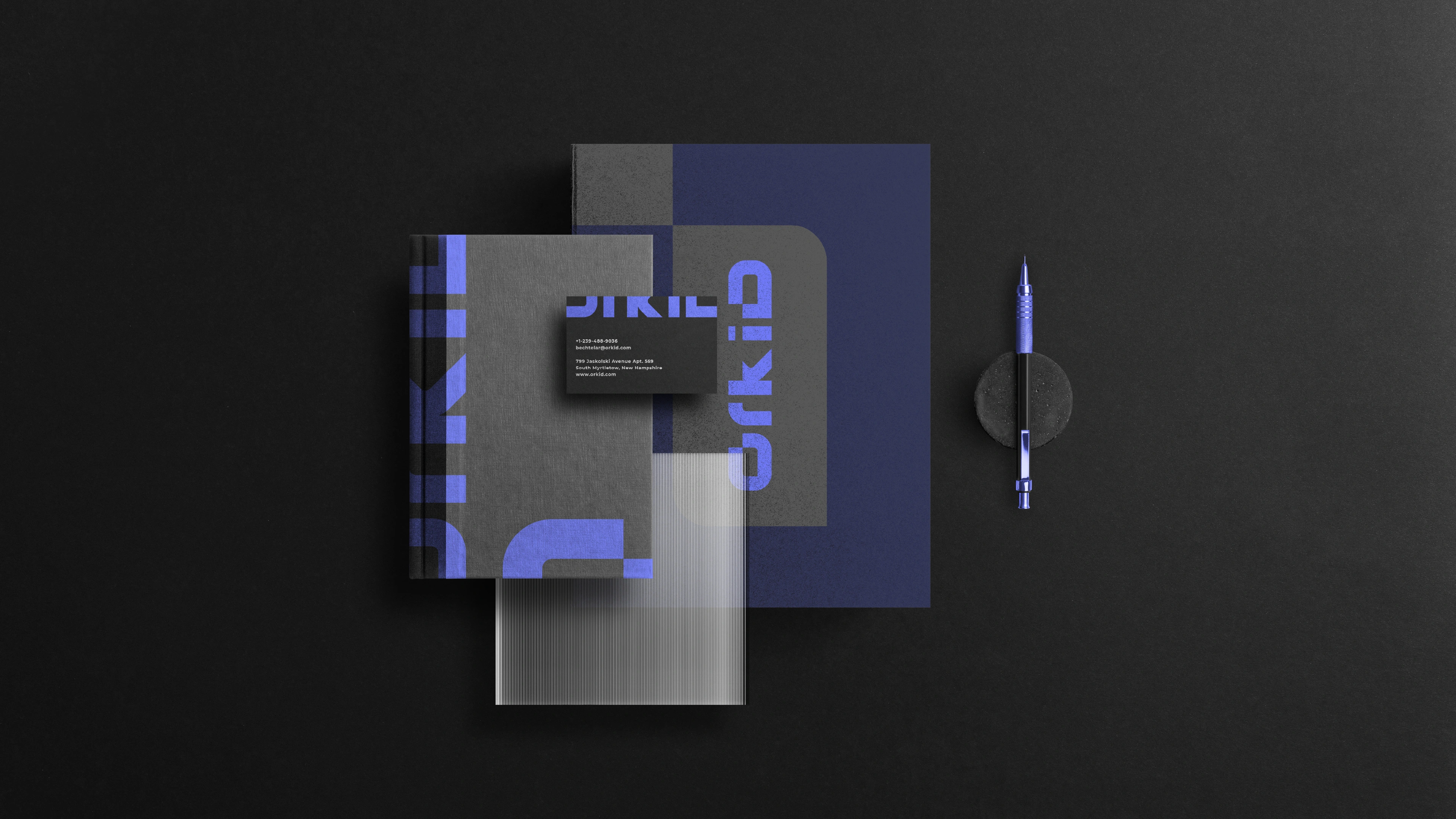
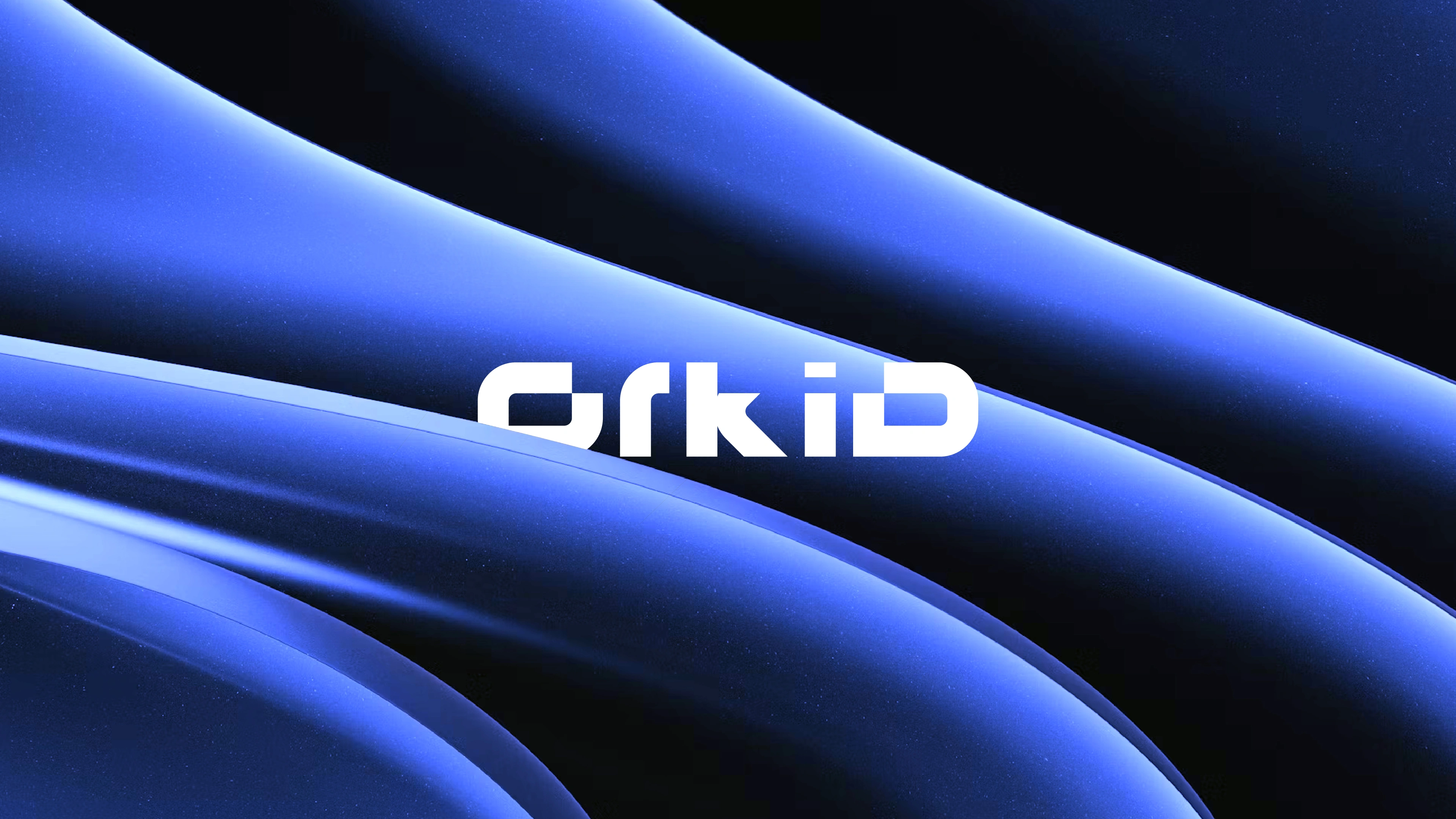
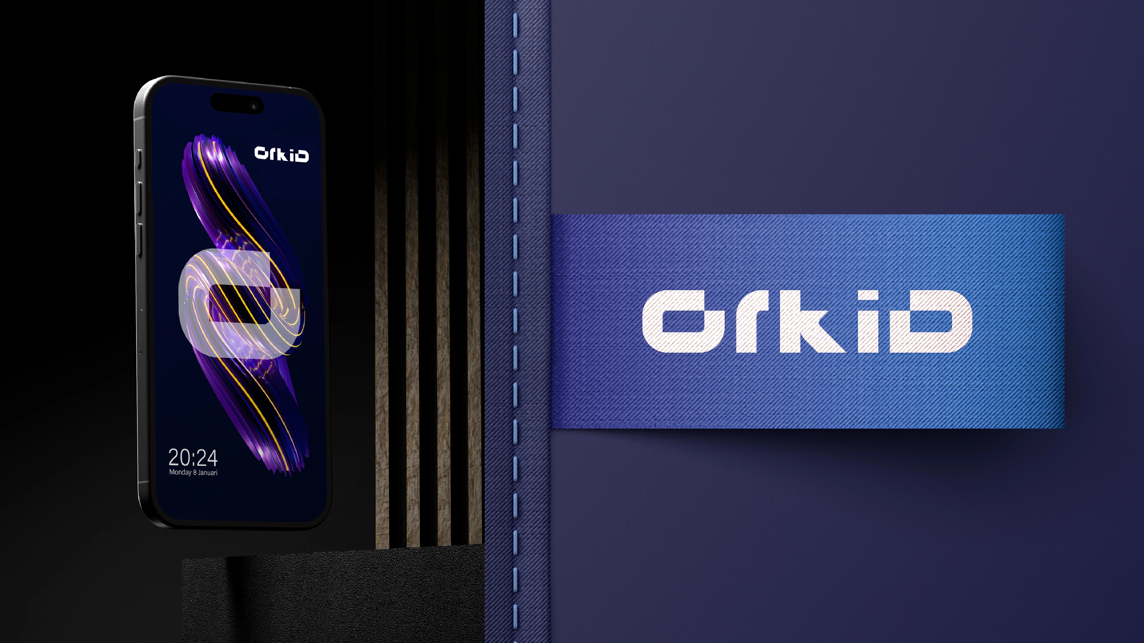
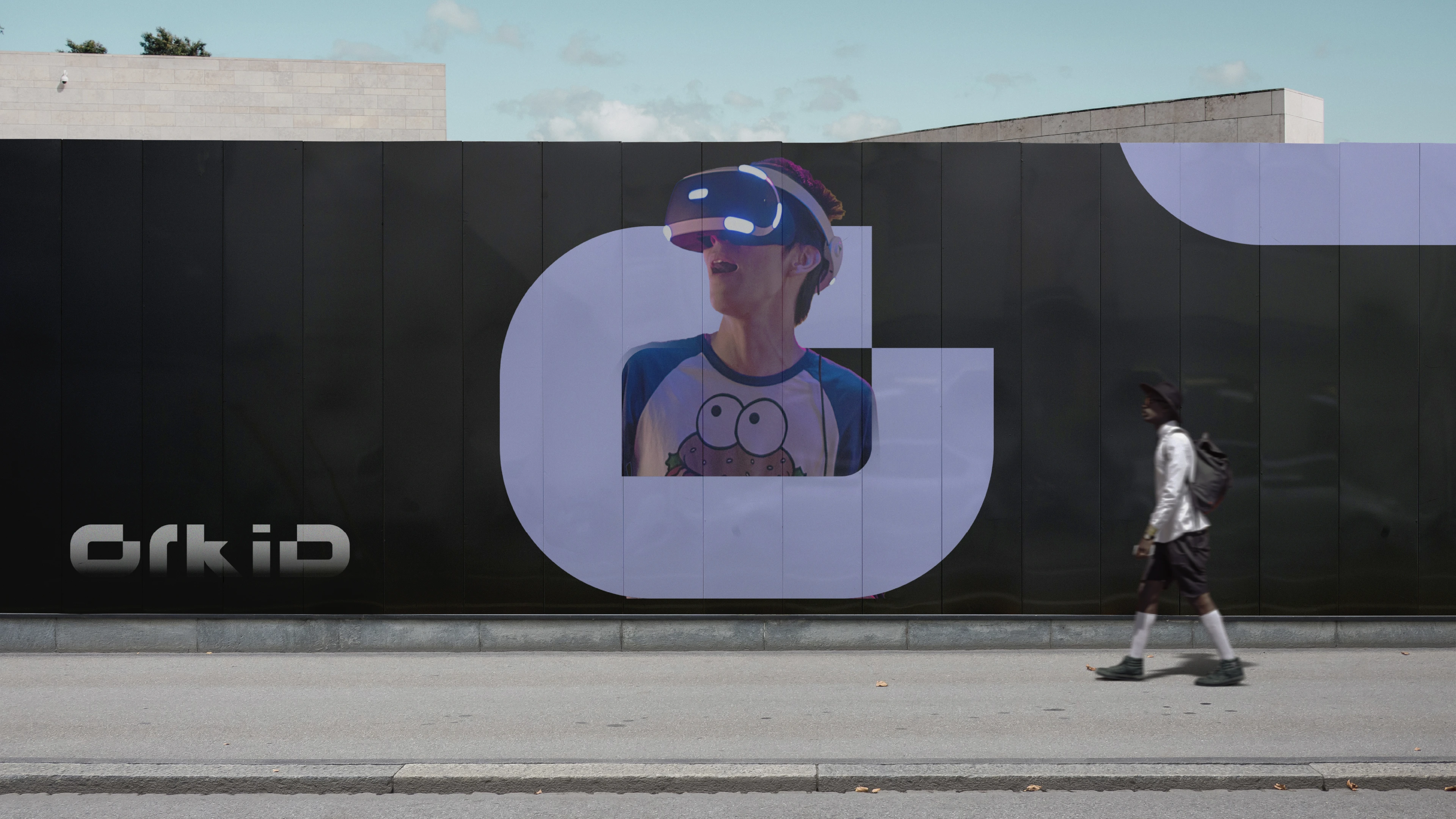
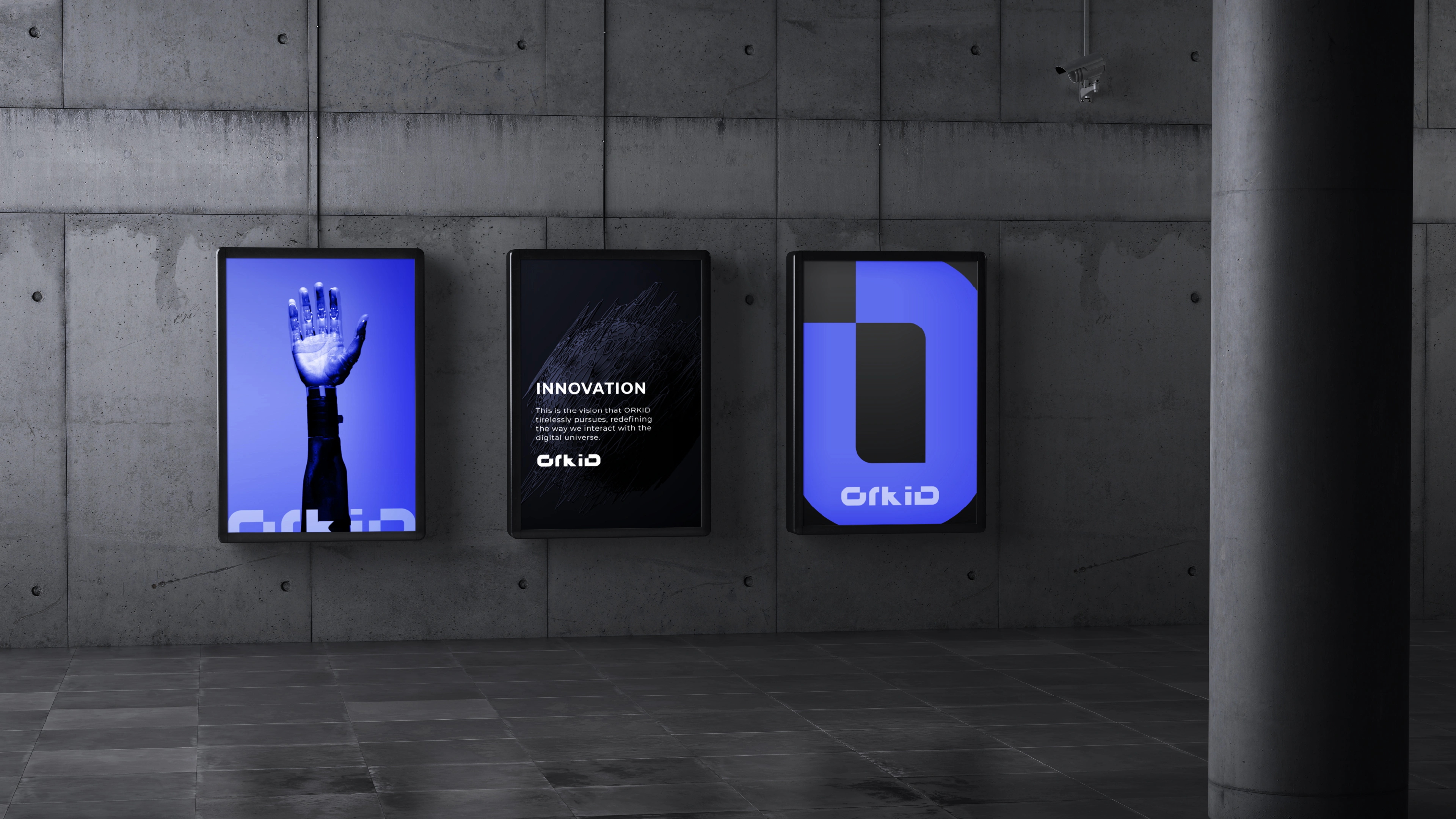
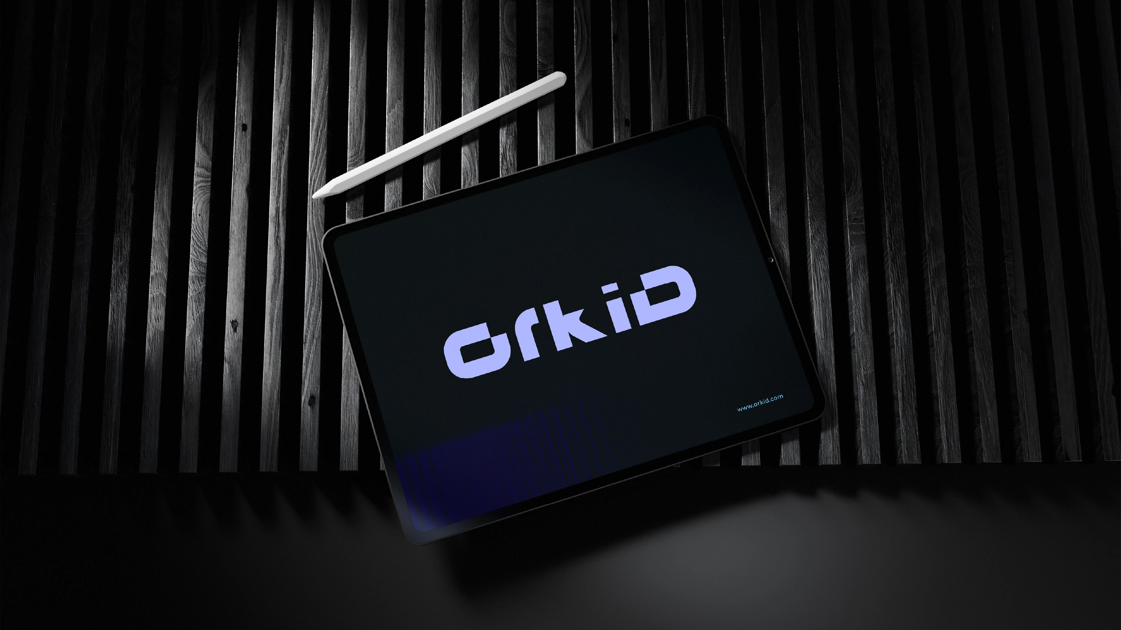
We have developed a bold and confident visual identity that perfectly embodies our startup's youthful and tech-savvy approach. Our design is characterized by striking contrasts and an ultra-minimalistic style that immediately catches the eye. Our brand symbol, which perfectly captures the essence of our coin, has been meticulously crafted with a distinctive notch, giving it a unique personality and depth that sets it apart from the rest. Our custom-made wordmark, called ORKID, perfectly complements the innovative spirit of our startup with its geometric attributes and contemporary style. In addition, we have strategically chosen a bright blue color palette that radiates confidence and helps our brand stand out from the competition.
©️2024_All rights reserved | Logo and Visual Identity | Md Rezaul
Project Inquiry at hellorezapixels@gmail.com
Thanks
for exploring the entire project!
Say hello👋 for a free consultation :)
Brand inquires👇
Like this project
Posted Apr 27, 2026
ORKID is a champion of sustainability and environmental stewardship. With a firm commitment to reducing its carbon footprint and promoting eco-friendly practices, ORKID leads by example, inspiring others to follow suit in the quest for a greener, more sustainable future.