VELVET SPOON | BRANDING
Md Rezaul
Introduction
At its core, Velvet Spoon is a story of care. Grown slowly through genuine passion and craftsmanship, the brand has always had a beautiful spirit. Our goal was to create a visual language that finally honors that truth—bringing the warmth of the inside to the very surface.
Challenge
The hardest part of rebranding a beloved institution isn't the design. It's trust. Velvet Spoon's customers didn't need convincing that the food was good — they already knew. The challenge was creating a visual identity that honored that history while opening the door to an entirely new generation. The brand needed to look like it had always been this good.
Solution
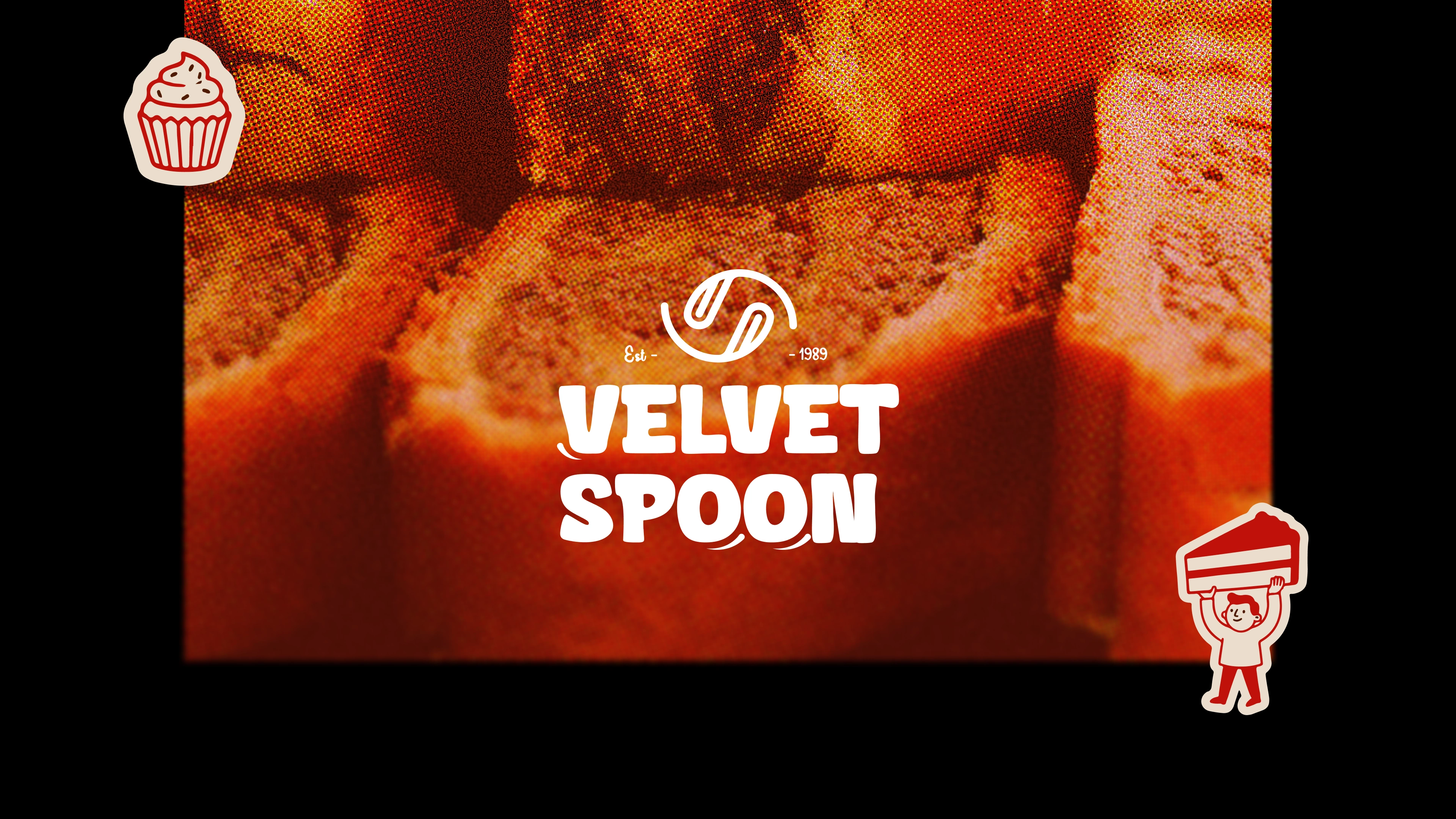
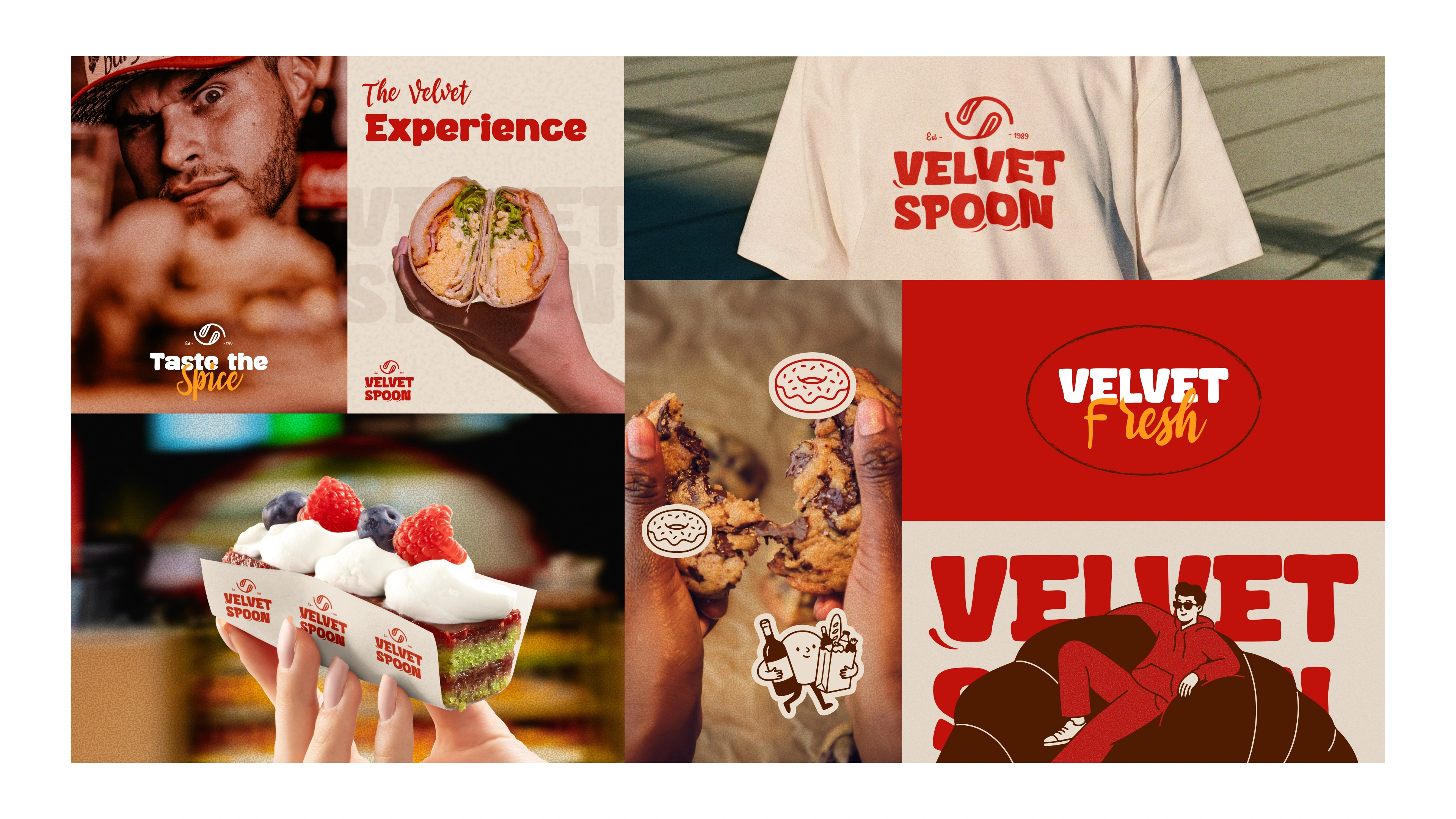
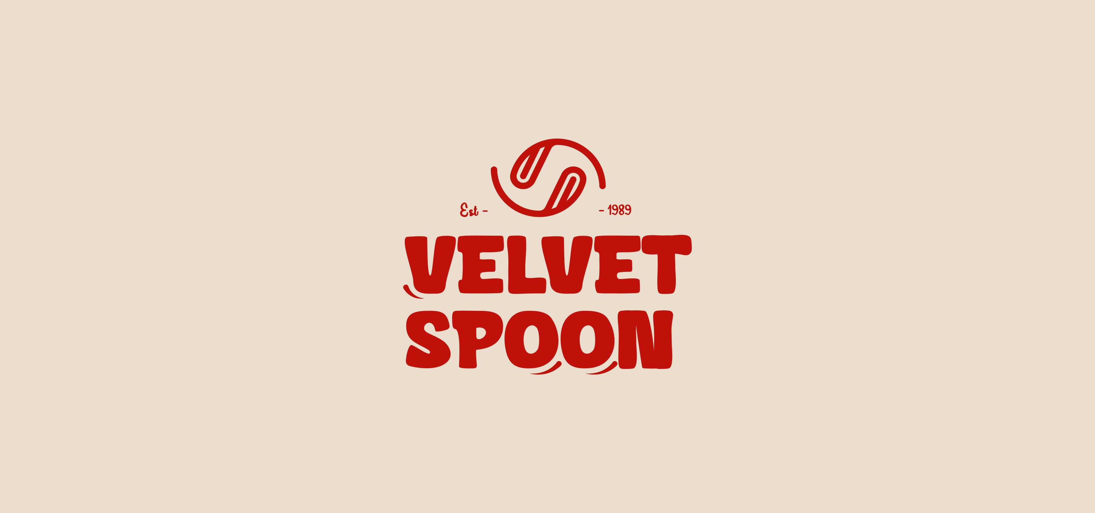
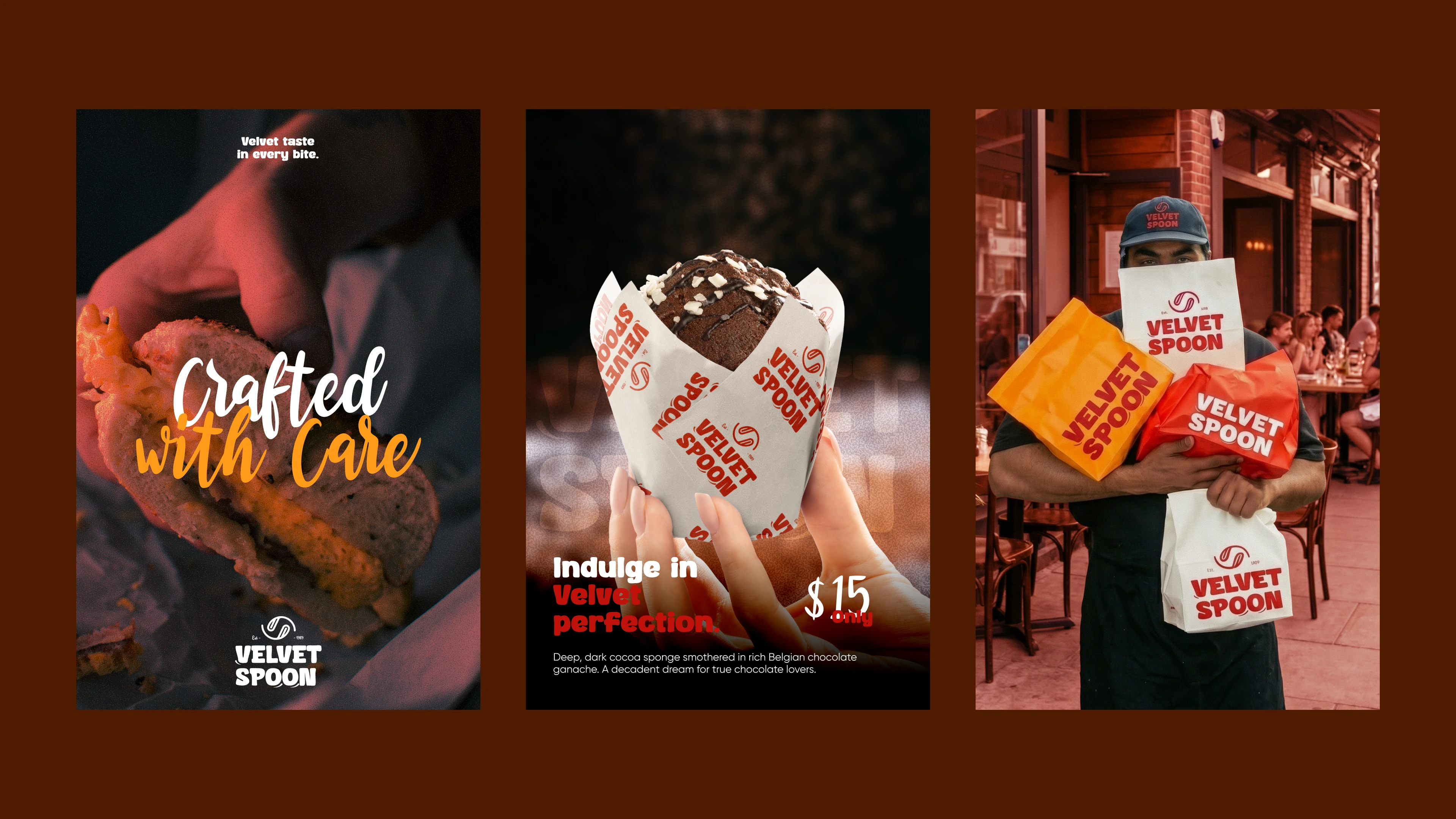
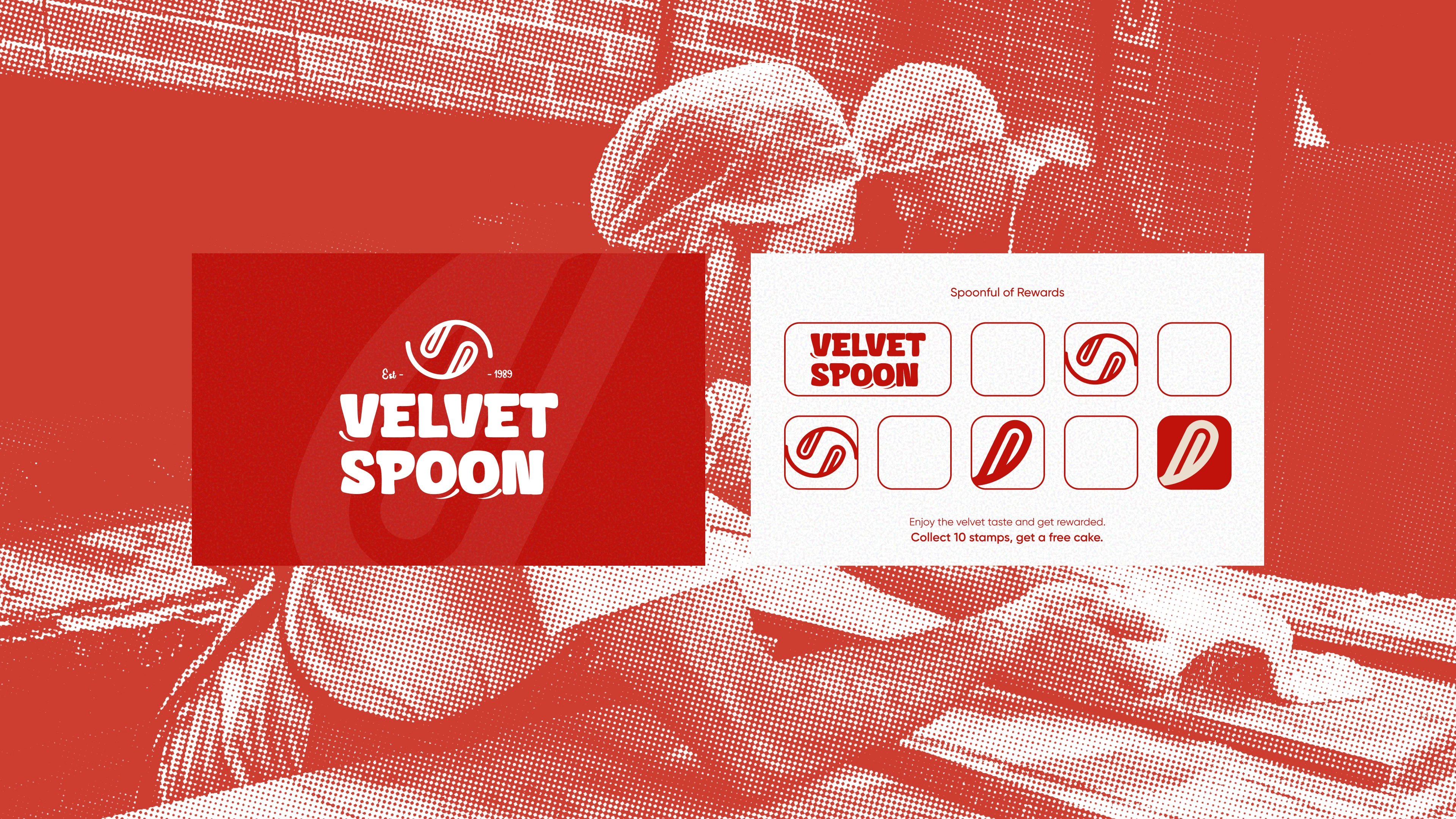
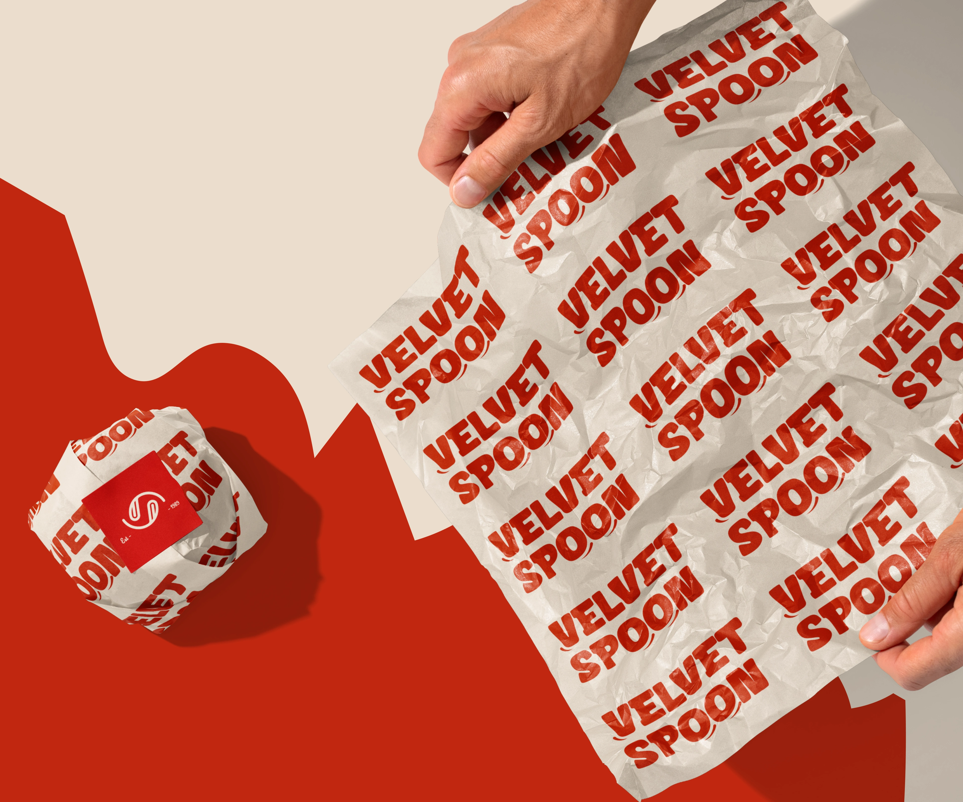
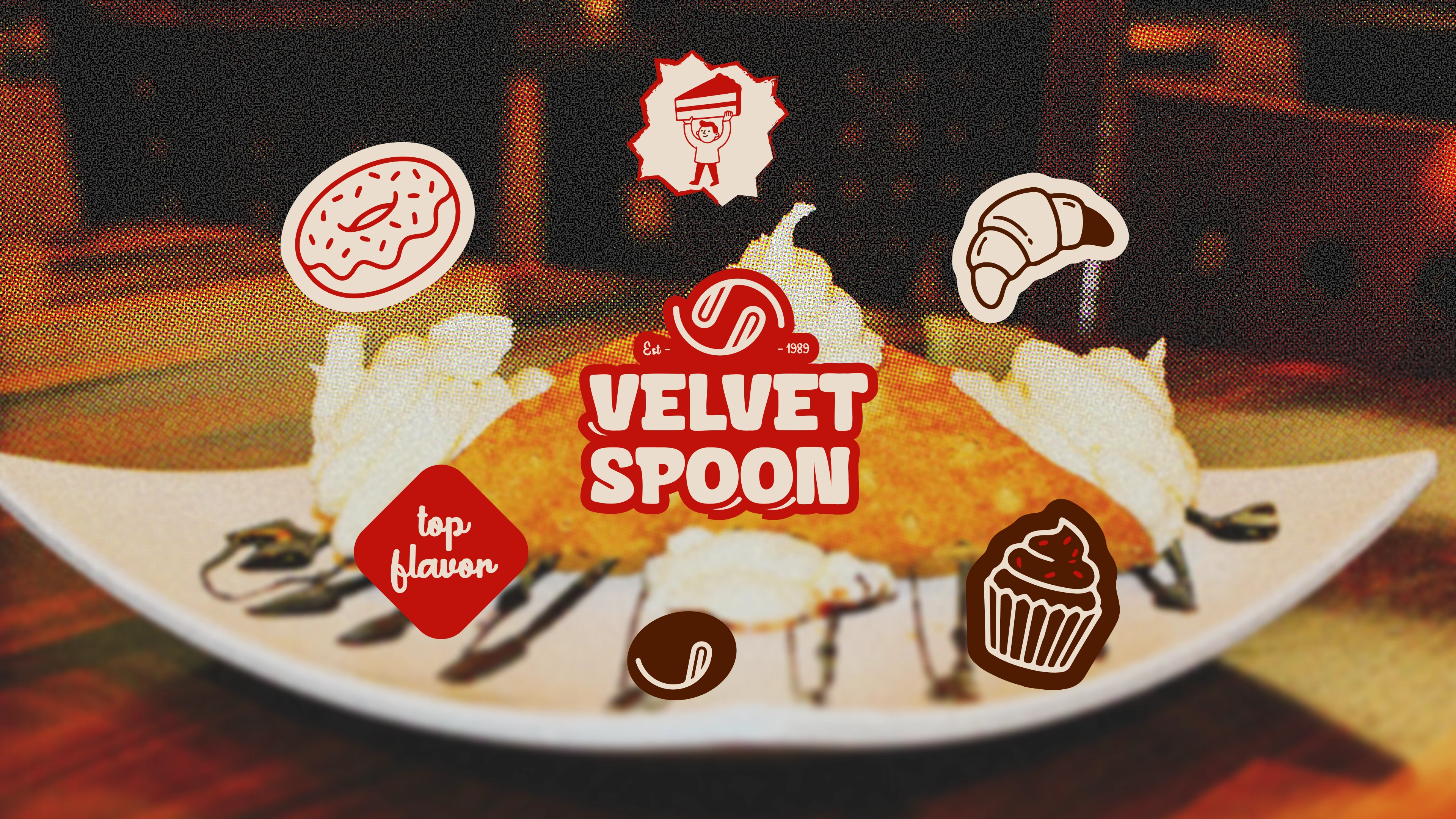
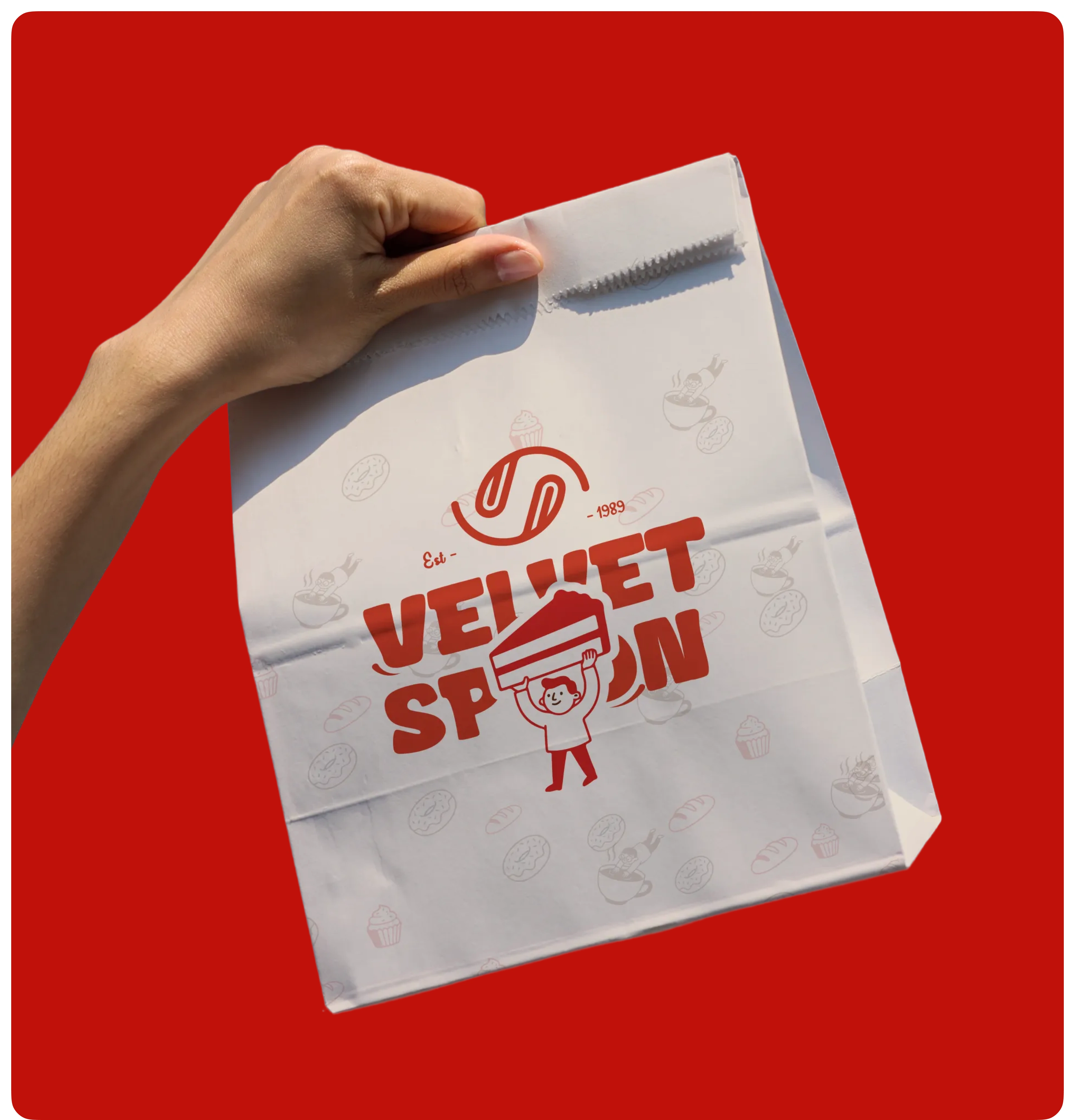
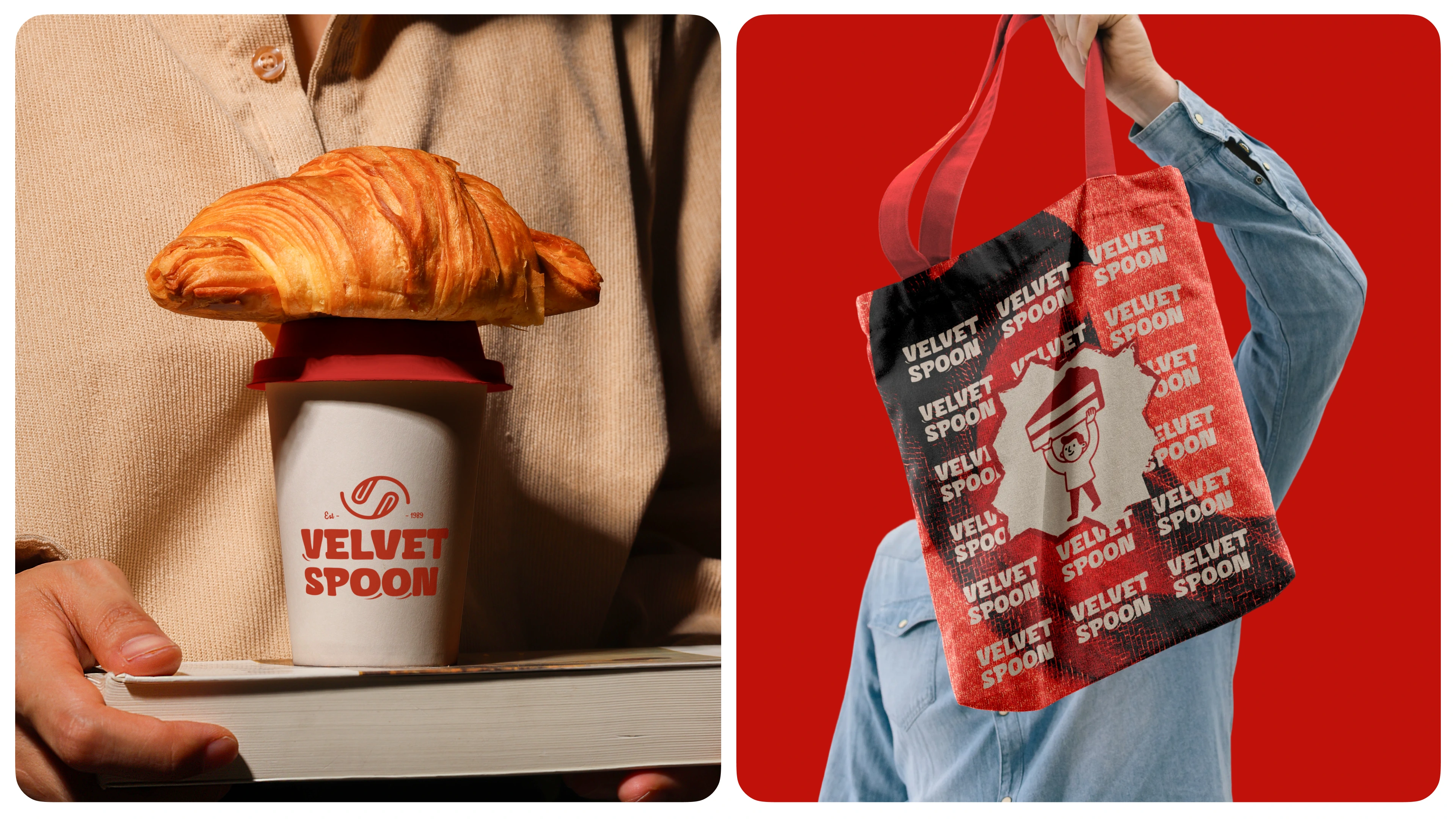
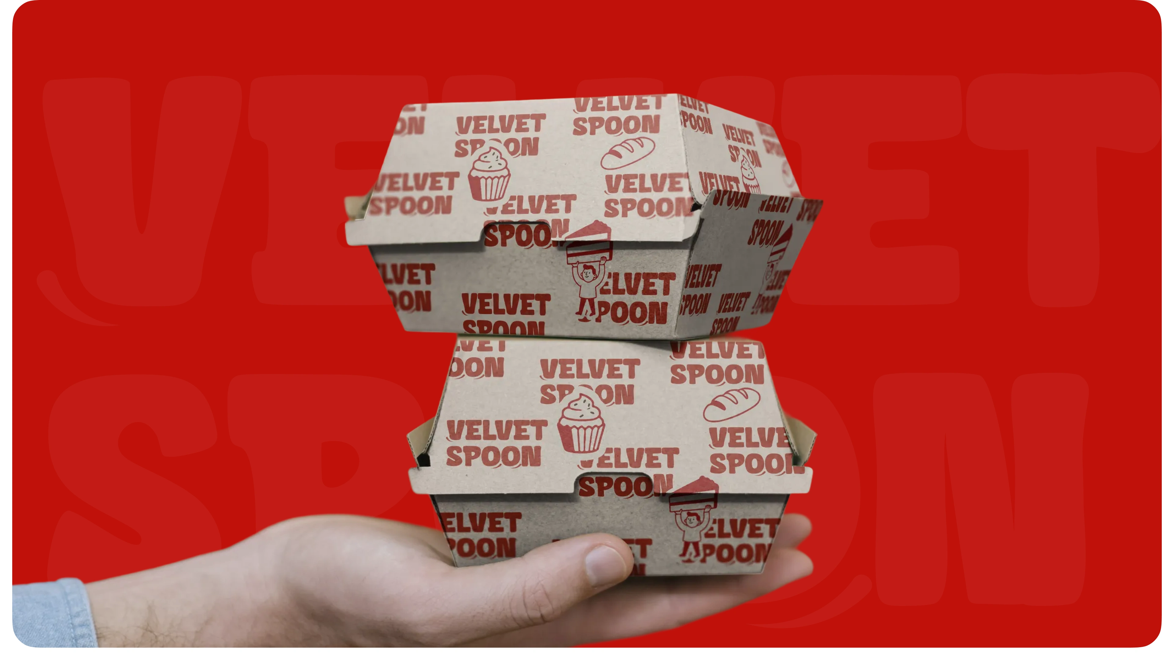
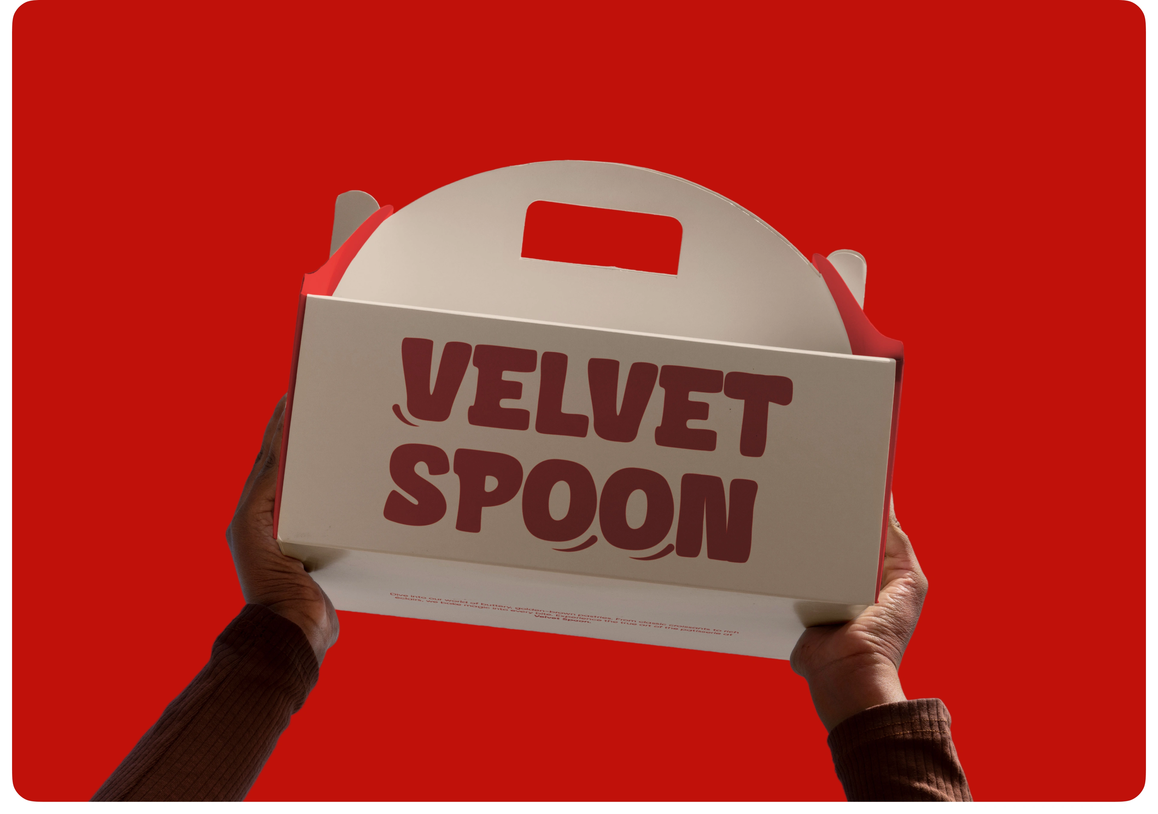
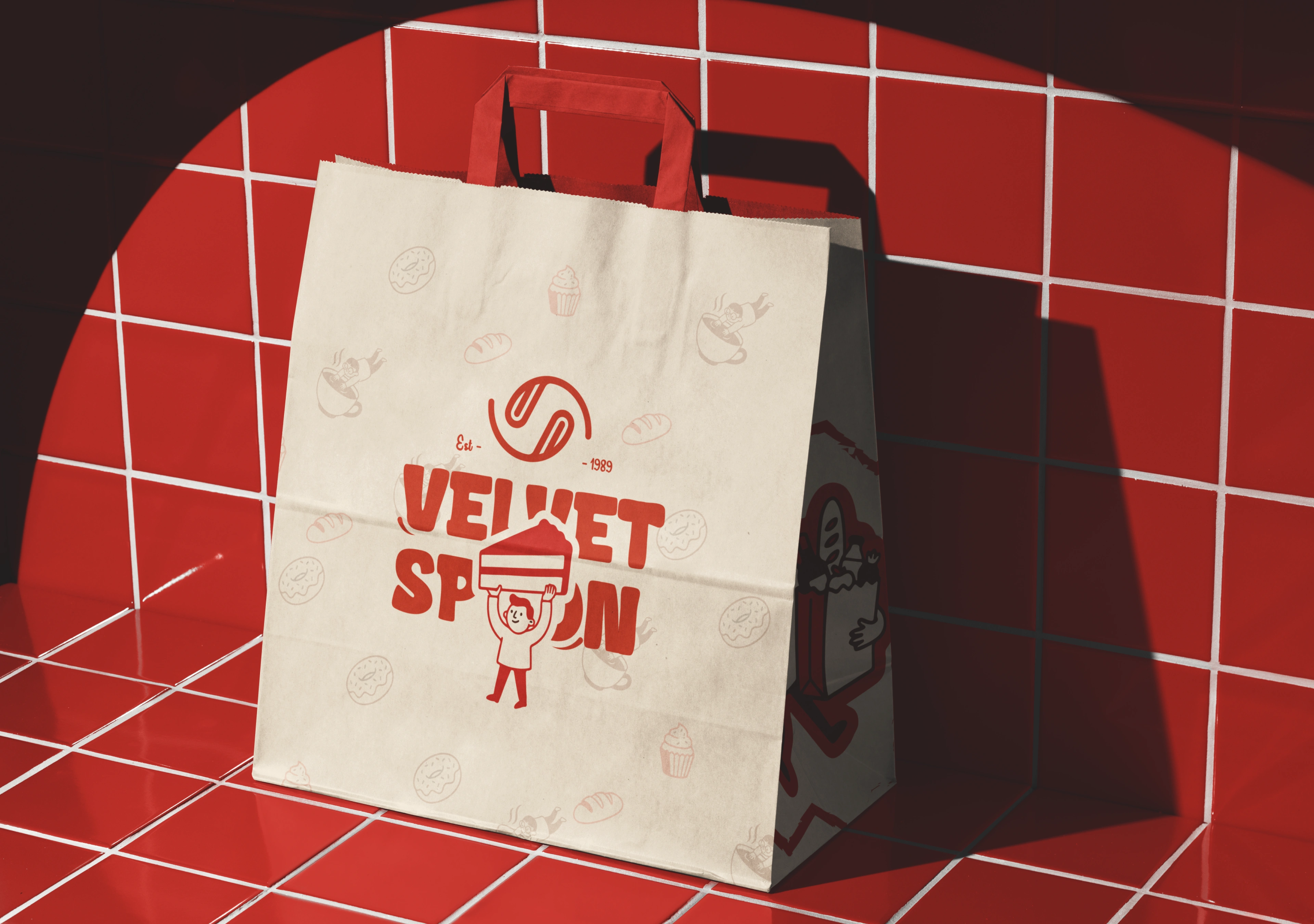
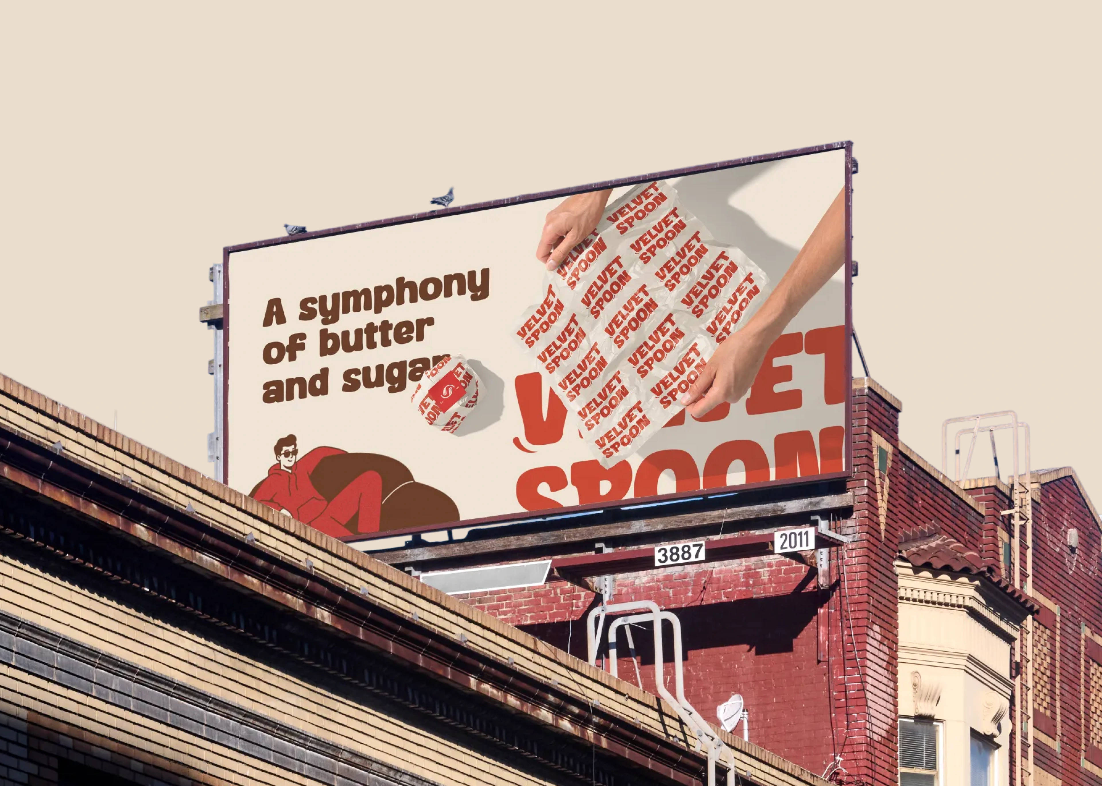
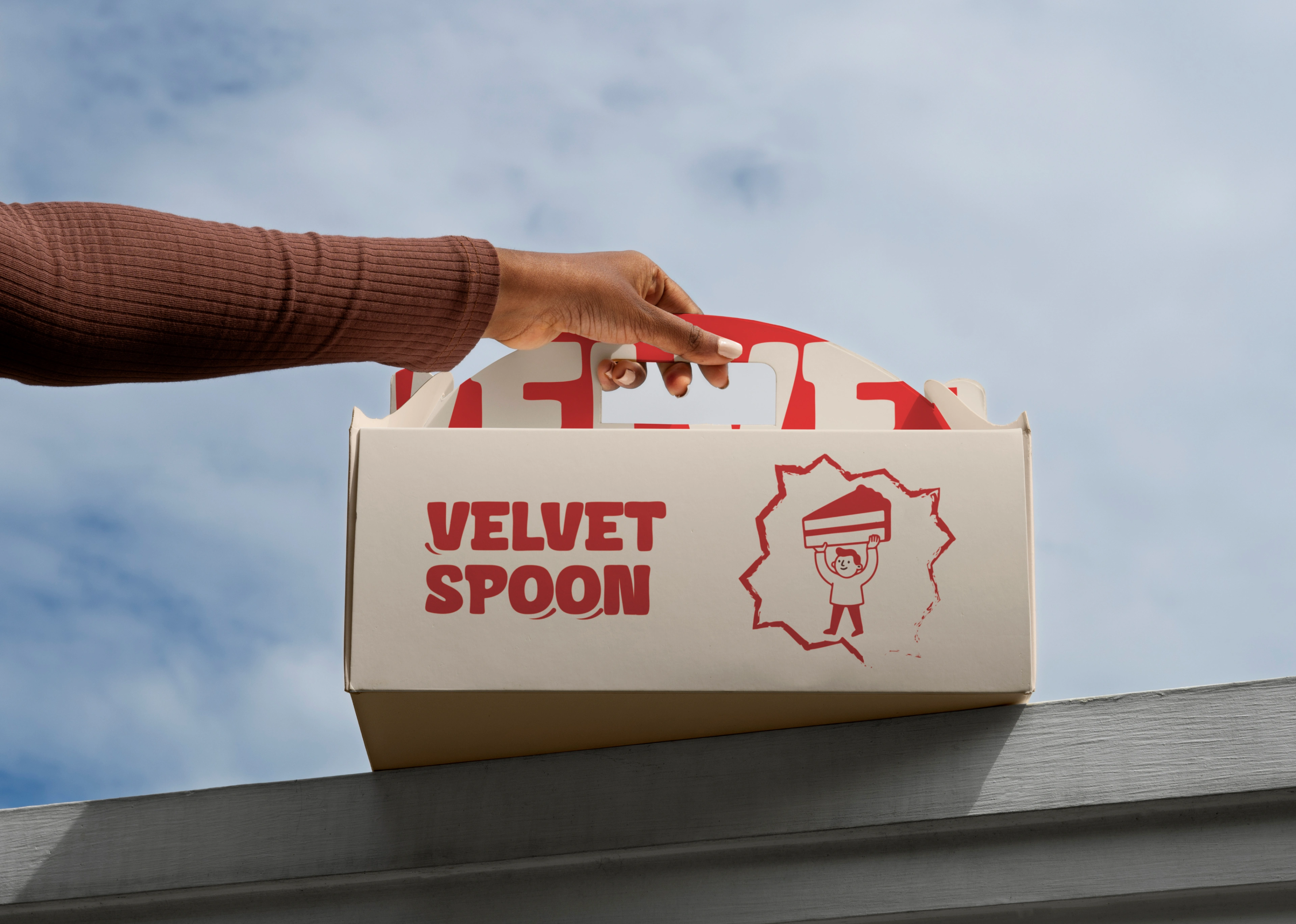
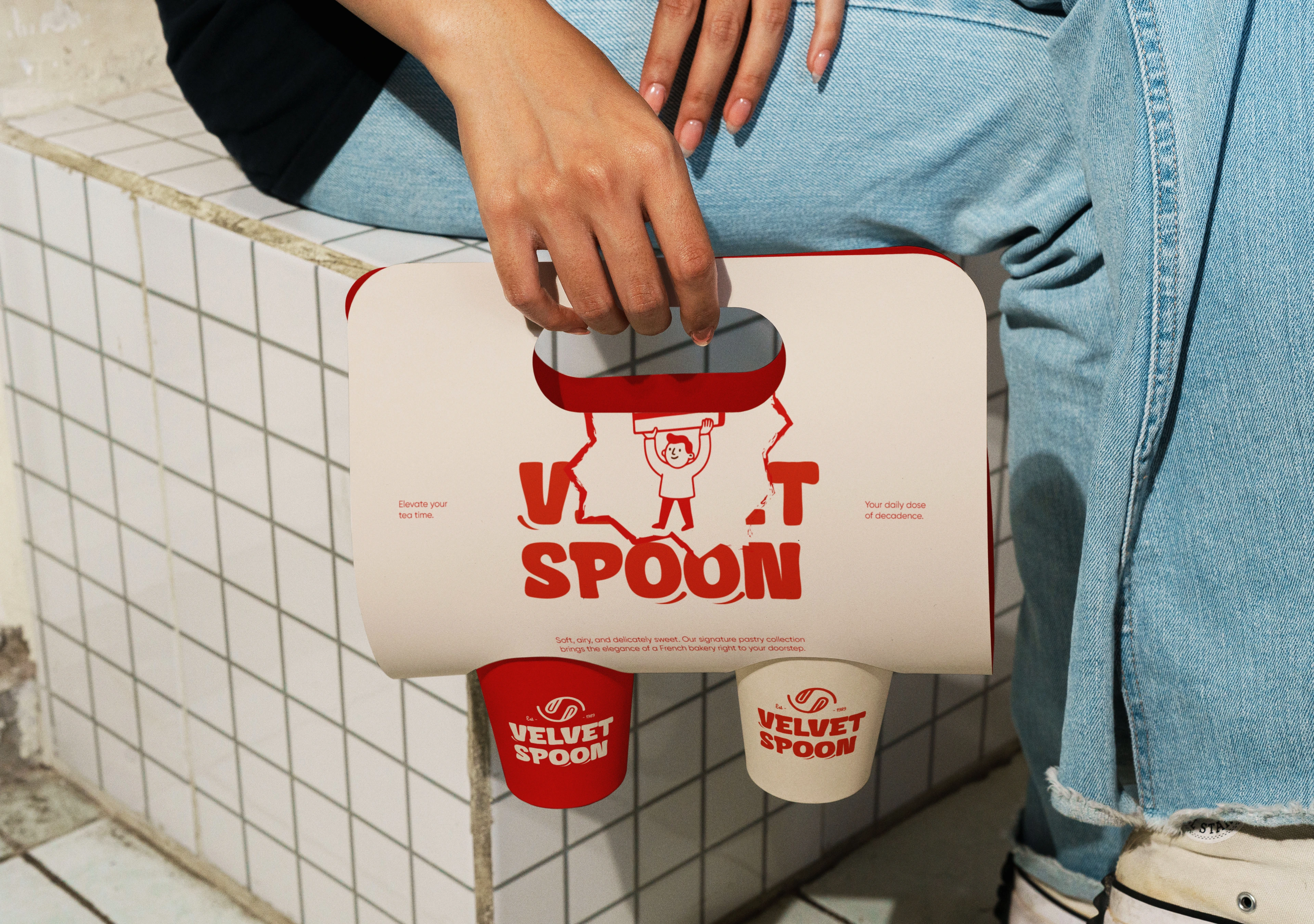
The new identity leans into character — literally. A bold serif-style wordmark, a mischievous mascot, hand-drawn illustrated icons, and a color palette built on deep bakery reds and warm cream. Everything was designed to work as a system: wrapping paper that tells a story, packaging that feels like a gift, uniforms that make staff feel like part of something. Every element was crafted to feel like Velvet Spoon has always looked exactly like this.
All rights reserved © Designed by: Md Rezaul

Like this project
Posted Apr 27, 2026
Crafted a timeless brand identity for Velvet Spoon. From logo to packaging, I balanced luxury with minimalism to ensure a distinctive presence in the market.