Gatorade- Logo & Packaging Redesign
Unnati Jain
WHY REBRAND?
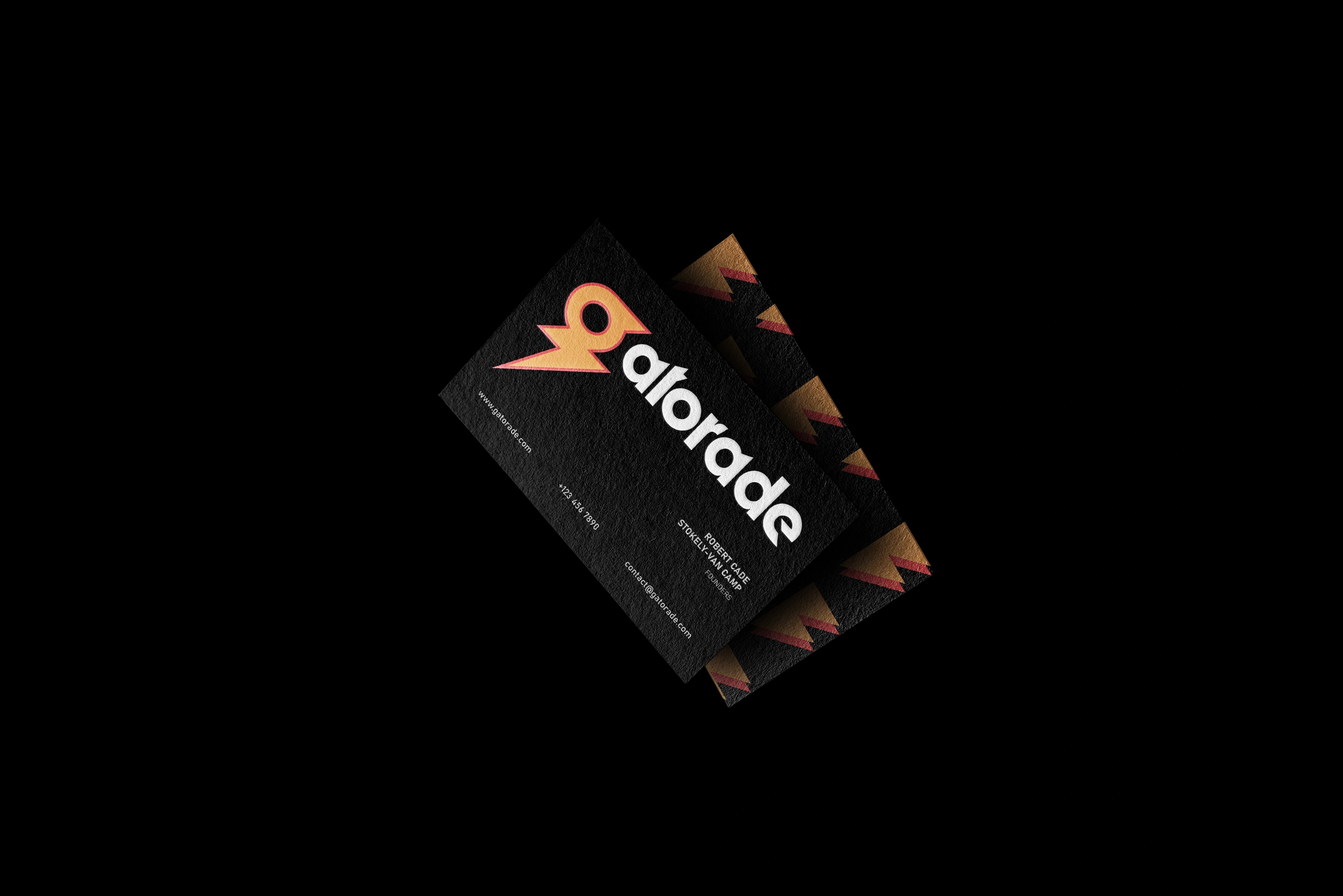
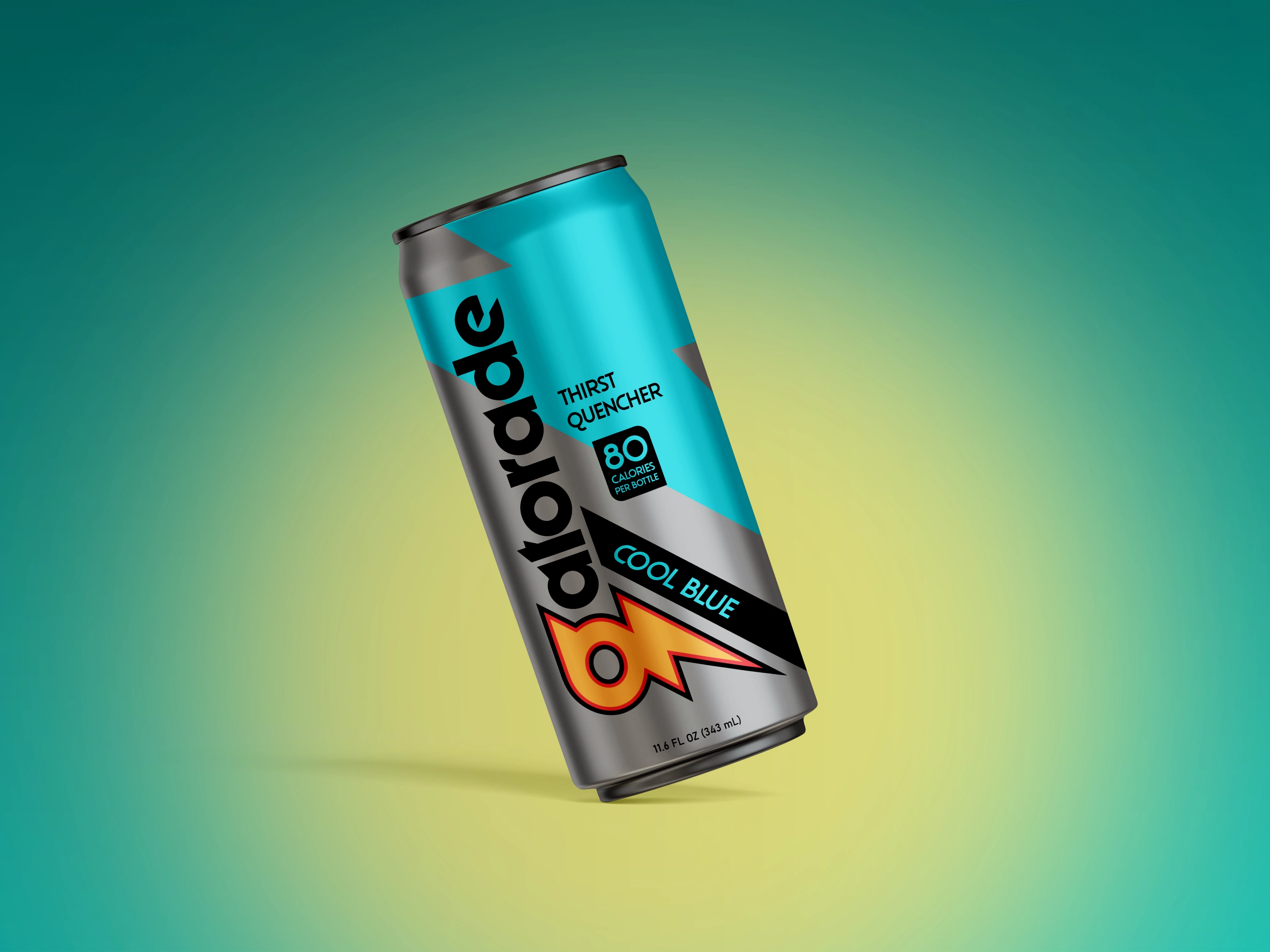
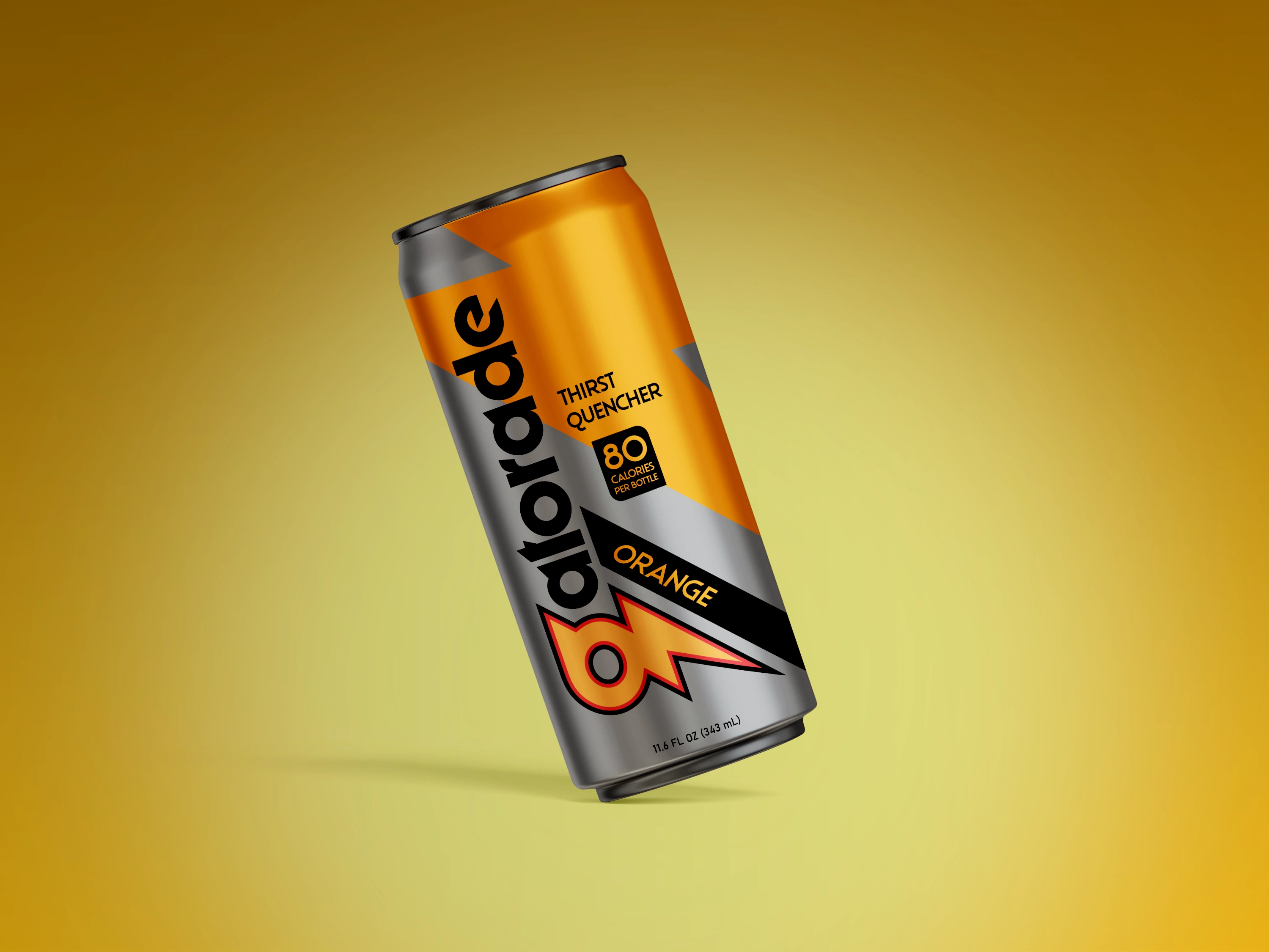
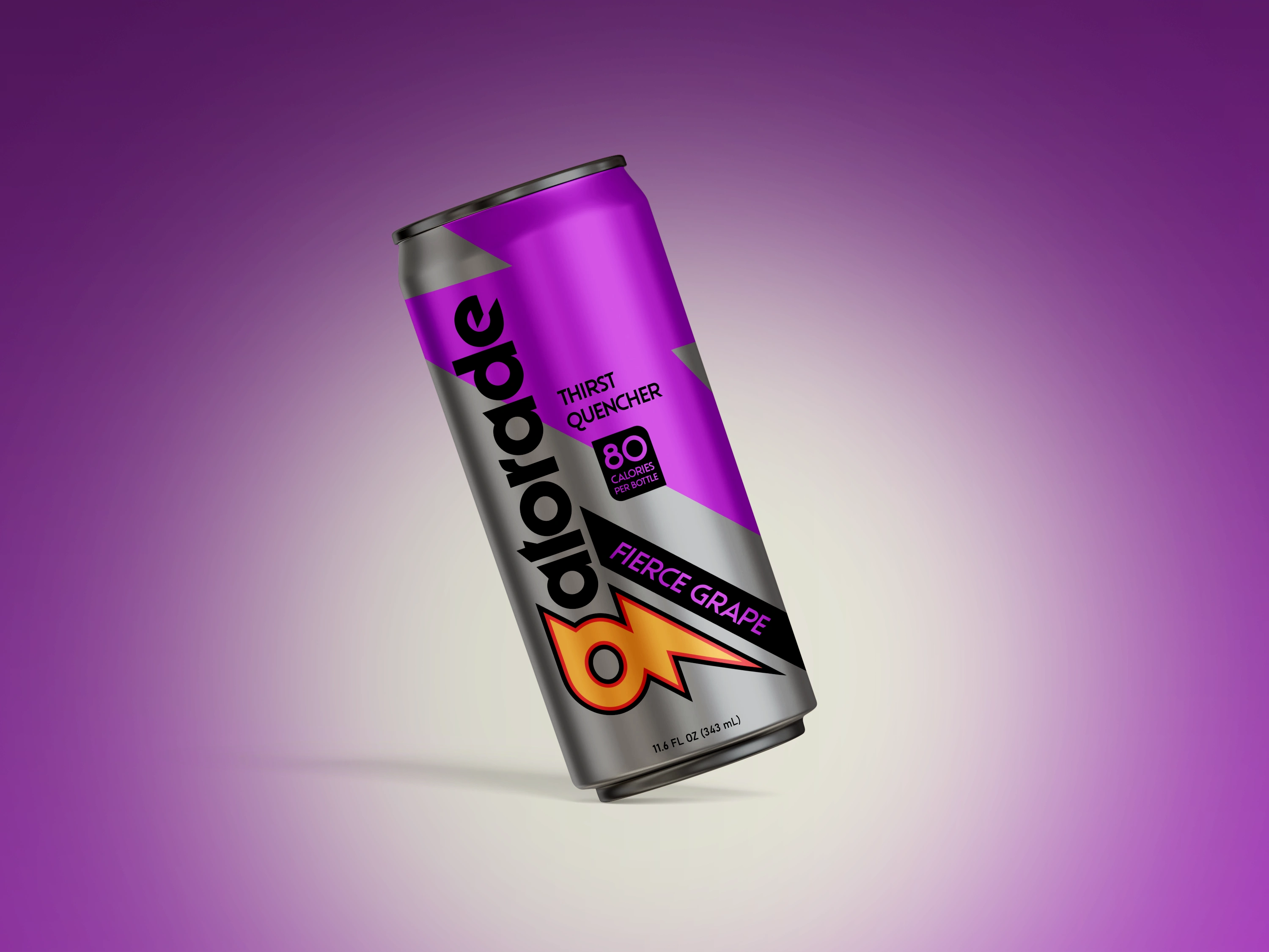
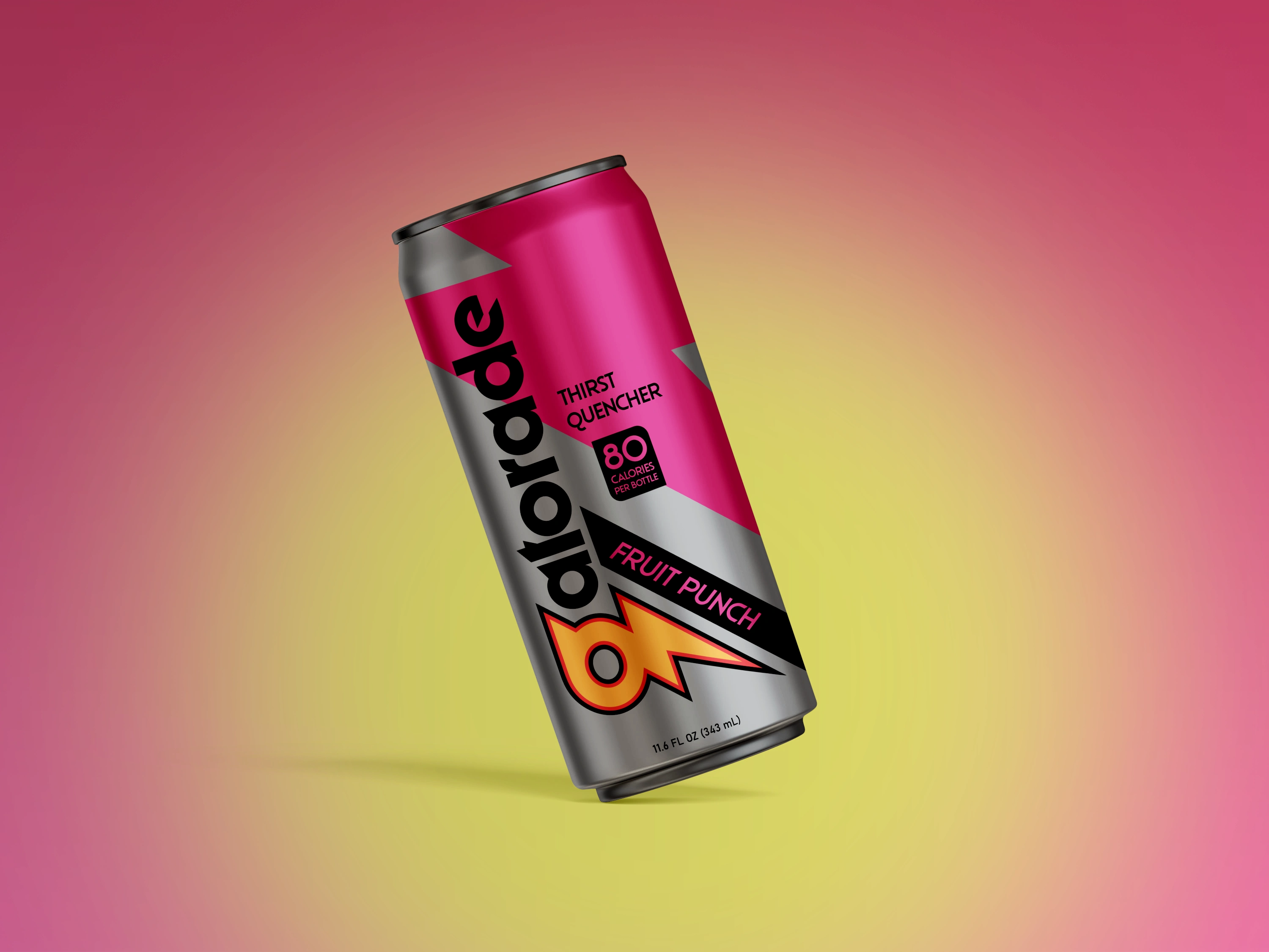
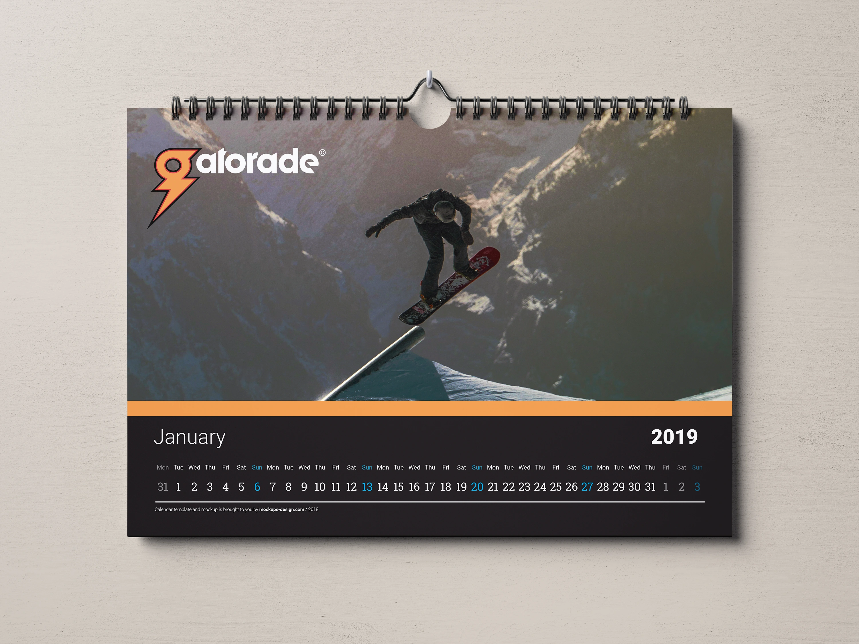
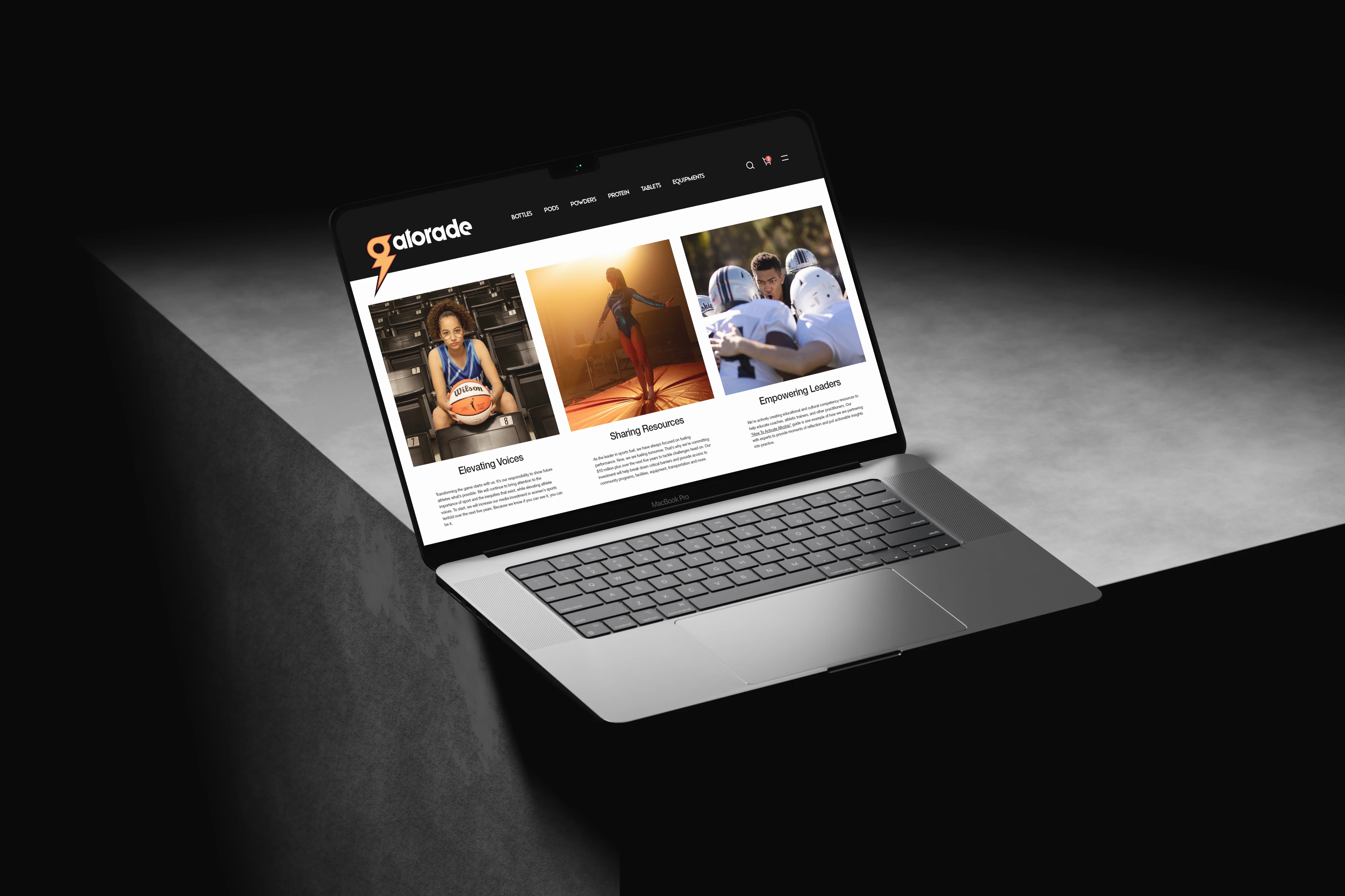
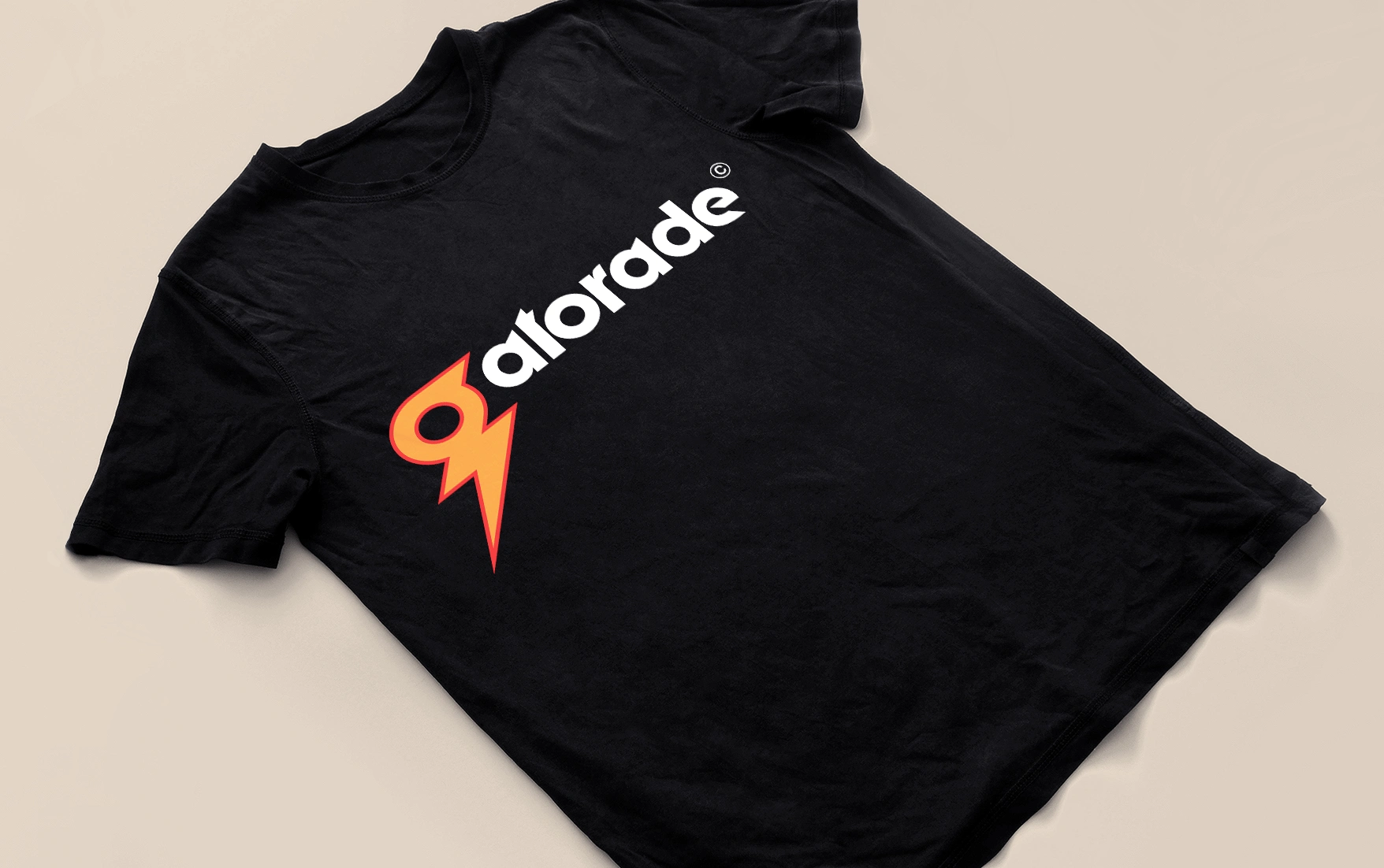
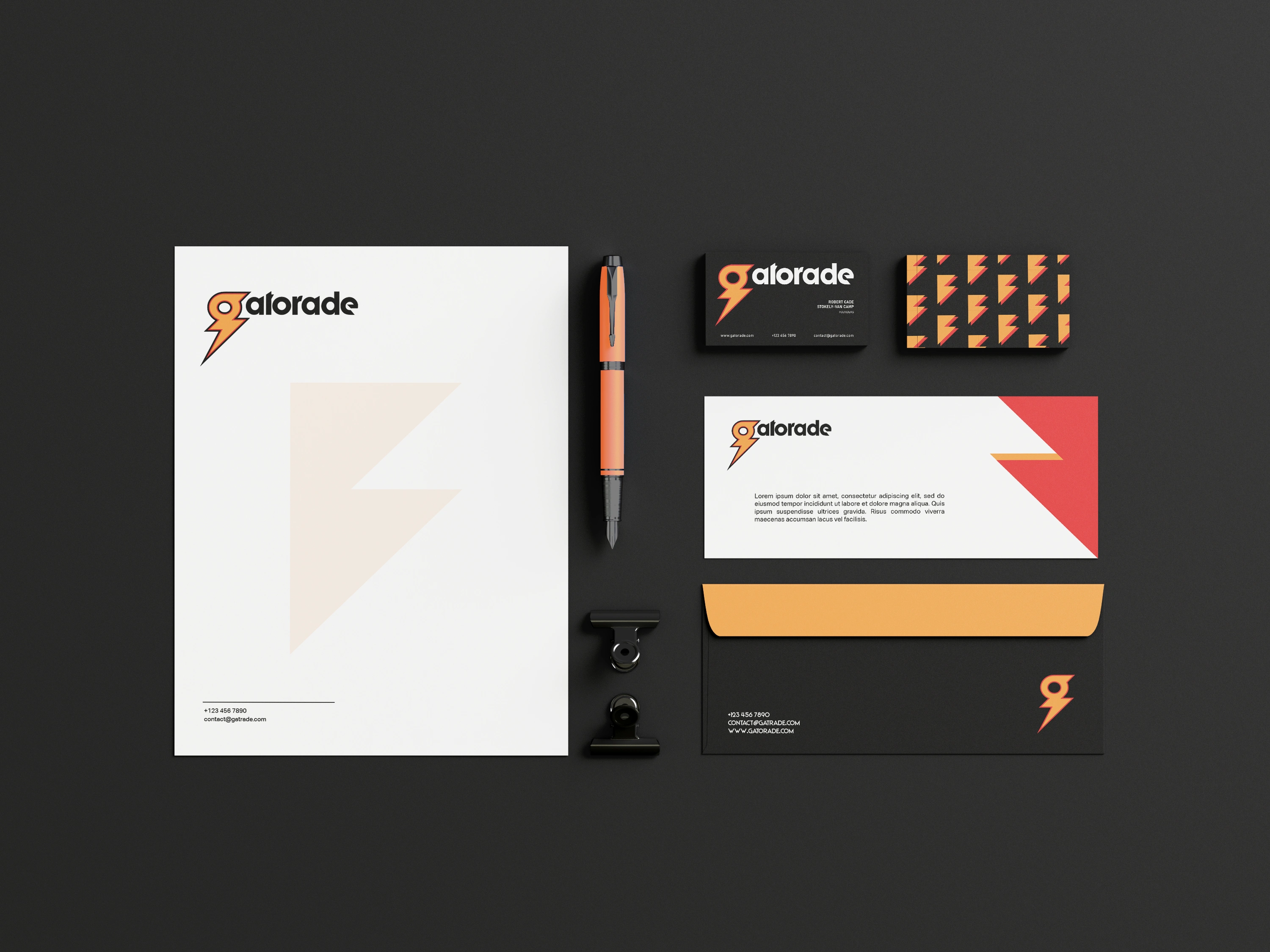
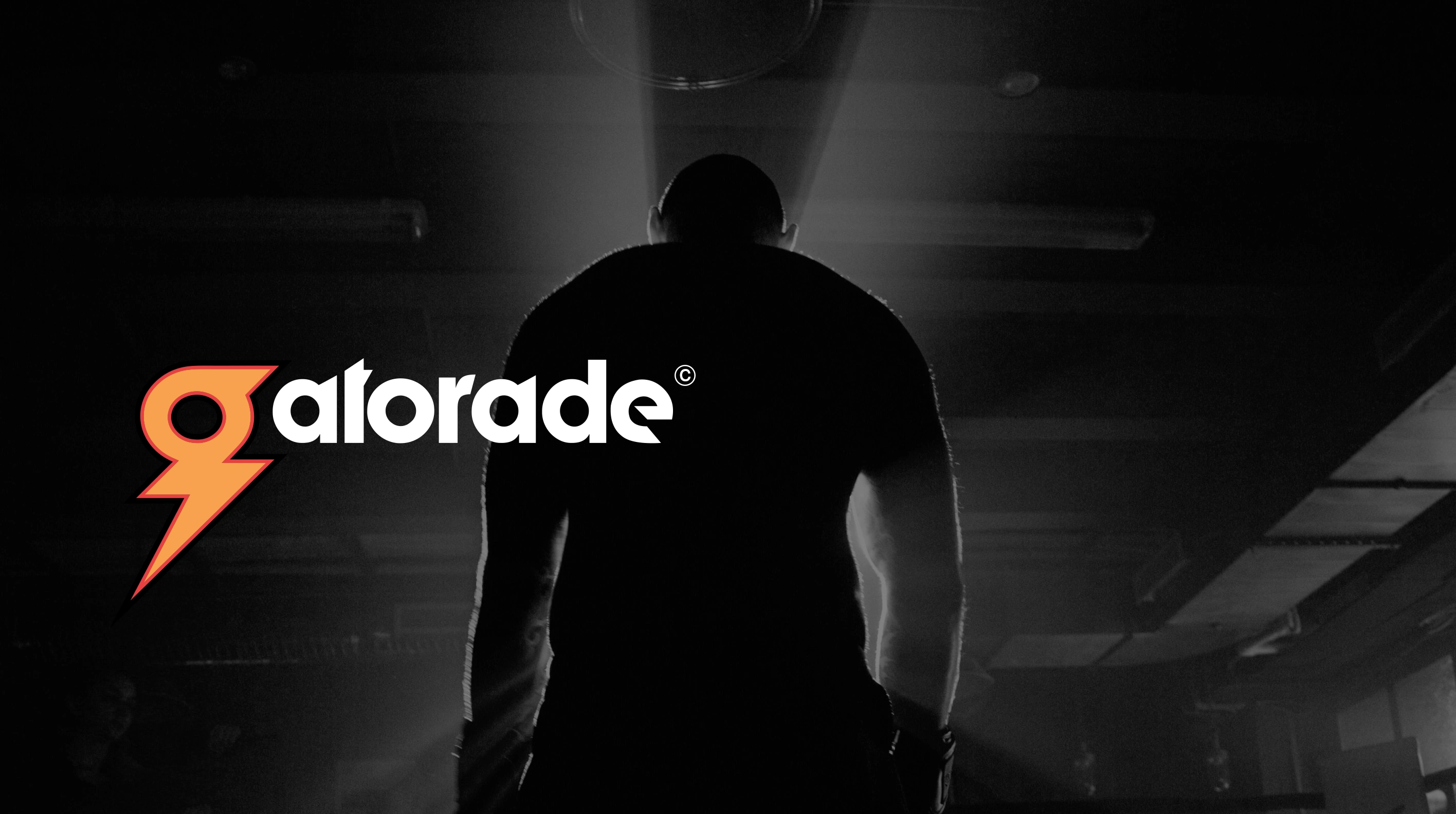
Gatorade's current logo uses a slab-serif typeface with its iconic thunderbolt. While it is simple as a logo should be, it also seems generic and outdated at the same time. To infuse more personality into its logo and bring out the energy it promises, I brought the 'g' in Gatorade and the lightning bolt together to form a mark, that is simple yet unique enough to be memorable and captivating. This combined with a modern sans-serif typeface for the wordmark makes it look more relatable for its young audience who are looking to maximize their energy levels and lead an active lifestyle. Apart from the logo, its new packaging with more vibrant colors instantly draws attention, and establishes itself as a brand that is bold and refreshing.


Like this project
Posted Mar 31, 2025
A conceptual rebrand for Gatorade, exploring a modern direction for this iconic energy drink brand, cleverly integrating the thunderbolt within the 'g'.