Design Leadership for TelsCare Healthtech Platform
Bello Teslim
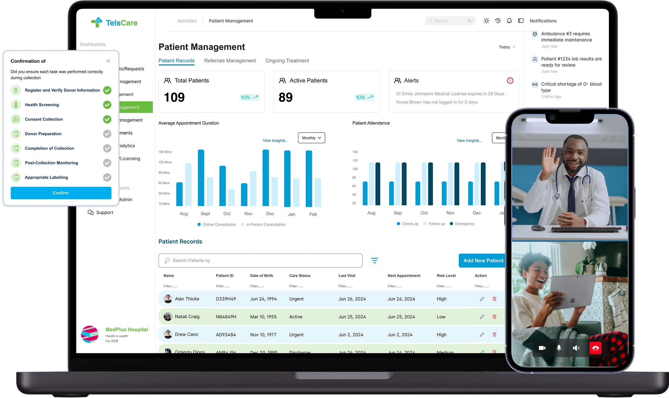
10+ User Roles. One Platform. Designed from the ground up
TelsCare was my first truly robust product design leadership role. And I’ll be honest, when I started… I was overwhelmed.
We weren’t building an app. We were designing a full healthtech ecosystem, from scratch. It had to serve:
• Service Organizations (hospitals, blood banks, ambulance systems)
• Service Providers (doctors, nurses, lab techs, pharmacists)
• End Users (everyday patients and their families)
All on one unified platform. All using the product differently. All expecting it to feel simple. No design system. No existing UX foundation.
Just a shared dream..
What if accessing care felt as easy as booking a ride?
My Mission
TelsCare was my first major multi-role design leadership gig. At first, it was thrilling, Then overwhelming, Then exciting again.
As the Product Design Lead, I wasn’t just designing screens, I was building the structure, the patterns, the strategy, the language
I wasn't just designing screens. I was building the structure, logic, and visual language behind the platform.
My job spanned:
• Leading the UX for all user types across mobile and desktop
• Building a design system that could scale across 10+ roles
• Collaborating with engineers, QA, ops, and the CEO to ship usable features all while leading a design team of 2.
• Designing and launching the public-facing website, TelsCare.com
Designing for Complexity (Without Letting it Show)
We needed to unify the UX across 6+ roles, without bloating the interface.
So I mapped the experience around 3 pillars:
• Role Clarity — Each user only sees what they need
• Speed of Action — Every flow is optimized for under 60 seconds
• Human Feel — Designed to feel like care, not admin work
We mapped out user journeys for every type of user involved in delivering and receiving care:
Basically we had to make healthcare make sense.
👩🏾 Nurses
Task lists, wound care tracking, photo uploads
👨🏽⚕️ Doctors
Consultation flows, prescriptions, patient handoffs
🧑🏽 Care Workers
Home visit notes, referrals, coordination tools
🧪 Lab Technicians
Test result upload, request management.
🚑 Ambulance Providers
Dispatch systems, patient transfer logs
💊 Pharmacists
E-prescriptions, inventory, fulfillment UX
🧍 Patients
Appointments, messaging, medical records
🏢 Admins Dashboards
compliance tracking, user management
🏥 Organization Managers
Inventory, staff scheduling, reporting
You can imagine the chaos if all of that lived in one interface.
So I designed around role-based UX clarity, show only what each person needs. Nothing more. Nothing less.
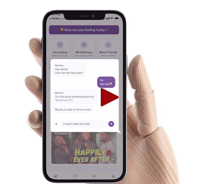
Empowering Users with AI: Meet Hikmah, Our Health Assistant
We knew from the start, the future of healthtech would be AI-powered. As our platform grew more complex, with over 10 user roles and dozens of overlapping workflows—we saw a major challenge coming:“How do we help users stay focused, make faster decisions, and reduce dependency on overworked staff?”That’s when we made a bold move — we built Hikmah, our intelligent assistant.
Why Hikmah
Healthcare is time-critical, repetitive, and emotionally taxing. From patients asking “What’s next?” to nurses buried in task lists, we saw an opportunity to create a conversational layer that:
• Guides users through tasks like referrals, documentation, care updates
• Answers common questions 24/7, especially when humans aren’t available
• Reduces nurse burnout by surfacing protocols, notes, and instructions instantly
• Learns user behavior to recommend next steps (e.g. “Want to update vitals now?”)We didn’t want it to feel robotic. So we spent time training tone, timing, and responses to make Hikmah feel human, but fast.
How Hikmah Fit In
We integrated Hikmah across both patient and provider interfaces, so it could:
• Be a triage assistant for patients navigating their care plans
• Be a smart task manager for nurses, doctors, and admins (e.g., “3 patients need wound photos”)
• Help reduce drop-off rates by reminding users to complete pending forms
• Offer contextual nudges like:“Hey, want to refer Mrs. Ade to a wound specialist? You can do that now.
What Made It Stand Out
Unlike basic bots, Hikmah was trained on our actual workflows and embedded into the product logic, not a third-party integration bolted on. That meant:
• Fully contextual responses based on the user’s exact screen
• Integrated with patient records, task lists, vitals, referral pathways
• Load times under 300ms, even on mobile in low-bandwidth areas
• Designed to scale across geographies and languages.
It wasn’t just a chatbot. It was the first line of care navigation for thousands of users.
Redesigning the Nurse’s Day
The first module I tackled was Task Completion for Wound Care.
Nurses were previously juggling Google Sheets, WhatsApp photos, and verbal reports.I redesigned it into a clean mobile-first flow:
→ Assigned task → Notes → Photo upload → Done.
Result: In test sessions, nurses documented care in 60% less time — with fewer errors and cleaner records. One nurse literally said:“It feels like someone finally thought about my day.”
Referrals Made Easy
Most healthcare systems make referrals feel like a black hole.
You refer a patient, then never know what happens next.We built a 3-step referral system that let care workers refer patients to specialists or labs with full visibility.
• Type of referral
• Provider directory
• Status updates: Pending → Accepted → Missed
🏥 Now providers know who they were sending patients to.
📈 And admins had a full referral audit trail.
Admin Dashboards Built Like Control Rooms
Designing for admins was like building mission control for care delivery.
They needed to:
• Track overdue tasks. • Review patient referrals. • Manage staff and service providers. • View analytics on everything
I designed dashboards that put what mattered most first, and didn’t overwhelm.
During internal testing, admins said they could now resolve issues 40% faster compared to their legacy tools.
I Built the Design System From Scratch
To prevent chaos, I built a Material Design 3-inspired system:
• Tokenized colors, spacing, radius
• Components: Status pills, modals, alerts, dropdowns
• Used across patient app, admin dashboard, and provider views
• Annotated specs embedded in Figma
• Built for light + dark mode adaptability.
✅ Devs shipped faster
✅ Designers stayed consistent
✅ Everyone spoke the same visual language
I Also Led the Design of the Marketing Site
While building the product, I also led the design of TelsCare.com , the platform’s public face. It had to feel:
• Professional (for clinics)
• Trustworthy (for patients)
• Friendly (for partners and organizations)
I designed the brand color system, layout, copy tone, creative direction and lead gen flow.
What We Achieved (Before Even Launching)
Even without being live yet, TelsCare was already delivering impact:
✅ 10+ role-based user experiences designed end-to-end
✅ We designed and deployed an AI assistant — Hikmah — to support users with care instructions, smart triage, and task reminders, built seamlessly into the provider and patient journeys.
✅ 60% faster nurse documentation (from testing)
✅ 40% admin visibility increase (via dashboard workflows)
✅ 3 core verticals running on the same design system
✅ One team, two designers, 500+ screens shipped
What I Learned
TelsCare taught me that designing for healthcare isn’t just about UX, it’s about empathy, trust, and clarity.
When you’re building for nurses, doctors, and patients…
you’re not just designing apps, you’re designing relief. It stretched me.
I led with vision, delivered with systems, and collaborated with empathy.
And now I’m ready to lead at even greater scale.
🔎 Want to go deeper?
Some features in Telscare were so robust, they deserved their own spotlight.
→ [Explore the Referral Flow in detail] → [See how we designed Hikmah AI Assistant]
Like this project
Posted Sep 16, 2025
Directed UX for TelsCare: AI tools, multi-role workflows, design system in Figma. Launched responsive app + marketing site.
Likes
0
Views
2
Timeline
Jul 18, 2024 - Dec 17, 2024