What I did at JOB TODAY
Mission & Value
JOB TODAY connects local jobseekers and employers, offering quick job matches within a day. Active in Luxembourg, Spain, UK, company was aiming for US market as well.
To expand further, we needed to enhance our interface quality and improve user experience. The app, largely unchanged since its 2015 launch, required a severe update.
JOB TODAY aimed to update its brand and UX, focusing on young first-time jobseekers aged 18-24.
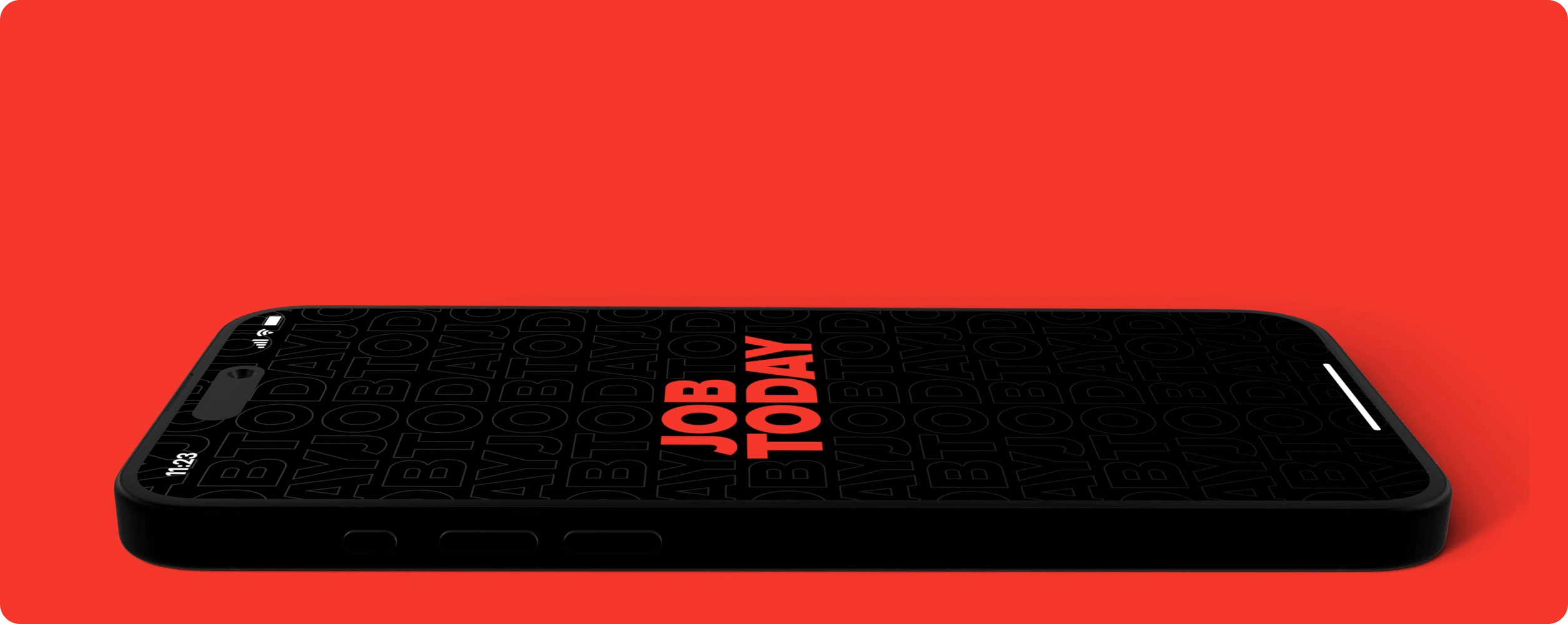
My Role
I joined as a Senior Product Designer, but in half a year I brought 2 new designers and became their Lead.
Review & Audit UX
It was important to understand key flaws and opportunities for improvement and to contribute to the current team backlog with the fresh sight. Over 25 items were already present there, but we wanted to expand and explore more opportunities.
Establish the Design System
From very tiny UI kit I took only main elements and explored the market on the design system supply. The decision was to build a new one based on one of the most flexible and aesthetic (not Material design) we found.
Extend Design Team
The app had 27 main flows and planned to grow, so the amount of work was tremendous, and we needed more senior designers to leverage that. We were aiming for 2 new people by the end of next quarter and it took still more then expected - 4 months.
Build Effective Processes
Once the team grew we needed to establish core principles and values for culture transformation ensuring more collaborative and transparent interactions. So the results are predictable and streamlined.
The Redesign Results
Below, you'll find a brief description of the main app screens and the changes made to them. Previous versions of the screens are available upon request.
Main Screen
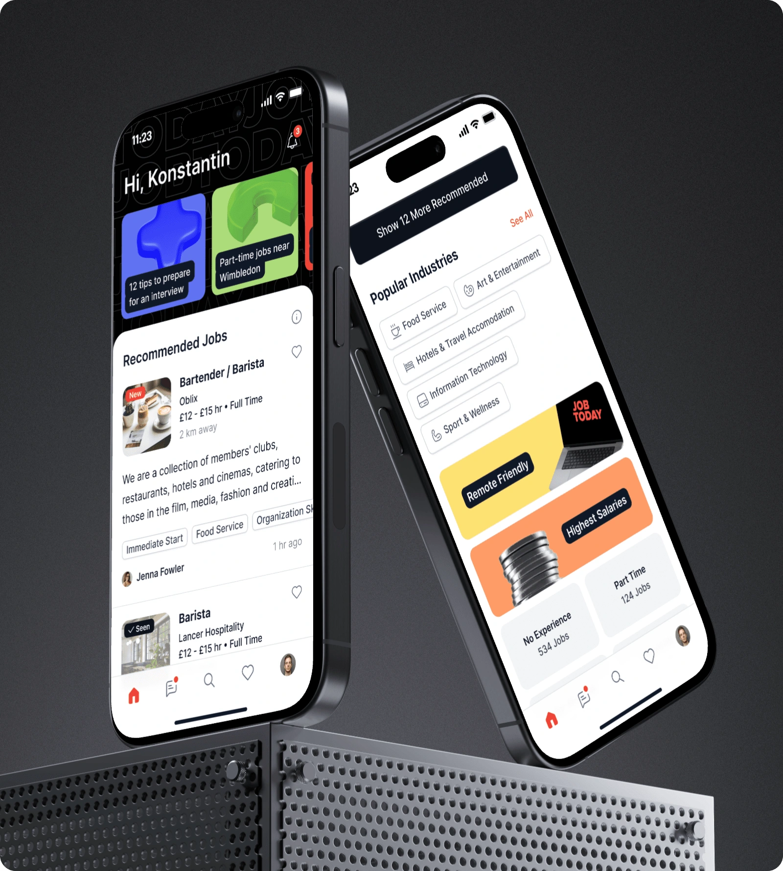
The old screen was cluttered with unnecessary elements and felt overloaded. User surveys shoved that the data presented on the screen doesn’t reflect the most needed essences there.
Favorite jobs
Stories featuring useful content and quick filters
New thumbnails with "new" and "seen" tags
Refined Job Cards
The enhancements increased page scroll depth, with the "save jobs" feature gaining significant traction. User interviews and surveys confirmed a strong preference for the new home screen content.
After implementing these personalization features, the app experienced a 22% boost in engagement with recommended jobs.
Chats Screen
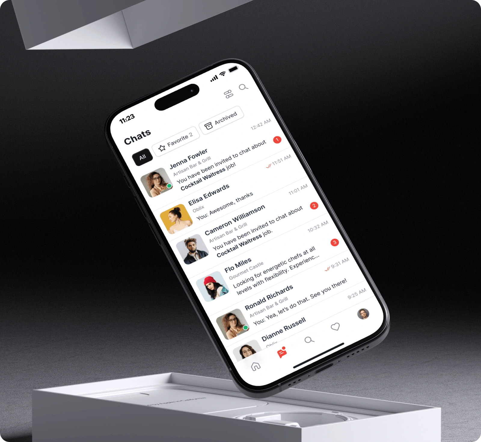
We replaced traditional job applications with chats—a novel approach in our industry. This feature aims to foster a sense of community among jobseekers, encouraging direct communication and mutual support. We've also committed to ensuring each candidate receives feedback within 24 hours of initiating a chat. Here's how we rebuilt the core of our app:
Chat folders
Message read status is now visible, mimicking modern messaging apps.
User online status is displayed.
New message notifications are highlighted in the message tab, ensuring jobseekers don't miss any communications.
Contact avatars are now filled in most cases, with company names and keywords highlighted in messages.
Helpful tips and quick replies
Filtering & Search inside chats
After implementing this feature, we saw a steady 15% increase in DAU. Surveys indicated that both employers and jobseekers experienced higher levels of engagement.***
Profile
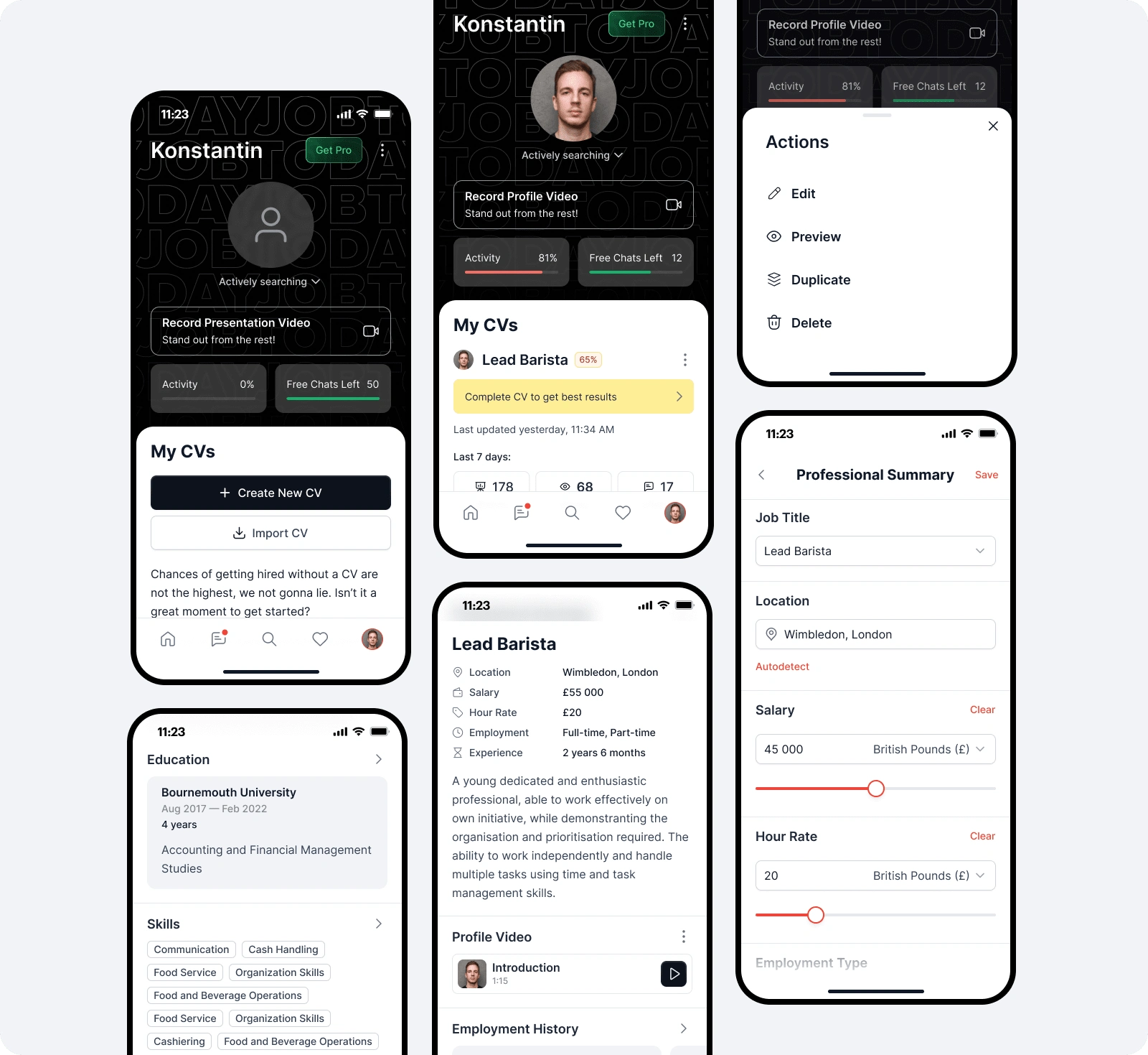
This key area of the customer journey map previously lacked functionality and overwhelmed users with excessive form-filling and incomplete guidance.
AI Assistance
Enhanced CV Structure & Multiple CV support
Profile Video
Profile Completeness Indicators
Statistics and Boost Function
PRO for Jobseekers
Activity Meter
These improvements led to a 40% increase in fully completed profiles and a 12% rise in chat activation rates.
Search Screen
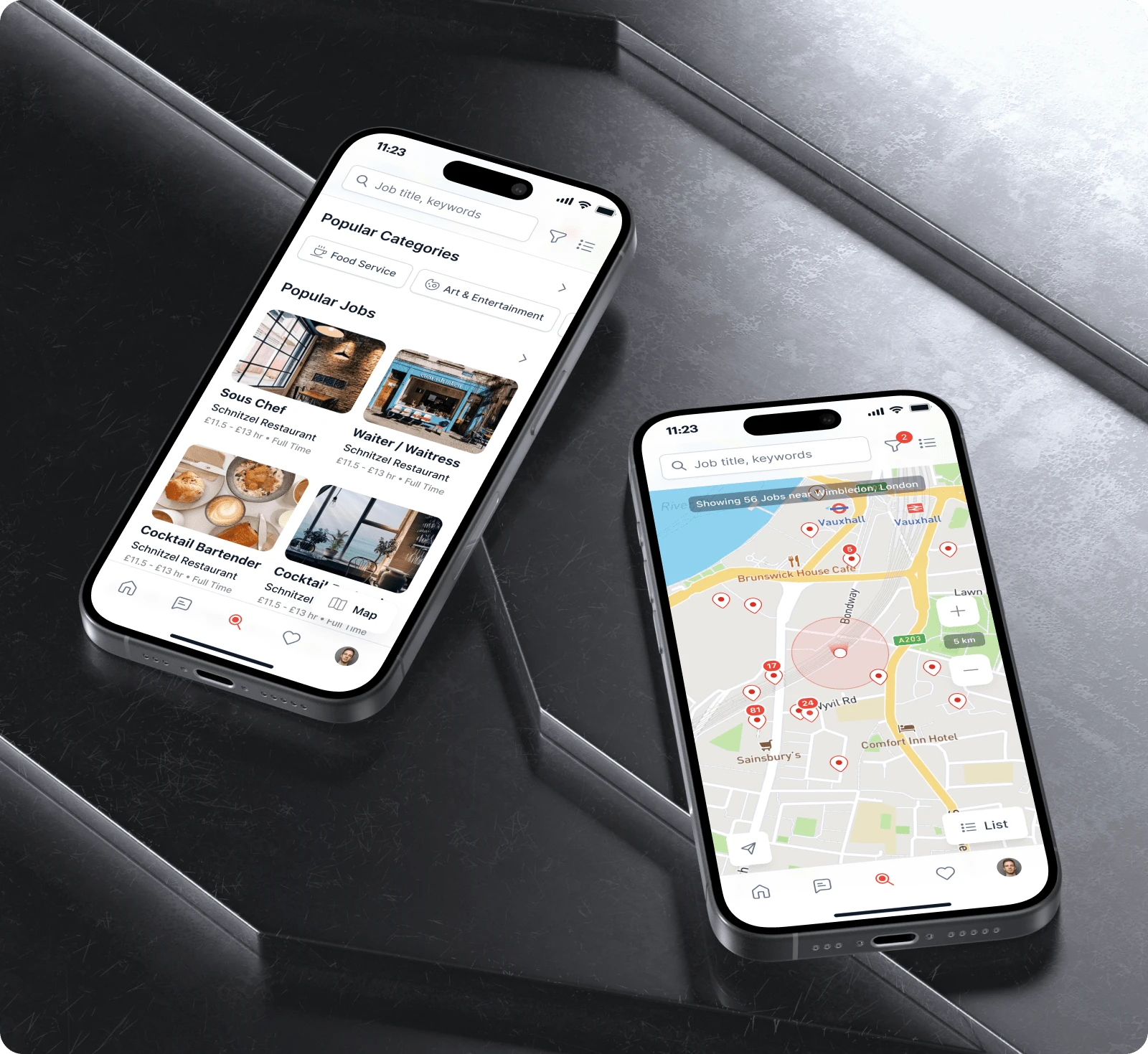
When users can't find suitable jobs on the home page, they need an effective search page that offers suggestions even without input. This approach anticipates users' needs and saves their effort.
Popular Categories
Popular Jobs
Map to list switcher
Pins with Counters
User surveys and interviews conducted six months after implementation revealed positive feedback.
Filters Screen
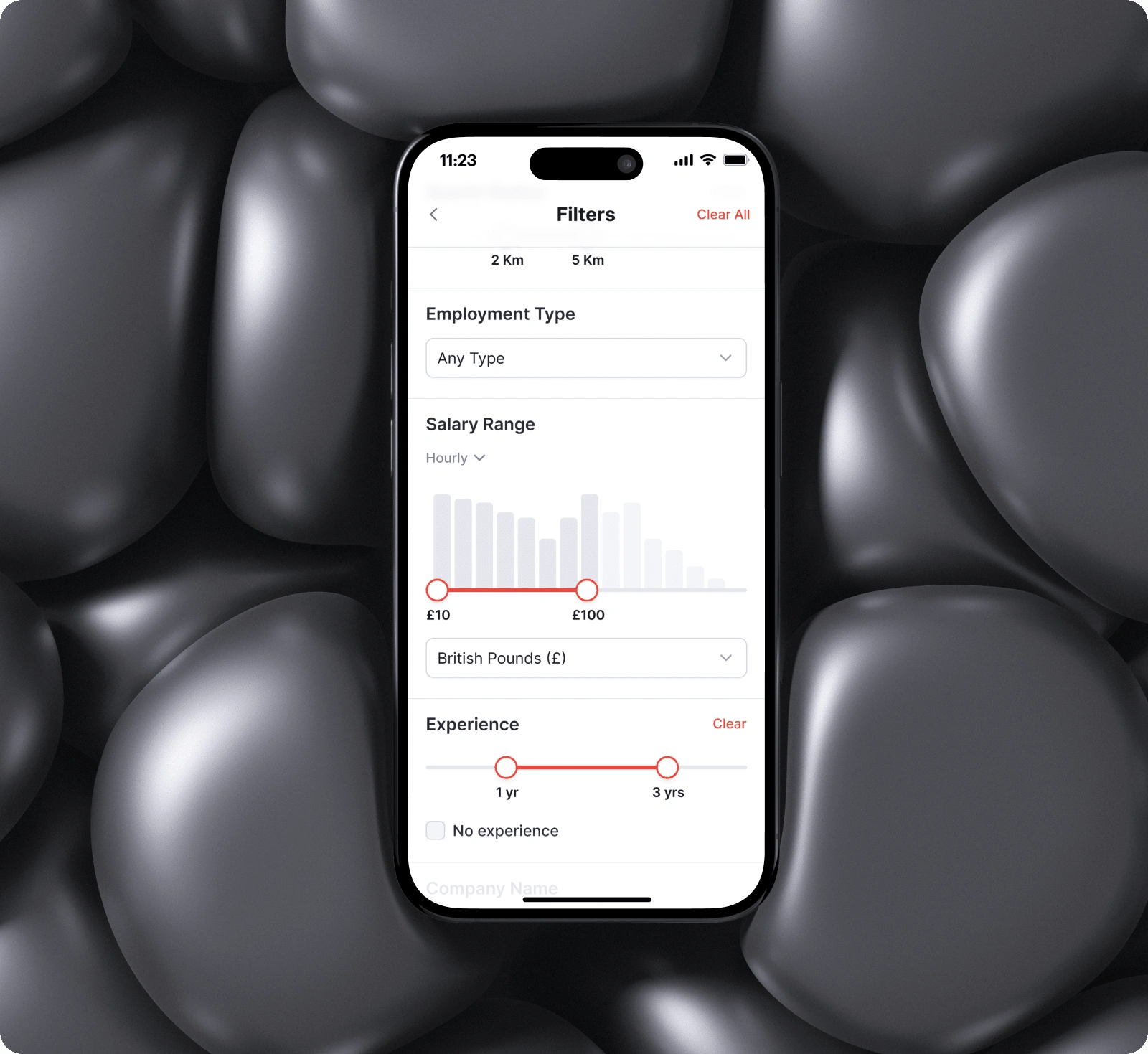
Added advanced filtering options to help users quickly find job listings that match their criteria, enhancing the overall search experience.
We've seen positive reviews in the app store, as this was a highly requested feature. It definitely raised our overall rating there, which was one of our main OKRs.
CV & Job Details
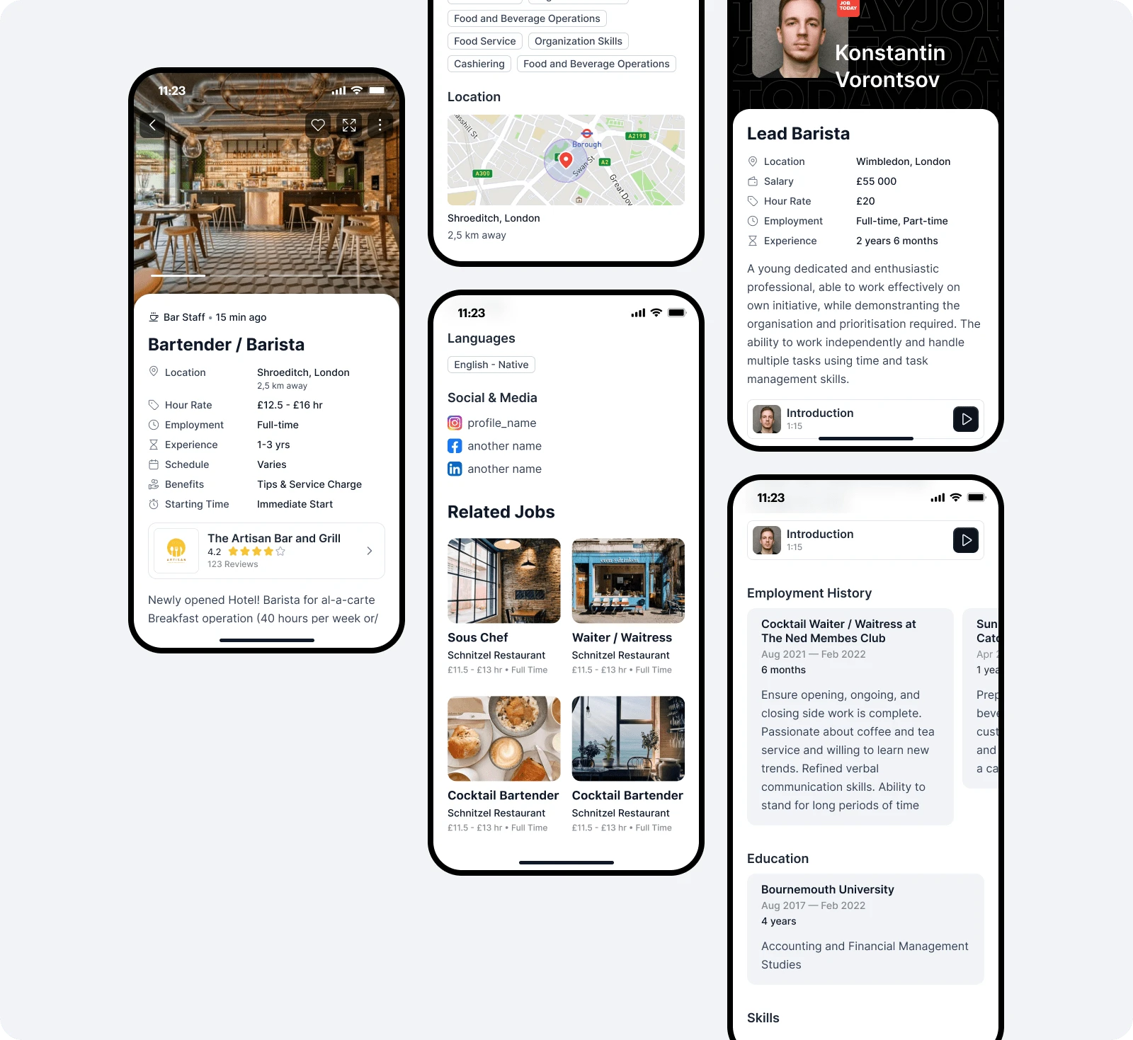
Extensive user research was conducted to optimize the content on these screens, allowing users to quickly scan the most crucial information. This approach demonstrates our commitment to valuing both jobseekers' and employers' time.
More structured layout with the most important information (based on surveys) at the top
Related Jobs section added below the main job listing
Company information widget now attached to the card for easier discovery
Company ratings introduced to enhance trust and transparency
By addressing layout issues and removing unnecessary and legacy elements, we've significantly improved our app store ratings and reviews
Brand and Design System Update
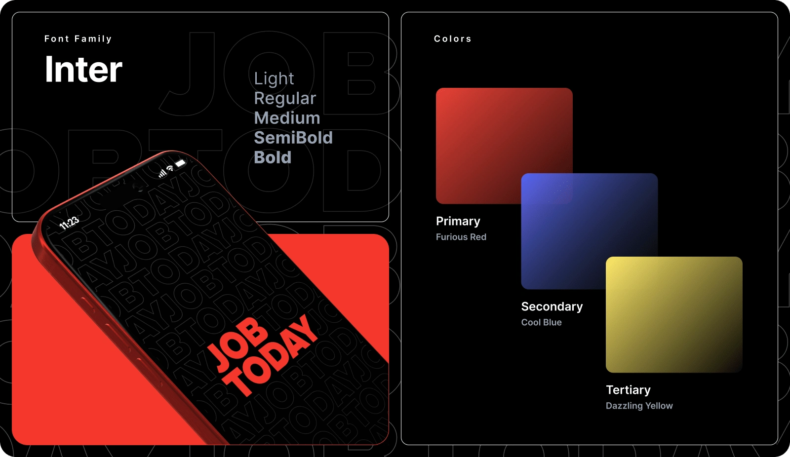
A brand and design system update offers several key benefits for a company:
Consistency: It ensures a unified visual identity across all platforms and materials, strengthening brand recognition.
Efficiency: A well-defined system streamlines the design process, saving time and resources.
Improved User Experience: Consistent design elements enhance usability and navigation for customers.
Scalability: It provides a framework for easy expansion as the company grows or introduces new products/services.
Brand Perception: A cohesive, modern design system can elevate the company's perceived professionalism and quality.
These benefits contribute to a stronger brand presence, improved user satisfaction, and potentially increased business success.
Our time to market (TTM) decreased from 3 weeks to 2 due to implementing design system.
Challenges We Faced
1. Prioritizing between routine but important updates, visual consistency improvements, and introducing a design system with new components.
2. Inability to monitor time to hire, an actual time of job search for the JS. They just closed the app after being hired and never returned back. That metric could expose more details on how our tweaks impact real user experience.
3. Shortage of development resources. One of the challenges we face when building features is time and resources. Back at that time, our team had 3 iOS engineers, 2 Android engineers and 1 web engineer. We had to be extremely thoughtful when planning the first scope and find the right balance between releasing the product fast but descoping nice-to-have features that are not going to be used much and visual update of the component library.
Results
Our team's efforts, including those of the design department, led to remarkable outcomes!
Through brand repositioning, adding personalization, implementing an advanced recommendation algorithm, and enhancing UX and interface quality by addressing critical issues, we significantly improved user satisfaction and usability metrics. Our app store ratings rose from 4.2 to 4.8 by December 2023. These improvements resulted in statistically significant higher conversion rates for premium users and active chat usage, demonstrating that the app is effectively serving millions of jobseekers and thousands of local businesses worldwide. We also began shipping changes more rapidly, responding swiftly to user feedback.
Thanks for reading!
Like this project
Posted Aug 6, 2024
Redesign of a 10+ million MAU app
Likes
0
Views
3


