Advansys Logo Redesign
Raghda Barakat

Advancing the Advansys Mark
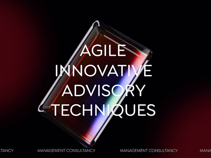
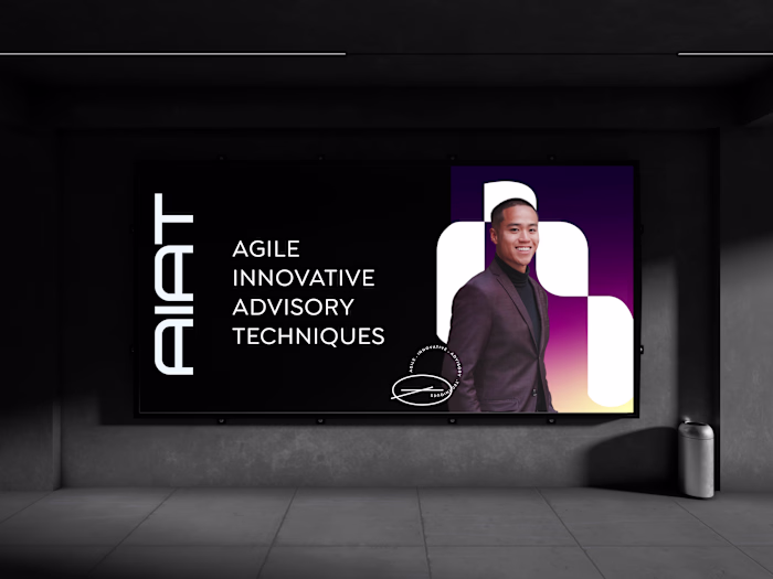
The updated Advansys logo builds on the original identity and strengthens it with a more contemporary and engineered feel. The evolution is intentional and smooth, keeping the familiar geometry while improving the clarity, proportion, and visual flow of the wordmark. Instead of introducing a sudden change, the facelift focuses on refinement so the brand continues to feel unified, recognizable, and trusted.
The enhanced emblem explores dimensionality, texture, and lighting to give the mark greater presence and depth. These variations stay true to the same geometric structure, maintaining continuity while opening new possibilities for motion, digital use, and high impact brand moments. By modernizing the forms and elevating the visual quality, the updated logo communicates precision, intelligence, and forward thinking innovation while staying rooted in the Advansys identity.
Like this project
Posted Nov 18, 2025
Updated Advansys logo for a contemporary and engineered feel, enhancing clarity and visual flow.
Likes
0
Views
15
Clients
Advansys