AIAT Management Consultancy Logo, Branding and Website
AIAT Management Consultancy | Logo, Branding & Website
For AIAT, a forward-looking management consultancy, I created a complete brand identity and digital presence, ensuring each touchpoint communicates their expertise in agile methodologies, innovation, and strategic advisory.
Scope & Deliverables
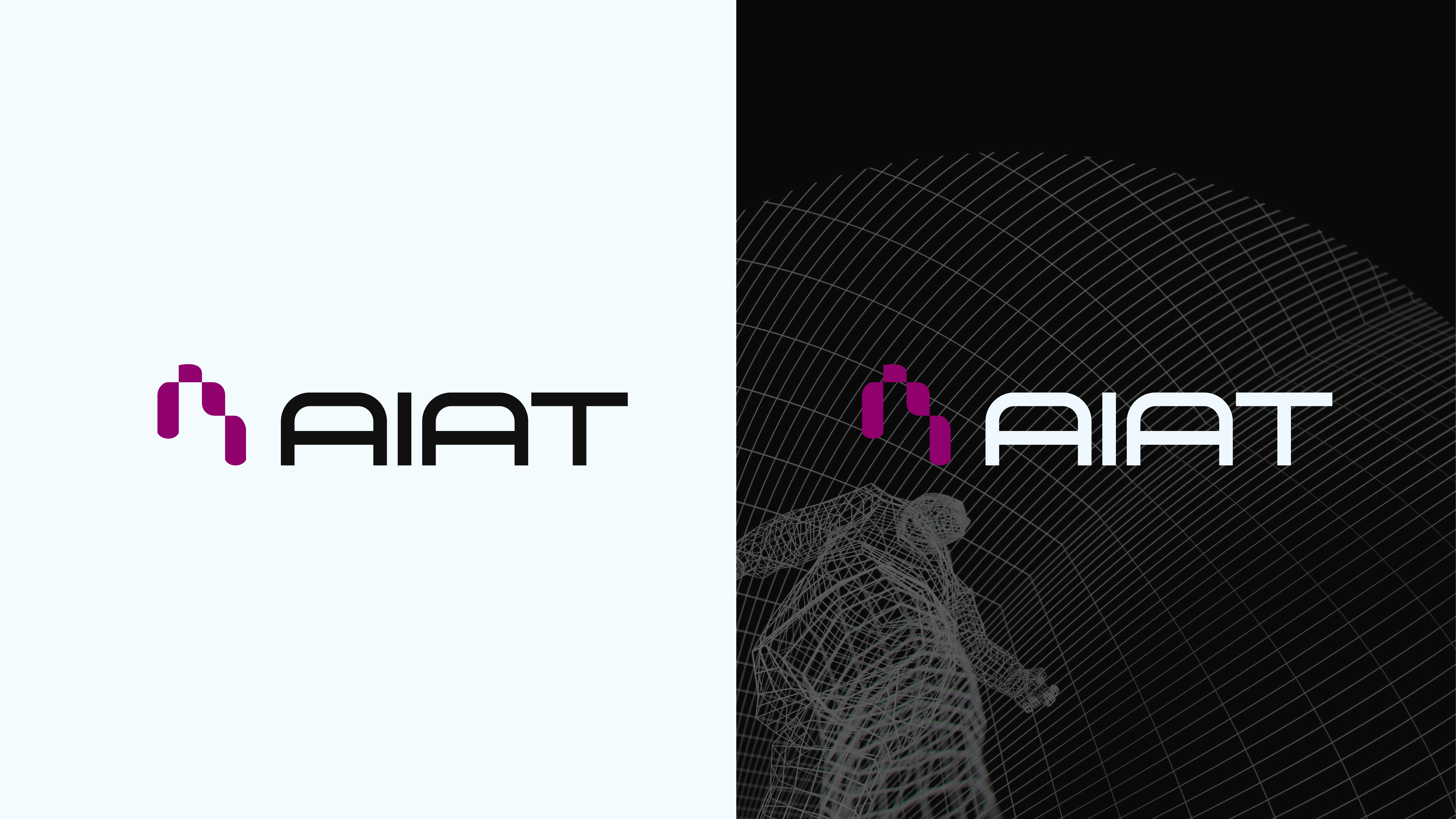
Designed a distinctive logo that balances modernity and professionalism, capturing the firm’s dynamism and credibility.
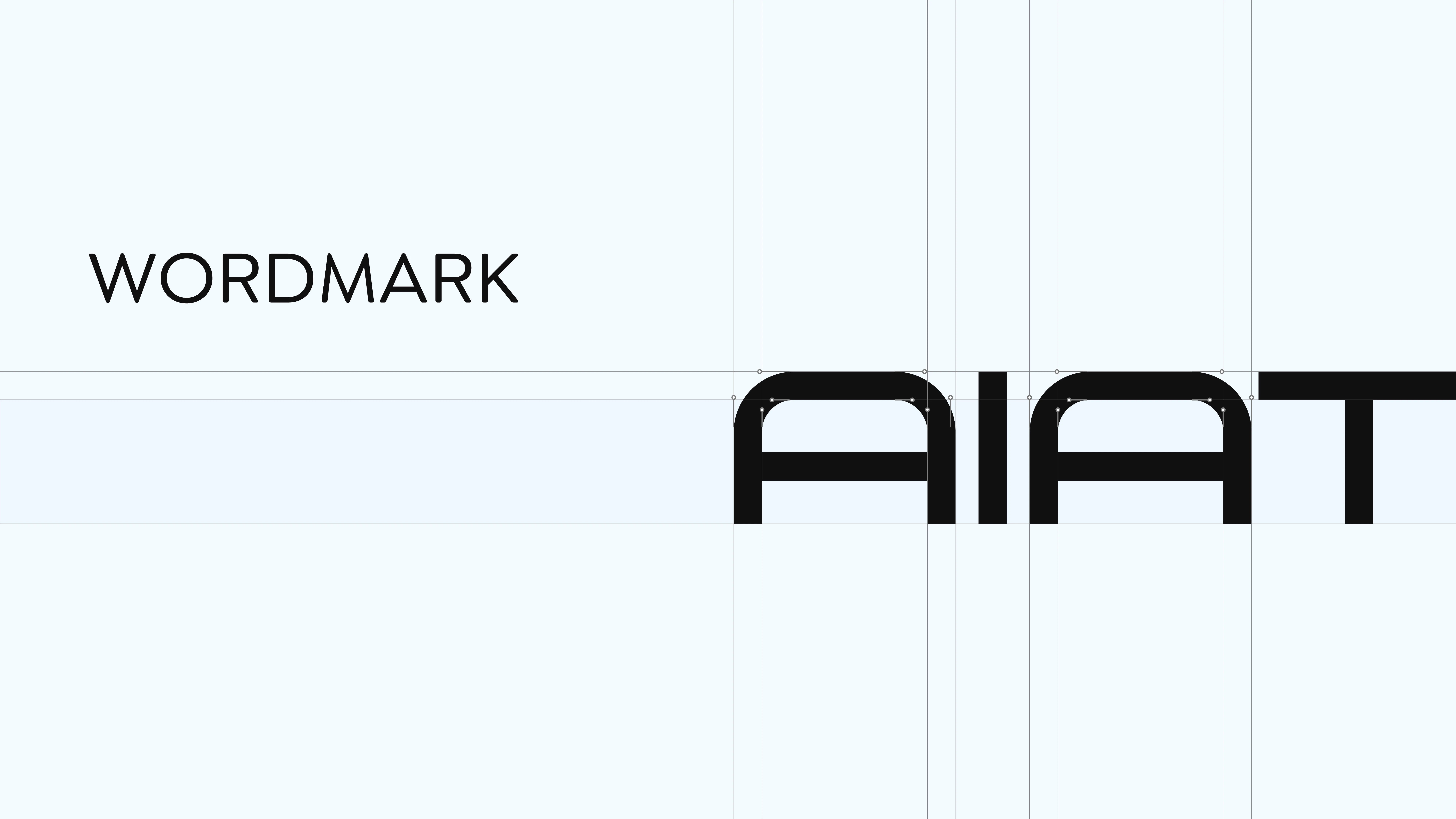
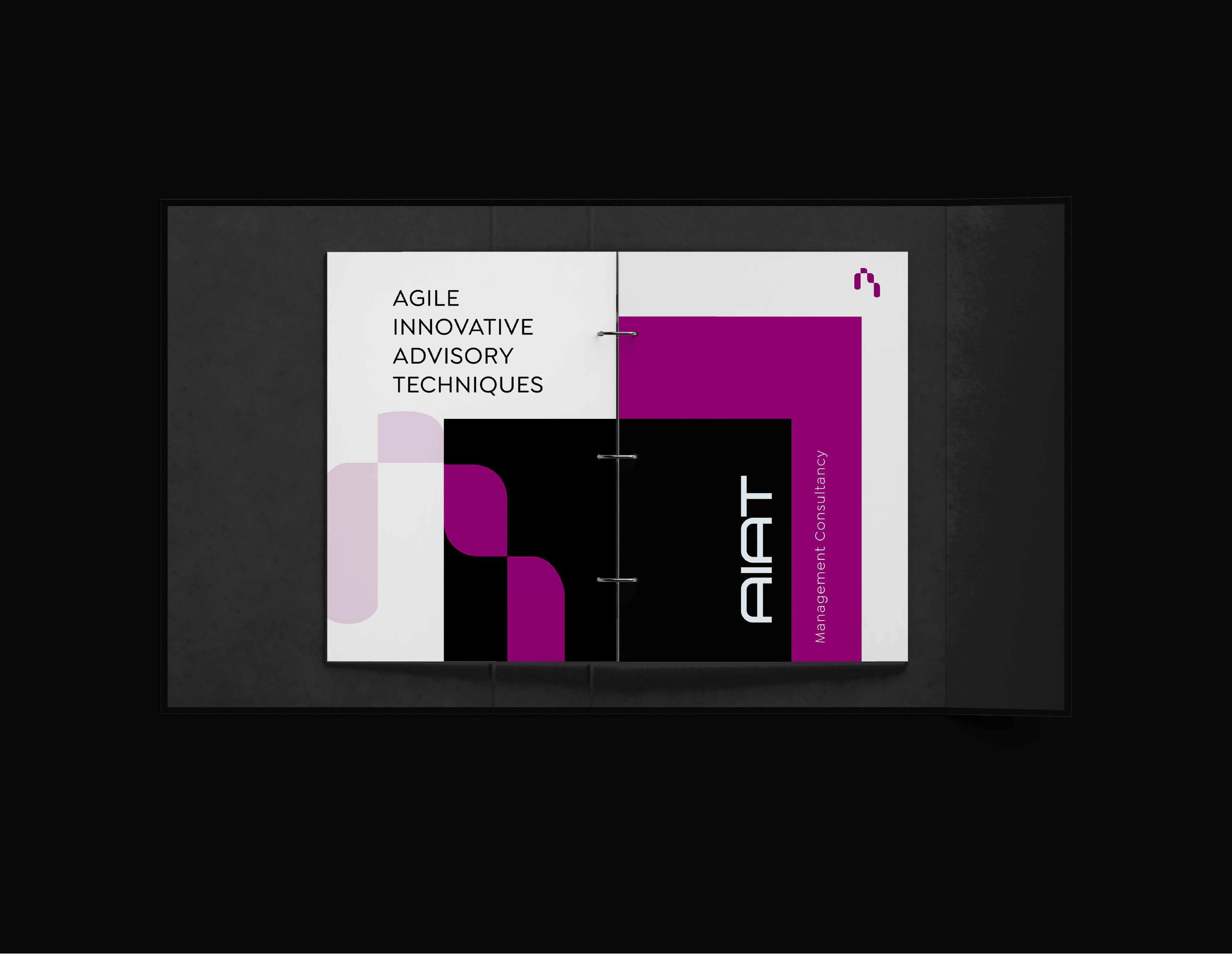
Built a comprehensive brand identity system, including color palette, typography, iconography, and usage rules, documented in a detailed brand book.
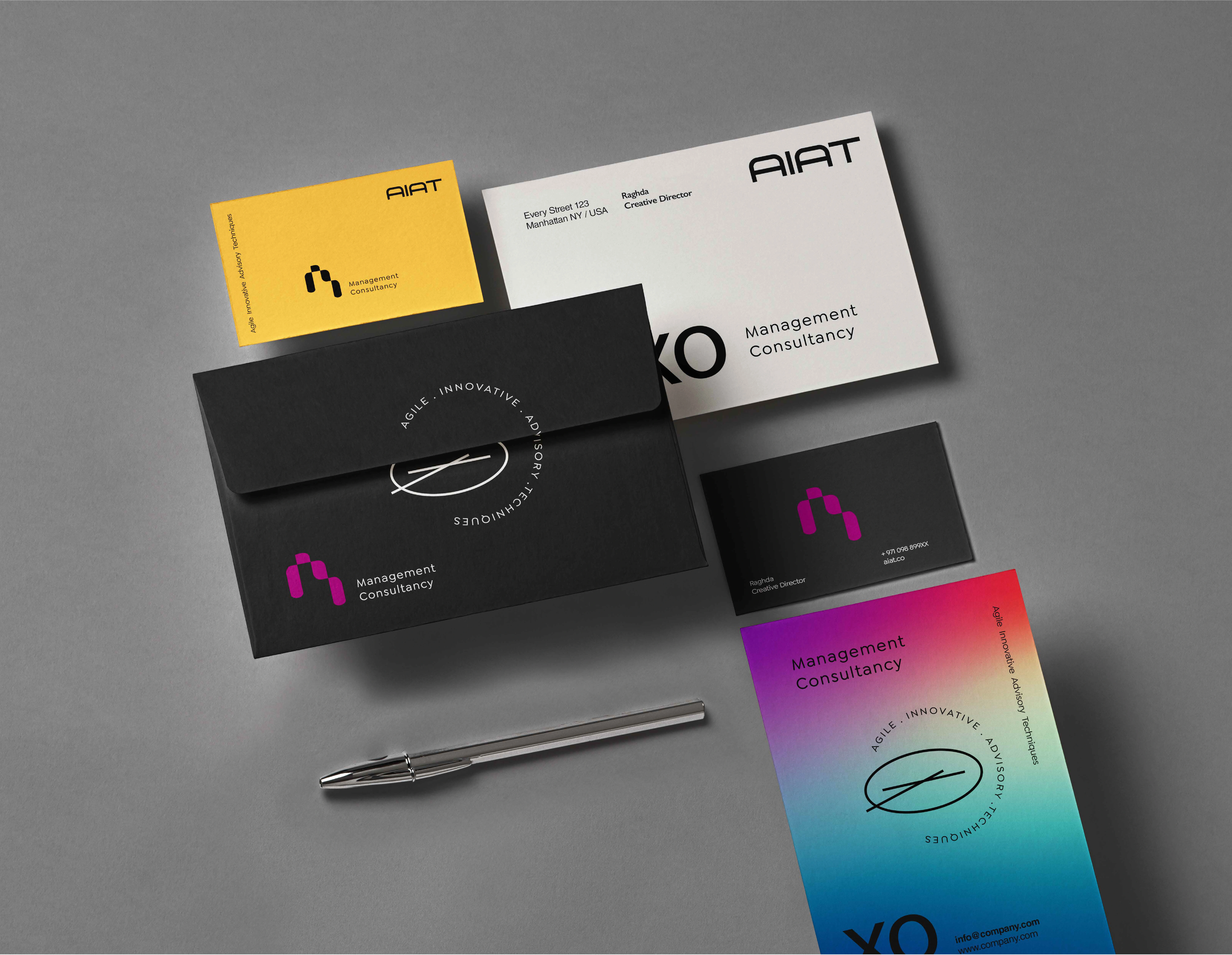
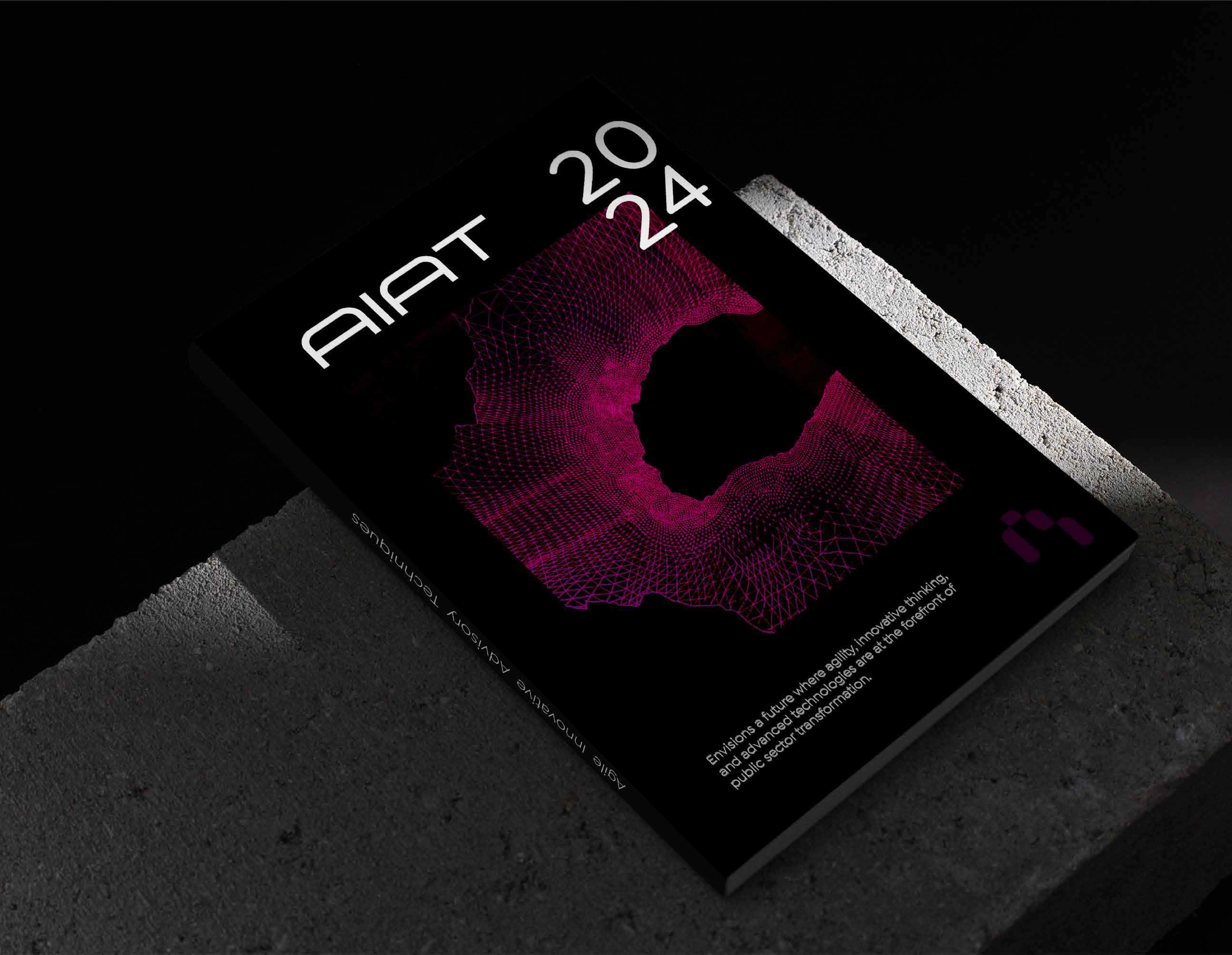
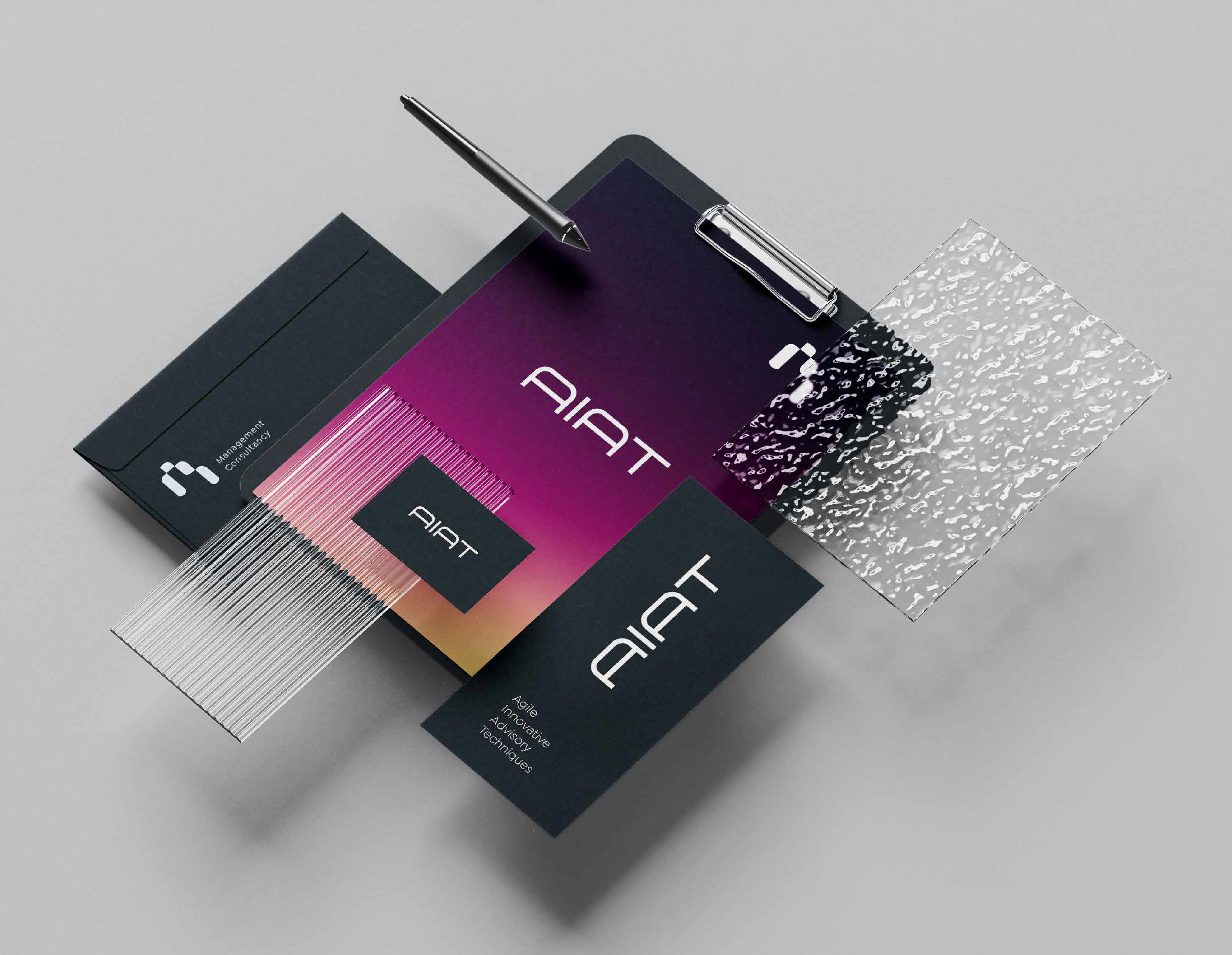
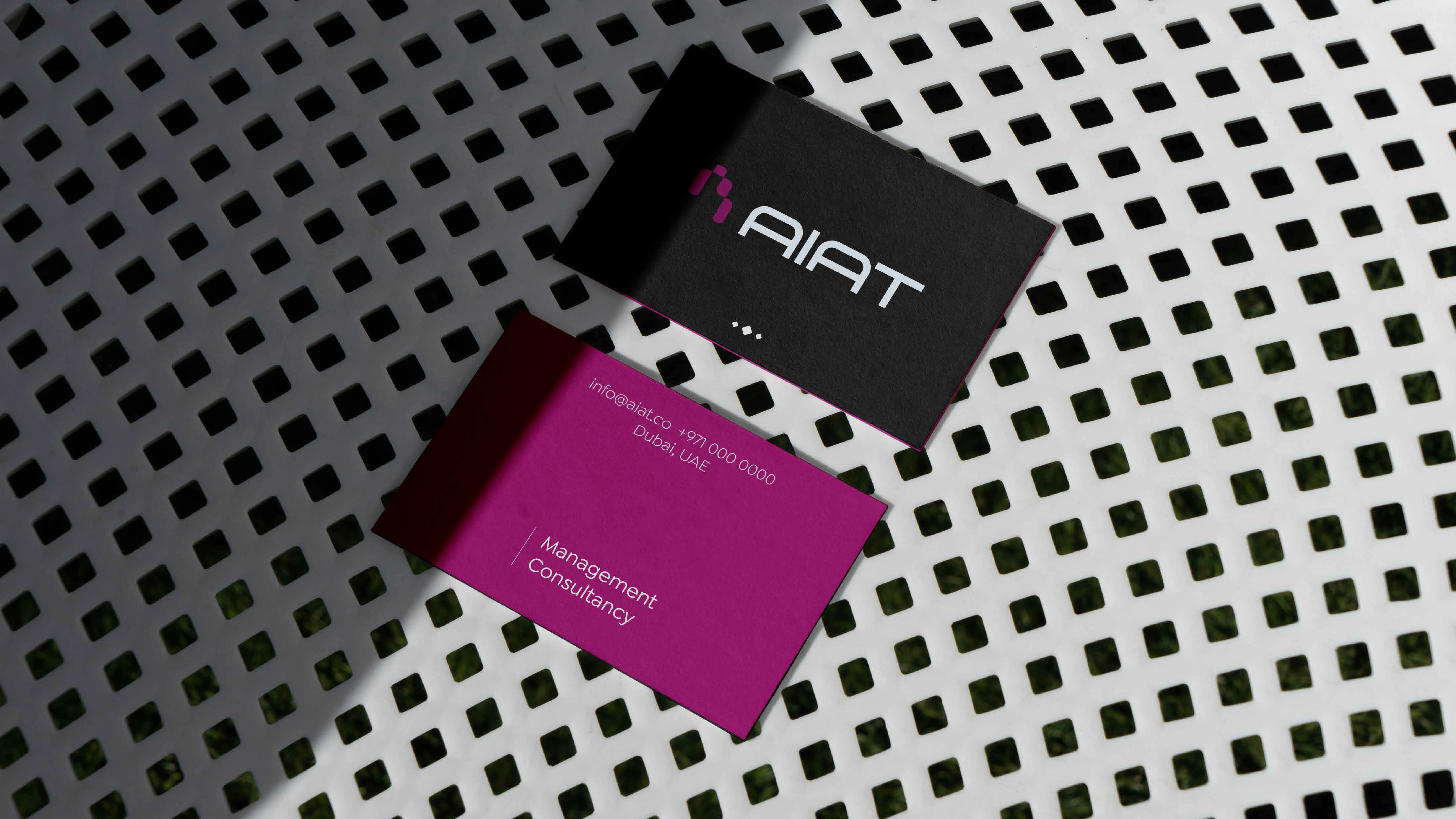
Developed branded collaterals and marketing assets such as stationery, company profile, and presentation templates to ensure visual consistency across all materials.
Designed and launched a responsive, polished website (www.aiat.com) to showcase AIAT’s services, case studies, thought leadership, and client journey, with emphasis on usability and clarity.
Produced custom videos integrated into the website, ensuring the motion content reflects AIAT’s agility, forward-thinking approach, and client-centric mindset.
Design Thinking & Strategy
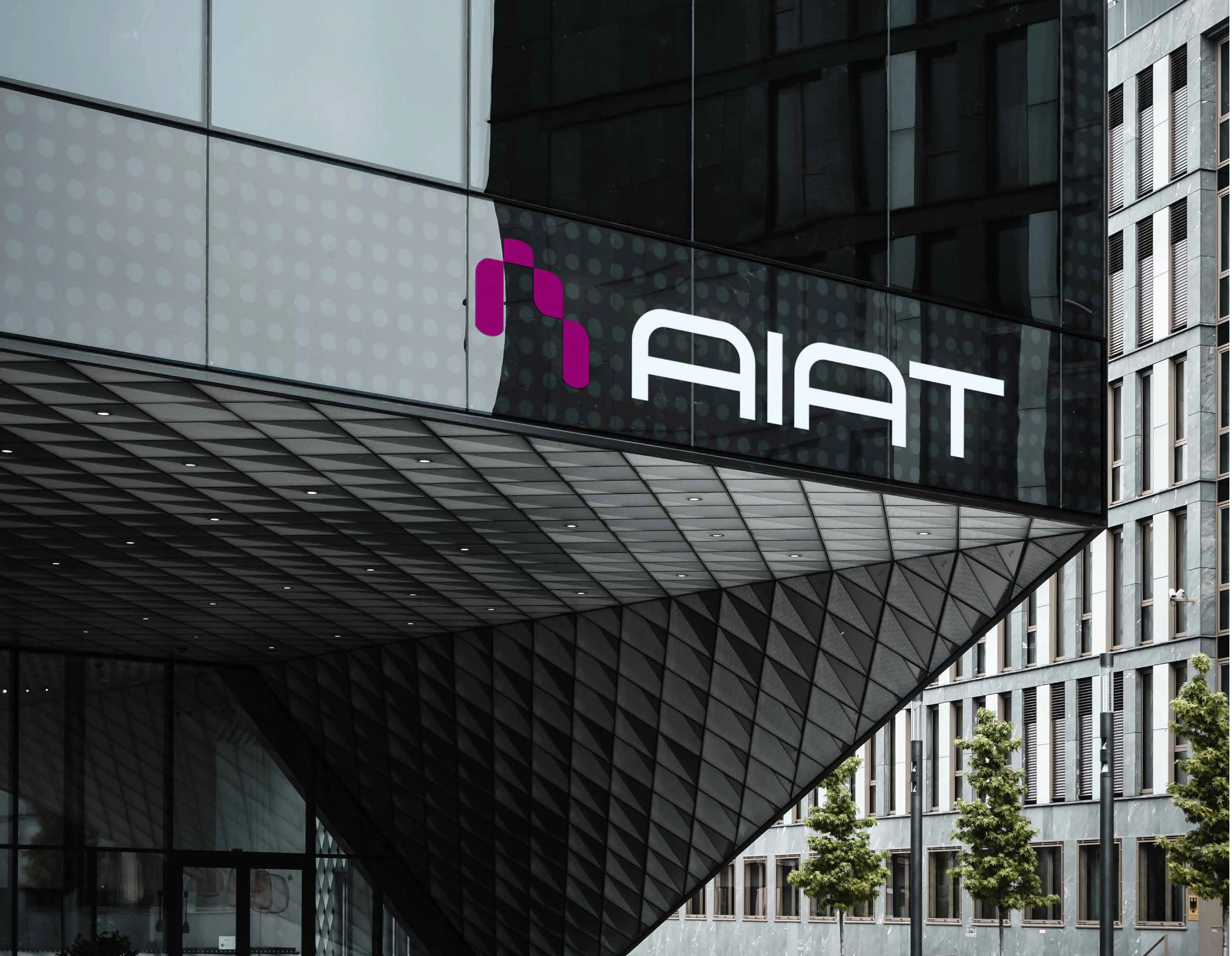
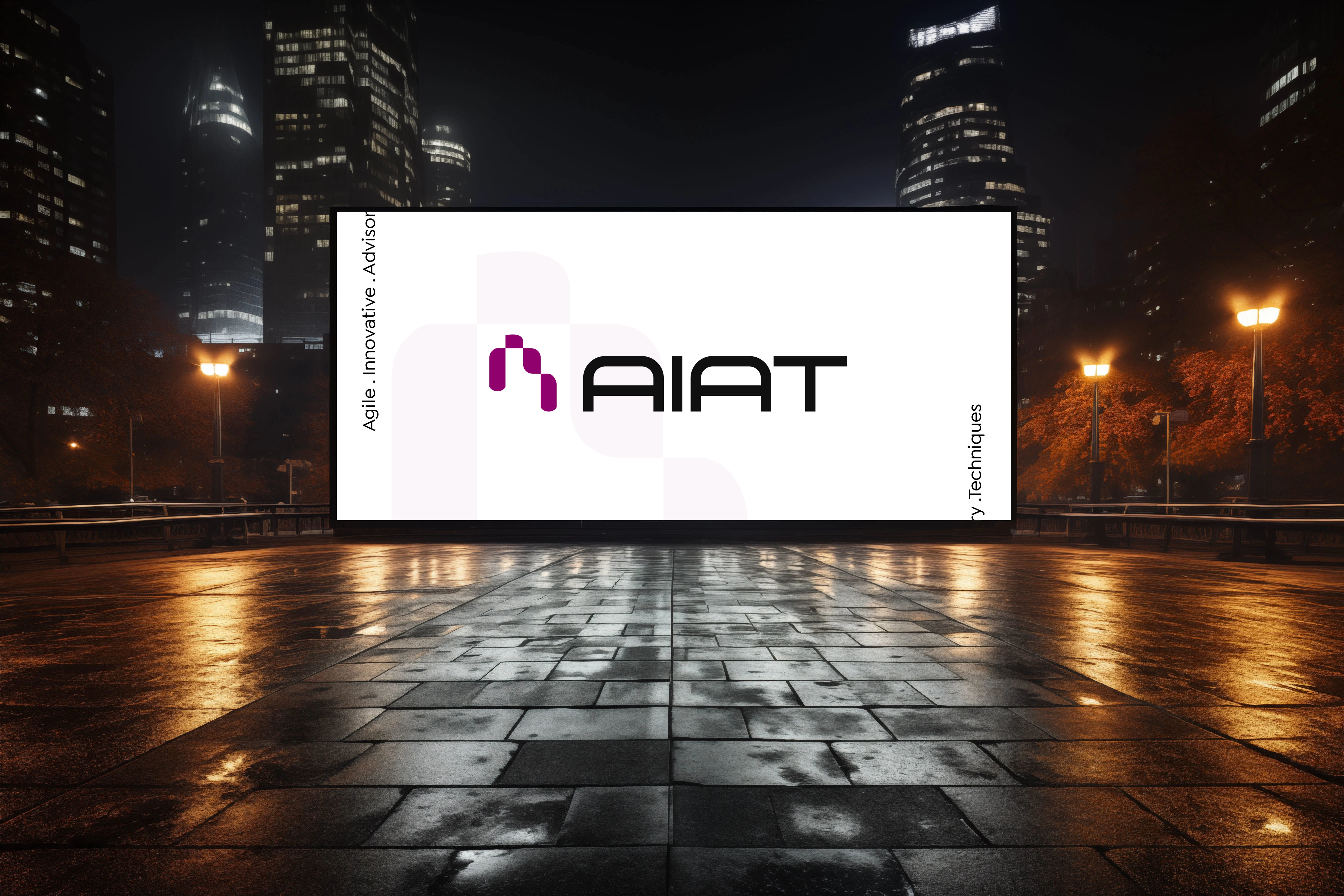
The visual identity is vibrant yet grounded, using energetic colors that signal innovation while being anchored by design elements that express structure and trust.
Every graphic and motion decision, from shape to spacing to video storytelling, was made with consistency in mind so that all materials communicate in one unified voice.
The website serves as both a branding and functional hub, with clean navigation, clear hierarchy, and engaging multimedia content to support client engagement.
Impact & Value
This project delivers more than just visual assets, it provides AIAT with a unified identity across print, digital, and video platforms, empowering the consultancy to present itself confidently to clients, partners, and the market.
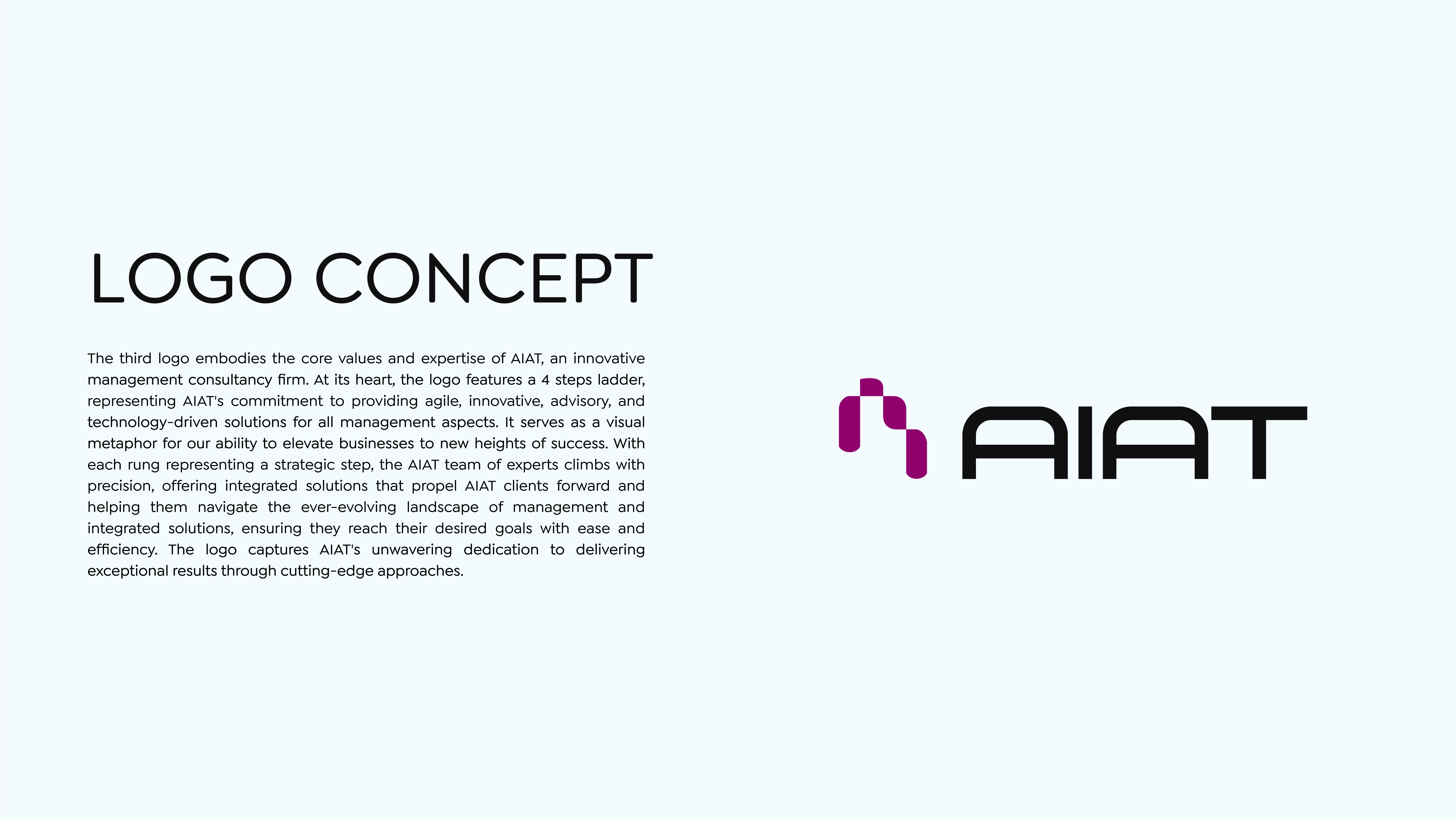
Logo Concept
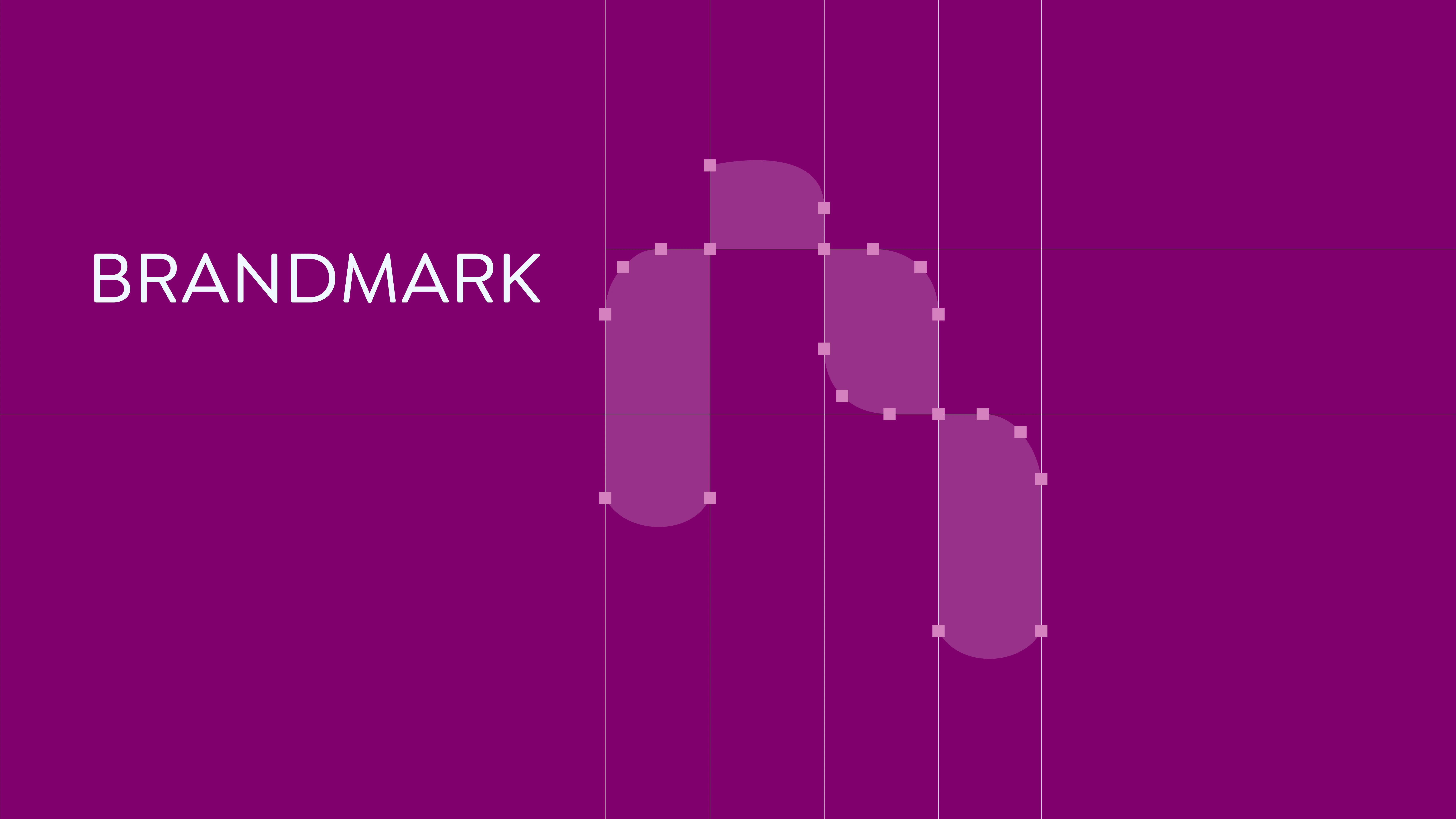
The AIAT logo is built around a simple but powerful idea: growth through strategy. At its heart, the design features a four-step ladder, each step representing one of AIAT’s pillars: Agility, Innovation, Advisory, and Technology. Together, they reflect the firm’s approach to guiding businesses forward with clarity and confidence.
The ladder is more than just a shape. It is a symbol of progress that shows how AIAT helps clients climb steadily toward their goals, turning complex challenges into clear, achievable steps. Each rung represents a milestone on that journey, highlighting the team’s ability to blend precision with creativity and strategy with execution.
In the end, the logo tells a story. AIAT is not only about consultancy, it is about elevating businesses to new heights. It captures the firm’s spirit: forward-thinking, practical, and deeply committed to helping clients succeed in an ever-changing landscape.



Like this project
Posted Jan 21, 2024
Execution of the comprehensive brand creation and development of AIAT.

