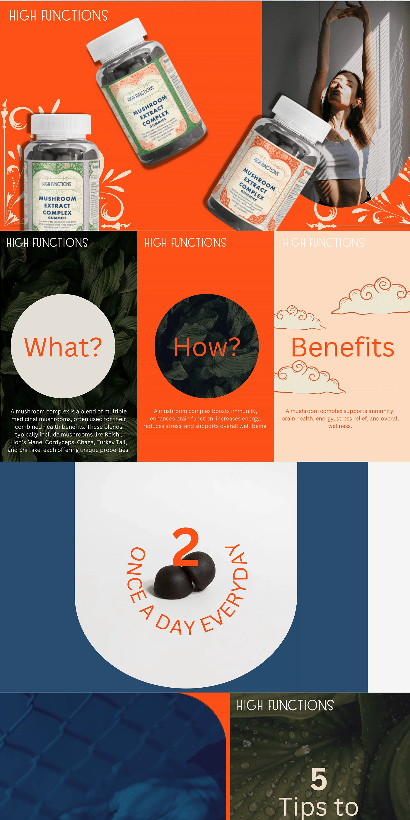
High Functions | Brand Identity & Label Design


High Functions is dedicated to enhancing cognitive performance and overall well-being through premium, nature-inspired supplements. Rooted in tradition and backed by science, our brand blends elegant design, high-quality ingredients, and modern wellness trends to deliver a sophisticated and effective supplement experience. With a focus on clarity, vitality, and balance, High Functions empowers individuals to perform at their best—mentally and physically.
The High Functions logo presents a refined and intricate design that blends vintage aesthetics with modern elegance. The typography uses the Bicycle font, characterized by its art deco-inspired curves and elongated letterforms, giving it a sophisticated and timeless appeal.
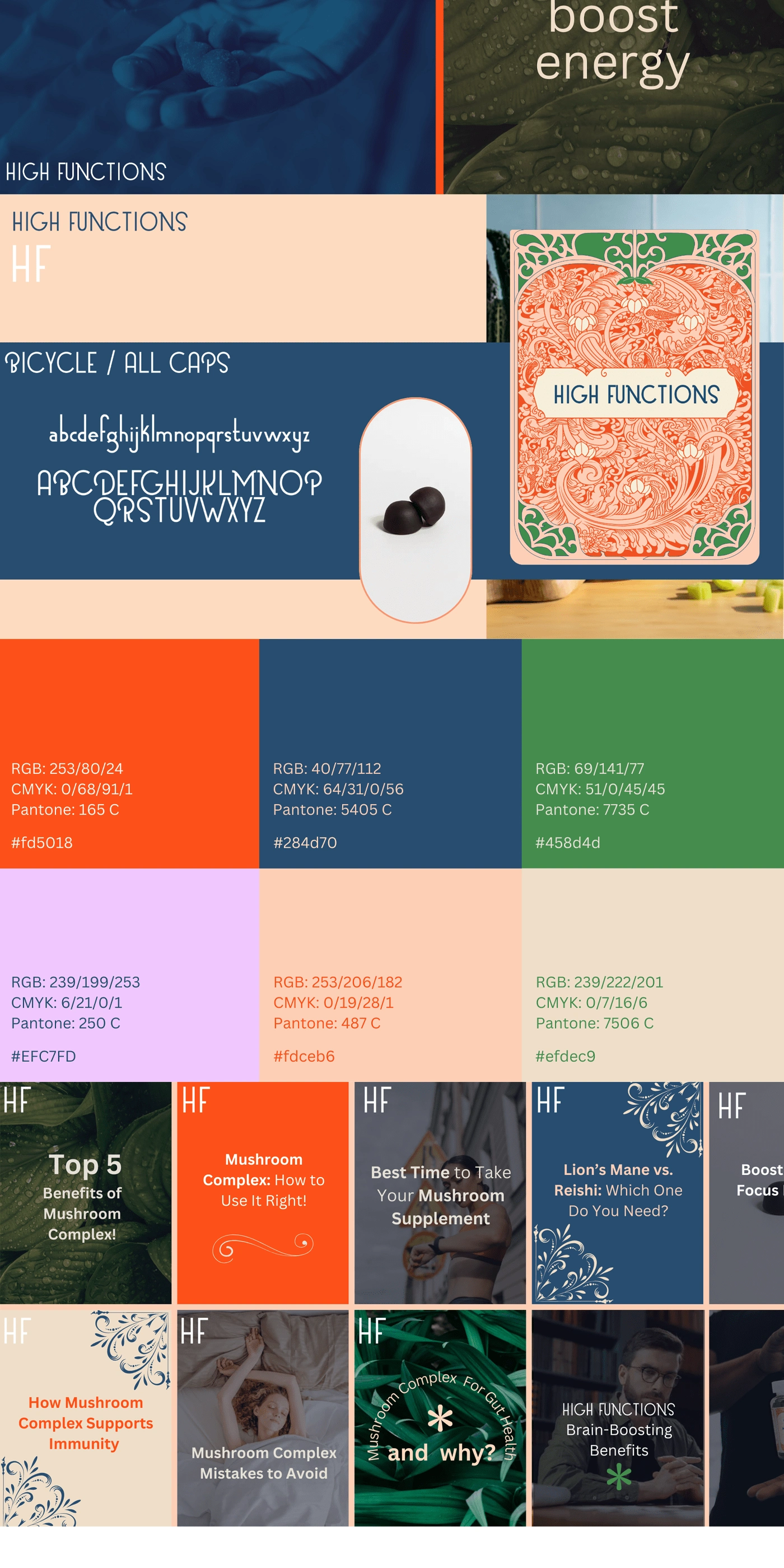
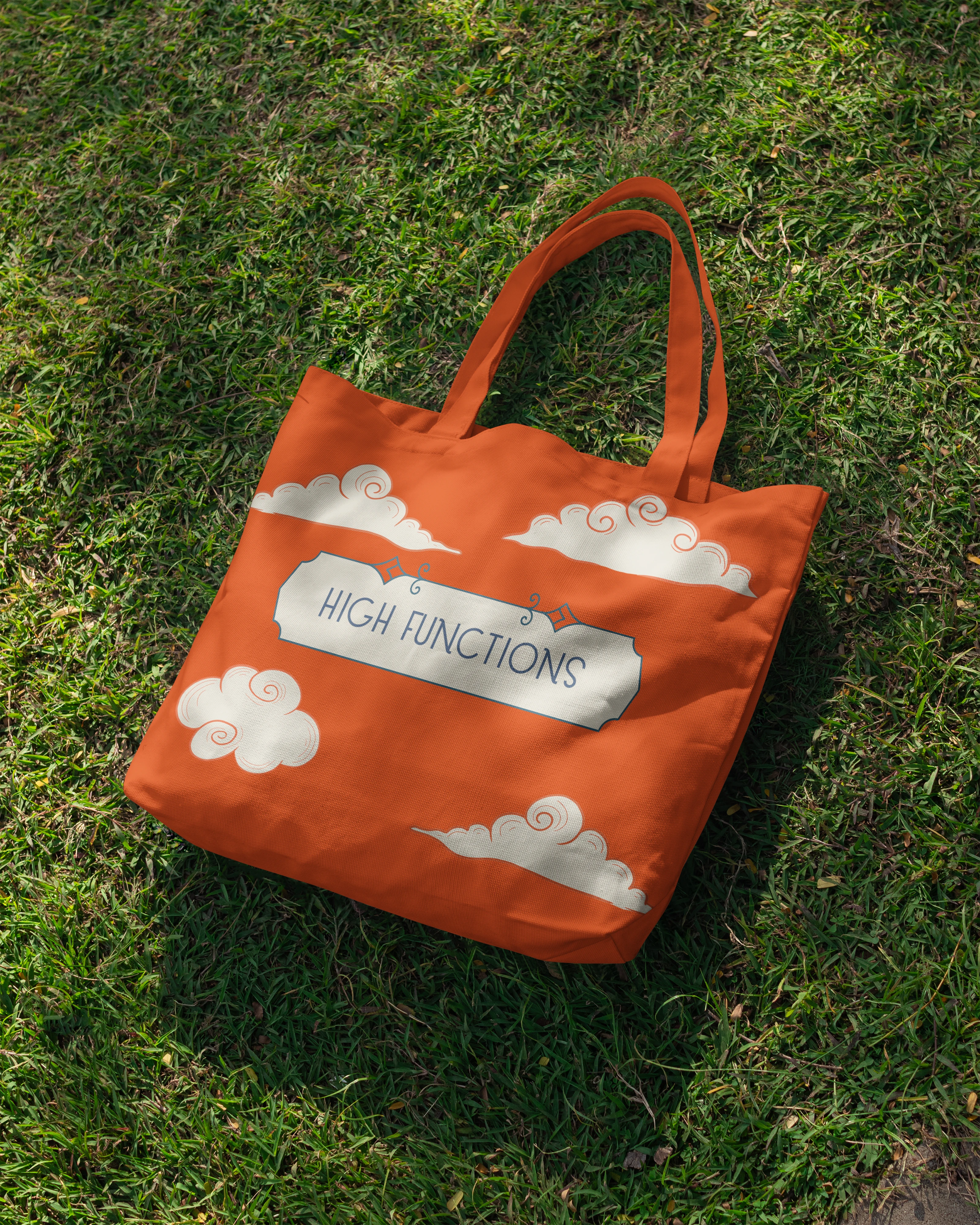
The color palette consists of peach, navy blue, coral orange, and green, creating a harmonious balance between warmth, elegance, and nature. These colors give the brand a premium yet approachable identity.
Like this project
0
Posted Jun 12, 2024
Crafted a series of label designs and a logo infused with Asian-inspired ornate aesthetics, while also developing a comprehensive brand kit.
Likes
0
Views
260
Timeline
May 24, 2023 - Jun 4, 2023
Clients
Content Mogul Pte Ltd


Merch Design - SMB
Istation | Graphic Design & Animation
Dumpster Fire Brewing Co. | Brand Identity & Packaging Design
Hound House | Line Design + Illustration